|
|
| Line 155: |
Line 155: |
| | | Unfamiliarity with R and the different packages required to build the visualisations | | | Unfamiliarity with R and the different packages required to build the visualisations |
| | || | | || |
| − | * Learning via online resources such as datacamp
| + | Explore online resources (e.g. Rpubs) |
| | + | Self-learn on Datacamp |
| | |- | | |- |
| − | | Retrieving the coordinates for the different town required to build a map for our visualisation | + | | |
| − | || Example | + | Lack ideas in designing the storyboard |
| | + | || |
| | + | Explore online resources such as Tableau Public Library to gather insights and inspirations |
| | |- | | |- |
| − | | Example || Example | + | | |
| | + | Retrieving the coordinates for the different town required to build a map for our visualisation |
| | + | || |
| | + | Look into various projects and examples that made use of geographical mapping as reference |
| | + | |
| | |} | | |} |
| | | | |
Revision as of 01:41, 12 October 2019
Problem Statement
Problem: Our team has identified a lack of information on HDB resale flats for homebuyers who want to understand and make decisions on the type of HDB flat to buy based on past transaction trends.
Motivation: With the increasing demand for housing, there is a need for homeowners to have a better understanding of the flats they are purchasing. Hence, there is a need to analyse the resale prices and transaction volume of the flats.
Objectives
Target: Home Buyers
In this project, we aim to create a visualization tool that helps homeowners make decisions by identifying:
- Changes of resale prices by flat types, years and month
- Value of the house based on the estate area
- Resale transaction price based on the age of the estate area (lease year)
- Identify Estates that are worth buying
Selected Data Sets
| Dataset/Source |
Data Attributes |
Rationale of Usage
|
HDB Resale Flat Prices
(https://data.gov.sg/dataset/resale-flat-prices)
|
- Month
- Town
- Flat Type
- Block
- Street Name
- Storey Range
- Floor Area Sqm
- Flat Model
- Lease Commence Date
- Remaining Lease
- Resale Price
|
To gain information on the HDB procurement over the years such as:
- The Resales prices by flat type
- Area size and Floor level and;
- The lease date of the flat.
|
Background Survey of Related Work
| Reference of Other Interactive Visualization |
What we Learnt
|
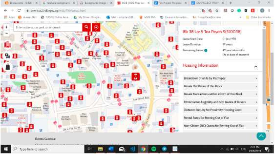
Title: HDB One Map
Source: https://services2.hdb.gov.sg/web/fi10/emap.html
|
- Shows detailed information on HDB flats but lacks the tool to show an overview on the HDB estates in Singapore
- It is usability is limited by its lack of function to filter by different data variables e.g. region, street, Model, Floor Range, Floor Area and etc.
|
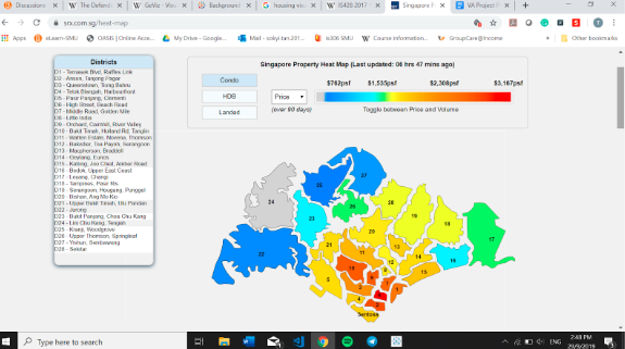
Title: SRX Heat Map
Source: https://www.srx.com.sg/heat-map
|
- Shows an overview of the price and transaction volume of the different types of estate in different towns.
- Bad color scheme used
- Could include more interactive elements to the chart & detailed information (eg when hover over a district can show price & no. of transactions)
|
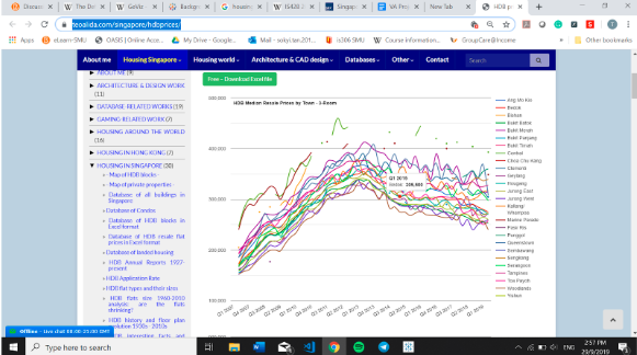
Title: Line Chart
Source: https://www.teoalida.com/singapore/hdbprices/
|
- Able to see the trend in a glance based on the different flat type
- Messy, not interactive as it does not show any highlight line when users hover over to the town that they want to see
|
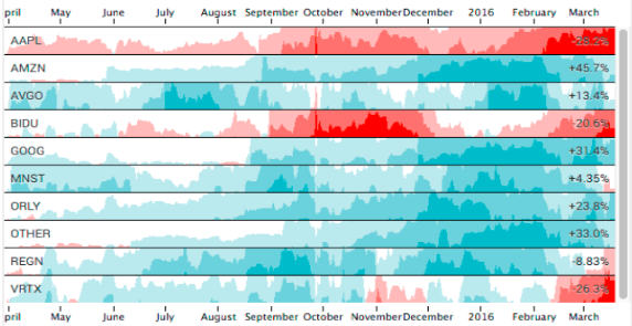
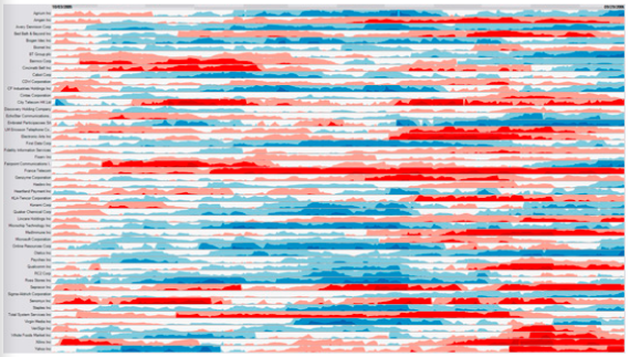
Title: Horizon Chart
Source: https://flowingdata.com/2015/07/02/changing-price-of-food-items-and-horizon-graphs/
|
- It allows users to look at patterns over time
- It does not come with any axis or bounds which makes it easy to implement
- Horizon chart also supports mouse interaction when hovered or selected in the chart.
- It makes use of colour based code to separate positive and negative values
- It collapses the negative values to the positive side of the axis, taking up less space and shows the same data.
|
Title: Horizon Chart
Source: https://www.perceptualedge.com/blog/?p=390
|
- Using different colour codes, it made the interpretation of data between charts much easier.
- Using the mirrored approach, it is much easier to compare the variance of data when they are side by side.
|
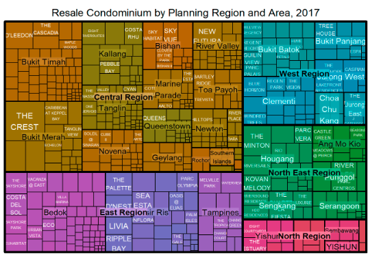
Title: TreeMap
Source: http://rpubs.com/tskam/treemap
|
- Main benefits of tree maps is that they make efficient use of compact space, so they can legibly display many items on the screen at the same time.
- But treemaps with too many items tend to be hard to read because of the many lines that enclose each small node.
|
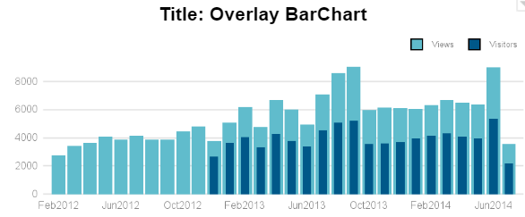
Title: Overlay BarChart
Source: https://blogs.sas.com/content/graphicallyspeaking/2014/07/27/overlay-bar-charts/
|
- Overlay BarChart reduces the chances of frequency measurement error.
|
Proposed Dashboard
Our group has proposed the following storyboard in our Visual Application:
| Dashboards |
Rational
|
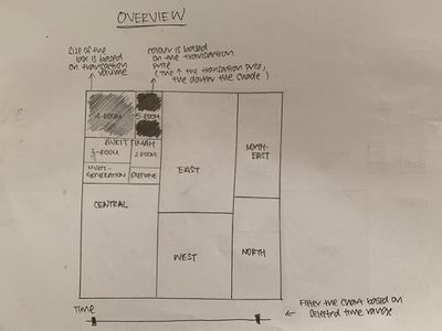
Dashboard 1: Overview
|
- An overview to show the Resale Prices and Transaction Volumes for the different flat types by region and town, in a hierarchy structure.
- The size of the box will be based on the total transaction volume and the colour will be based on the median transaction price.
- The chart can be filtered by time and the treemap will be updated according to the filter.
|
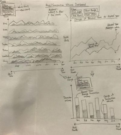
Dashboard 2: Price/Transaction Volume Dashboard
|
- A horizon Chart to show the Resale Prices or Transaction Volumes by Towns.
- When Filtered to Resale Prices and Selected Town, the right graph will display a Line chart. It will show the absolute Resale price of the selected town and the changes of Resale price from the previous year to the current year.
- When filtered by Transaction Volume, it will show the absolute Transaction Volume of the selected town and changes of transaction volume from the previous year to the current year.
|
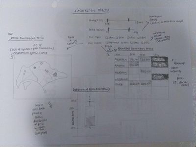
Dashboard 3: Past HDB Resale Transactions
|
- The user will apply filters on the price range, lease year, flat type and flat model
- When filters are applied, the proportional map and heat map will reflect the selections accordingly
- The proportional map’s symbol size is determined by the number of transactions within each town
- The heatmap shows the median past transaction prices by town and flat type
- The heatmap shade intensity is determined by the median transaction price
- Upon hovering over the points on the proportional map, it will show a box plot with the distribution of the transaction prices by the specific town
|
Key Technical Challenges
| Challenges |
Action Taken
|
| Unfamiliarity with R and the different packages required to build the visualisations
|
Explore online resources (e.g. Rpubs)
Self-learn on Datacamp
|
|
Lack ideas in designing the storyboard
|
Explore online resources such as Tableau Public Library to gather insights and inspirations
|
|
Retrieving the coordinates for the different town required to build a map for our visualisation
|
Look into various projects and examples that made use of geographical mapping as reference
|
Milestones
References
