Difference between revisions of "Two Eyes One Pizza"
| Line 222: | Line 222: | ||
*Gantt Chart | *Gantt Chart | ||
| − | [[Image: | + | |
| + | [[Image: Gantt.png |800px|center]] | ||
==<div style="background: #8b1209; padding: 15px; line-height: 0.3em; text-indent: 15px; font-size:18px; font-family:Helvetica"><font color= #FFFFFF>References</font></div>== | ==<div style="background: #8b1209; padding: 15px; line-height: 0.3em; text-indent: 15px; font-size:18px; font-family:Helvetica"><font color= #FFFFFF>References</font></div>== | ||
Revision as of 22:13, 11 October 2019
Contents
Introduction
International Food Chain (IFC) is a leading brand in its sector, with over 18000 outlets worldwide and an ever-growing presence in the global market. In Taiwan alone, IFC has over 240 branches and are constantly expanding.
However, as the franchise grows bigger, so does its challenges. One of the challenges involves the lack of a tool to efficiently compare the performance of each chain to one another.
Leveraging on this fact, our group aims to build a dashboard for IFC that allows for visualization and modeling. We hope to track the performance of each chain in relation to Point-Of-Interests surrounding each chain, uncovering and comprehending phenomena, with the aid of spatial data.
Problem and Motivation
To build a dashboard that allows for:
- Business profiling of the company’s outlet to determine Points-Of-Interests that can generate insights such as: Highest earning outlets, relative performance of outlets, outlet’s profile patterns and item sales information.
- Creating dynamic visualisations to make informed business decisions, such as determining locations for new outlet openings with matching POIs of high sales outlets
- Digitizing of each chain’s trade and delivery area
- Scalable program to incorporate future data to generate current information (Using data from other cities besides Taiwan)
- Easy and intuitive tool to quickly view information with regards to all branches
Objectives
This project aims to provide insights into the following:
- Outlets with the highest monthly sales
- Relative monthly or yearly performance of each outlet
- Each branch geographical information, including the type and number of POI’s in the surroundings
- Profiling of similar types of branches
- Improvements for poor performing outlets
- Scalable system to incorporate future data
Background Survey of Related Works
| Visualizations | Explaination |
|---|---|
|
|
This visualisation enables the viewer to find out the countries that the tourists are coming from. This, combined with the thickness of the line to represent the relative number of tourists compared to the other countries will enable us to have a quick and clear overview. Additionally, the team will look into customising this current chart, to allow for a more detailed view of each countries' actual proportion of tourists that are coming into Singapore compared to the other countries being visited. |
|
|
This visualisation comprises of two charts in one - a time-series line chart, and a bar chart, which compares the international visitor arrival with the year on year change. Despite the limitations with this visualisation (seemingly confusing), the team feels that it is necessary to give a broad overview of the overall trend in relation to the total number of visitors. Additionally, it would be good to subsequently break this down to enable zooming into a certain country's monthly changes. |
|
|
The bar chart allow user to compare data between the countries. Next to each bar, we will indicate whether the number of visitors increases or decreases from the previous year, and how much different is the percentage. This chart is to let our user get a rough gauge of the number of visitors to Singapore. |
|
|
The used of stacked horizontal bar charts is an effective way of displaying the expenditure of visitors by country. The columns allow users to see the expenditure breakdown of visitors from the given country, as well as compare this breakdown against other visitor countries. This helps with understanding the distribution of expenditure by overseas visitors to Singapore, which will help with targeted marketing efforts such as market segmentation. |
Proposed Storyboard
#1: Title Screen
The title screen indicates the project objectives that the data visualisation tool seeks to achieve on the analysis of IFC Taiwan. As the project focuses on Taiwan branches, an image of Taipei 101 was used as a landing page.
The screens are implemented in a form of single-page website design, where each screen occupies the full screen and is navigated through scrolling action.
#2: Geographical overview
The overview will allow the user to see all respective branches in the map. There will be an option for modes of view e.g (relative sales performance), which builds a thematic map. Hovering or clicking on any branch will allow for a tooltip that displays the information corresponding to the mode.
#3: Sales Overview
This storyboard will provide visualizations for us to quickly identify top branches with high monthly sales. Upon selecting a branch, the monthly sales performance change across the years could be displayed using line graphs. It shows the overall monthly and yearly sales performance of all outlets using bar charts.
#4: Key findings and conclusion
The key findings and conclusion page display the insights that have been gathered from the visualisation tool, which aligns with the objectives of the project. The background of the page signifies the importance of tourist attractions in the selection of new outlets, which plays a big role in maximising the yield for an outlet.
Tools and Libraries
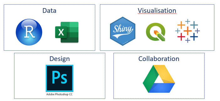
The following tools and libraries are used in the development of the web-based data visualisation application:
- QGIS
- Microsoft Excel
- R Studio
- R Shiny
- Tableau
- Adobe Suite
- Google Drive
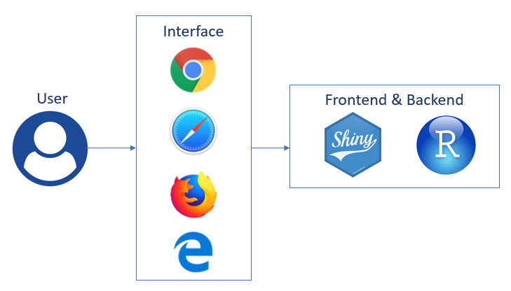
Architectural Diagram
The following architectural is used in the implementation of the visualisation tool: The application is deployed through R Shiny with shinyapps.io.
Datasets
These are the datasets we plan to use:
| Dataset | Rationale |
|---|---|
| |
| |
| |
|
Foreseen Technical Challenges
We encountered the following technical challenges throughout the course of the project. We have indicated our proposed solutions, and the outcomes of the solutions.
| Key Technical Challenges | Proposed Solution | Outcome |
|---|---|---|
|
NA | |
|
We managed to start using the packages quickly and suit our own project needs. Each of us work on different parts such as setting up, designing, logic and deployment. This speeds up our project progress. | |
|
The adopted process was having clear instructions issued to each member in the team, along with maintaining constant communication with each other. In the event that the dataset is deemed too dirty to be usable, it was dropped along with sourcing for new data that would be a suitable replacement. | |
|
NA | |
|
The data points can better allow us to generate insights on the profile of each outlet via its trade area. | |
|
NA | |
|
NA |
Roles & Milestones
- Project Timeline
File:Teamveg5.jpg Version 1 |
File:Teamveg7.jpeg Version 2 |
- Gantt Chart
References
- Tableau: https://www.tableau.com/learn/training
- R Shiny: https://shiny.rstudio.com/tutorial/
- QGIS: http://www.qgistutorials.com/en/
Ideation Drafts
In the process of completing this research project, an iterative approach was adopted. This comprised of various ideation drafts, where whiteboarding and draft prototyping was conducted.
Comments
Feel free to leave comments / suggestions!


