XccessPoint Proposal
| Proposal | Poster | Our Application | Research Paper | The Team |
In recent years, increasing attention has been paid to the issue of inequality in Singapore among parliament discussions and social policy studies. “This is what inequality looks like.” You Yenn Teo’s recent best seller book in 2018 uncovers the heightened tension on social inequalities in Singapore through illuminating an ethnographic presentation of the experiences of the less privileged Singaporeans. Moreover, in the recent Commitment to Reducing Inequality Index 2018 conducted by International Confederation Oxfam International, Singapore was ranked as one of the bottom 10 countries worldwide in inequality reduction.
The current state of inequality has motivated to use to delve deeper into the spatial inequality in Singapore which has not been widely examined in the past. We hope to understand inequality by examining the accessibility to many key essential facilities for an ordinary Singaporean living in Housing Development Board (HDB) units. The improvement in visibility to geospatial inequality through our application could provide policy makers a more justified and structured approach for strategizing future plans in mitigating inequality in different neighbourhoods.
Our project would like to develop geographical accessibility and spatial interaction model to study the accessibility of HDB units to facilities in Singapore. The aspects of accessibility to look into includes the distance to healthcare facilities (General Practitioner Clinics, Polyclinics and Hospitals), transportation infrastructure (MRT stations and Bus Stops), Schools, Police Stations, and Hawker Centres for all HDBs in different regions, planning areas and planning subzones. We hope to develop an accessibility study tool through Analytic Hierarchy Process and enable urban planners leverage on this open-source, interactive, reproducible and highly accessible tool to better strategize urban planning policies.
In summary, through our project, we aim to:
- Study the spatial distribution of facilities and HDB units
- Identify the areas with poor accessibility to essential facilities
- Analyze and highlight regions with higher needs for certain facilities
- Indicate whether there is a substantial difference in accessibility to facilities across regions, planning areas and planning subzones
- Provide customizable input parameters on pairwise comparisons of facilities, thus allowing policy makers to generate overall Analytic Hierarchy Process accessibility score based on their prioritie
- Evaluate results of analysis and provide recommendations for urban planners to enhance the accessibility to different facilities
|
Dataset |
Description |
Data Type |
Source(s) |
|
Singapore Regions |
To facilitate urban planning, the Urban Redevelopment Authority (URA) divides Singapore into 5 regions, namely Central, West, North, North-East and East Regions. |
SHP |
|
|
Singapore Planning Area |
Indicative polygon of planning area boundary. To facilitate urban planning, the Urban Redevelopment Authority (URA) divides Singapore into 55 planning areas |
SHP |
|
|
Singapore Planning Subzone |
Indicative polygon of subzone boundary. The Planning Regions are divided into smaller Planning Areas. Each Planning Area is further divided into smaller subzones which are usually centred around a focal point such as neighbourhood centre or activity node. |
SHP |
|
|
HDB |
List of HDB location via postal code |
CSV |
|
|
School facilities |
List of education facilities in Singapore |
CSV,KML |
|
|
Government Markets Hawker Centres |
Contains Address of Hawker Centres in Singapore |
KML |
|
|
Heathcare Facilities |
Contains Address to Healthcare Facilities in Singapore |
Website Information |
|
|
LTA Mrt station |
The layer contains the locations of MRT station exits. |
KML |
|
|
Bus Stops |
All bus stops, bus interchanges, bus terminals in Singapore. |
SHP |
Literature review of relevant research paper on spatial analysis of accessibilities are conducted to enhance our project methodology.
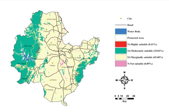
1.Site Suitability Evaluation for Ecotourism Using GIS & AHP: A Case Study of Surat Thani Province, Thailand
Study Objective:
This paper aims to identify and prioritize the potential ecotourism sites using Geographic Information System (GIS) and Analytical Hierarchy Process( AHP) in Surat Thani Province. The factors in consideration for suitability for the land ecosystems include landscape/naturalness, wildlife, topography, accessibility and community characteristics.
Visualization:
Methodology
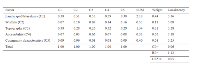
1. Determination of Weights using AHP
AHP is one extensively used Multi-Criteria Decision Making technique (developed by Saaty in 1980) used in structural decision making process for complex problems that involves multiple criteria across different hierarchical levels. Pairwise comparisons method is used to compare the criteria and allow for evaluation of relative significance of all parameters. Expert opinions were taken into consideration for the comparisons. Pairwise comparison uses a scale of 1 to 9 which 1 means having equal importance while 0 means having extreme importance. Reciprocal pairwise comparisons is used for opposite comparison of facilities.
2. Factoring in Decision Making Inconsistency
To ensure consistent judgement of decision makers, AHP efficiency criteria are measured by Consistency Relationship (CR = Consistency Index/Random Index). If CR is smaller than 0.10, degree of consistency will be fairly acceptable. Otherwise if it exceeds 0.10, inconsistencies exist in the evaluation process and we need to reject the pairwise comparisons and reiterate the process.
3. Land Suitability Assessment
The total suitability score “Si” for each land unit (i.e. each raster cell in the map) was calculated from the linear combination of suitability score obtained for each factor and criteria involved.
where “n” is the number of factors, “Wi” is the multiplication of all associated weights in the hierarchy of “ith” factor ( as seen in Table 5) and “Ri” is a rating given for the defined class of the “ith” factor found on the assessed land unit
Learning Point:
2.Estimating Spatial Accessibility to Facilities on the Regional Scale: an Extended Community-based Interaction Potential Model
Study Objective:
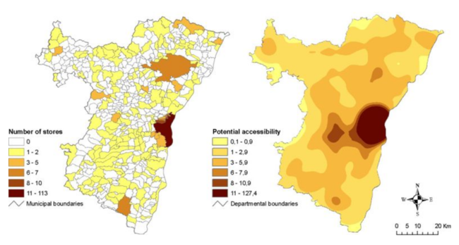
The study aims to leverage on measurements of spatial accessibility to regional facilities using aggregated data.The set of facilities includes three types of food outlets on the regional level at Bas-Rhin department,, namely hyper/supermarkets, grocery stores and bakeries.
Visualization:
Methodology
1. Frequency Count of Opportunities within a Given Neighborhood
Frequently used indices based on count was first illustrated to give users a quick overview of the spatial distribution of facilities. This is known as container index which overcomes the limitation of individuals choosing only the nearest facility for consumption and actually consider all available opportunities within a neighborhood.
2. Community-based Interaction Potential Model
This model take into account of difference in urbanization level in the region when computing the accessibility level. As accessibility is a multi-dimensional concept, travel behaviours of the population are factored in. Kernel density estimation and Enhanced Two-Step Floating Catchment Area Method are used for accessibility assessment. These methods consider demand (population) and supply (health practitioners) side as well as travel impedance specification by assigning higher weight to opportunities in nearer region.
Learning Point:
To avoid administrative boundaries from limiting the number of closest facilities for each HDB units, administrative boundaries should be ignored when aggregating data. This is more realistic and precise estimation of accessibility levels such that we will not have areas with null accessibility.
To effectively implement such customized potential model for spatial accessibility analysis, we need demand, supply of facilities and household characteristics at each HDB units including travel impedance.
Caveat:
3.Enhancing Healthcare Accessibility Measurement using GIS: A Case Study in Seoul, Korea
Study Objective:
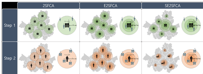
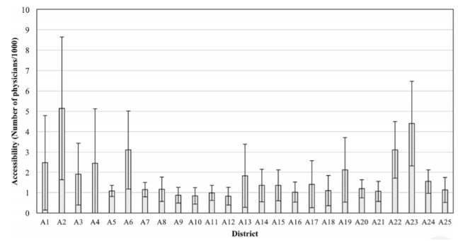
This paper proposes a new method, Seoul Enhanced 2-Step Floating Catchment Area (SESSFCA) to study the accessibility of citizens to healthcare facilities in Seoul. Maintaining accurate and up-to-date information on healthcare accessibility allows the relevant government bodies to strategize future improvements and this includes expansion of healthcare infrastructure, effective labor distribution, alternative healthcare options for the regions with low accessibility, and redesigning the public transportation routes and schedules.
Visualization:
Methodology
1. Seoul Enhanced 2-Step Floating Catchment Area (SE2SFCA)

Where S1 and S2 are the standard number of physicians for distinguishing healthcare facilities between a regular hospital, hospital complex and large hospital complex.
This methodology is customized to Seoul city as it factors the fact that the population density is higher and the average distance between healthcare-service locations tends to be shorter than the typical North American or European cities. In addition, Seoul has a higher hospital density than other typical cities. In Korea, a healthcare facility is categorized into regular hospital, hospital complex and large hospital complex in accordance with the size and the number of provided medical specialties. The customized method proposed is more effective and realistic in identifying the regions with weaker accessibility.
2. Critical Distance Boundary Determination

Critical distance boundary (Dt) calculated from the critical travel time, is modeled as a function considering the travel mode of each population. ci is the number of private vehicles per person at population location i, and vc and vp are average speeds of private vehicle and public transportation modes, respectively. In the case of using the public transportation, the travel time boundary is also penalized by subtracting the waiting time (tw) from t. The critical distance boundary sets a distance buffer by factoring in the different socioeconomic status of individuals such as their vehicle possession.
3. Accessibility Calculation
Accessibility to healthcare is determined by geographical distances to service organizations, travel time, available modes of transport, population by region, average car ownership per person, average waiting time for public transportation and Income Differential Indices. The measurement is also separated to accessibility measurement for private and public healthcare facilities.
Learning Point:
The table below shows a overall summary of our methodology
- Data Preparation
- Perform geocoding (Google API)
- Change coordinate system to SVY21 (EPSG:3414)
- Merging boundaries on different levels (region, planning area or subzone)
- Set Accessibility Radius
- Since comparing across facilities all over Singapore for each house is inefficient and computationally expensive, we will create a buffer of ~1km around each house and calculate distance to facilities within this radius only.
- If no facilities are found, accessibility radius will be increased to beyond 1km
- Next, compute minimum distance for each house to each type of facility using Euclidean Distance
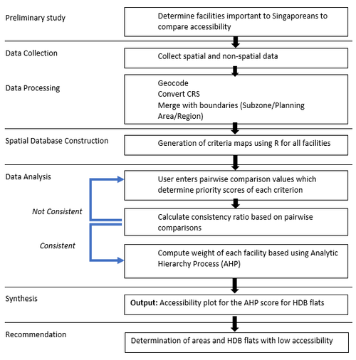
- Accessibility Calculation using Analyic Hierarchy Process
- User will need to enter his/her priorities for the facility types in a pairwise matrix from -9 to 9
- Calculate consistency Consistency Ratio (CR) = Consistency Index(CI)/ Random Index(RI) CI = (λmax -n) / (n-1) Where λmax is the maximum eigenvalue of the pairwise comparison vector and n is the number of attributes. Random Index is the mean of the resulting consistency index based on the order of the matrix
- If the criteria entered by user is not consistent(CR>0.1), user will be prompted to reenter the priority
- If consistent, weight for each facility will be calculated
- Calculate weighted sum where each weight is multiplied by minimum distance to that facility. AHPi = SUM(Wj x Dij) where i is each house and j is each facility. Wj is weight of facility j and Dij is minimum distance from house i to facility j
- This weighted sum forms the AHP score which is then plotted in the graph. The lower the AHP score, the higher the accessibility
|
Data Page
|
|
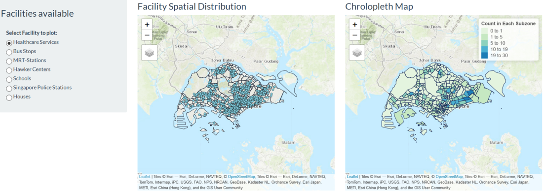
Our team first plans to display the locations of all the facilities in Singapore on a plot. We will also plot a Chrolopleth map where colour of the subzone represents the number of facilities in that subzone |
|
Accessibility Page
|
|
Then we will calculate distance from each HDB to the facility selected (i.e. Healthcare Services in this case). We will plot it in a map of the region/planning area/subzone selected. |
|
Analytic Hierarchy Process
|
|
Finally, we will calculate AHP for all the houses based on the priority entered and plot it according to the boundaries selected. |
| No. | Key Challenges | Description | Solution(s) |
|---|---|---|---|
| a. | Data Collection | Many of the datasets required are not widely published online. There is a need to find alternative sources or ways to derive the data indirectly. |
|
| b. | Varying Level and Type of Dataset Atrributes | Having considered HDB units and various facility types, it is difficult to combine all due to the different data formats. Some of the datasets only provided addresses or KML files without proper data descriptions. The datasets also have varying coordinate reference systems. |
|
| c. | High Computational Complexity for Distance Calculation | Since we had to calculate distances between thousands of HDBs with thousands of other facilities, we could not successfully compute them all due to time constraint and limitation in our computer processing speed and power. |
|
| d. | Slow loading of Application due to Extensive Number of Spatial Points | As we have six facility types together with 8000 plus HDB units, usage of functions (tmapicons) is not ideal while plotting of certain plots are very slow, cluttered and not insightful. |
|
| e. | Difficulty in Applying Sophisticated Spatial Potential Models | As not all information on supply and demand of our facility types (e.g. Police Stations, Hawker Centres) can be found online or derived, it is difficult to apply such models that require substantial information. |
|
|
Task |
Description |
Developer |
Expected Completion Date |
Status |
|
Interim Project Proposal |
|
All |
Week 9 |
Done |
|
Data Collection |
|
Raynie |
Week 9 |
Done |
|
Data Preprocessing |
|
Shubham |
Week 10 |
Done |
|
AHP Research |
|
Kaelyn |
Week 10 |
Done |
|
Exploratory Data Analysis Plots |
|
Kaelyn |
Week 10 |
Done |
|
RShiny Dashboard Prototype |
|
Raynie |
Week 11 |
Done |
|
Distance Radius Measurement |
|
Shubham |
Week 11 |
Done |
|
Minimum Distance Calculation |
|
Shubham |
Week 11 |
|
|
Visualizations Plotting |
|
Kaelyn |
Week 11 |
Done |
|
Analytic Hierarchy Process Calculation |
|
Kaelyn |
Week 11 |
Done |
|
RShiny Dashboad Finalization |
|
Raynie |
Week 12 |
Done |
|
Poster |
|
Kaelyn |
Week 12 |
Done |
|
Accessibility Plot |
|
Shubham |
Week 12 |
Done |
|
Application Interface Design |
|
Kaelyn |
Week 13 |
Done |
|
Final R Shiny User Experience Improvement |
|
Raynie |
Week 14 |
Done |
|
Final Application User Interface Design |
|
Kaelyn |
Week 14 |
Done |
|
Artifact Final Submission |
|
All |
Week 14 |
Done |
|
Research Paper |
|
All |
Week 14 |
Done |
|
Final Update on Wiki Page |
|
All |
Week 14 |
Done |
1. Leong, C. (2018, May 30). Stay connected. Retrieved from https://www.ipscommons.sg/inequality-has-a-geographic-dimension-between-and-within-neighbourhoods-in-singapore/
2. Chua, M. (Ed.). (2018, February 18). Inequality is a threat - name it, and face it. Retrieved from https://www.straitstimes.com/singapore/inequality-is-a-threat-name-it-and-face-it
3. Here's why Singapore is one of the worst countries in reducing inequality. (2018, October 10). Retrieved from https://sbr.com.sg/economy/news/heres-why-singapore-one-worst-countries-in-reducing-inequality
4. Y., Byon, Y., & Yeo, H. (2018). Enhancing healthcare accessibility measurements using GIS: A case study in Seoul, Korea. Retrieved from https://doaj.org/article/5ee6f964387d4f2786136d21147dcd5e
5. Bunruamkaew, K. & Murayama, Y. (2011, nd). Site Suitability Evaluation for Ecotourism Using GIS & AHP: A Case Study of Surat Thani Province, Thailand. Retrieved from https://www.sciencedirect.com/science/article/pii/S1877042811013474#!
6. Salze, P., Banos, A., Oppert, J., Charreire, H., Casey, R., Simon, C., . . . Weber, C. (2011, January 10). Estimating spatial accessibility to facilities on the regional scale: An extended commuting-based interaction potential model. Retrieved from https://ij-healthgeographics.biomedcentral.com/articles/10.1186/1476-072X-10-2
Feel free to comments, suggestions and feedback to help us improve our project!

