ISSS608 2018-19 T1 Assign Wang Yixuan Task1
Jump to navigation
Jump to search
 Air Pollution Analysis in Sofia City
|
|
|
|
|
|
|
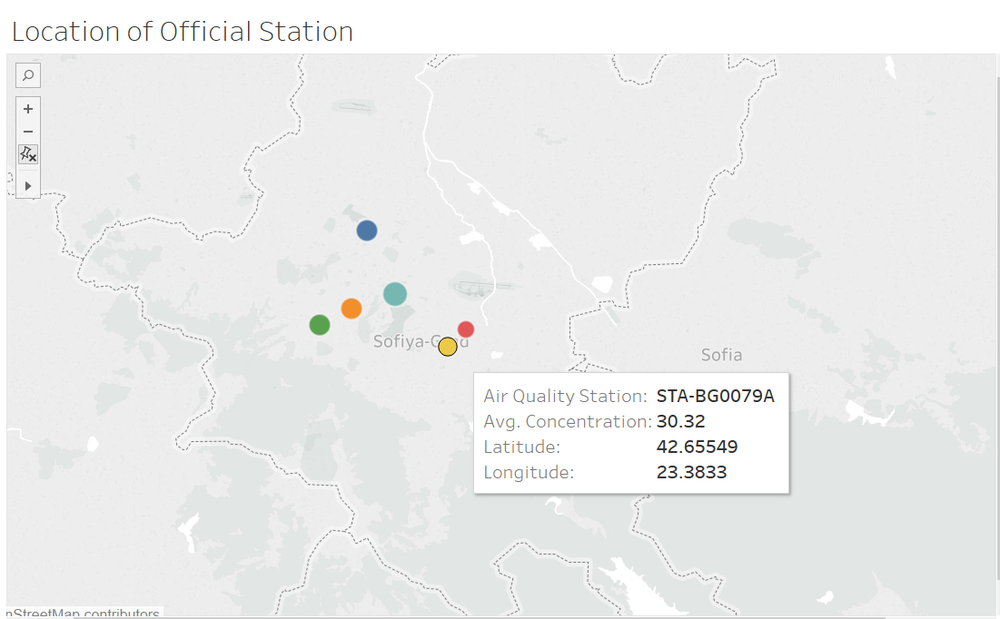
Mapping the Station

Firstly, we visualize the six air quality stations on map.
- The station is represented by different colors.
- The average concentration of each station is represented by sizes. The higher the average concentration, the larger the size of the circle.
- From the map we can see that Orlov Most station has the highest average of concentration, while Druzhba station has the lowest average of concentration.
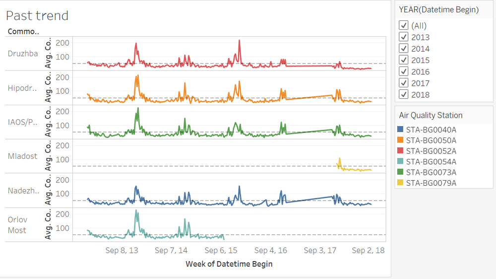
The Past and More Recent Situation of Air Pollution

In order to visualize the past and more recent situation of air pollution in Sofia city, we visualize the average concentration of each station in time series trend lines, starting from Jan 2013 to Sep 2018.The stations are presented in different colors, and a filter is provided for the customer to choose a certain time period to visualize the trend.
The past trend line graph indicates the changes of six stations in PM10 concentration over the past few years.
- The reference line represents the value of European hourly standard PM10 concentration.
- We noticed that there
