ISSS608 2018-19 T1 Assign Huang Shan Insights
|
|
|
|
|
|
Turning Data Into Insight
Putting data to work requires experienced insight which uses a combination of both art and science to tell the real story. I transform data in to tangible results.
Task 1: Office Air Quality Measurements
Anomalies In Dataset
After data preparation, I found some anomalies from the raw data and summarized the below table:
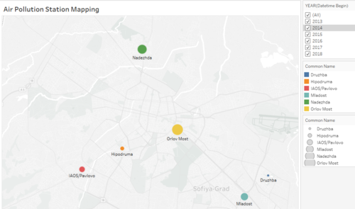
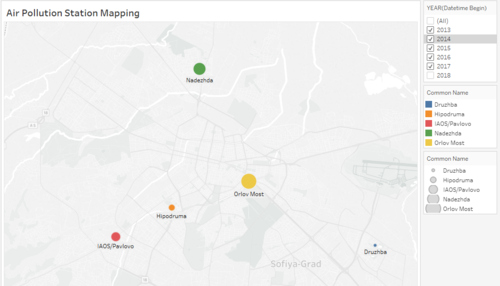
BG0054A Station(Orlov Most) only has data from 2013 to 2015,after that, there is not data from 2016 to 2018. BG0079A Station(Mladost) only has data in 2018. We can guess that Orlov Most is an old air quality station and Mladost is a new air quality station.
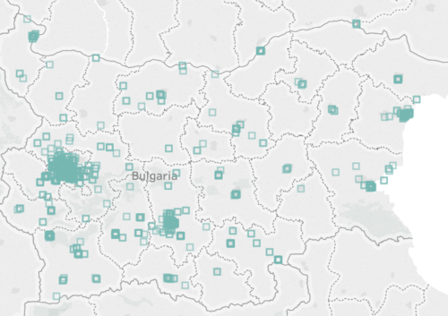
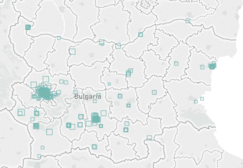
From these stations maps, we used the filter function in tableau.It shows that Mladost is not in the right map which we didn't choose the 2018 year data.Otherwise if we only choose 2018 year data, Orlov Most will not display in the map.
Characterize of Past and Present Air Quality Situation in Sofia City
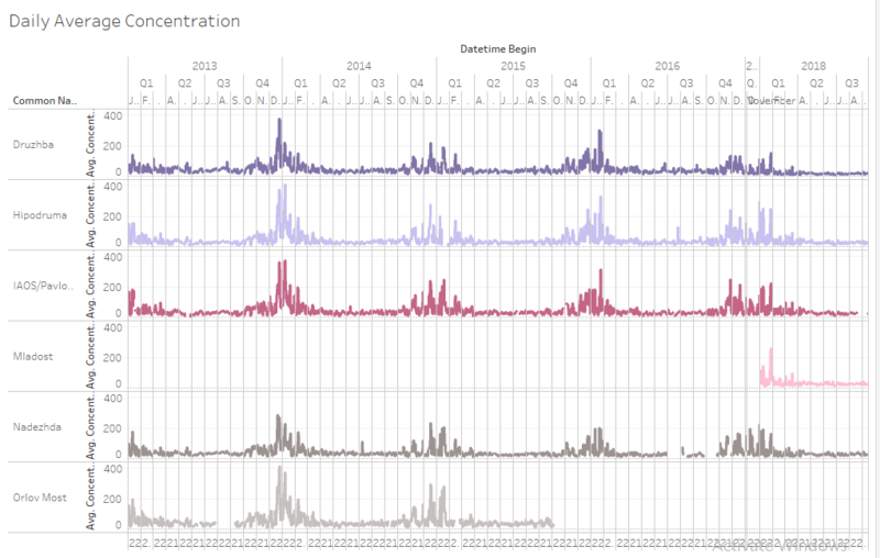
The upper line chart shows the daily average concentration air quality in five years, x-axis means all Air Quality Stations, y-axis means all date/time in five years. we can find out the period of each year during Dec and Jan the air pollution has the peak,especially in 2013-2014 which is obviously.However,the index from 2017 to 2018 is also the highest in this year,but it is not as star as the last a few years, which shows that they have carried out an improvement on air quality.
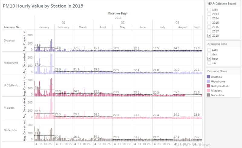
Based on the hourly PM 10 reading in 2018(Jan-Sep),in January, the hourly index of every air quality station is above 50 μg/m3, in the rest of the months, the index is below 50 μg/m3. Druzhba, an air quality station, generally has a low index compared to others stations.
A typical day in Sofia City
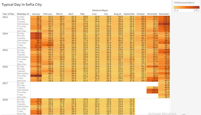
From the above Calendar Chart, it shows the value of all Air Quality Station across each year and each weekday.The darker the color, the higher the value(Concentration of PM10)as can be seen at the beginning of year in Jan and at the end of the year in Dec. Especially Dec 2013 to Jan 2014 have the darkest color and highest value in the concentration of PM10. We can also see that the peak of nearly 180 appeared in 2016.
Task 2: Citizen Science Air Quality Measurement
Characterize the sensors’ coverage, performance and operation
Assuming still air, in an open area, BAPI’s gas sensor coverage area is 7,800 ft² (725 m²) maximum. The coverage area is roughly a circle with the sensor in the center. A 7,800 ft² (725 m²) circle is 100 feet (30.5 meters) in diameter. One example of this is a Carbon-Monoxide sensor mounted to a support column in the middle of a parking garage. If the sensor is mounted on a wall, the area is half, roughly a half circle. If the sensor is mounted in a corner, where two walls meet, the area is one fourth, roughly a quarter circle.If the area is broken up by partition walls that extend from the floor to a height of 4 feet (1.2 meters) or more, the coverage area is only that of the “room”. If the room is larger than 7,800 ft² (725 m²) more than one sensor will be needed. If you place a sensor in a small closet, the coverage area is only the closet.
The graphics are about the geographical distribution of all the sensors. The sensors can detect the Humidity, PH10, PH2.5, Pressure, and Temperature. There are sensors across the whole country especially in Sofia city.From the comparison of the two graphs, we can see that the amount of sensors in 2018 is much more higher than that of in 2017.


