Group08 Report
|
|
|
|
|
|
Contents
Introduction
Yu’e Bao (余额宝) is an investment product offered by Alipay (支付宝), a mobile and online payment platform established by China’s multinational conglomerate Alibaba Group. In June 2013, Alibaba Group launched Yu’e Bao, in collaboration with Tianhong Asset Management Co., Ltd., to form the first internet fund in China. Since then, Yu’e Bao has become the nation’s largest money market fund and, by Feb 2018, has US$251 billion under its management. In Chinese, Yu’e Bao represents “Leftover Treasure”. Alipay users can deposit their extra cash, for example, leftover from online shopping, into this investment product. The money will be invested via a money market fund with no minimum amount or exit charges, with interest paid on a daily basis. While major banks offer 0.35% annual interest on deposits, Yu’e Bao may offer user 6% interest with the convenience and freedom to deposit and withdraw anytime via Alipay mobile app. Thus, Yu’e Bao became extremely popular in China.
Using various data visualization methodologies and techniques, coupled with user transaction level survival analysis and time-series clustering, this project aims to build an interactive tool on R Shiny framework, so as to unearth the underlying treasures of associations between Yu’e Bao’s user profiles, cash flow behaviour, time and other financial factors. This will let us understand more on how people in China invest their money through Yu'e Bao and gain insights that will be valuable to internet money market fund industry.
This report is separated into 9 sections. After this introduction, we will discuss our motivation and objective of this project in section 2. We have also reviewed some related literatures and explained our corresponding critics in section 3 of this report. Description of the dataset and our data preparation process will be covered in section 4 and 5 respectively, followed by the application introduction, installation and user guide in section 6. Next, in section 7, we will provide detailed explanation to the data exploration, analysis and insights we have gained through the Yu'e Bao dashboard. Finally, we will conclude the report by highlighting some of the key challenges faced throughout the project and possible future works to this project in section 8 and 9 respectively.
Motivation and Objectives
The dataset used in this project is released by a competition (The Purchase and Redemption Forecasts-Challenge the Baseline Competition) organized by Alibaba Cloud, TIANCHI Aliyun . The competition challenges its participants to train models to predict future cash flow of Yu’e Bao users, based on historical financial data from the government, Yu’e Bao and its user, and their user profiles. The results can aid Ant Financial Services Group, Alibaba Group’s affiliate company operating Alipay, in its business of processing cash inflow and outflow. Hence, most of the works done on this dataset are focused only on achieving the best score for predictive modelling. There is no works published at the time of this project with other data analysis or insights.
In view of this, we have chosen to provide an alternate analytical approach to the dataset by building a Shiny App with interactive features, and employing the data visualization methodologies, to visualize the data and its insights interactively. We also want to perform additional analysis of survival analysis and time-series clustering, and to generate dynamically visualizations of the analytical results. This visualization platform is built with RStudio, R programming language with rich libraries. Our final objectives aim to:
- Provide interactive visualization and enable users to explore the dataset in various dimensions by different chart type and to gain corresponding insights
- Dynamically generate different customer segmentation to analyze customer deposit and withdraw behaviour, enable users to explore and visualize the different of different Yu'e Bao user behaviour in different customer segments
- Provide interactive visualization for time clustering and survival analysis, and enable users to perform the analysis with different input parameters
Literature Review
Despite the popularity of internet crowdfunding in China, there is little scholarly research in this area. Shen Lin Bing’ research study (2018) reviews the history of marketplace lending globally, with China as the emphasis, and further explores industries development and driving forces of China. A small part of the article draws relation to Yu'e Bao as an innovating financial investment service with reference to the visualization figure on the left. The figure tries to plot the Yield Rate of Yu’E Bao, Interest Rate for Current Deposit of Banks, and Fund Share of Yu’E Bao from May 2013 to May 2017. Yu'e Bao Big Data Report posted by big data forum (2014) provides the financial summary of Yu'e Bao and it's customer demographics in general. The webpage content provides a comical and simple summary of the objective. In the report posted by SINA Financial (2014) , by plotting Yu'e Bao total count of deposit and withdraw transactions from 2013-2014, it is concluded that average daily withdraw transactions count is three times higher than deposit.
All the analysis and visualization mentioned above is not interactive, though they provided a general summary of Yu'e Bao customer behaviour, there was little or no detailed analysis on the relationship between customer profile and their behaviour. With growing proportion of funds flowing to such investment tool, a centralize and interactive data visualization platform to analyze Yu’e Bao customer segmentation and behaviour will be very helpful for the healthy growth of its ecosystem.
Dataset & R Libraries Used
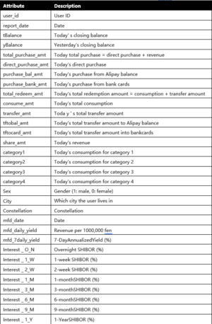
The source of data is Alibaba Cloud, TIANCHI, Competition: The Purchase and Redemption Forecasts - Challenge the Baseline. The dataset from this competition comprises of Yu'e Bao user’s profiles, transaction behaviour, and financial interest rates over time, in 4 CSV tables as follows:
| Table Name | Description |
|---|---|
| user_balance_table.csv | 2,840,421 observations of the time series cash flow data from 28,041 Yu’e Bao users for 14 months, from 1st Jul 2013 to 31st Aug 2014. Cash flow data includes 18 variables of account balances, different types of deposits, withdrawals, interest earned and, if funds are used to make online purchases, categories of purchase. |
| user_profile_table.csv | 28,041 rows of user profile data that describes the user’s gender, zodiac sign, and registered city, based on each user ID, in 4 columns. |
| mfd_day_share_interest.csv | 427 observed dates from 1st Jul 2013 to 31st Aug 2014 and the corresponding Yu’e Bao’s daily and 7-daily interest rates. |
| mfd_bank_shibor.csv | 294 observed dates from 1st Jul 2013 to 31st Aug 2014 and the corresponding 8 types of Shibor interest rates, from overnight interest rates to yearly interest rates. Although the time frame is the same as above, the number of observations is less here because there are no Shibor interest rates data for weekends and public holidays. |
The dataset spots some challenges which will require some cleaning and recoding. As the dataset is relatively large, and for the purpose of or analysis, we will also need to pre-process the data differently for each of our visualization, eg. reshaping, filtering and aggregating. R libraries like tidyverse, dplyr, plyr, cluster, chron, grid, lubridate, xts, data.table, be considered for this purpose.
| R Library | Description |
|---|---|
| Plotly | Plotly's R graphing library makes interactive, publication-quality graphs online. |
| Treemap | A treemap is a space-filling visualization of hierarchical structures. This function offers great flexibility to draw treemaps. |
| Corrplot | A graphical display of a correlation matrix or general matrix. It also contains some algorithms to do matrix reordering. |
| Lattice | A powerful and elegant high-level data visualization system inspired by Trellis graphics, with an emphasis on multivariate data. Lattice is sufficient for typical graphics needs, and is also flexible enough to handle most nonstandard requirements. |
| Survival | A package which allow users to do survival analysis, is indeed formidable. |
| Ranger | Ranger is a fast implementation of random forests (Breiman 2001) or recursive partitioning, particularly suited for high dimensional data. Classification, regression, and survival forests are supported. |
| Ggfortify | Unified plotting tools for statistics commonly used, such as GLM, time series, PCA families, clustering and survival analysis. The package offers a single plotting interface for these analysis results and plots in a unified style using 'ggplot2'. |
| Survminer | Provides functions for facilitating survival analysis and visualization. |
| Shiny | Shiny is an R package that makes it easy to build interactive web apps straight from R. |
| Shinydashboard | This package allows users create dashboards with 'Shiny' and provides a theme on top of 'Shiny', making it easy to create attractive dashboards. |
| ShinyWidgets | Some custom inputs widgets to use in Shiny applications, like a toggle switch to replace checkboxes. And other components to pimp your apps. |
| Dashboardthemes | The dashboardthemes package provides two main important features:
Using new pre-defined themes and logos for dashboards. Creating custom themes and logos for dashboards. |
Data Cleaning and Preparation
The data is generally clean but requires some amount of preparation to be meaningful. In the user profile table, column name ‘constellation’ is replaced as ‘Zodiac’ for clarify that the column contains user’s Zodiac signs. The data of Zodiac signs are also translated from Chinese characters (eg. 狮子座) to English Zodiac names (eg. Leo). Next, column ‘sex’ with values of ‘1’ and ‘0’ is translated into column ‘Gender’ with values of ‘Male’ and ‘Female’ respectively. As there was no way to decipher the actual name of the city from the 7-digit code representation of ‘city’, they are replaced with character representation of ‘City A’, ‘City B’, … ‘City G’.
Next, user_id, report_date and mfd_date are converted to factors in R. With these, user balance table is joined with user profile table by user_id, which is then further joined with bank shibor interest table and day share interest table via report_date (in user table) and mfd_date (in interest rates tables).
At this point, it has become obvious that there are missing data for bank shibor interest rates columns during the weekends and public holidays. This is because there are no official interest rates released during these off days. This is not seen in Yu’e Bao interest rates as it is a 24/7 platform. To ensure that it is possible to compare between Yu’e Bao interest rates and bank shibor interest for all days, all missing shibor interest rates will adopt the first available interest rate from previous days. For example, 6 July 2013, (Saturday) and 7 July 2013 (Sunday) will adopt the interest rates of 5 July 2013 (Friday) which is available. If 5 July 2013 is a public holiday, all 3 days will adopt the next available interest rate going backwards in time.
Finally, to allow us to analyze time as categorical data, we extract the year, month, day and day of week from the report_date to form 4 new variable columns. For each of the subsequent analysis, different data manipulation techniques will be used to prepare the data for each analysis and visualization. This will be discussed separately in subsequent sections.
Application User Guide
Local Installation and Execution
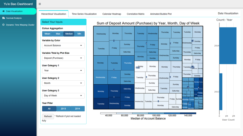
The Yu’e Bao shiny dashboard app is build using R version 3.5.1 (Feather Spray) and RStudio version 1.1.463 for Windows Vista/7/8/10, which are the latest versions available at the time of the project. Hence, it is recommended to use the same versions to run the app. The app also requires the latest version of R libraries, mentioned earlier, that are compatible up to the mentioned version of R. Before running the app, it is advisable to update all R libraries first. Upon starting the app, all libraries that are not already installed, will automatically install without manual intervention. Please be patient and wait for the apps to load as there may be quite a few libraries to install and may require some time. Once all required libraries are installed, the app dashboard should appear as shown below.
It is also recommended to run the app in internet browser, eg. Google Chrome, for best app visualization experience. Additionally, to enhance the user experience, most data has been pre-processed to minimize data processing at the front end. Therefore, different data or data object has been pre-generated for each functionality. On the initial load, the pre-processed data has also been configured to load automatically but may take slightly longer depending on the data size. Please be patient and wait for the data to load completely. Try not to close the app before the data is loaded to avoid data corruption. Once the data is loaded, it will automatically be saved into the global environment and subsequent usage of the functionality will be smooth sailing.
General Usage
Shiny and shinydashboard R libraries has been used as the main framework to create a dashboard like user interface application. A custom theme, Blue Gradient, is used by using dashboardtheme R library to give the app a unified theme experience. Shinywidget R library is used to create more professional looking dashboard controls like material switch buttons and group radio buttons.
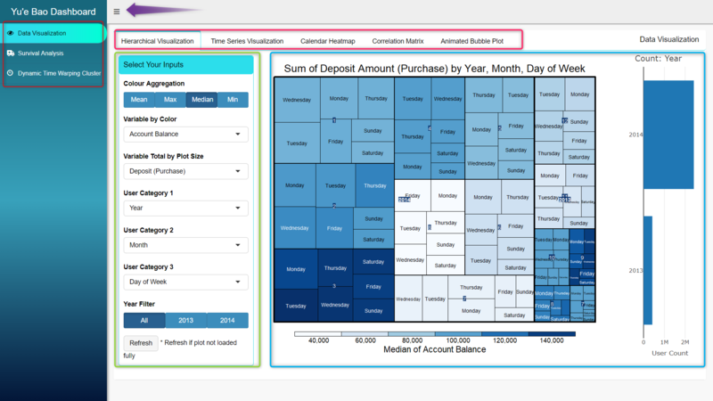
As shown in image above, the overall layout design of the app is based on 3 main functionalities which are listed on the left sidebar menu (red box). Each main functionality opens to a new page to its right. In cases where there are sub-functionalities, they will be listed at the top as tabs (pink box). In the main page area, the control inputs (green box) will be placed to the left and right, or at the top of the page, while the visualizations and plots (blue box) will occupy the rest and most of the remaining area. If the visualization feels squeezed, users can click on the button beside the dashboard title “Yu’e Bao Dashboard” (purple arrow) to hide the sidebar menu as shown in the image below.
Additionally, in some case there will be a Refresh button or an Update View button in the controls. In the case where there is a Refresh button, the visualization will automatically regenerate with every change in inputs. However, in some cases, the visualization may not be plot properly or does not fit the plot frame (eg. when browser window size is changed while visualization is being generated), the visualization can be refreshed with this button. For controls with Update View button, change in input does not regenerate the visualizations automatically and requires the Update View button to do so.
Input Controls
Various input control types are used in the app:
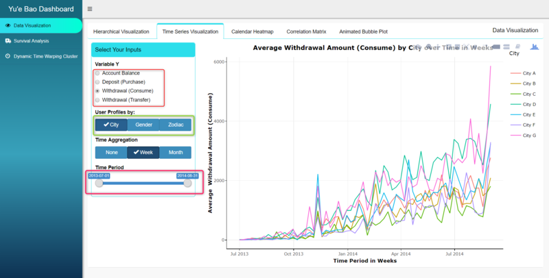
- Radio Buttons (red box) – a set of radio buttons where only 1 option can be selected. Usually used when list of character selection is mid-size, too long for Radio Group Button but does not require a dropdown list. Selected choice will have a dot beside it.
- Radio Group Buttons (green box) - a set of radio buttons in the form of selection buttons joined as a group. Functions like the same manner as radio buttons and typically used for shorter list of selections where description of selection is also short. Selected button will be darkened.
- Slider Text Input / Slider Input, with 2 selections (pink box) – a sliding selection that allows users to select a maximum and minimum limit from a range of values. The selected range, if shorter than the allowed range, can also be dragged along the slider to change the max and min, yet maintaining the interval length between max and min. Typically used to filter a specific time period.
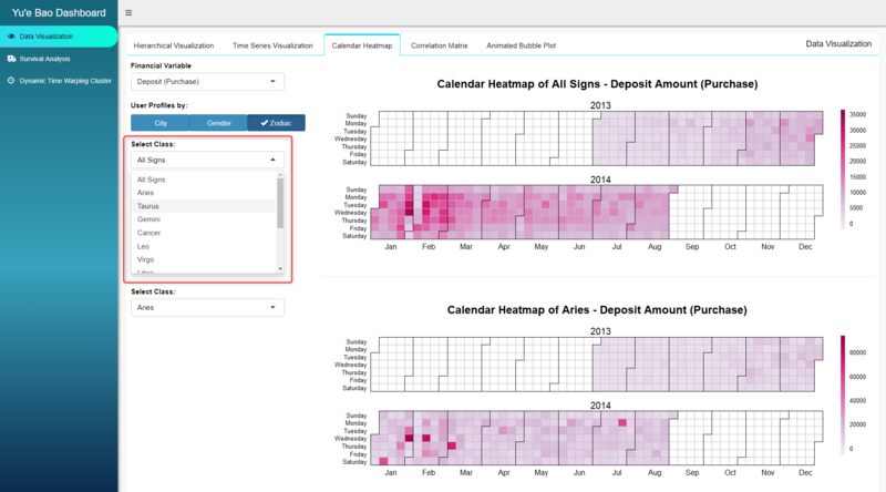
- Select Input – a dropdown list of selections. Only one choice can be selected. Typically used for a longer list of character selections. If selection list is longer than dropdown window, scroll is enabled to browse up and down the list.
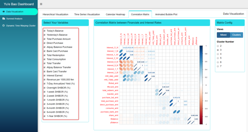
- Checkbox Group Input – a group of checkbox selections. Allows more than one selection or none selected at all.
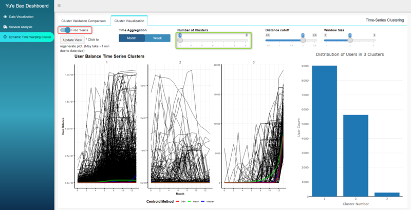
- Material Switch (red box) – a toggle switch for binary selection to choose between 2 choices.
- Slider Input, single selection (green box) – a bar slider allowing user to select one value along the slider bar. Typically used for a list of continuous values.
Interactive Visualizations
Some visualizations in the app are static plots, while others are interactive visualizations generated by R library plotly. For interactive visualization, on mouse over, the corresponding tooltip will appear. A single click on any of the categories in the legend will hide that category from the plot. On the contrary, a double click will filter out all other categories except the selected one. Plotly interactive visualizations also allow users to zoom in and out of the plot to focus on a selected range of values by drag and select.
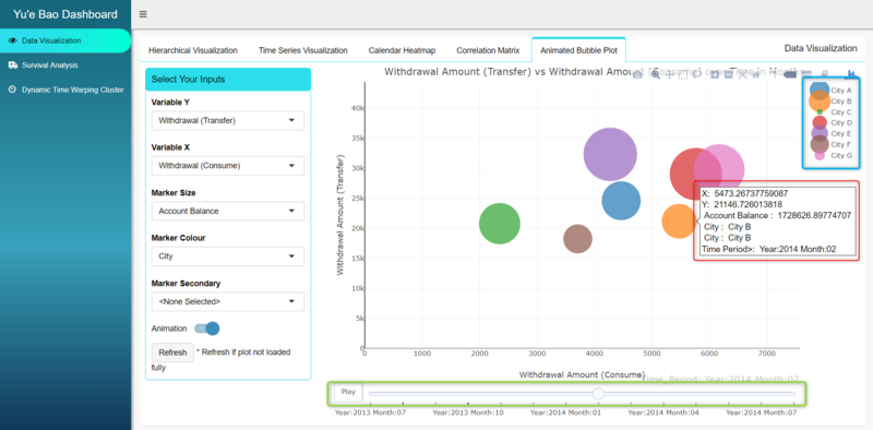
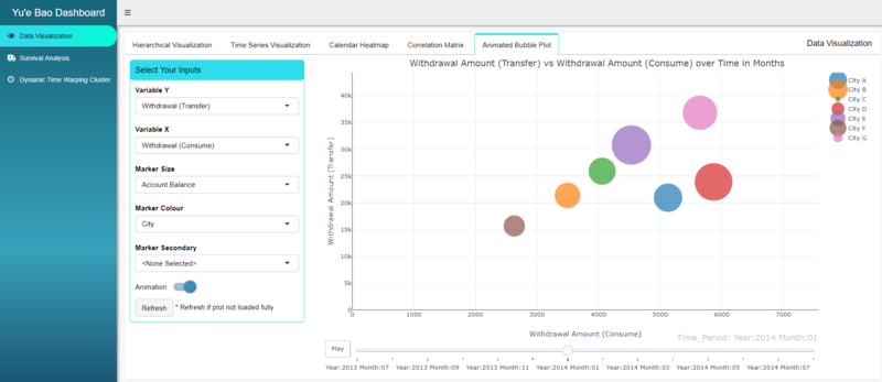
Additionally, in animated bubble plot, there is an additional feature of animation that shows the changes of values over time (green). The animation controls allow users to simply auto play the changes over time by clicking Play button, or manually move time over a slider bar by clicking and dragging the scrollbar.
Visualization Methodologies and Analysis
In the design of the framework of the Shiny dashboard, we categorize the features of the Yu’e Bao app into 3 main functionalities, based on the objectives mentioned in the earlier section of Motivation and Objective. The first main feature of the app is Data Visualization which allows user to visualize the data though 5 different type of analytical data visualization techniques. The techniques used are treemap, time series line graphs, calendar heatmap, corrplot and (animated) bubble plot, and each of them are available as a sub functionality of the Data Visualization feature. The second feature of the app visualizes the results from the survival analysis in the form of Kaplan–Meier survival curves, risk table and censor plot, to gain understanding on how quickly different user types or deposit types are being withdraw. Lastly, the third feature of the app visualizes the evaluation of time series clustering results generated using different control parameters of data time aggregation and dynamic time warping. Clusters can also be compared among one another to gain insights to different Yu’e Bao customer segments that are clustered based on their account balances.
Data Visualization and Insights
Hierarchical Visualization
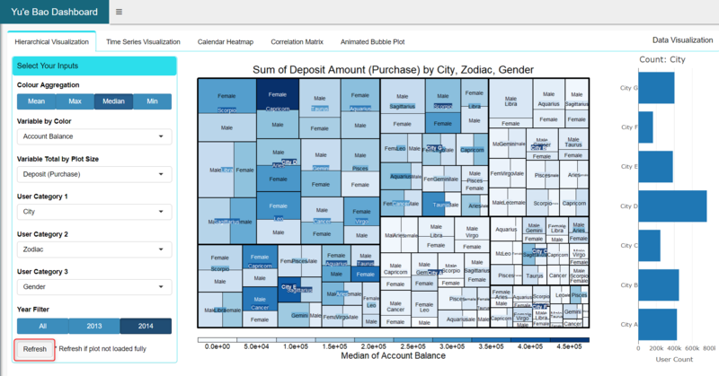
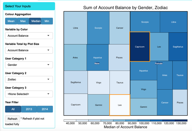
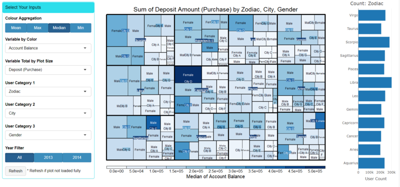 In the R shiny app, a treemap is incorporated to assist user to conduct hierarchical data analysis on user cash flow data with categorical data like user profile and time categories. Users can choose the target cash flow of their interest (account balance, deposits or withdrawals) to be represented by the colour and plot size of the treemap via Select Input dropdown list in the input controls. For colour, users can select to aggregate the data by 4 methods (mean, median, max, min) from a Group Radio Button. For plot size, the app will perpetually derive the sum of the selected cash flow data. As the data spans across different months for 2013 and 2014, using another Group Radio Button, users can filter the data based on the year of records. Finally, to display the treemap in hierarchical structure of categorical data, users can select up to 3 levels of categorical variable from User Category dropdown list (zodiac, city, gender, year, month, day of week). It is compulsory to select a category for the first level but users can choose omit the other 2 levels by selecting “None Selected” should they not wish to visualize 3 levels. Based on these selections, the data will be filtered and aggregated using group_by and summarize functions of dplyr R library. Finally, the transformed data will be plot using the treemap R library. The count of each class of the first categorial level will also be shown to the right of the treemap to give users a sense of the distribution of Yu’e Bao users across the category.
When exploring the Hierarchical visualization and by setting user category input parameters by the three levels: city, zodiac and gender, we found that female Capricorn users has the highest median account balance of 130K yuan, while male Leo users has the lowest median balance of only 40k Yuan.
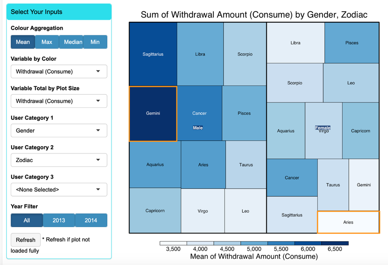
When changing the cash flow variable to mean withdraw amount, we can see that male Gemini users has the highest mean shopping withdraw of around 6.5k, while female Aries has lowest mean shopping withdraw of around 3.5k.
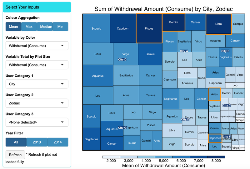
Next, by changing the user category to City and Zodiac, we found that different city has different top zodiac withdrawal (consume) group. In city D, Pisces users has the highest average withdrawal by consumption of around 8,000 yuan whereas Gemini users has the highest of 8,000 yuan in city A. The user groups by zodiac with highest withdrawal by consumption in city C, F are Aries and Capricorn respectively. We do not see significant top zodiac users’ group with highest withdrawal by consumption activity in city B and G.
Time Series Analysis
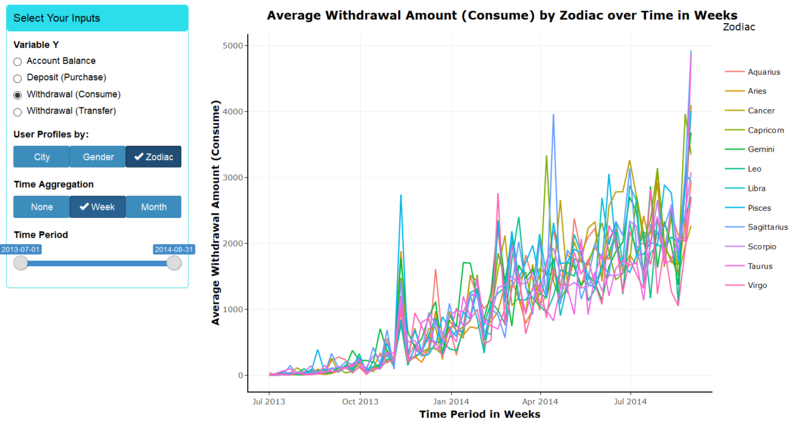
The time series line graph plots the trend of Yu’e Bao users’ cash flow over time. App users can select the cash flow variable (Variable Y) from a list of radio buttons. The time series line will be subdivided into classes of user profile categories, which users can select from the User Profile radio group buttons. Additionally, app users can choose to aggregate the time series cash flow data to weeks or months by selecting from the Time Aggregation radio group buttons. To allow users to filter and view particular time period of interest, a 2-selection slider bar is added to filter according to values of time. As the values of time change depending on the selection of time aggregation, the sliderbar is set to be reactive to changes in time aggregation and will automatically update itself accordingly. Finally, all selections will be filter, grouped and summarize using the corresponding functions in the dplyr library, plot using ggplot, and wrapped by ggplotly function of plotly R library, to generate an interactive time series line graph.
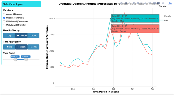
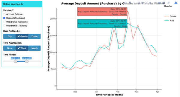
To further understand the Yu’e Bao’s user behaviour, it’s essential to look into different user groups’ behaviour over time. Cash flow time series data like account balance or deposits can be grouped by their user profiles like gender or zodiac sign to visualize their individual trends over time. Data can also be aggregate across time by weeks or months. When we plot average deposit by gender over time and zoom into 2014 Chinese New Year period (early February), we found that on the week before CNY average deposit by male is ~20% higher than that of the female; conversely, female deposits where ~20% higher than that of male the week after CNY.
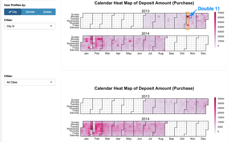
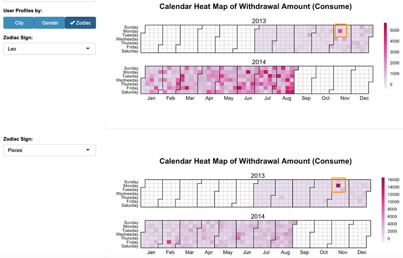
Calendar Heatmap Comparison
Calendar heatmap allows users to visualizes time series data attributes over days in a calendar-like view, making it easy for them to identify daily patterns or anomalies. In our implementation, we want to allow users to compare 2 calendar heatmaps of different classes within the same user profile categories, which can be selected via the User Profile radio group buttons (labels will also be updated accordingly). Once selected, the dropdown list, for each heatmap, will automatically update to the unique classes of the selected user profile, from which users can select 2 to compare. Upon these selections, the corresponding calendar heatmap will be plot using the calendarHeat.R function created by Paul Bleicher which uses R libraries like plyr, chron, grid and lattice.
From the calendar heatmap we can see that during 2013 double 11 (Nov 11th, biggest online shopping festival in China), only city G has significant higher deposit on Monday and Friday the week before the mega sales day compare with other cities. Our guess is that before double 11, the online sellers needs to stock up to prepare for the mega sales and they will be paying manufactures who could possibly be found mostly in city G. Hence, a significant amount of money was deposit to Yu'e Bao during that time.
We set the parameters to observe the withdrawal (consume) amount between users of different Zodiac signs. The result shows on Double 11 of 2013, Pisces users spent around 16,000 yuan while Leo users spent only around 5,000 yuan averagely.
Correlation Matrix
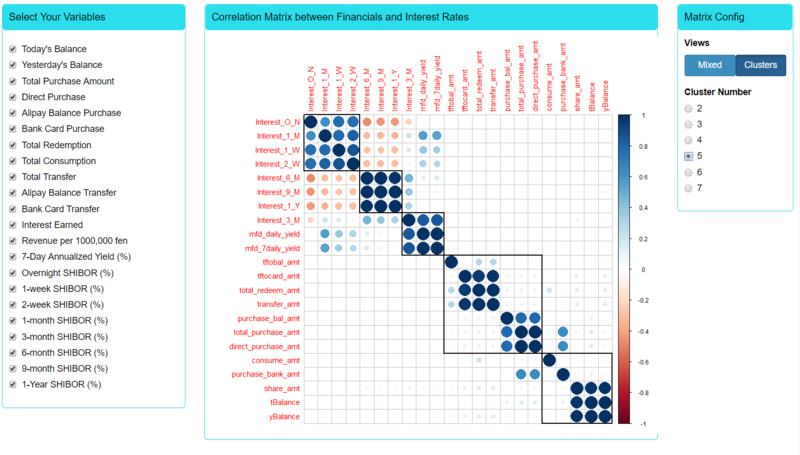
The correlation matrix is designed to display the correlation between continuous variables of user cash flow and financial interest rates, and confirm if there are any correlations between any of these 2. The continuous variables to be included in the matrix can be selected from the checkbox group input. By default, all variables are selected and users can choose to include or exclude any of them. Users can also choose to view the matrix in Mixed or Clusters view. For the cluster view, as shown above, a hierarchal clustering will be performed for the variables and users can select the number clusters to create. With these selections, the data will be fileted based on the selected variables and the resulting data will be visualized using the corrplot R library.
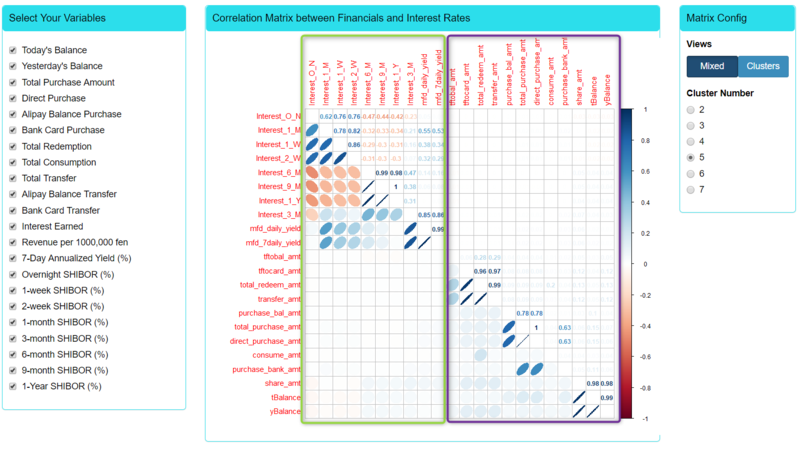
As shown below, for the mixed view, the matrix is sub-divided into 2 triangles where one will show the correlation coefficient between variables and the other will show the ellipse, whose shape and colour will change according to the correlation coefficient. A rounder ellipse represents higher magnitude of correlation while the slant, to the right or left, represents a negative or positive correlation (like gradient of line plot). Similarly, a darker colour will represent higher magnitude of correlation, while blue and red colour will represent positive or negative correlation respectively. From the diagram below, we can see that there is little or no correlation between interest rates (green box) and user cash flow data (purple box).
Interactive Animated Bubble Plot
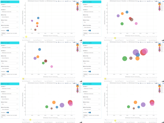
A scatter plot can help users visualize the relationship between 2 cash flow (continuous) variables. The X and Y dimensions of the scatter plot can be selected from the dropdown list of cash flow variables. The scatter plot is upgraded to a bubble plot by adding additional dimensions of colour and size to the scatter markers. The marker size takes another cash flow variable from the dropdown list and the marker colour will represents a user profile or time categorial variable selected from the Marker Colour dropdown list. The user can also choose to split the colour marker by a secondary variable selected from the Marker Secondary dropdown list. By selecting the Animation toggle button, it will add a 5th dimension of time (in months) to form an interactive animated bubble plot. Based on these selections, the dates will be transformed to the format of just year and month using mutate function of dplyr R library. This is then again aggregated by the group_by and summarize functions. Next, the (animated) bubble plot can be generated via plotly. By running the bubble plot in animation mode, users can observe how the relationship of these 5 dimensions change over time, in months, and some trend may be observed.
Survival Analysis and Insights
Survival Analysis is used to explore the impact of different factor on expected time difference between each deposit/withdraw activity. Raw dataset transactions consist of customer deposit and withdraw activities, to conduct survival analysis we need to transform the data so that it contains; (1) Duration of observation and; (2) Status of observation. In our project context, individual withdraw records need to be paired with one or more deposit records. We conducted this mapping based on FIFO (First in first out) and LIFO (Last in first out) assumption. In FIFO approach, we map always the first deposit transaction with first withdraw transaction, then calculate using the difference of deposit and withdraw date as the survival duration. In the LIFO approach, we map the last deposit transaction with first withdraw activity. In case the deposit amount is different from withdraw amount, we map the transaction with smaller amount first and then map the leftover transaction with bigger amount.
In the Shiny app, users are able to conduct the survival analysis interactively. Options are provided for user to choose transaction mapping logic (LIFO/FIFO) and variables to conduct survival analysis (Gender, City, Zodiac etc.).
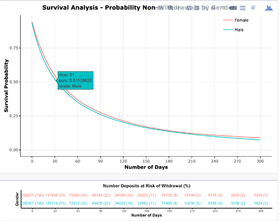
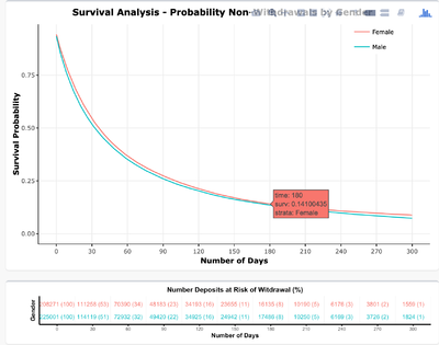
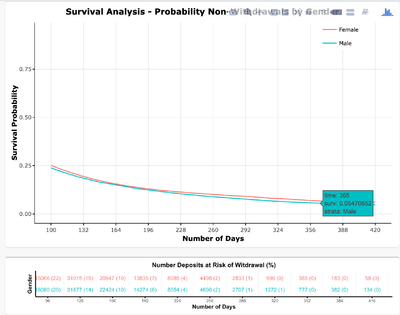
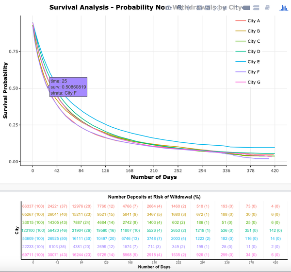
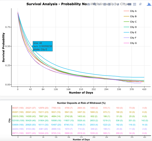
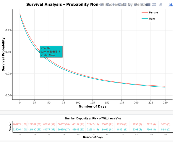
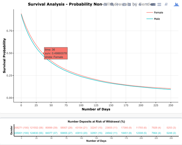
Kaplan–Meier curves will be generated to show the survival possibilities (of users keeping their money in Yu’e Bao) over the duration of the dataset (number of days). A risk table is shown to display the number and percentage of deposits at risk of being withdrawn. A censor plot will show the distribution of censors' activity by different variable (in this case people don’t withdraw and no further data is provided).
We found that the survival analysis result does not differ much between FIFO and LIFO dataset, this is probably due to most of the transactions in Yu’e Bao follows the single deposit and withdraw pattern, the mapping result in that case we be the same.
Overall, 50% of users will withdraw their money within 1 month after deposit. 86% of user decided to withdraw their money before 6 months, only 6% of users deposit their money without withdraw for more than 1 year.
Probability of non-withdrawals by different city differs, City F users has higher probability of withdrawal compare with other cities, City E users has lower probability to withdrawal their money in Yu’e Bao for the same amount of time duration. 50% of City F user transactions will be withdrawn on 25th day while for City E user transactions it is 46 days. Apart from Yu'e Bao, there are also other investment tools in Alipay which allows users to place fix deposit for 30 days or 45 days, these investment tools offer better interest rate compare with Yu’e Bao . If Alipay would like to promote these tools, City E seemed to be a good place to start with.
Regarding gender, contrary to people’s stereotype, averagely males withdraw their money earlier than female users. 50% of male users' transactions are withdrawn in 32 days where 50% of female users’ transactions are withdrawn in 35 days.
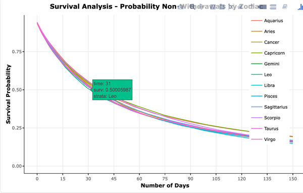
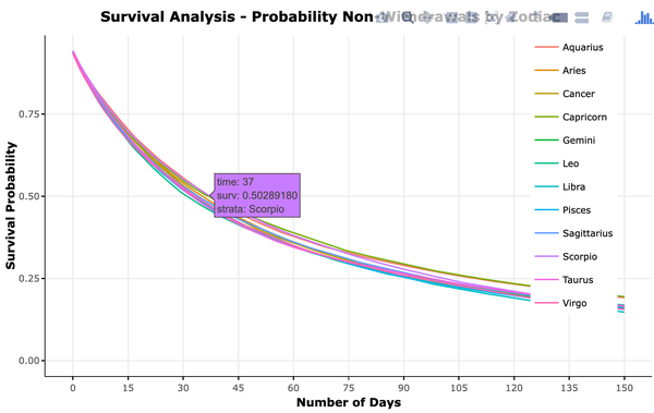
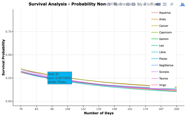
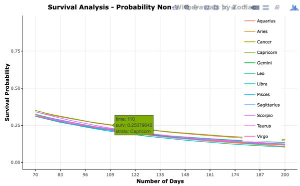
For different Zodiac, 50% of Leo users transactions are withdrawn within 30 days, while for Scorpio users it is 38 days. 25% of Pisces users’ transactions are withdrawn after 91 days where 25% of Capricorn and Aquarius users' transactions are withdrawn after 110 days.
Dynamic Time Warping Clustering and Insights
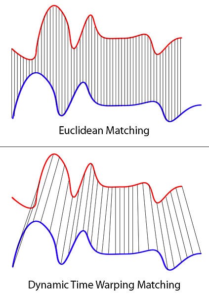
Time series clustering is the partition of time series data into segments based on their similarities or distance between each other. One of the algorithms to do this is dynamic time warping (DTW) by measuring similarities between time sequences, which may vary in speed. At each time period of a time sequence, the distances to a varying number of time periods on another time sequence is measured. The number of additional time period on the second sequence is controlled by a configurable windows size that defines the additional time period before and after the time period of the first sequence. In this way, DTW clustering takes into consideration shifts or distortion in time sequences, when measuring the similarities between given sequences, independent of non-linear variations, to generate desired clusters. In R, this is implemented by TADPole Clustering in dtwclust and TSclust R library.
In this analysis, we are interested in clustering Yu’e Bao users based on their account balance over time. 28,041 Yu’e Bao users’ account balance data is transformed into time series using the spread function of tidyr R library. However, there is a large amount of users in this dataset without cash flow activities (zero account balance throughout). These users are removed from our analysis so as not to affect the clustering, leaving behind 14,923 users. To further reduce the resource requirement of our clustering analysis, we separately aggregate the mean of account balance by time period to weeks and to months, using apply.weekly and apply.monthly functions of xts R library. For each of the 2 new data tables (weekly and monthly aggregated), the data is use to perform DTW clustering using tsclust function of TSclust R library, which is also highly reliant of dtwclust R library. Firstly, clustering type is selected as “tadpole” to define the clustering method as TADPole Clustering. Various clusters sets are generated using different permutations of:
- Number of clusters – number of clusters to generate
- Distance cutoff – distance between time series within this limit is considered a neighbour
- Window size – number of time points to measure distance before and after each time period
In total, 210 different cluster sets are created for all weekly and monthly data. To measure the performance and validity of these clusters sets, 6 cluster validation indicator (CVI) values are generated for each cluster set. The 6 CVIs are as follows:
- Silhouette index (Arbelaitz et al. (2013); to be maximized)
- Calinski-Harabasz index (Arbelaitz et al. (2013); to be maximized)
- Dunn index (Arbelaitz et al. (2013); to be maximized)
- Davies-Bouldin index (Arbelaitz et al. (2013); to be minimized)
- Modified Davies-Bouldin index (DB*) (Kim and Ramakrishna (2005); to be minimized)
- COP index (Arbelaitz et al. (2013); to be minimized)
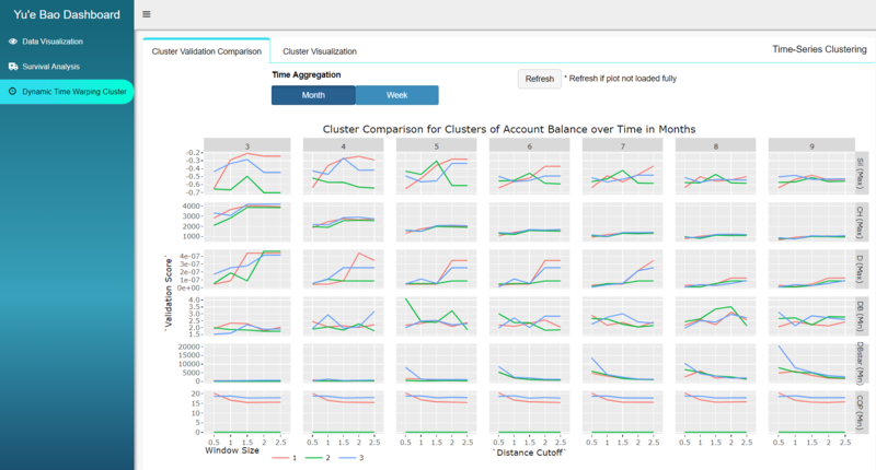
App users can select whether they want to view the comparison of cluster sets from week or month time aggregation by selecting the corresponding option from the radio group button. To visualize the comparison of CVI metric for different clusters sets with different permutations, they are plotted using R library ggplot – line graphs with facet-grid and wrapped with ggplotly of plotly R library in the Cluster Validation Comparison sub-function as shown below.
From the comparison, shown above, we can see that cluster set of less clusters generally generate better CVI than cluster sets with higher number of clusters. While changes in window size give mixed results depending on CVI, distance cutoff of 1.5 or 2 gives better CVI value for monthly aggregated data. For weekly aggregated data, shown below, distance cutoff of 1 generates better CIV metrics. More detailed explanation of this function will be explained in later section of application user guide.
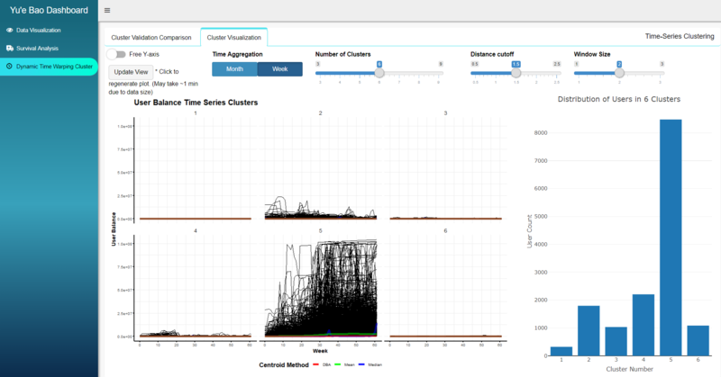
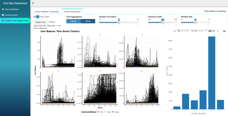
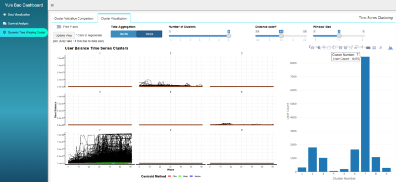
With a cluster set of interest in mind, we can visualize the comparison between the clusters using the Cluster Visualization sub-function. The time aggregation can be selected by the 2-button radio group buttons, while the number of clusters, distance cutoff and window size can be selected using the slider input. The individual clusters are plot using ggplot with facet-grid and Free Y-axis toggle button allows users to free the y-axis of the facets from limits adjustment, to show significantly smaller y values hidden by the dominating cluster when the y-axis is fixed. In addition, the distribution of number of users in each cluster will also be plot, to the right of the clusters, using plotly bars.
For example, the image above shows a set of 6 clusters generated from the weekly data using DTW parameters of distance cutoff 1.5 and window size 2. It is clear that cluster 5 is the dominating cluster with 8,479 users making up ~57% of the total 14k users. Note also that the y-axis scale is not the same for all clusters and Cluster 5 has significantly higher account balance than other clusters. We observe that user of Cluster 5 are early adopters of Yu’e Bao who continue to invest and increase their balance in Yu’e Bao through the period. For the other smaller clusters, we see a cluster of late adopters in Cluster 6. Additionally, Cluster 1 user appear to be mid-term adopters, whose balance spiked initially, but subsequently reduced and stayed relatively constant for the remaining period. Cluster 2, 3 and 4 showed a vary increase in account balance through the time period.
We next turn our focus to the domination cluster. As shown below, even if we increase the number of clusters, the dominating cluster remained at the same user count which means that new clusters are split from the smaller clusters instead of the dominating one. In this case, the dominating cluster could represent most typical Yu’e Bao users, while the other clusters could be abnormally or outliers. This also explain why smaller number of clusters gives better CVI as shown earlier in the CVI comparison.
Challenges
The first challenge faced was to understand how Yu’e Bao system operates. That includes understanding what each cash flow variable means and how they are derived, as well as the differences between the different types of interest. These took come research to understand even with 2 Chinese local members on the project team. As mentioned earlier, the dataset also required some cleaning and recoding of variables, like replacing Zodiac signs from Chinese to English, changing of city name representation and filling up the missing weekend bank shibor interest rates.
While building the shiny app, we also faced an issue where it was difficult to pass dates, in the format of just month and year (without the day), between shiny ui SliderInput and shiny server, while remaining effective to use these dates to filter the data, and to update the SliderInput range of values based on the time aggregation selected. Eventually this was overcome by using SliderTextInput, instead of SliderInput, such that dates were passed in the form of characters between ui and server, and conversion between to date and character format happens back in the server. We also found that some libraries share the same function name but works differently from each other (eg. summarise of dplyr and summarise of plyr). If R is left to choose which library to use randomly, we may get error in execution, or worse, results may not be as expected without our knowledge. Therefore, it is sometimes important to specify the library for such functions (eg. dplyr::summarise).
As the dataset is relatively large, it is not possible to use the dataset directly to generate visualization plots. Data aggregation, by different categorial grouping or time interval, needs to be performed first using R libraries like dplyr. On the same note, a large time series dataset made it difficult to implement time series clustering due to a limitation of R, which runs on 32bit on Windows operating system, regardless of whether the OS is 32bit or 64bit. Due to this limitation, the initial time series clustering attempts continuously encountered error as R is not able to allocate vector of size more than 4GB (5.9GB is required for this analysis). With further data exploration, we found that there is a significant number of non-users (zero account balance) which were then removed from the analysis as mentioned earlier. Eventually, with time series aggregation to months and weeks, we were finally able to perform dynamic time warping clustering.
However, the analysis performed in this project requires significant amount of time to generate the analysis output. If we were to perform the analysis on ad-hoc basis, this significantly increases the time app users need to wait for visualization to be generated. Therefore, in some cases, we choose to pre-generate the analysis results while in other cases, the data is pre-processed according to the needs of the visualization though the use of reshaping, filtering and aggregating. These results are separately saved as new datasets or data objects which can be used directly to generate same visualization without affect app user experience.
In the survival analysis, we need to come out with our own assumptions to map the deposit and withdraw data points, additional script was developed to prepare the data for analysis, in the script different scenarios needs to be catered, for example handling the deposit and withdraw amount mismatch, daily interest payout needs to be grouped with latest deposit, starting balance is not zero.
By overcoming these challenges, and with the kind advice of our academic advisor – Prof Kam, we achieved our objective of building the Yu’e Bao Shiny Dashboard Application, using data visualization methodologies, to provide a platform for app users to visualize the TIANCHI dataset, its insight, and the results of our analysis.
Future Works
Additional functions:
- Auto data processing and data preparation, to automatically generate the data objects needed for visualizations.
- Group users with the deposit and withdraw amount basket, perform more specific user profiling analysis.
- In survival analysis, look into transaction amount, explore the difference between high, medium and low transactions amount survival duration by different data dimension.
- Explore more deposit and withdraw mapping rules and observe the difference in data pattern
- Add trace lines while the bubbles are in transition during the animation of bubble plot so users can see the history of transition clearly.
Real world use cases:
- Connect the shiny app with Yu'e Bao data warehouse, so that it can also perform analysis on the data after 2014 with a bigger user group.
- Automate the creation of data object for each function so that a data upload function can be created for more internet crowdfunding platform data to be analyzed and visualized in this app.
- Use this shiny app as the data dashboard for Yu'e Bao operation team, for performance monitoring, customer engagement and target marketing purposes.
References
Banner image credit to: China Money Network

