Group08 Proposal
|
|
|
|
|
|
Contents
40 Thieves Members
¥ Wong Yam Yip
¥ Wu Jinglong
¥ Song Chenxi
Abstract
Yu’e Bao (余额宝) is an investment product offered by Alipay (支付宝), a mobile and online payment platform established by China’s multinational conglomerate Alibaba Group. In June 2013, Alibaba Group launched Yu’e Bao, in collaboration with Tianhong Asset Management Co., Ltd., to form the first internet fund in China. Since then, Yu’e Bao has become the nation’s largest money market fund and, by Feb 2018, has US$251 billion under its management. In Chinese, Yu’e Bao represents “Leftover Treasure”. Alipay users can deposit their extra cash, for example, leftover from online shopping, into this investment product. The money will be invested via a money market fund with no minimum amount or exit charges, with interest paid on a daily basis. While major banks offer 0.35% annual interest on deposits, Yu’e Bao may offer user 6% interest with the convenience and freedom to deposit and withdraw anytime via Alipay mobile app. Thus, Yu’e Bao became extremely popular in China.
Using various data visualization methodologies and techniques, coupled with user transaction level survival analysis and time-series clustering, this project aims to build an interactive tool on R Shiny framework, so as to unearth the underlying treasures of associations between Yu’e Bao’s user profiles, behavior, time and other financial factors. This will let us understand more about how People in China invest their money through Yu'e Bao and the generated insights will be valuable for internet money market fund industry.
Data and Preparation
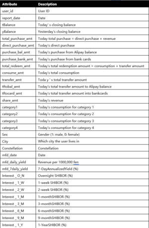
The source of data is Alibaba Cloud, TIANCHI, Competition: The Purchase and Redemption Forecasts - Challenge the Baseline. The dataset from this competition comprises of Yu'e Bao user’s profiles, transaction behaviour, and financial interest rates over time, in 4 CSV tables as follows:
| Table Name | Description |
|---|---|
| user_balance_table.csv | 2,840,421 observations of the time series cash flow data from 28,041 Yu’e Bao users for 14 months, from 1st Jul 2013 to 31st Aug 2014. Cash flow data includes 18 variables of account balances, different types of deposits, withdrawals, interest earned and, if funds are used to make online purchases, categories of purchase. |
| user_profile_table.csv | 28,041 rows of user profile data that describes the user’s gender, zodiac sign, and registered city, based on each user ID, in 4 columns. |
| mfd_day_share_interest.csv | 427 observed dates from 1st Jul 2013 to 31st Aug 2014 and the corresponding Yu’e Bao’s daily and 7-daily interest rates. |
| mfd_bank_shibor.csv | 294 observed dates from 1st Jul 2013 to 31st Aug 2014 and the corresponding 8 types of Shibor interest rates, from overnight interest rates to yearly interest rates. Although the time frame is the same as above, the number of observations is less here because there are no Shibor interest rates data for weekends and public holidays. |
The dataset spots some challenges which will require some cleaning and recoding. As the dataset is relatively large, and for the purpose of or analysis, we will also need to pre-process the data differently for each of our visualization, eg. reshaping, filtering and aggregating. R libraries like tidyverse, dplyr, plyr, cluster, chron, grid, lubridate, xts, data.table, be considered for this purpose.
Critic of Existing Works
The TIANCHI competition challenges its participants to train models to predict future cash flow of Yu’e Bao users to aid Ant Financial Services Group, Alibaba Group’s affiliate company operating Alipay, in its business of processing users' cash inflow and outflow. Therefore, most of the works on this dataset are focused only on getting the best score with predictive modeling.
There are other works that tries to provide some information / visualization on Yu'e Bao and we have reviewed 2 of them as follows:
| Source | Visualization | Critique |
|---|---|---|
| The Journal of Alternative Investments Winter 2018, 20 (3) 95-110
Shenglin Ben, Dan Luo and Jiamin Lv |

|
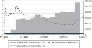
The article reviews the history of marketplace lending globally, with China as the emphasis, and further explores industries development and driving forces of China. A small part of the article draws relation to Yu'e Bao as an innovating financial investment service with reference to the visualization figure on the left. The figure tries to plot the Yield Rate of Yu’E Bao, Interest Rate for Current Deposit of Banks, and Fund Share of Yu’E Bao from May 2013 to May 2017. We feel that the figure lacks clarity in the information it is trying to represent.There is no graph title and it is not clear what the Y axes means. Furthermore, in terms of aesthetics, the color coding are not very distinguishable and "YueBao Fund Size" plotted in bar chart could have been a line graph to make it easier to compare with other variables. |
| 余额宝周岁大数据报告 (Yu'e Bao Big Data Report)
大数据文摘 |

|
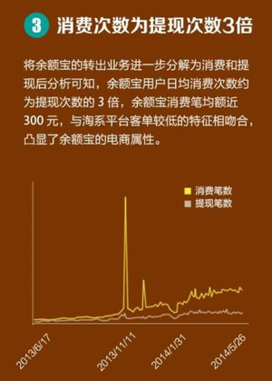
This website gives a report on the financial summary of Yu'e Bao and it's customer demographics in general. The webpage content provides a comical and simple summary of the objective. However, much of these information was presented in the form of text which makes it hard to read. For other content presented in the form of charts, the choice of color, eg purple background, and the use of unrelated pictures also made it distracting and confusing at times. The charts were mostly too small or lacks clarity what they are trying to say, for example, chart titles and axis labels in some cases. In another example, show in the figure on the left, there is no tick mark on the x-axis to indicate where the date labels are along the axis. The colour used to differentiate the 2 classes are also too similar to each other, making it hard to tell them apart. |
Visualization and Analysis
With the above in mind, our group has chosen to provide an alternative view to this dataset, and to seek and visualize insights not visible from predictive modeling. We also aim to build a better app with more comprehensive visualization features compared to what's already available. Additionally, the app will also be able to do visualize the results of additional analysis, which we intend to perform with this dataset. The description of features to be implement in our Shiny app are as follows:
Data Exploration and Visualization
In this module, we will make full use of the dataset and aim to provide an interactive data explorer to visualize the data in different ways. We will employ different visualization techniques to demonstrate the interaction and relationships between different combination of cash flow behaviour, different user profiles (gender, city, zodiac) and varying interest rates. Treemaps will help us visualize Yu'e Bao cash flow in relation to user profiles in different hierarchy, while calendar heatmap and time-series line graphs will show us how cash flow varies in relation to time by each day, week, month and year. Corrplots will enable us to visualize and find correlation between financial information like interest rate and deposits. Scatter/Bubble plots will also allow us to compare between different financial information, in relation to user profiles. By animating the plot, we can also extend the comparison in relation to time period in months. App users will have the flexibility to select the variables of their interest and dynamically generate the corresponding visualizations. For these visualizations, R libraries like ggplot2, plotly will be heavily used. We will also explore other libraries like gganimate, Treemap, d3treeR, corrplot, sunburstR, parcoords and lattice.
Survival Analysis and Visualization
In contrast to predicting the future cash flow, we will perform survival analysis on the user cash flow data with reference to the time data. This will give us an understanding of what percentage and how soon Yu’e Bao users will withdraw their balances upon depositing into the account. Separate survival analysis will also be performed for individual classes of user profiles. The results will be visualized in a survival line plot to compare the survival of Yu’e Bao users’ deposits between different classes. We will also be able to see the number and percentage of deposits at risk of being withdrawn in a text table. For example, between male and female users, or between Taurus and Aries. With this, we can become MythBusters to verify if the myths, like Taurus are better savers than Aries, are indeed true. For this section, data preparation and visualization of survival analysis will likely require the usage of:
- survival
- ranger
- ggfortify
- survminer
Time Series Clustering and Visualization
The dataset provides a rich time series data of Yu’e Bao users’ cash flow. We will attempt to perform segmentation on Yu’e Bao users, by their account balances, in time series aggregated based on weeks and months, using time series clustering. The time series clustering technique of Dynamic Time Warping will be explored using the tsclust and dtwclust R libraries. By using facet-grid function of ggplot2, our Shiny app will provide an evaluation platform of different clustering results through an interactive visualization and comparison of cluster validation indicators, over a matrix of cluster numbers and Dynamic Time Warping clustering parameters. Based on clustering parameters of their interest, app users can also dynamically generate the visualization of clusters, in separate facets, to explore and compare among the clusters.
Shiny Dashboard Design
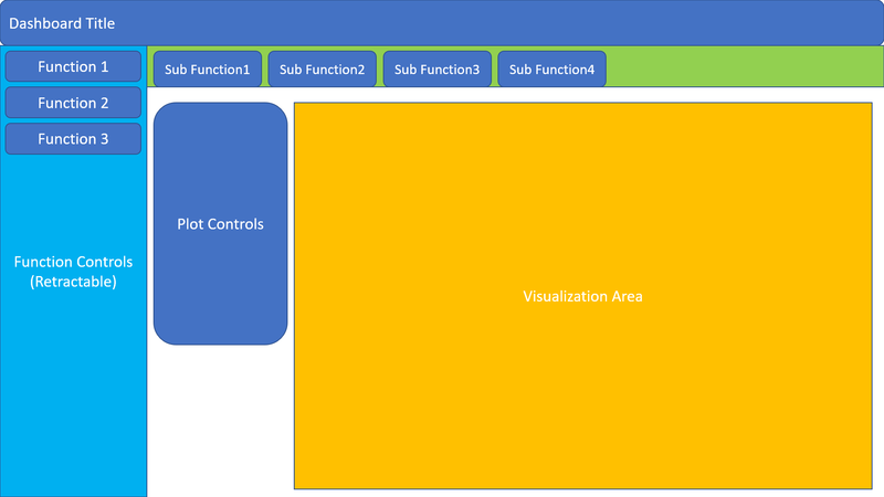
The 3 main features above will be listed in the Function Controls section of our Shiny app while the sub-functionalities, if applicable, will be available as tabs, just below the Dashboard Title. Separately, a Plot Controls section will allow app users to change the parameters generating the visualizations. The following Shiny and Shiny related libaries will be considered for the dashboard:
- shiny
- shinydashboard
- shinyWidgets
- dashboardthemes
- shinyBS
A draft dashboard design can be found below:

Challenges
Firstly, the metadata of dataset provided by the competition is not very detailed, and the meaning of some variables is not clearly explained. Therefore, research will need to be done to gain domain knowledge on the workings of Yu'e Bao and understanding on the meaning of the dataset variables. Time series clustering is a resource intensive analysis and on preliminary trials, using all 2,840,421 observations, clustering failed with error: cannot allocate vector of size 5.9GB. This appears to be a limit of R in Windows where R only runs in 32bit, even on a 64bit Windows OS, where the address space cannot exceed 4Gb. We will need to look for ways to reduce the data to a suitable size. The size of data also affects the dynamic generation of visualizations in the Shiny app, where it takes relatively long to generate a visualization, which will affect app user's experience. Thus, we will need to explore data aggregation techniques before executing the visualizations. Other issues of dataset includes missing values, a lot of zero value data, Chinese characters in data, and the city variable is represented by a 7 digit number, which prevents us from mapping our data into a geospatial visualization. Nontheless, we shall overcome these challenges, one at a time, to achieve our objective of building a platform that will enrich our users will an abundance of insights through the feature-rich Shiny visualization application.
References
Banner image credit to: China Money Network

