ISSS608 2018-19 T1 Assign Huang Shan Insights
|
|
|
|
|
|
Turning Data Into Insight
Putting data to work requires experienced insight which uses a combination of both art and science to tell the real story. I transform data in to tangible results.
Task 1: Office Air Quality Measurements
Anomalies In Dataset
After data preparation, I found some anomalies from the raw data and summarized the below table:
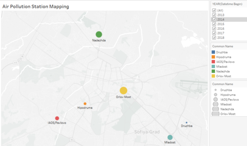
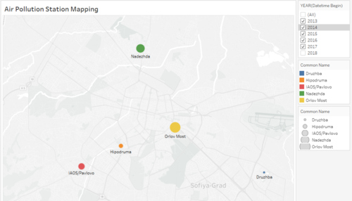
BG0054A Station(Orlov Most) only has data from 2013 to 2015,after that, there is not data from 2016 to 2018. BG0079A Station(Mladost) only has data in 2018. We can guess that Orlov Most is an old air quality station and Mladost is a new air quality station.
From these stations maps, we used the filter function in tableau.It shows that Mladost is not in the right map which we didn't choose the 2018 year data.Otherwise if we only choose 2018 year data, Orlov Most will not display in the map.


