ISSS608 2018-19 T1 Assign Zhang Yanli Task2
|
|
|
|
|
|
|
Task 2: Spatio-temporal Analysis of Citizen Science Air Quality Measurements
View the interactive Tableau design here: Link1Link2
| pattern | 2017 | 2018 |
|---|---|---|
| Are they well distributed over the entire city?
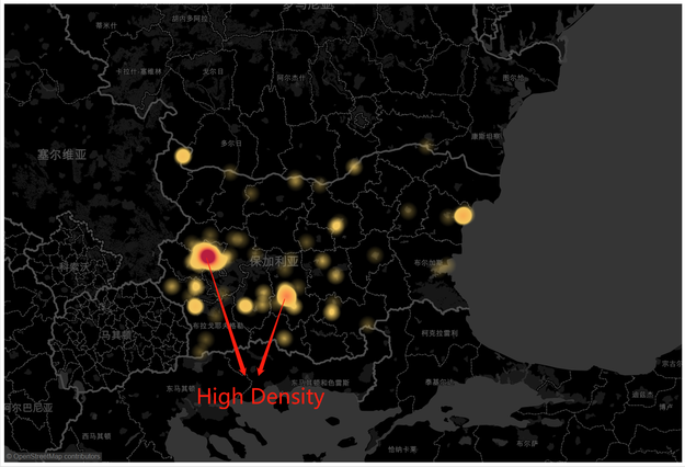
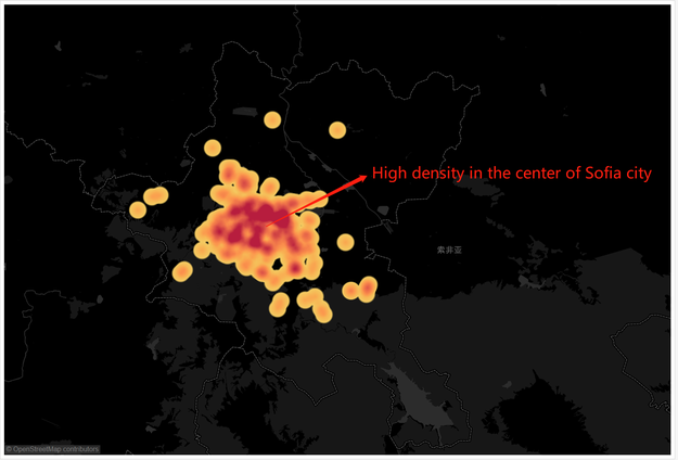
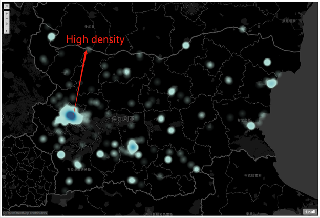
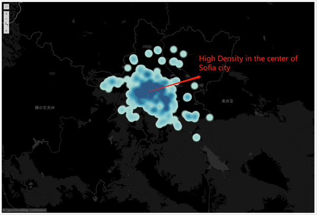
We are able to locate all sensors on the map after getting related longitude and latitude data that are decoded by ‘geohash’. From the data of 2017, we can know that there are 383 sensors over the entire area, not just distributed in Sofia city. We get 240 marks by using “Lasso selection tool” to choose the data we need. The number of sensor in Sofia city accounts 60% of the total. It is clearly that the sensors concentrate in the center of the Sofia city from the above pictures. Density of sensor in urban is low. Then, as time goes on and the sensors rise from 123 to 231 by 20 per month. However, the growth rate of urban sensor is slower than the center of Sofia city. The sensors in the entire area increase to 1253 in 2018, which is 10 times the number used to be. There are 712 sensors in Sofia city, which account more than 50%. The sensors in Sofia city increase 472 in 2018 comparing to 2017. The urban sensors increase as well, but mostly are distributed in the center of the city. Especially, there is no sensor at the bottom right corner in the map. |
| pattern | illustration |
|---|---|
| Are they all working properly at all times?
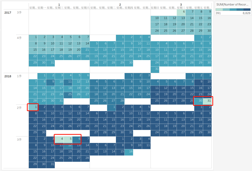
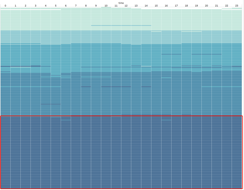
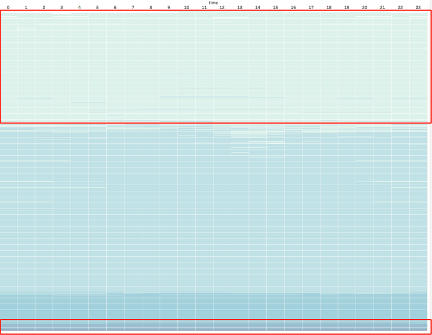
It is obviously that the numbers of records of each sensor in 2017 are different. The daily records rise from 400 to 5200 in 2017, but in 2018, the daily records rise to 8000 even to 9000 for some respective sensor in the center of Sofia city with the increasing of the sensors. It is worth noting that the data in few days are not so much in 2018, which we can surmise reasonably that there is a adjustment in every three months. According to the distribution per hour of different sensors, we can know that 40% sensors work irregularly, 20% sensors record 1 per hour. This work allocation is not very reasonable; some of the sensors may finish the work over the schedule. The numbers of outperform sensor decline in 2018. One third of sensors are inoperative and low efficient. Above all, we can conclude that some of the sensors loss the significance of recording because of the high density of sensor in the center. |
|
| Can you detect any unexpected behaviors of the sensors through analyzing the readings they capture?
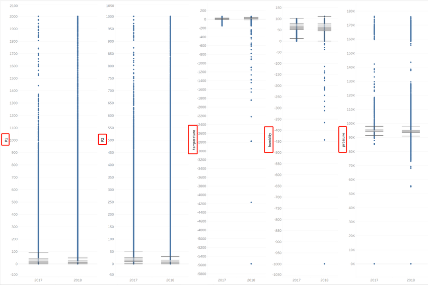
There are some unreasonable phenomena existing in measurement of sensor. 1.The range of P1 should be 0-600 2.The range of P2 should be 0-300 3.The range of Pressure should be 880 to 1060 Hpa 4.Negative humidity appears in 2018, the granulometric range should be 0-100 in -999 temperature. 5.The reasonable range of the temperature should be -20-50, the minimum and value is -142 in 2017, and -5573 in 2018. |
|
| Which part of the city shows relatively higher readings than others? Are these differences time dependent?
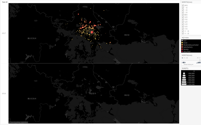
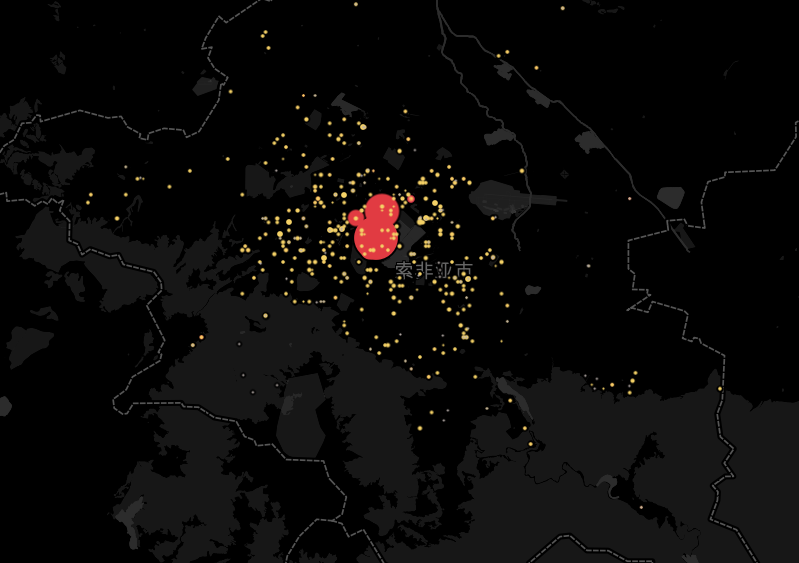
From the above picture, we can know that the AQI index rises with the declining of the temperature. The pollution is the worst in 2017.12 and 2018,1. We can observe that there are several data in the center of city with the worst pollution, and the average of P1 is very high. Then we can speculate reasonably that it is because of the error recording of sensors. The distribution of AQI in every area is normal. |
