ISSS608 2018-19 T1 Assign Wu Jinglong Task1
|
|
|
|
|
|
|
Overview
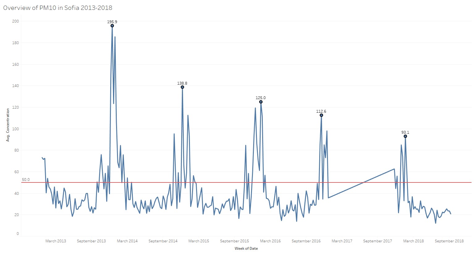
From the official air monitoring dataset, we can visualize the air quality in Sofia from 2013 to 2018. The red reference line shows the EU limit value for PM10 which is 50μg/m3. For each year, PM 10 concentration is averagely below EU limit value from February and March, and from October onwards the PM 10 concentration will hike to more than EU limit and reach the yearly PM 10 concentration peak at December. We can clearly observe a trend that the PM10 concentration peaks is decreasing from year to year. In 2013 December, it reaches the highest weekly average of 195.9. The peak value keeps on decreasing on yearly bases and in 2018 it drops to 93.1. From this overview graph, we can see that Sophia faces air pollution issue during the winter heating season and the situation is getting better from year to year. Base on the chart, the majority of the year 2017 data is missing.
Station Level Analysis
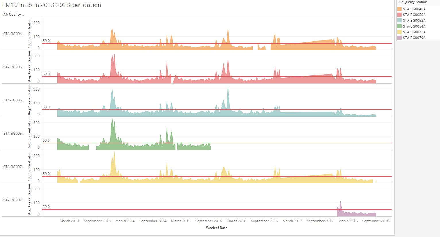
At station level, PM 10 concentration trend follows the same pattern. From the read up it mentioned different station has different pollution type. For station 40A, 50A, 52A the pollution type is “General Pollution” and station 54A, 73A is “Traffic Pollution”. Thus it’s necessary to check if traffic pollution PM 10 concentration trend is different from “General Pollution”.
Plot the difference (avg traffic group concentration – general group concentration) we can see that during winter (from December to April), traffic station group has significantly higher reading compare with the general group, thus during winter both heating and traffic contributes to bad air quality.


