ISSS608 Assign Zhang Kexin taskb
|
|
|
|
|
|
Task 2 Insights: Spatio-temporal Analysis of Citizen Science Air Quality Measurements
Importing Data
In original Air Tube data set, we only have Geohash column, so I use R packages to convert Geohash column into longitude and latitude. Then I import the converted data set into Tableau and concatenate 2017 and 2018 two files.
Insights
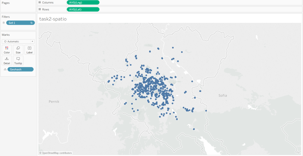
By using R packages to convert geohash column in air tube dataset, now we can map sensors. The original dataset contains air quality sensors all over Bulgaria, I use selection method to only filter sensors in Sofia city. From this graph, it's easy to find out that there are many sensors placed in Sofia. Most of them are located at the center part of Sofia, some of them are located at north and south part. But overall, the sensors are clustered in the center part, not well distributed over the entire city.
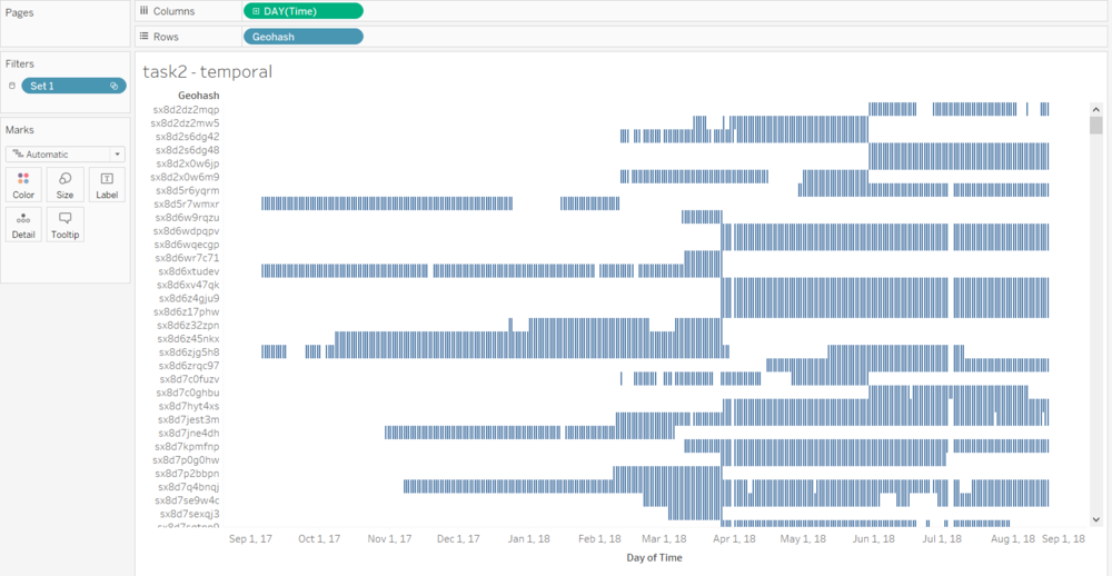
This graph is to show the operation duration of each sensor in Sofia city. From this graph, we can find out that the dataset contains air quality data from 2017/09 to 2018/08. Most sensors didn't operate whole time, but instead they only operate on a small duration during 2017 to 2018.
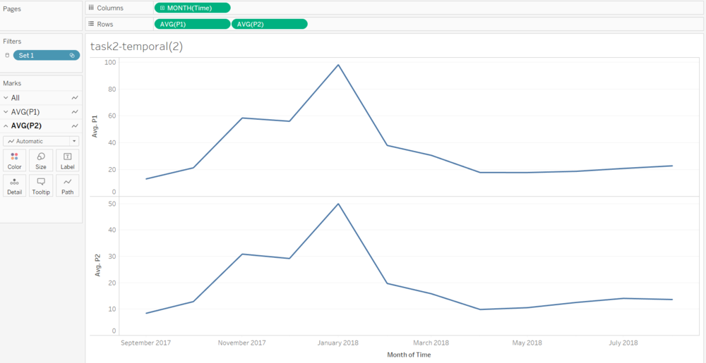
This graph is to show the monthly average P1 and P2 value during 2017 to 2018. It's very easy to find out that winter have worse air quality, while summer have better air quality.
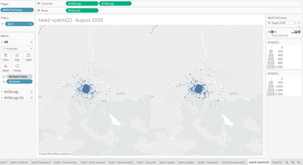
This graph is animated, the left map is to show the monthly average P1 value of all sensors during 2017 to 2018. The right map is to show P2 value. The size of the dots is to show the P1/P2 value. The higher the value, the larger the dot. From this graph, we can find out that dots tend to be bigger in the exactly center of Sofia. And it's apparent that there are some anomalies during April 2018 to August 2018. There are some very large dots while other dots remain very small, such as sx8d7hyt4xs sensor have very high P1 and P2 value in May and July, sx8d8xv4bbd sensor in May and June have unusually P1 and P2, sx8d8vjerh have very high P1 and P2 in July and Aug, and sx8dfg2p28f have high P1 and P2 in Aug. Also, from this graph, we can find out that during November to January, P1 and P2 are much higher in the center of Sofia, but during February to August, P1 and P2 are quite consistent around Sofia.
