ISSS608 2018-19 T1 Assign Yan Huilin
Task 1
- REDIRECT yan1
Methodology:
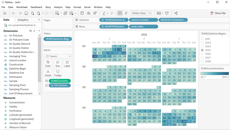
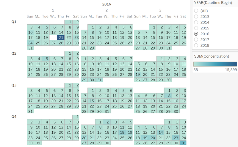
Heatmap calendar. The reason that I chose heatmap calendar is that the data set are full of single day data, which means that I have to find a way that not only could visual one single day but also gives me the entire trends. And I think heatmap calendar is good choice, for it can not only visual the value of one single day by the color but could also show the entire date set by presenting the calendar.
Visualization Design:
Using Year as filter, color as the level of the concentration. Place three months a row for a better view.
Insights:
Characterize the past and most recent situation with respect to air quality measures in Sofia City:
2013 has 2 days of heavily polluted days, about 10 days of medium polluted days, total polluted rate, medium.
2014 has 4 days of heavily polluted days, about 35 days of medium polluted days, total polluted rate, medium.
2015 has 6 days of heavily polluted days, about 45 days of medium polluted days, total polluted rate, high.
2016 has 1 days of heavily polluted days, about 1 days of medium polluted days, total polluted rate, very low.
2018 has 5 days of heavily polluted days, about 6 days of medium polluted days, total polluted rate, low.
From 2013 to 2015, the polluted days increased, thus the pollution level became higher. In 2016 however, the concentration plumped, and there was very few polluted day across the year. In 2018, the polluted days increased a bit at the beginning of the year, but stayed modest-polluted to the middle of September.
What does a typical day look like for Sofia city:
Condensation: 1500 – 7500
Trends of possible interests:
In 2013, the polluted days were in the early January and the late December. In 2014 and 2015, the polluted days were in January, February, November and December. In 2016, the only heavily polluted day was in January. In 2018, the polluted days were in January. Early or late of the year are the times that Sofia City most likely to be polluted.
Anomalies found:
1) Different duration data type: day or hour. From 2013 to 2015, the [ average time ] is day, while from 2016 onwards, the [ average time ] is hour.
2) 2017 data is not available: It only contains data from 2017.11.28 to 2017.12.31.
Potential problems of the anomalies:
1) When conducting year comparison, the different time dimension will affect the feasibility of tableau functions.
2) Since lost track of the data of one single year. Cannot get full view of the pollution trends and the understanding of the pollution pattern may also be flawed.
Task 2
Methodology:
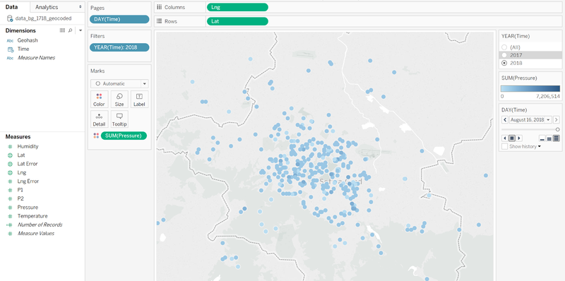
Using geohash package to decode the geohash data. And using R language to join two data tables into one, since the size of the file is too big for other methods to perform combination. Using map to visual the data, and using animation to show the trends.
Visualization design:
Using Year as filter, using Day as pages. It’s easy to visual the changes of the measurements and also the changes of the station.
Insights:
Are they well distributed over the entire city:
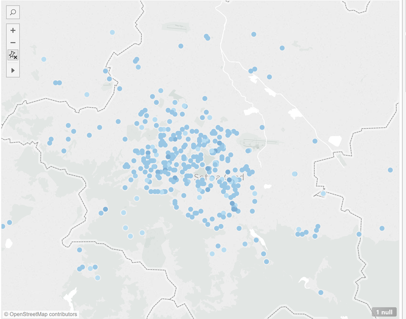
Total sensor number: 2017- 383, 2018- 1253 The number of sensors inside the city: 2017- 240, 2018- 713
The sensors highly aggregated around the center of the city. They are not uniformly distributed across the city.
But it may also makes sense that the center of the city has larger population and is modernized, thus this area need to be monitored.
Are they all working properly at all times:
Numbers of shutdown sensor when performing different measurements:
| Year/Measurement | Humidity | Temperature | Pressure |
|---|---|---|---|
| 2017 | 7 | 7 | 23 |
| 2018 | 29 | 29 | 132 |
Unexpected behaviors of the sensors through analyzing the readings:
1. In April 31 and July 5, 2018, the majority of sensors shut down, causing a plump in the data table.
2. There is a significant positive correlation between humidity and pressure. When the humidity goes up, the pressure tends to raise. However, no significant correlation found with temperature.
3. As time goes by, the number of the station increased. But it still focused on the center of the city. From the shape of the aggregated station we could also see that the urban area develop in a north-west and south-east direction.
Which part of the city shows relatively higher readings than others? Are these differences time dependent?
As mentioned above, the center of the city have higher readings than the other part of the city. As the number of the stations get higher, the more the center of the city becomes aggregated.


