ISSS608 2018-19 T1 Assign Zhang Yanli Task2
Revision as of 16:09, 18 November 2018 by Yanli.zhang.2017 (talk | contribs)
|
|
|
|
|
|
|
| decrption | 2017 | 2018 |
|---|---|---|
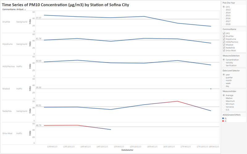
| The air quality of Sofia city picks up gradually in most recent years. As can be seen from the diagram, great changes of average concentration have taken place during 2017 and 2018 from 43.96 to 29.52 . More specially, the average concentration in six stations also declines. From the diagram above, it is easy to see that there are missing data in Mladost and Orlov Most stations. For Orlov Most station, the official air quality dataset only consists of the data from 2013 to 2015. While, the dataset only consists of the data of 2018 for Mladost station. When we do the analysis, there would be some errors may occur.
|
||

