ISSS608 2018-19 T1 Assign Wong Yam Yip
Contents
Overview
4.2 million deaths result from exposure to ambient air pollution and over 80% of urban residence are exposed to air pollution exceeding WHO standards globally.<a href="#_ftn1" name="_ftnref1" title="">[1]</a> Air pollution is also known to be the cause for other health risk like stroke, heart and lung diseases.
Dataset overview
EEA Dataset
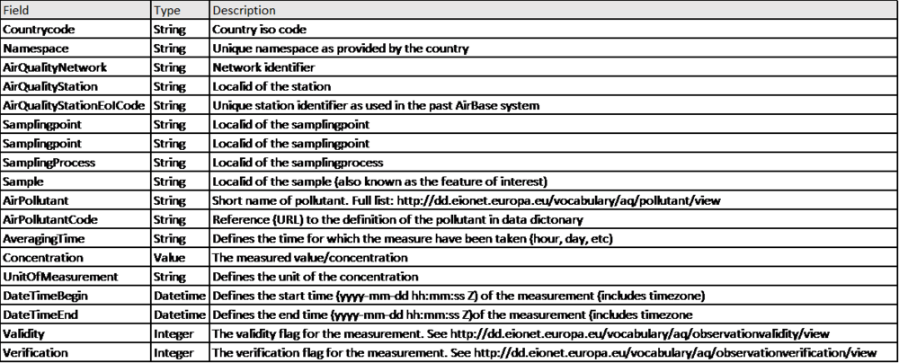
A. This dataset contains official PM10 air pollution readings from 6 air stations in Sofia
B. The dateset is made multiple CSV files, each file represents a year’s data from 1 of the 6 air stations between 2013 to 2018.
C. Overall, there were 39,715 observations stretching from 1 Jan 2013 to 14 Sep 2018.
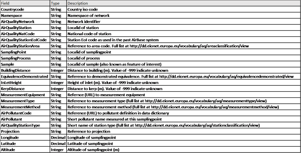
D. There is also an additional metadata providing more data on each station, including altitude and type of air station and type and placement of equipment used.
E. Description of dataset as follows:
Metadata.xlxs:
Air Tube Dataset
A. 2 csv files of civilian sensors readings from 2017 and 2018
B. In total dataset has 3,610,146 readings from 1265 civilian sensors distributed across Bulgaria from 06 Sep 2017 to 16 Aug 2018
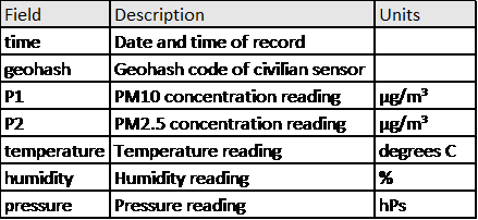
C. Sensor measures temperature, humidity, pressure and 2 pollution indicators P1 and P2
D. Geohash and time of reading
E. P1 and P2 are 2 variables in this dataset which represents PM10 and PM2.5 concentration readings in µg/m³.<a href="#_ftn2" name="_ftnref2" title="">[2]</a>
F. Description of variables in dataset as follows:
Meteorology Dataset
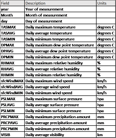
A. This dataset contains 2449 dates from 1 Jan 2012 to 17 Sep 2018, each with the corresponding meteorological data.
B. Description of variables in dataset as follows:
Data preparation
EEA Dataset
For this analysis, we merge the data from all station for the entire period of 2013 to 2018. Subsequently, the corresponding air station information is updated to each row, from metadata.xlxs, using JMP Pro. In data exploration, Averaging Time: has 3 different categories, vars, hour and day. By measuring the difference in time between Datetime Begin and Datetime End, it is found that vars is actually also an hourly time measure, thus vars is recoded to hour.
Further to this, to compare past and present, the data is split to align with the break in data in time. Data collected 2013-2016 are grouped as past data 2013-2016, while data collected from 28 Nov 2017 to 14 Sep 2018 are grouped as present data, 2017-2018.
Air Tube Dataset
The 2017 and 2018 dataset were merged by the rows. Next, Geohash in R Studio is used to map to Latitude and Longitude.
Unfortunately, there appears to be an error in the geohash of one of the readings mapped its location to somewhere in the Indian Ocean. In addition, there are 4 counts of missing geohash, preventing the mapping of spatial location of these readings. For this subsequent analysis, these 5 observations will be disregarded in this analysis
Meteorology Dataset
To compare the relation between local meteorology and air pollution, the official PM10, and civilian, PM10 and PM2.5, readings are aggregated to an average each day. These 3 mean aggregates are subsequently updated to the meteorology dataset. As the dates available in official and civilian dateset do not fully match, we shall look at them their correlation with local meteorology readings separately by filtering dates that do not have concentration readings. In addition, values of PRCPMAX and PRCPMIN are all missing (-9999), we will exclude these 2 variables from our analysis.
Task 1: Official Air Quality
Challenges with dataset
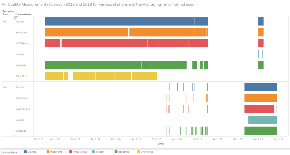
From the above image, there is inconsistency in the dataset and some missing data
· There is a switch from daily Averaging Time method in the past (2013-2016) to a hourly Averaging Time method in the present (2017-2018)
· There are various missing pockets of data in the time series
· There is no data of station Orlov Most from Oct 2015 onwards
· Data is only available from Jan 2013 onwards for station Mladost
· For the other 4 stations, Druzhba, Hipodruma, IAOS/Pavlovo, Nadezhda
- Some limited hourly data is available from 31 Dec 2015 to 31 Dec 2016. This may be a trial period for migration to hourly data.
- From 31 Dec 2016 to 28 Nov 2017, there is no data at all and after which hourly data is available till the end of period and daily data is only available for a short period between 15May 2018 to 14May 2018.
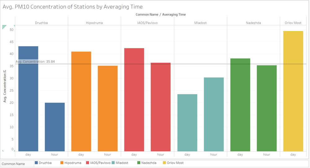
The missing data in Time series puts a challenging to the accuracy of the measurements when PM10 concentration levels are aggregate by the stations. Furthermore, unequal ratio of daily to hourly data will affect the comparison between past and present concentrations where any variance between past and present could be due to the change in averaging method rather than an actual difference in concentration levels. As we can see below, for the same station, all 4, Druzhba, Hipodruma, IAOS/Pavlovo, Nadezhda stations have higher readings with daily measurements compared to hourly. In particular, Druzhba’s daily average is more than double that of the hourly average. The exception is Druzhba but as mentioned, this station started only in 2018 and there is insufficient daily data to make a significant comparison. Overall the average PM10 concentration is 35.84 µg/m3 for the entire period.
It is also difficult to compare past and present data as there is only <1 year of present data. Moreover, station Mladost only appeared in the past data while another appeared only in the present data also affects the validity of the comparison.
Comparison between past: 2013-2016 and present: Nov 2017-2018 (hourly data)
PM10 over Time
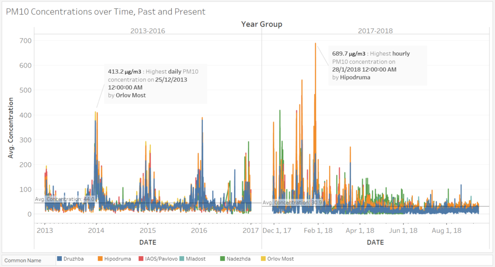
Overall, the average concentration of present, 35.3 µg/m3, is lower than that of the past, 43.0 µg/m3. However, the highest reading recorded in the present, 689.7 µg/m3, is significantly higher than of the present, 413.2 µg/m3. One possible explanation is that the past data were mainly daily average readings and spikes within the day cannot be captured in the data like that of the present.
In the past, there is an obvious trend of seasonal increase in PM10 concentrations in Q1-Q4 each year, rising from September, peaking around December/January. The reading will drop back to the lower levels by March/April, and stay relatively similar through the rest of Q2-Q3.
In the present, concentrations drop from Nov 2017 to Dec 2017 but rises again in Jan 2018. Finally, concentrations returned to lower levels 10-30 µg/m3 from Feb onwards. Overall, concentrations readings from the present, station Druzhba seemed to be relatively lower, than in the past, and compared to the other stations. It would be interesting to know the reason behind Druzhba’s measurement dropped as compared to other stations.
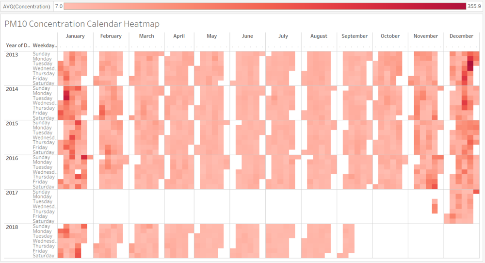
These findings evident from the concentration heatmap below where the colour is significantly darker in between Nov – Feb.
PM10 by Day of Month
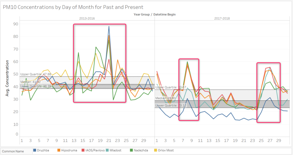
Overall, the quantiles in the past are also relatively higher than the present. The overall levels of pollution has reduced in 2017-2018, especially for Druzhba (Blue). In the past, generaly higher conc in between 13-25th day of month, spike on 21st of month. Now, the same period seemed to have lower conc while 1st, 8th and 26-26th is higher. This is interesting point exploring why the past and present seemed to be showing opposite results 11 months apart.
PM10 by Hour on different Days of Week
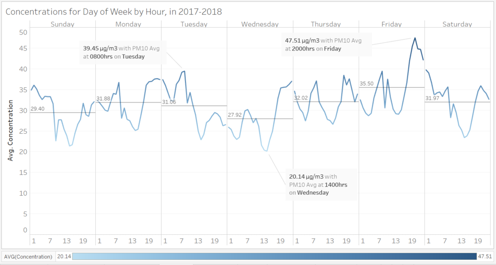
As there is very little hourly data for 2013-2016, it will not be signification to look at the past, this we focus on only 2017-2018 hourly data. This is what a typical week would look like.
On a typical weekday (Mon-Fri), PM10 concentration rises from 3am to a peak of at 8am, which is likely attributed to the morning rush with high traffic volume. Concentration drops after that till 2pm, before starting to increase again, generally peaking at 6-8pm and remaining relatively constant till 12am. This could be due to the after-office hour traffic. Another interesting thing to note is that the average PM10 reading for weekdays starts from 31.88 µg/m3 on Monday, and drops till 27.92 µg/m3 on Wednesday before peaking again on Friday with an average of 35.5 µg/m3. Friday also records the highest hourly average in for the week at 47.51 µg/m3 at the after-office rush hour of 8pm.
On weekends, the PM10 concentration typically drops from 12am till 2pm before picking up again toward the end of the day.
Station Type vs Concentration
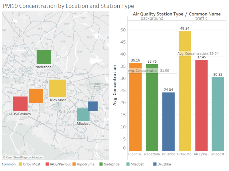
As above, station type: traffic has higher average concentration readings, 39.04 µg/m3, in particular, #54 has the highest average reading of 49.34 µg/m3. As compared to station type: background, with average of 31.99 µg/m3, traffic station type has higher concentration reading which is not surprising since traffic station type predominantly measures pollution from nearby traffic while background stations reads pollution in general.<a href="#_ftn3" name="_ftnref3" title="">[3]</a> However, it is interesting to note that Orlov Most, with the highest average PM10 concentration reading, is the station that no longer provides measurement data from October 2015 onwards. Instead, the new Mladost started providing average concentration readings, 30.32 µg/m3, below both traffic and background type average.
Task 2: Citizen Science Air Quality
Sensor Coverage, Performance and Operation
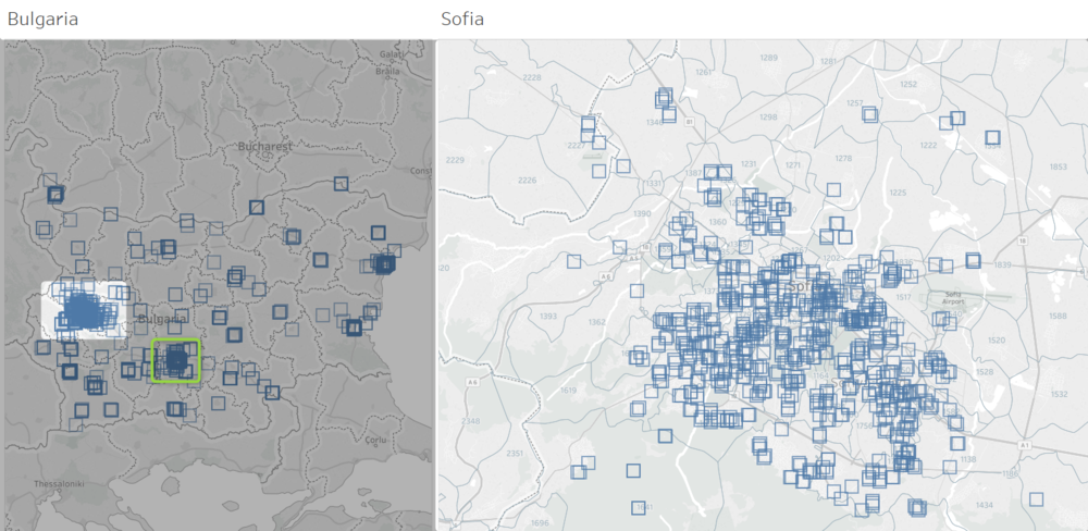
Overall the sensors are distributed over the counties and there appears to be at least one sensor in each state of Bulgaria. Nonetheless, most of them congregate in Sofia, while a significant amount can also be found in Plovdiv (green), which is the second largest city in Bulgaria.
For this analysis, we would only like to define the boundaries of Sofia city by Longitude 23.191 – 23.457 and Latitude 42.603 – 42.788. This will leave us 1,949,114 readings from 647 sensors (above right). The sensors are generally well distributed across the city. There are more sensors towards the center of the city, where we can see more overlapping sensor marks.
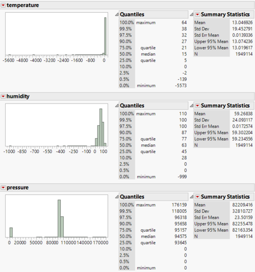
As seen above, some of the readings for temperature, humidity and pressure are skewed in an irrational way. For example, there are readings of 64°C and -5573°C, as well as pressure as high as 176,159 hPs, which are not humanly liveable conditions. Similarly, negative humidity % not possible! Therefore, the accuracy and operability of these sensor readings are questionable.
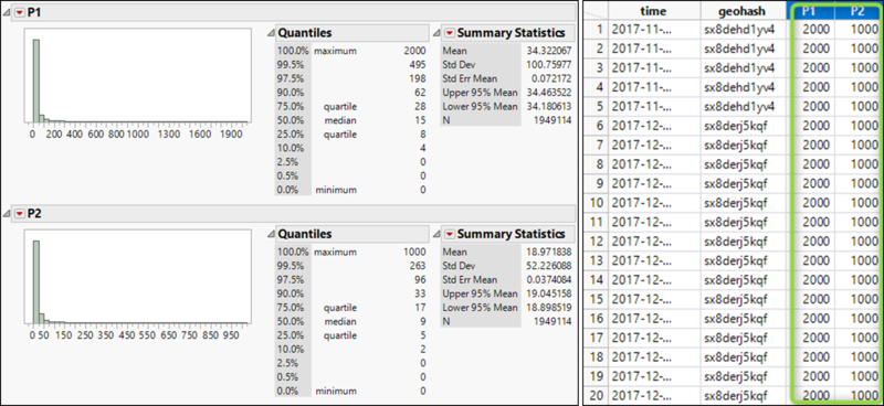
Exploring PM10 and PM2.5 readings, the distributions are also highly skewed, reaching as high as 2000 and 1000 for PM10 and PM2.5 respectively. IF we assuming that there is indeed the readings are accurate, then there may be a limit of the capabilities of these sensors.
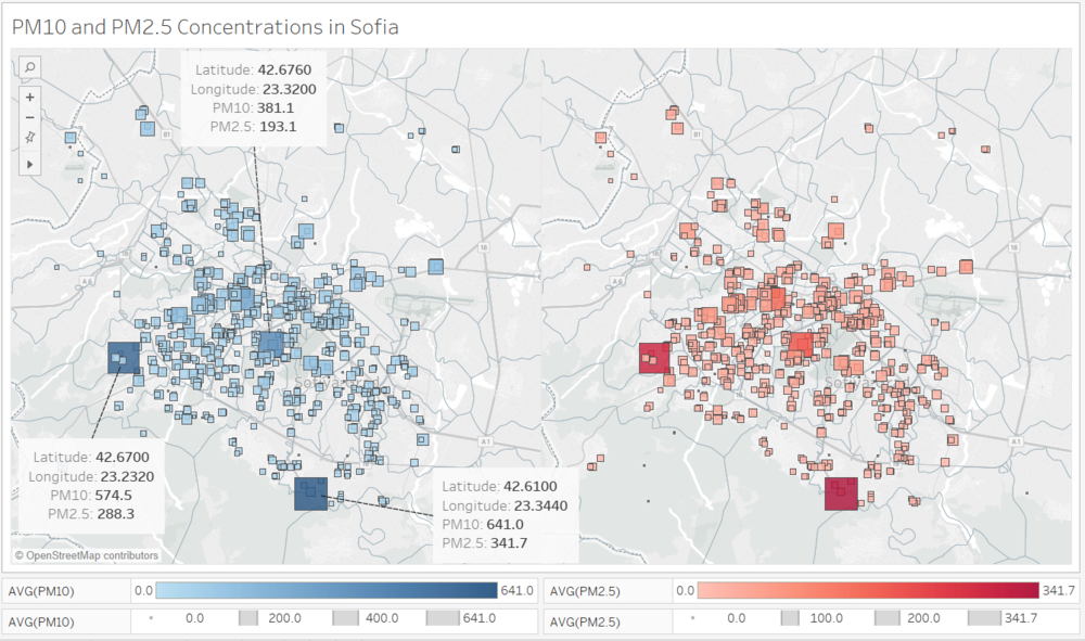
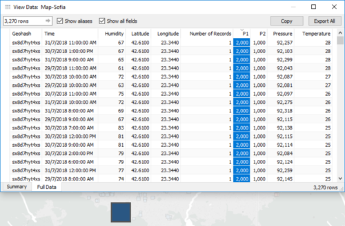
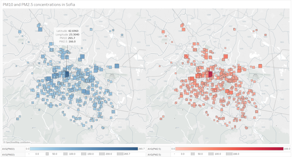
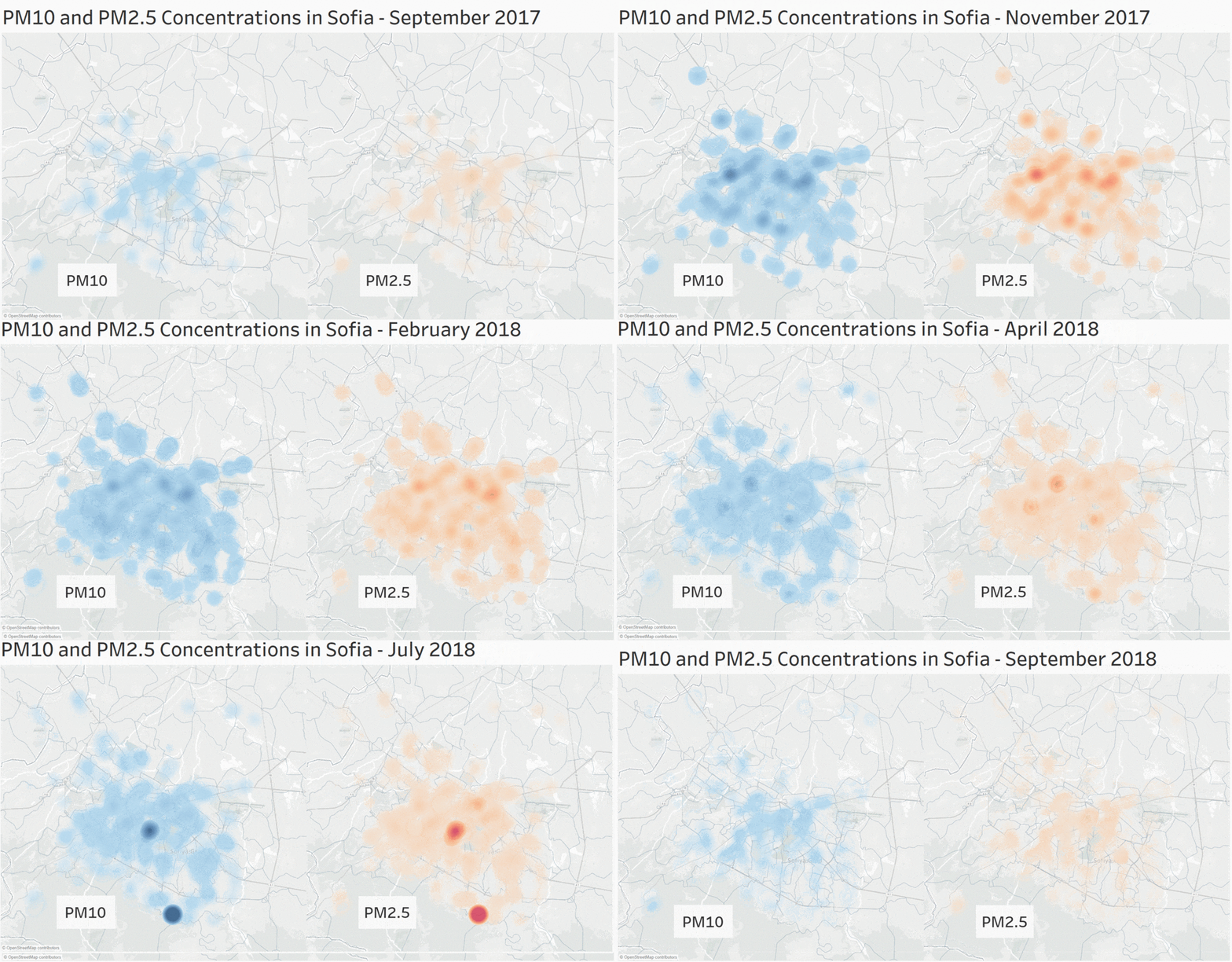
On first look, it seems that the highest readings are found in the areas highlighted by annotations, where the PM10 and PM2.5 concentration is the highest, 2 of which are in the outskirts of the city with PM10 readings 641 µg/m³ and 574.3 µg/m³ respectively. Seen in the below image, a series of maximum PM10 and PM2.5 readings were recorded for these locations, thus pushing up the average. It is possible that the readings are detecting very polluted air, reaching the limits of PM10 and PM2.5. However, if we look at the vicinity of these sensors, they appeared to be the only one getting such high readings. It is unlikely that air pollution is contained within a specific geographical location. Thus, it may also be possible that these sensors are behaving abnormally and giving inaccurate readings.
To further our analysis on other areas, we exclude those 3 earlier sensors and now we can see other areas with relative higher readings and mostly in the city center, highlighted in (in green). The highest average reading detected by the sensors here is PM10: 265.7 µg/m³ and PM 2.5: 166 µg/m³.
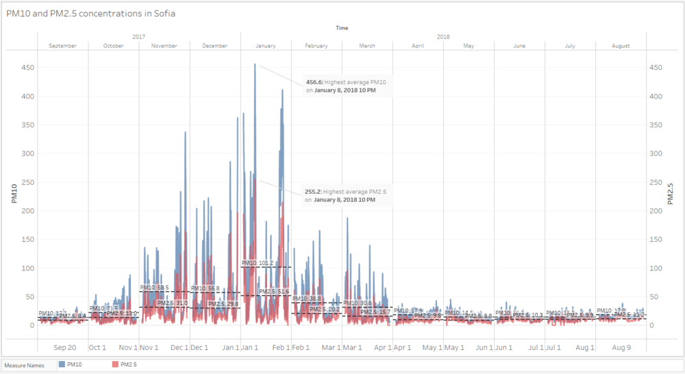
The below shows the air pollution concentration measurements in different areas of the city over time
Looking at the readings for Sofia city over time, similarly trends of higher concentration readings during end/start of the year. Highest average PM10 and PM2.5 readings are 456.6 µg/m³ and 255.2 µg/m³ respectively on the same day of 8 Jan 2018. The average reading for Jan 2018 was also the highest at 101.2 µg/m³ and 51.6 µg/m³. As there is insufficient data, it is not possible ascertain that this is the trend for other years, but these trends are similar to those of the official data.
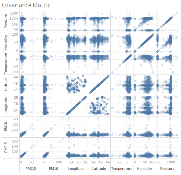
Finally, we attempt to explore the correlation of PM10 and PM2.5 readings with the collected environment variables like Pressure, Humidity, Temperature and Latitude/Longitude. As we can see, it appears that there is little/no correlation between air pollution and the environmental measurements of the civilian sensors.
Task 3 Identifying factors of pollution
Correlation with Environmental factors
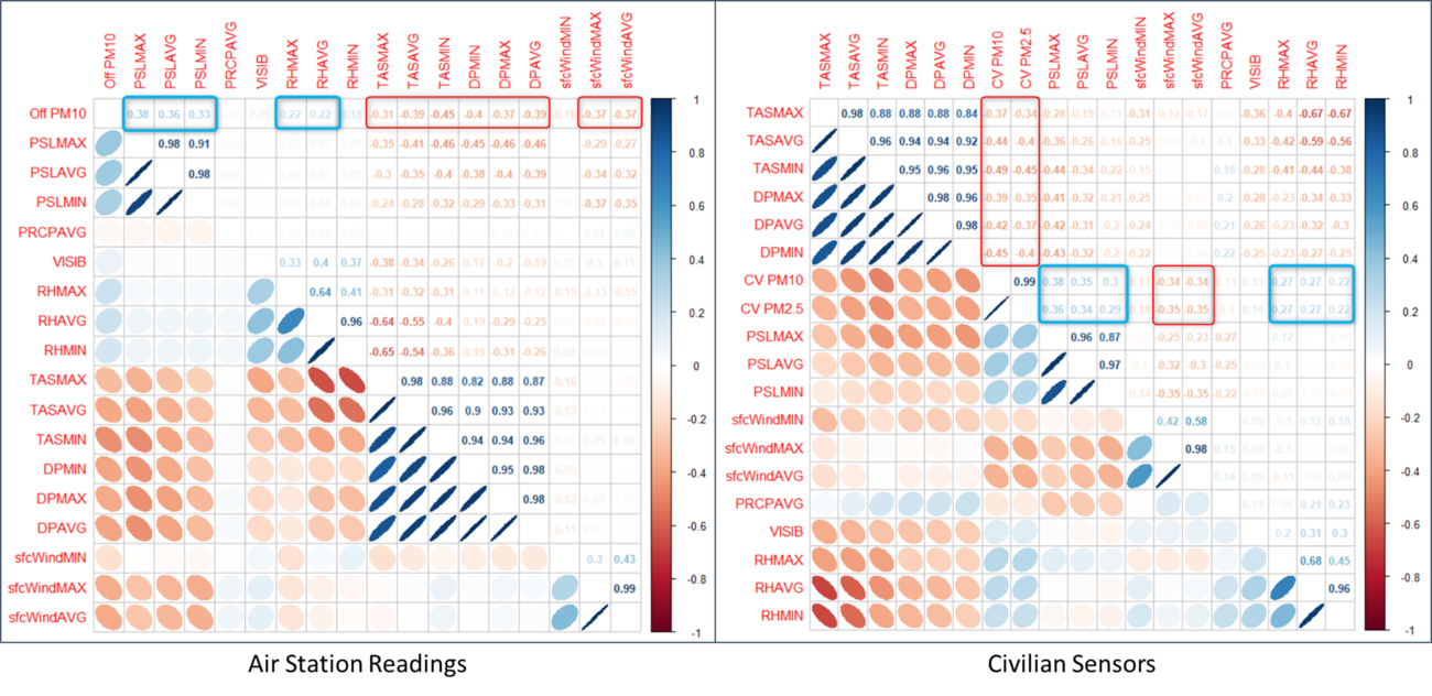
Using corrplot in R Studio, the covariance matrix of air population reading is mapped out as above. For both official air station concentration readings and civilian sensors, PM10 (and PM2.5) is positively correlated to surface pressure (PSL***). The air pollution indicators are also positively correlated to relative humidity (RH***), in a relatively smaller magnitude. Both have higher correlation at higher magnitude of these environment factors. On the flip side, the air pollution indicators are negatively correlated to temperature (TAS***) and dew point temperature (DP***), with higher absolute correlation at lower temperature. Wind speed (sfcWind***) is also negatively correlated, with higher correlation at higher wind speed. These findings contradict that from the previous section and further strengthens our doubt on the accuracy and operationality of the civilian sensors.
Energy Sources
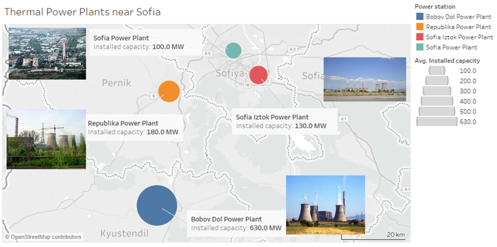
As shown in the above image, there is one energy plant, Sofia Power Plant<a href="#_ftn4" name="_ftnref4" title="">[4]</a> situated in the middle of the city. This probably explains why there are high air pollution readings within the center of the city.
To the southeast, on the outskirt of the city, there is also another energy plant, Sofia Iztok Power Plant situated just outside Sofia city. This plant has a higher install capacity of 130MW, compared to 100MW of Sofia Power Plant. It is possible that a significant portion of the city center’s air pollution is a result of the location of these 2 plants.
Further down South-West, there are 2 more energy plants, Republika Power Plant and Bobov Dol Power Plant, 22km and 51km away from Sofia city center respectively based on google maps measurements. These energy plants have with even higher install capacity. In particular, Bobov Dol Power Plant, has installed capacity of 630MW. Higher installed capacity would mean higher emission of air pollution.
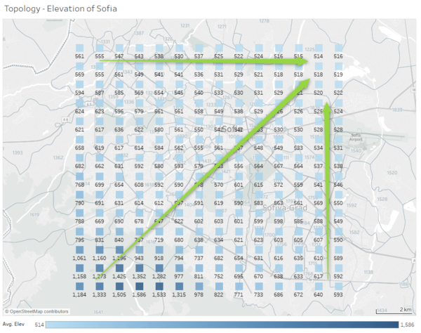
Topology of Sofia
From the above image, when we look at the topology the Sofia City, we can see that the elevation is highest at the South-West corner and the north east corner being the lowest corner. This forms a natural funnel that channels air from the south west to north-eastward. This likely resulted in air pollution from the other 2 energy plants, Republika Power Plant and Bobov Dol Power Plant, to be brought to the city. We can verify this by reviewing wind direction pattern of Sofia city. This likely explains why there were exorbitant readings from civilian sensors at the outskirts, in the South and South-West of the city seen in the earlier section of Task 2.

