ISSS608 2018-19 T1 Assign Hou Xuelin
Contents
Task1 Exploration of Official Data
Situation of Air Quality
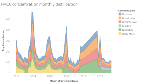
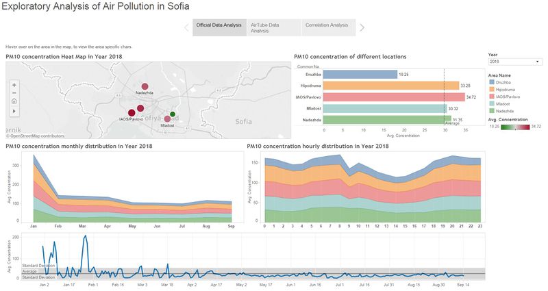
The annual average PM10 concentration is around 45 from 2013 to 2018.
Druzhba is improving its air condition in recent two years, but Nadezhda showed uplift in 2017.
PM10 concentration in the rest of areas are gradually declining.
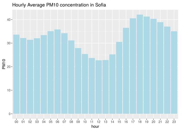
A typical PM10 trend within a day remains average around 30, and declines to around 20 between 10am - 5pm, when most of people are out for working.
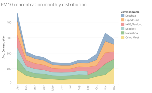
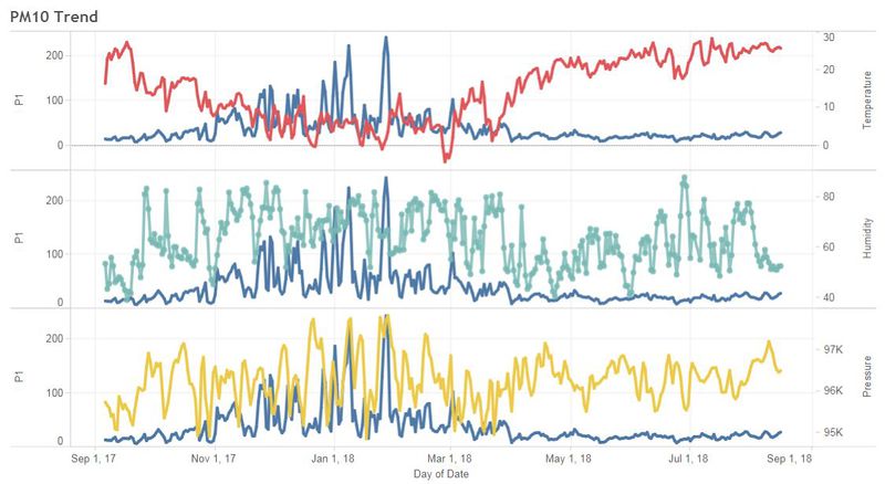
The PM10 trend in Sofia is highly periodic and the peaks are always fall on winters (Jan/Dec).
This may be due to domestic heating in winters.
Anomalies of Official Data
- Only Nov/Dec data is recorded in 2017 and the rest months data is all missing.This may not be representative for 2017 annual data.
- the sampling frequency `AveagingTime` is inconsistent throughout the data, it ranges from day, hour and var. This may introduce some bias, when we aggregate the data.
Task2 Exploration of Citizen Science Data
Sensor Data Quality
Coverage
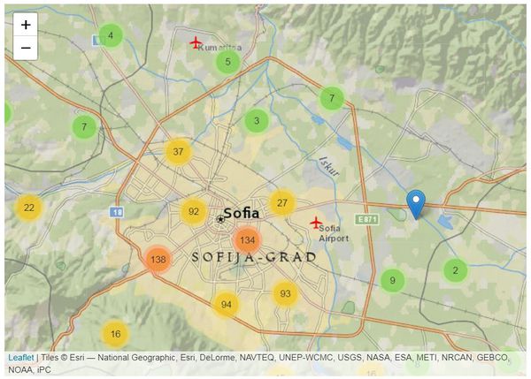
The highest density of sensor is around the urban area around the capital of the city.
Sensors densely covers the southern of Sofia city, while left with a low coverage on the north of the city.
Operation
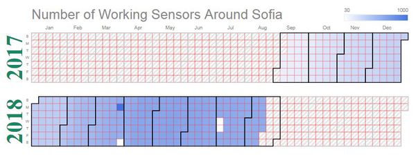
There in total 1265 sensors deployed around sofia from Sep 2017 to Sep 2018.
The average working sensors is 453.2, and median of working sensors is 513.
Performance
The measurement of sensors are not consistently reliable. Because some abnormal measurement are observed:
- P1, P2 value are capped at 2000, 1000, which may be the maximum the sensor can measured or measurement error. This is not sure from the data.
- pressure should be ranged from 90000 to 100000 hPs. Negative value is observed from data.
- temperature should be ranged from -10 to 50 degree Celsus. Extreme value, (e.g. -5573, 435) is unreasonable.
- humidity is an percentage, which should be ranged from 0 to 100. Anomalies are also observed, such as -999 and 898.
| quantile | P1 | P2 | pressure | temperature | humidity |
|---|---|---|---|---|---|
| 0% | 0 | 0 | -20148 | -5573 | -999 |
| 10% | 4 | 2 | 0 | 0 | 28 |
| 20% | 7 | 4 | 93178 | 4 | 40 |
| 30% | 9 | 6 | 94075 | 8 | 49 |
| 40% | 11 | 7 | 94552 | 12 | 57 |
| 50% | 14 | 9 | 94936 | 15 | 63 |
| 60% | 18 | 11 | 95360 | 18 | 69 |
| 70% | 23 | 15 | 96242 | 21 | 74 |
| 80% | 34 | 20 | 99027 | 24 | 80 |
| 90% | 62 | 33 | 100140 | 27 | 88 |
| 100% | 2000 | 1000 | 254165 | 435 | 898 |
I also noticed that, not all types of measurement are available for all sensors. Therefore, I divided the sensors into 3 types:
- only measure particle concentrations (P1, P2) => particle-measurement only
- only measure Temperature, Pressure & Humidity => TPH-measurement only
- measure all 5 indexes => All-measurement
Air Quality Condition
According to AirTube, P1, P2 reading are referring to PM10 and PM2.5 in µg/m³.
I calculated the cutoff of PM10 for different band, based on AQI calculator & AQI definition.
| PM10 | AQI | Label |
|---|---|---|
| 0 to 54 | 0 to 50 | Good |
| 55 to 154 | 51 to 100 | Moderate |
| 155 to 254 | 101 to 150 | Unhealthy for Sensitive Groups |
| 255 to 354 | 151 to 200 | Unhealthy |
| 355 to 425 | 201 to 300 | Very Unhealthy |
| > 425 | 301 to 500 | Hazardous |
Seasonal Effect
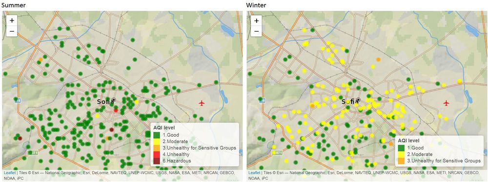
The air condition in summer is generally much better than winter, which should be contributed by the domestic heating by the residents in winters.
In summer, there are only very few locations on the southwest and south areas are suffering in poor air condition, but this might be due to measurement error, because the measurement of adjacent sensors are fairly good.
However, in winter, the entire city air condition is worse and southwest and south part are even worse.
Hourly Effect
The air condition in daytime (7am - 4pm) is better than in nighttime(7pm - 6am).
A strong hypothesis is pointed to emission from daily commuting to work/home and domestic heating in the evening.
Task3 Factors Affect Sofia Air Pollution
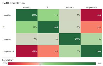
I explored the correlation between PM10 concentration (P1) and climate indicators (Temperature, Pressure & Humidity).
There slight positive correlation of P1 and humidity and slight negative correlation between temperature and P1.
Again, the assumption is still point to domestic heating, the usage of which is extensively higher when the temperature is low.
Eventually, I confirm the relationship with trend chart. Notice that the P1 concentration spikes when temperature is low. And when humidity remains high level, P1 spikes.
Interactive Web Visualization
Link of tableau visualization
Data Source
Four major data sets in zipped file format are provided for this assignment, they are:
- Official air quality measurements (5 stations in the city)(EEA Data.zip) – as per EU guidelines on air quality monitoring see the data description HERE…
- Citizen science air quality measurements (Air Tube.zip) , incl. temperature, humidity and pressure (many stations) and topography (gridded data).
- Meteorological measurements (1 station)(METEO-data.zip): Temperature; Humidity; Wind speed; Pressure; Rainfall; Visibility
- Topography data (TOPO-DATA)
They can be download by click on this link.
Application Libraries & Packages
| Package Name | Descriptions |
|---|---|
| xlsx | R package for Excel file manipulation. |
| dplyr | dataframe general manipulation |
| ggplot2 | general charting |
| leaflet | geo-spatial chart |
| googleVis | calendar chart |


