Task 2: Citizen Science Air Quality
|
|
|
|
|
|
|
Understanding Citizen Science Air Quality Data
Contents
Characteristics of sensors’ coverage, performance and operation
Distribution of sensors
Congregation of sensors at City Center
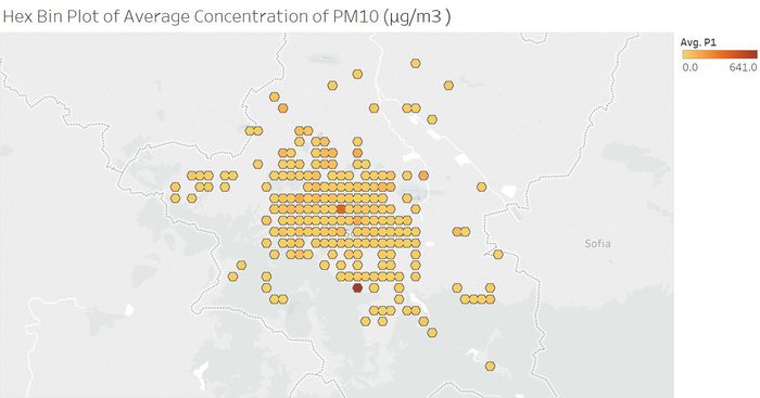
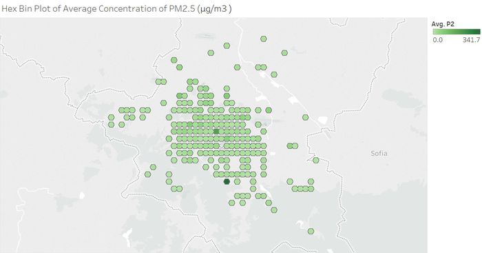
Initial exploratory analysis in JMP Pro revealed that there are 1265 unique geohashed location of sensors. By plotting the location of sensors onto the map of the city, we observed that these sensors are mostly located at the city center with sparse representation at the extremities of Sofia City. Hex binning is performed to prevent overlap in pointers when plotting the sensors onto the Tableau online map.
Performance of sensors
Distribution of air pollutant in Sofia City
Which part of the city shows higher concentration in air pollutant?
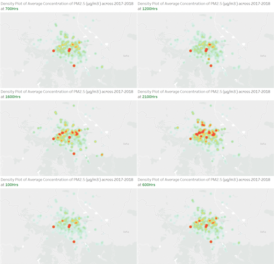
Is difference in concentration time dependent?
Concentration of pollutant increases in the evening
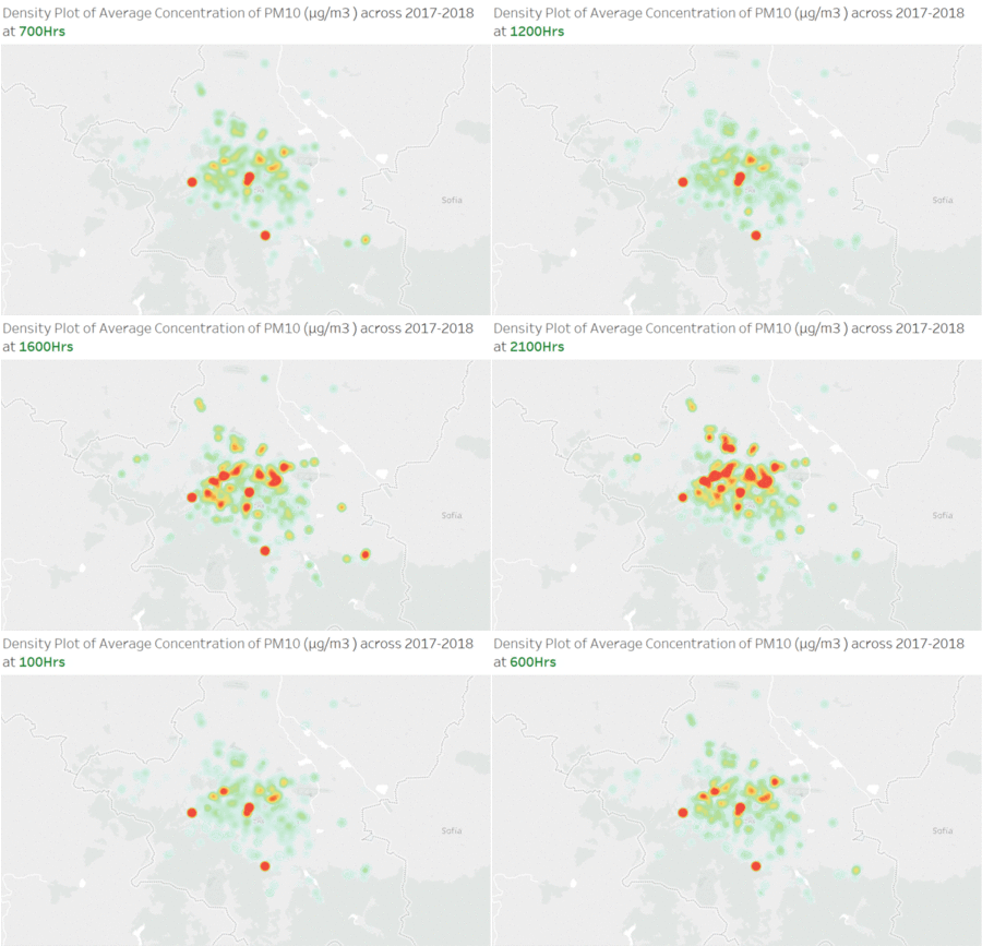
The density plot is used to represent the hourly concentration of pollutants across Sofia City where area of higher concentration is reflected with darker/warmer shade of colors. We have prepared a gif to allow user to have a better visual understanding of changes in concentration of PM10 and PM2.5 throughout the day. We find that concentration is generally lower throughout the day, especially period of 1200hr-1700hr in the afternoon. Concentration of pollutants increases significant as the day turns to night.
