Difference between revisions of "Task 1: Official Air Quality"
Yqchia.2017 (talk | contribs) |
Yqchia.2017 (talk | contribs) |
||
| Line 68: | Line 68: | ||
| − | 'With exception of Druzhba, all other stations recorded increase in average annual PM10 concentration from 2013-2018' | + | |
| + | |||
| + | '''With exception of Druzhba, all other stations recorded increase in average annual PM10 concentration from 2013-2018'''<br/> | ||
Taking in consideration of incomplete data point from 2013-2018 for Orlov Most and Mladost, we can plot the slope graph of changes in average concentration of PM10 (µg/m3) for the remaining 4 stations. While the cycle plot enable us to have an appreciation of the changes in pollutant concentration over the years, the slope graph allow us to compare the movement in concentration level across individual stations from 2013-2018. | Taking in consideration of incomplete data point from 2013-2018 for Orlov Most and Mladost, we can plot the slope graph of changes in average concentration of PM10 (µg/m3) for the remaining 4 stations. While the cycle plot enable us to have an appreciation of the changes in pollutant concentration over the years, the slope graph allow us to compare the movement in concentration level across individual stations from 2013-2018. | ||
Revision as of 21:03, 18 November 2018
|
|
|
|
|
|
|
Spatio-temporal Analysis of Official Air Quality
Contents
Comparison of Past and Present Air Quality Situation in Sofia
Characterize the past and most recent situation with respect to air quality measures in Sofia City. What does a typical day look like for Sofia city?
Changes from 2013 to 2018
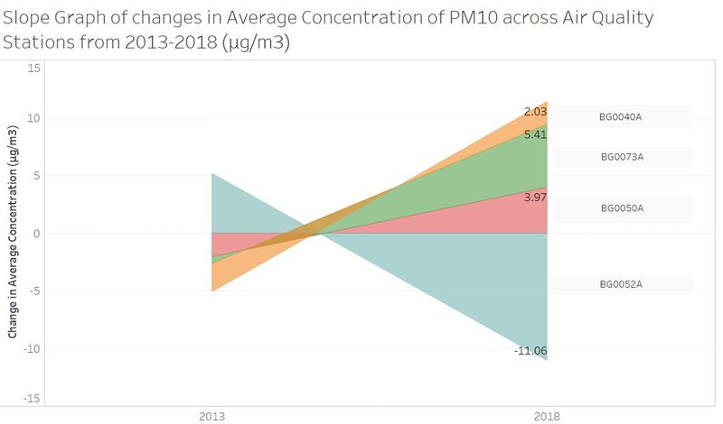
With exception of Druzhba, all other stations recorded increase in average annual PM10 concentration from 2013-2018
Taking in consideration of incomplete data point from 2013-2018 for Orlov Most and Mladost, we can plot the slope graph of changes in average concentration of PM10 (µg/m3) for the remaining 4 stations. While the cycle plot enable us to have an appreciation of the changes in pollutant concentration over the years, the slope graph allow us to compare the movement in concentration level across individual stations from 2013-2018.
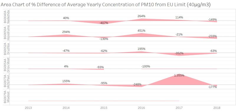
Annual Average Concentration of PM10 frequently exceeds the EU allowable limit
The European Union sets the limit of 40 μg/m3 as the maximum annual average for PM10. When plotting a horizon graph, we were able to discern the percentage difference of the annual average concentration level across various stations throughout 2013-2018. The shaded area above/below the x-axis reflects the percentage difference which the annual average concentration deviates from the EU annual limit (40 μg/m3).
Most notably, the highest annual average concentration level was recorded in 2017 at BG0079A where average concentration level exceeded EU annual limits by 1755%.
Discovered Trends of Interest
Anomalies in dataset
Missing dataset for STA-BG0054A from 2016-2018
Data from STA-BG0054A (Orlov Most) is missing from 2016-2018. This could be possible decommissioning of the air quality station from 2016 onwards.
New Air Quality Station in 2018 – STA- BG0079A (Orlov Most)
Dataset for Orlov Most covers only the first 9 months of 2018.
Incorrect altitude level for STA-BG0079A (Mladost)
In the metadata table provided, we noticed that altitude for STA-BG0079A (Mladost) set as “0” is likely to be an error as Sofia city sits at 550m above sea level.


