Difference between revisions of "Assignment ZUOANNA Task 1"
| Line 52: | Line 52: | ||
===Overview=== | ===Overview=== | ||
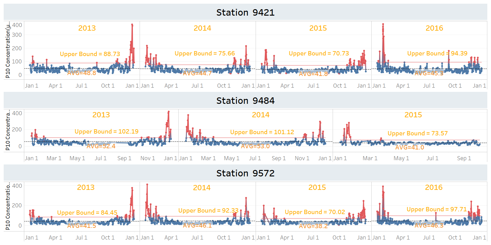
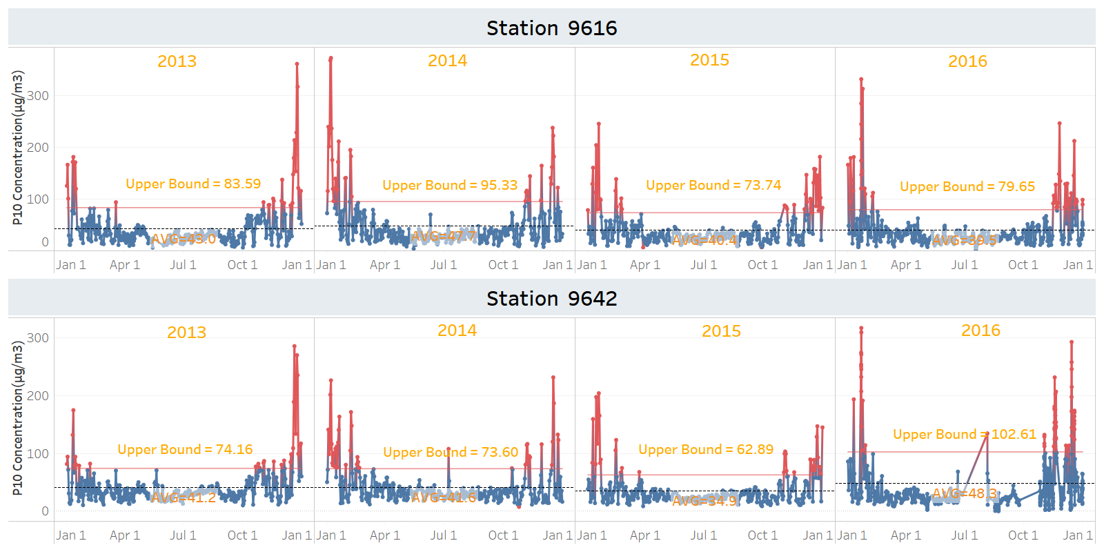
Over the 4-year period, there are five stations showing a similar pattern which the concentration on P10 went up extremly high both in Jan and Dec for each year, so the line is drawed like a letter “U” on the one year time series. The number which is calculated based on average concentration for each station over one year frequenly lies between 40 µg/m3 to 50 µg/m3 except the average numbers for Station 9484 which are just above 50 µg/m3 and the upper bound is also much higher than the other 4 stations. However, the good trend is that the concentration decreased continously from 2013 to 2016 indicated by the decreasing average concentration and the upper bound which is one standard devation above its one year average concentration. | Over the 4-year period, there are five stations showing a similar pattern which the concentration on P10 went up extremly high both in Jan and Dec for each year, so the line is drawed like a letter “U” on the one year time series. The number which is calculated based on average concentration for each station over one year frequenly lies between 40 µg/m3 to 50 µg/m3 except the average numbers for Station 9484 which are just above 50 µg/m3 and the upper bound is also much higher than the other 4 stations. However, the good trend is that the concentration decreased continously from 2013 to 2016 indicated by the decreasing average concentration and the upper bound which is one standard devation above its one year average concentration. | ||
| − | [[File:G1Z.png|center]] [[File:G2Z.png|center]] | + | [[File:G1Z.png|frame|center]] [[File:G2Z.png|frame|center]] |
The readings showed by Station 9484 from 2013 to 2015 is much higher than the other stations within the same time period, although the average concentration decreased from 52.4 µg/m3 to 41.0 µg/m3 in 2015 for P10. | The readings showed by Station 9484 from 2013 to 2015 is much higher than the other stations within the same time period, although the average concentration decreased from 52.4 µg/m3 to 41.0 µg/m3 in 2015 for P10. | ||
Revision as of 16:52, 16 November 2018
Contents
Spatio-temporal Analysis of Official Air Quality
Data Preperation
Know Your Data
| Station | Timeseries(Original records for each year) | Consolidation(Exclude title) |
|---|---|---|
| Station 9421 | 2013_Day(358), 2014_Day(365), 2015_Day(357), 2016_HD(464), 2017_HV(777), 2018_H(5965) | 8,280 Records |
| Station 9484 | 2013 _Day(314), 2014_Day(342), 2015_Day(264) | 917 Records |
| Station 9572 | 2013_Day(365), 2014_Day(345), 2015_DH(347), 2016_DH(453), 2017_HV(777), 2018_DH(6097) | 8,378 Records |
| Station 9616 | 2013_Day(344), 2014_Day(363), 2015_DH(352), 2016_DH(465), 2017_HV(776), 2018_DH(5449) | 7,744 Records |
| Station 9642 | 2013_Day(364), 2014_Day(360), 2015_DH(358), 2016_DH(514), 2017_HV(752), 2018_DH(6051) | 8,393 Records |
| Station 60881 | 2018_DH(6005) | 6,004 Records |
| Consolidate All Stations | 2013 - 2018 | 39,715 Records |
* Notes
1. DH represent for Day and Hour which means that the concentration of the pollutant was recorded either by Days or Hours over the relanvent period. If the station records the concentration by day, each day should have only one reaching. But if the station records the concentration by hour, each hour have only one reading and each day will have 24 readings.
2. HV represent Hour and Var(showed by dataset). From the data, it is noticed that both of them represent the measurment for concentration by hour.
3. Finally, we will want all the records from above six stations consolidate together, so it is more convenient to make interactive visualization in Tableau by filtering the station, year and method of the measurement(by day or by hour).
Unevenly spaced time series
Before we analyse the unique or similar patterns for the readings provided by six stations, it is quite important to make clear on what characteristic of the time series for each station that we have because the time period of the readings recorded by each station is not consistent and we need to separately compare and conclude the patterns for the group of stations which have the data on the same time period.
| Period Type | Group | Year | Station | Month |
|---|---|---|---|---|
| Past Period (Daily based time series) |
Group 1 | 2013-2016 | Station 9421 Station 9484 Station 9572 Station 9616 Station 9642 |
12 Months |
| Group 2 | 2017 | Station 9421 Station 9572 Station 9616 Station 9642 |
Nov&Dec | |
| Recent Situation (Hourly based time series pattern) |
Group3 | 2018 | Station 9421 Station 9572 Station 9616 Station 9642 Station 60881 |
12 Month with hourly readings |
Steps:
Group1.“U” pattern on time series
Characterize the past period with respect to air quality measures in Sofia City (2013-2016)
Overview
Over the 4-year period, there are five stations showing a similar pattern which the concentration on P10 went up extremly high both in Jan and Dec for each year, so the line is drawed like a letter “U” on the one year time series. The number which is calculated based on average concentration for each station over one year frequenly lies between 40 µg/m3 to 50 µg/m3 except the average numbers for Station 9484 which are just above 50 µg/m3 and the upper bound is also much higher than the other 4 stations. However, the good trend is that the concentration decreased continously from 2013 to 2016 indicated by the decreasing average concentration and the upper bound which is one standard devation above its one year average concentration.
The readings showed by Station 9484 from 2013 to 2015 is much higher than the other stations within the same time period, although the average concentration decreased from 52.4 µg/m3 to 41.0 µg/m3 in 2015 for P10.
Outliers
The outliers for the first four stations during Dec and Jan are all peaked around 400 µg/m3, while the outliers recorded by Station 4262 reached at most around 300 µg/m3 which is lower than the other stations over the period. Since the outliers has much higher readings, it will highly affect the calculation on the average concentration on P10 and lead our analysis biased if we focus too much on comparing the average concentration among these stations. In other words, the higher average amount on concentration can not perfectly prove that the pollution is quite serious in this year. Another situation is that the air condition was not too bad, but the reason for the higher number on average concentration may mainly lead by the outliers with extremely large number appearing in this year.
Trend
It is also obvious that the numbers of average concentrations are positive correlated with the number of upper bound. If we focus on the trend of average amount of concentration over the four years, Station 9484 and 9626 show that the air pollution became better in 2016 than it in 2013, while the other three stations show that the air condition became even worse in 2016 than before.

