IS428 AY2018-19T1 Zhuo Yunying
Contents
- 1 Problem & Motivation
- 2 Dataset Analysis & Transformation Process
- 2.1 Task 1: Spatio-temporal Analysis of Official Air Quality
- 2.2 1. Combine all time-series data (e.g. BG_5_9572_2017_timeseries) into one single excel spreadsheet
- 2.3 2. Merge metadata file with combined time-series data
- 2.4 Task 2: Spatio-temporal Analysis of Citizen Science Air Quality Measurements
- 2.5 Task 3: Find out the relationship of the air quality analysis with other factors
- 3 Interactive Visualization
- 4 Interesting & Anomalous Observations
- 5 References
- 6 Comments
Problem & Motivation
Air pollution is an important risk factor for health in Europe and worldwide. A recent review of the global burden of disease showed that it is one of the top ten risk factors for health globally. Worldwide an estimated 7 million people died prematurely because of pollution; in the European Union (EU) 400,000 people suffer a premature death. The Organisation for Economic Cooperation and Development (OECD) predicts that in 2050 outdoor air pollution will be the top cause of environmentally related deaths worldwide. In addition, air pollution has also been classified as the leading environmental cause of cancer. Air quality in Bulgaria is a big concern: measurements show that citizens all over the country breathe in air that is considered harmful to health. For example, concentrations of PM2.5 and PM10 are much higher than what the EU and the World Health Organization (WHO) have set to protect health. Bulgaria had the highest PM2.5 concentrations of all EU-28 member states in urban areas over a three-year average. For PM10, Bulgaria is also leading on the top polluted countries with 77 μg/m3on the daily mean concentration (EU limit value is 50 μg/m3). According to the WHO, 60 percent of the urban population in Bulgaria is exposed to dangerous (unhealthy) levels of particulate matter (PM10).
This assignment aims to study the following:
- Task 1: Spatio-temporal Analysis of Official Air Quality
- Task 2: Spatio-temporal Analysis of Citizen Science Air Quality Measurements
- Task 3: Find out the relationship of the above analysis with other factors (Local energy sources, Local meteorology, Local topography, Complex interactions between local topography and meteorological characteristics and Transboundary pollution)
Dataset Analysis & Transformation Process
Task 1: Spatio-temporal Analysis of Official Air Quality
1. Combine all time-series data (e.g. BG_5_9572_2017_timeseries) into one single excel spreadsheet
- Create a new "Station" Column (indicating station code i.e. 9421) and "Year" Column based on the year for each of the time-series data
- Use excel to combine the rest of time-series files based on all the common columns (e.g. Countrycode, Namespace, AirQualityNetwork and etc.)
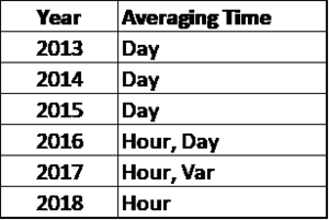
- Based on the analysis of the existing combined time-series data from 2013 to 2018, there is a drastic difference in the level of aggregation across the years. As shown in the table below, Year 2016 has a combination of hourly air quality readings and daily air quality readings while in 2017, there is a mixture of hour and var readings as for certain days, readings are not measured at one-hour interval continuously. As such, the analysis on air quality readings will be based on "Day" averaging time from year 2013 to 2016 as it is impossible to lower the aggregation level of "Day" to "Hour" readings in 2016. On the other hand, the analysis on air quality readings will be based on "Hour" averaging time for 2017 and 2018. For the data in 2017,average readings will be taken if the readings for any specific days are done on "Var" basis. Hourly analysis is also more accurate for both 2017 and 2018 as there are missing data on specific months. (In 2017, only Nov and Dec data are available while in 2018, only Jan to Sep's data are available)
- Due to the standardization in averaging time, the values under "Concentration", "DatetimeBegin" and "DatetimeEnd" have been adjusted accordingly while other column values remain unchanged.
- There are quite a number of duplicated readings in the dataset. These duplicated readings are removed during the transformation process to avoid unequal weightage.
- Due to the high variation in raw data and small dataset, excel is used for the transformation process.
2. Merge metadata file with combined time-series data
- According to the source of scrapped data (http://discomap.eea.europa.eu/map/fme/AirQualityExport.htm),"the join between time-series files and the metadata file should be made using the Countrycode (or Namespace) and SamplingPoint". Thus, metadata file and time-series data time are merged via Vlookup function in excel based on SamplingPoint (since Countrycode are all "BA" for both data file).
- Upon further inspection, these two datasets have a number of common columns with same values. These columns include "Countrycode, Namespace, AirQualityNetwork, AirQualityStation, AirQualityStationEoICode, SamplingProcess, AirPollutantCode, AirPollutant" and thus repeated columns are removed.
Task 2: Spatio-temporal Analysis of Citizen Science Air Quality Measurements
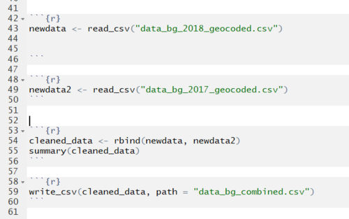
- Geohash represents station locations. However, Tableau is not able to interpret geohash as geographic data. Before Air Tube data is imported to Tableau for analysis, geohash needs to be decoded into geographical coordinates. Due to the sheer size in Air Tube datasets(data_bg_2017.xlsx and data_bg_2018.xlsx), R packages ("devtools", "tidyverse" and "geohas") as indicated by Prof Kam will be used to transform the geohashed raw data to a new csv file containing the coordinates of the locations.
- Next, 2017 and 2018 datasets that have been transformed will be combined based on the R programming code below.
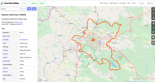
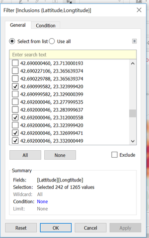
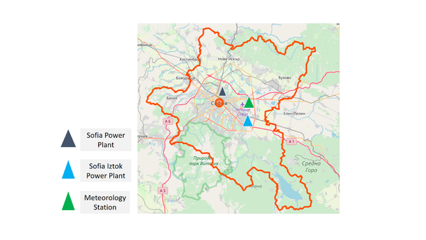
- The combined datasets comprises of readings across the whole Bulgaria area which is beyond the scope of our concern (i.e. Sofia). To maintain the consistency in comparison, Inclusion filter function is used to filter in only longitudes and latitudes that are in Sofia city. Due to the difficulty in comparing with the real geographical area of Sofia, an existing map on Sofia City (from Open Street Map) was used to filter through the Tableau filter function. The folowing shows map of Sofia and the filtering function.
Task 3: Find out the relationship of the air quality analysis with other factors
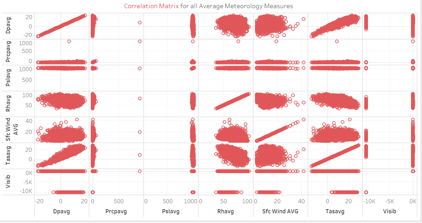
- The Meteorological data scrapped is currently in crosstab format which is not suitable for analysis on Tableau. Hence, the dataset has to be transformed to columnar format. Hence, pivoting will be done to transform the data.
- As the data includes average, minimum and maximum readings for different types of measurements and are presented on separate columns. The format is not suitable to be processed on Tableau if there is a need to introduce filters in the dashboard. Hence the dataset is transformed to as shown below.
Interactive Visualization
The interactive visualization can be accessed here:
Official Air Quality in Sofia City
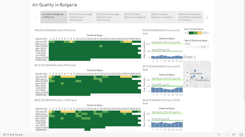
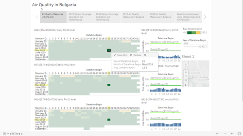
This dashboard shows the daily and hourly PM10 concentration in the 4 measured stations. A user can select a day on the heat map and investigate PM10 concentration at different times of the day.
Sensor Coverage, Performance and Operation
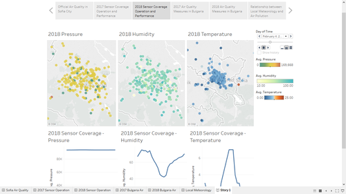
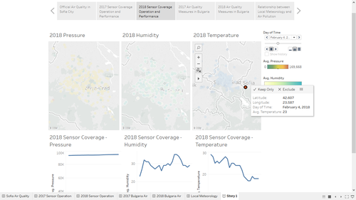
This dashboard shows sensors and their readings in Sofia City. When selecting a sensor, the line charts will display the sensor readings at different times of the day. A user thus can tell when the sensors start not working properly.
Air Quality Measures in Sofia City
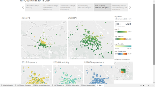
This dashboard helps user see the flow of air pollution from day to day and analyse the impacts of local topography and meteorology on air quality.
Relationship between Local Meteorology and Air Pollution
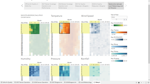
The last dashboard helps user find the relationship between local meteorology and air pollution. A user can select a few days and compare the patterns among temperature, pressure, rainfall, humidity, wind and air quality.
Interesting & Anomalous Observations
Task 1: Spatio-temporal Analysis of Official Air Quality
| 1.1 Characterize Recent and Past Situation of Air Quality in Sofia City
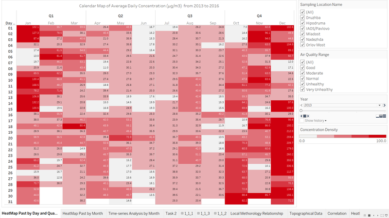
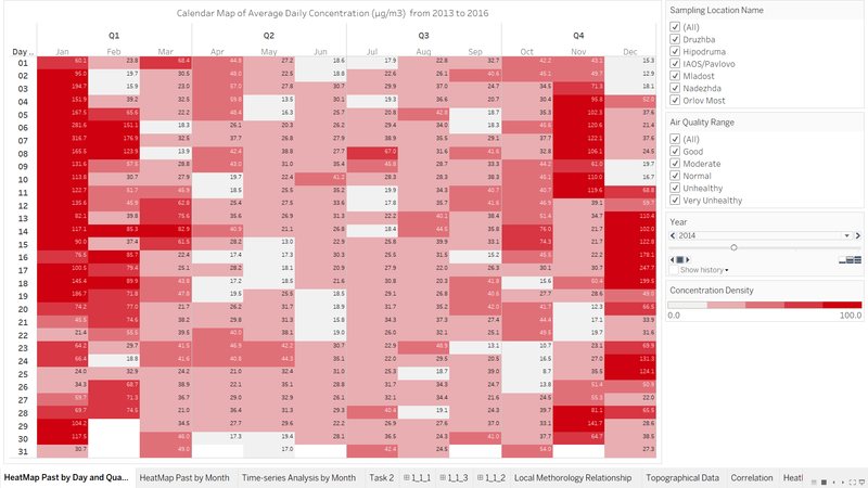
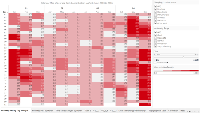
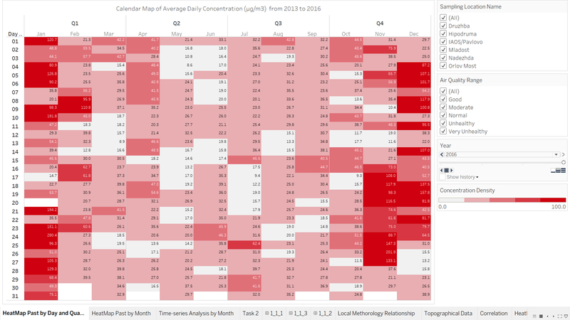
The figures above shows the PAST average daily concentration heat map for year 2013 to 2016 as daily readings are not computed for year 2017 and year 2018. The calendar heat map visualization allows users to appreciate the trend in average daily concentration from Jan to Dec at one glance. The calendar map also includes filter by Sampling location, air quality range as well as Year. With reference to EU Air Quality classification based on research, the air quality range includes 0-20:Good, 20-40:Moderate, 40-50:Normal, 50-75:Unhealthy, 75 and above: Very Unhealthy.The heat map’s colour intensity is specified within a range such that dark red represent unhealthy and very unhealthy air quality range and vice versa. Trends Analysis:
|
| 1.2 A Typical Day in Sofia City
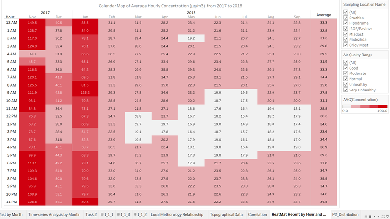
This calendar heat map shows the hourly concentration of PM 10 throughout a typical day across different months from Nov 2017 to Sep 2018. The rightmost column “Average” shows the overall average readings of hourly concentration. Filter on sampling location and air quality range could be utilized to narrow down the scope of comparison.
Trends Analysis:
|
| 1.3 Further Analysis on Sampling Points
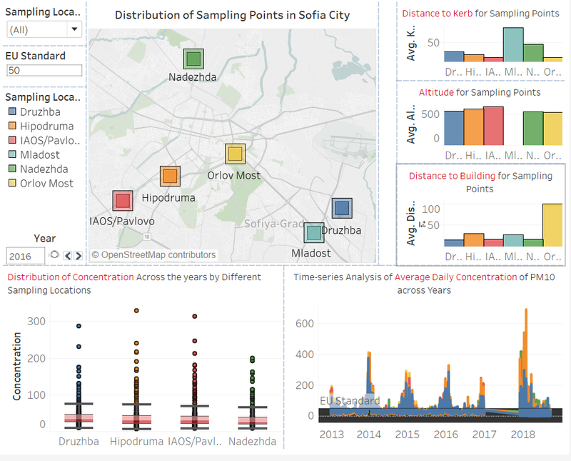
TThis dashboard shows the distribution of sampling points in Sofia city as well as the readings concentration, distance to Kerb, altitude and distance to building for these sampling points.
Trends Analysis:
|
| 1.4 What anomalies do you find in the official air quality dataset?
|
| 1.5 How do these affect your analysis of potential problems to the environment?
|
Task 2: Spatio-temporal Analysis of Citizen Science Air Quality Measurements
| 2.1 Sensor Coverage, Performance and Operation
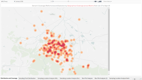
The heat map density illustrates the distribution of sensors across Sofia city. The higher the intensity, the more number of sensors found in the specific area. According to this heat map, it shows that the sensors mostly concentrate in the central area of Sofia city while the number of sensors decreases drastically beyond the central area. This could be due to the fact that the city area has a higher percentage of residential areas and transportation network. Thus, citizens place more sensors in the central area of Sofia city.
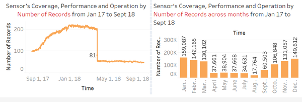
By looking at the number of records captures by the sensors from Sept 17 to Sept 18, the number of records increases steadily from September 17 but from May 18 onwards, the records dropped drastically from 200 to below 80 records. By looking at the number of records across months, it shows that the number of recordings is the highest in Jan, Feb, Mar, Oct, Nov, and Dec. While for other months, the number of recording decrease rapidly from around 60-159k to 17-38k.Considering that the lifetime of sensors last more than one year, the inconsistent number of records shows that the sensors are not working properly throughout the months.
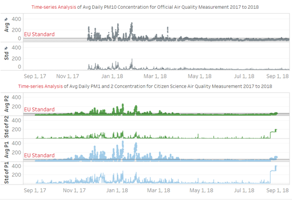
Through drawing out the time-series data of the average pollutant concentration and standard deviation for both Official Air Quality and Citizen Science Air Quality measurements, it shows that the reading range of P1 is much higher than that of PM10 under official air quality records (by 100 µg/m3). Meanwhile, the standard deviation of P1 is also much higher than that of PM10 under official air quality record. Therefore, the readings from sensors might not be fully accurate as the quality may differ significantly depending on the citizens' purchasing power or needs. Thus, the inconsistency in sensors used resulted in higher variation in the readings which may casue the readings to be inaccurate and inconsistent over time. |
| 2.2 Air Pollution
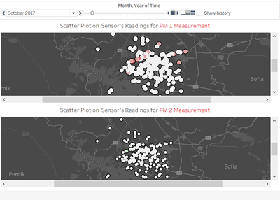
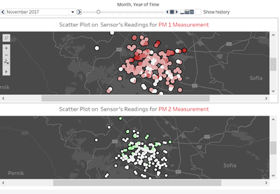
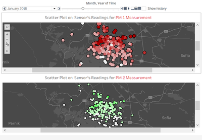
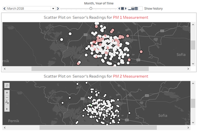
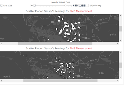
Which part of the city shows relatively higher readings than others? Are these differences time dependent? The central region has higher readings than other regions. However, as we show the history of the change in concentration for both P1 and P2 pollutants based on the density plot. At the beginning, the difference is relatively small from September 17 to October 17. However, from November 17 onwards, the difference increases sharply considering the increase in density in central region versus the rest. The difference is the sharpest in January 18. Subsequently, the difference decrease and in June 18, there is negligible difference between central region and non-central region. |
Task 3: Factors Affecting Air Quality in Sofia City
| Factor 1: Local Energy Sources
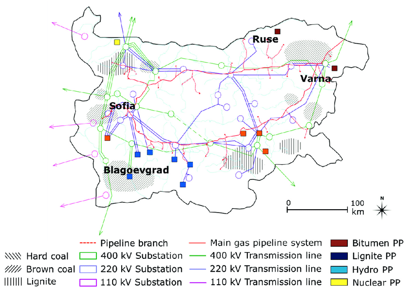
The diagrams above shows that in cities like Sofia and Blagoevgrad, P1 concentration is relatively high. This might be because these cities are along the main gas pipeline system. Since the cities are rich in hard coal, the gas and energy generated in these cities might be from burning of hard coals, which damages the air. |
| Factor 2: Local Meteorology
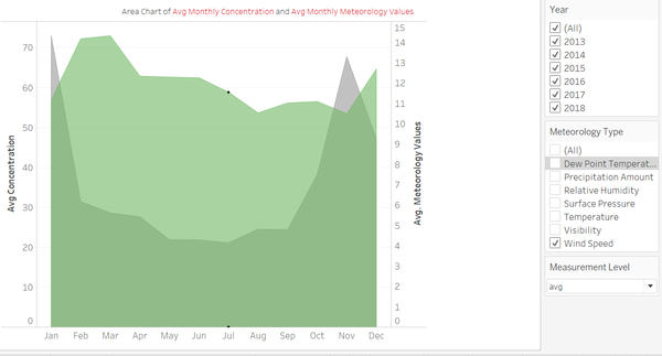
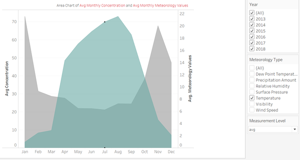
The diagrams above compare the patterns of temperature, wind speed, humidity, pressure and rainfall in Sofia Airport (42.6537, 23.3829 ) with the pattern of PM10 concentration in Station STA-BG0052A(42.6665, 23.4002) in 2014. It shows that PM10 concentration tends to be high in a low temperature, low wind speed, high humidity and high pressure environment. However, the relationship between rainfall and PM10 concentration is not very obvious. Data in 2016 also shows the same findings. |
| Factor 3: Local Topography
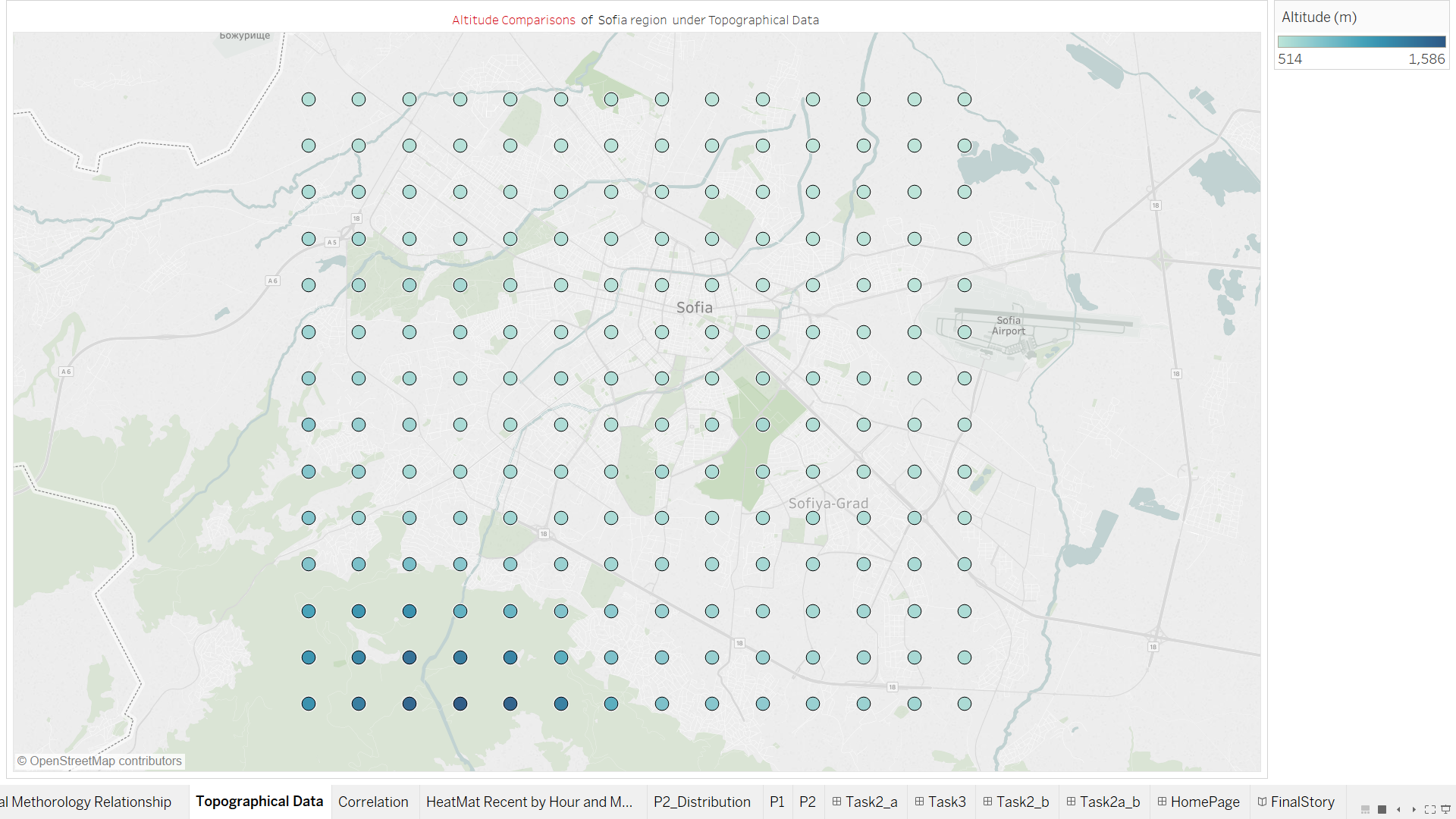
As mentioned in Task 2, pollution usually starts from the northern part of Sofia city. This may be due to the fact that Sofia's altitude is low in the north and high in the southwest. PM10 particles from the north can flow into Sofia city much more easily than those from the southwest. |
| Factor 4: Complex interactions between local topography and meteorological characteristics
The diagram shows that even though the pressure was high, humidity was high and temperature was low across the city, the pollution level is high in the northern part of the city mainly because of the low altitude in the northern part. |
| Factor 5: Transboundary Pollution
Pollution does spread from one place to another as discussed in Task 2. The graph below also displays that when air quality in Sofia is poor, the cities around it also have places with poor air quality. |
References
Understanding the current issues of poor air quality in Bulgaria https://www.eea.europa.eu/publications/air-quality-in-europe-2018/at_download/file
Map on the Bulgarian Coal Resources and Energy Infrastructure hhttps://www.researchgate.net/figure/Map-on-the-Bulgarian-coal-resources-energy-infrastructure-and-largest-power-plants_fig1_257941554
Coordinates of Sofia's Thermal Plants http://www.wikiwand.com/en/List_of_power_stations_in_Bulgaria#/Thermal
