IS428 AY2018-19T1 Huang Huanyuan
|
|
|
To be a Visual Detective
Overview
Air pollution is an important risk factor for health in Europe and worldwide. A recent review of the global burden of disease showed that it is one of the top ten risk factors for health globally. Worldwide an estimated 7 million people died prematurely because of pollution; in the European Union (EU) 400,000 people suffer a premature death. The Organisation for Economic Cooperation and Development (OECD) predicts that in 2050 outdoor air pollution will be the top cause of environmentally related deaths worldwide. In addition, air pollution has also been classified as the leading environmental cause of cancer.
Air quality in Bulgaria is a big concern: measurements show that citizens all over the country breathe in air that is considered harmful to health. For example, concentrations of PM2.5 and PM10 are much higher than what the EU and the World Health Organization (WHO) have set to protect health.
Bulgaria had the highest PM2.5 concentrations of all EU-28 member states in urban areas over a three-year average. For PM10, Bulgaria is also leading on the top polluted countries with 77 μg/m3on the daily mean concentration (EU limit value is 50 μg/m3).
According to the WHO, 60 percent of the urban population in Bulgaria is exposed to dangerous (unhealthy) levels of particulate matter (PM10).
Data Pre-Processing
In this section, we will be looking into the data pre-processing process to clean the data, before we dive into the analysis proper. In general, I will be using Python and Jupyter Notebook for the pre-preparing of data. Subsequently, joins across different data sources will be done through both Python and the SQL-like build in functions within Tableau.
The Dataset given contains a .zip file from four different sources. These sources are: Official Air Quality Measurements (EEA Data), Citizen Science Air Quality Measurements (Air Tube Data), Meteorological Measurements (METEO Data), and Topography Data for Sofia City. For the EEA and Air Tube datasets, the transformation will combine the data into a single .csv file for convenience’s sake.
Official Air Quality Measurements (EEA Data)
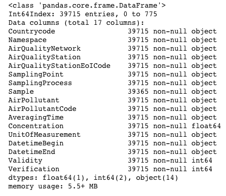
The EEA datasets contain data from 2013-2018 stored in 28 .csv files (partitioned by year) from five stations in the city. The columns within the dataset is as follow:
Issues:
- The data for each station has various levels of completeness for each station. Some stations contain all five years of data from 2013 to 2018, while others may only contain between one to three years of data.
- The granularity of data is different in 2017 and 2018 compared with the other years. The dataset of 2017 and 2018 contains hour-level data, while other years contain only day-level data. This added granularity gives us an additional layer of analysis, but we will not be able to compare the analysis across the years from 2013-2016.
- Although 2017 data provides added granularity, it is also incomplete. One would expect a full-year worth of data from 2017, but the dataset only contains hour-level data from November to December. This raises an issue as we are unable to conduct any form of analyses between January to October of 2017.
- The hour-level data for 2018 is only complete up till early September, and does not contain the full 24-hour data onwards.
Solutions:
As the given sets of data from the .zip folder is incomplete, I have opt to redownload the datasets from the official EEA website. I will elaborate on how I issues stated above are addressed below.
- I have chosen to only include the datasets from stations with the complete five-year data from 2013 to 2018. This ensures consistency of data used in our analyses.
- This proves to be an issue that cannot be addressed, since hour-level data is unavailable for the years 2013-2016.
- For 2017, I have chosen to use day-level data as it is a complete dataset.
- I only took data up till July 31st, 2018.
The resulting dataset contains 35713 rows, as compared to 39715 rows from above. Additionally, I have included a Datebegin column, derived from the DatetimeBegin column, to use as a key to join with the METEO dataset later on.
Citizen Science Air Quality Measurements (Air Tube Data)
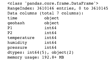
The Air Tube datasets contain data from 2017-2018, stored in 2 .csv files (partitioned by year) from instruments placed around the country. The columns within the dataset is as follow:
Issues:
- Datetime value in the ‘time’ column is stored in an unusable format (‘%Y-%m-%dT%H:%M:%SZ).
- Geographic data is stored in a geohash format.
- Dataset contains data from across Bulgaria, even though we are only interested in Sofia City.
Solutions:
- Parsed the time into a usable datetime format using Python’s library: datetime’s strptime() function.
- Used Python’s library: pygeohash to decode the geohash data.
- Used Python’s library: reverse_geocode to get tag each lat-long pair to a city within Bulgaria. This allowed me to filter easily for Sofia City during the analyses afterwards.
- Initially tried to use Google Map’s API to do the reverse geo-coding. However, the API constantly times out due to large number of calls.
- The reverse_geocode library has a set of known geocoded locations and uses a k-d tree to efficiently find the nearest neighbour, and hence allows geocoding to be done offline. This however leads to some inaccuracies in the parsed data, since the algorithm finds the nearest neighbour, which might not be the correct city of interest.
- (Additionally) I only took data up till July 31st, 2018.
The resulting dataset contains 35713 rows, as compared to 39715 rows from above. Additionally, I have included a Datebegin column, derived from the DatetimeBegin column, to use as a key to join with the METEO dataset later on.
Meteorological Measurements (METEO Data)
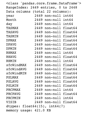
The METEO dataset contains information on temperature, humidity, wind speed, pressure, rainfall and visibility from 2012-2018. The columns within the dataset is as follow:
Issues:
- Date information is stored in 3 different columns – year, month and day.
Solutions:
- Create a new ‘Date’ column that combines the date information into ‘%Y-%m-%d’ format.
- (Additionally) I did not limit the date range to lie between 2013 and July 31st 2018, as we will be using this table for an inner join within Tableau.
Topography Data for Sofia City (TOPO Dataset)
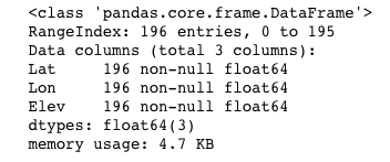
The TOPO dataset contains information on elevation of several coordinates around Sofia City. The columns within the dataset is as follow:
Data Transformation
In this section, we will be looking into how we transform the data that we pre-processed previously into data sources that we will be using for our analyses subsequently. For the analyses, the Tableau workbook be powered primarily by two data sources:
- EEA,METEO: Official Air Quality Measurements (EEA Data) + Meteorological Data (METEO Data)
- AirTube,METEO,TOPO: Citizen Science Air Quality Measurements (Air Tube Data) + Meteorological Measurements (METEO Data) + Topography Data for Sofia City (TOPO Dataset)
EEA,METEO
The transformation process is done within Tableau itself, with an inner join between the pre-processed EEA dataset and the pre-processed METEO dataset. The joining keys are Datebegin column from EEA and Date column from METEO.
AirTube,METEO,TOPO
The transformation process is broken down into two parts: joining the AirTube dataset to the TOPO dataset (Python), and joining the resulting table to the METEO dataset (within Tableau).
As the TOPO dataset’s coordinates are not comprehensive, a join was based on the lowest resulting distances using the Harversine formula. The Haversine formula determines the great circle distance between two points on a sphere given their longitudes and latitudes. Minimizing this distance allow us to classify each lat-long coordinate pair in the pre-processed Air Tube dataset to its closest counterpart on the TOPO dataset, and in turn allow us to estimate the elevation for each lat-long coordinate pair. Since the TOPO dataset only contains lat-long coordinates within Sofia City, the resulting table will incorrectly estimate elevation for lat-long coordinate pairs outside Sofia City to its closest counterpart within Sofia City. This is not a problem if the other coordinates are on the border of Sofia City, but will pose a problem if they are far away. However, since our analyses will focus primarily on data within Sofia City, the incorrect data can be ignored.
The resulting table is then joined on the pre-processed METEO dataset within Tableau, with an inner join between resulting table and the METEO dataset. The joining keys are Date column from EEA and Date column from METEO.
The Task
Task 1: Spatio-temporal Analysis of Official Air Quality
Task 2: Spatio-temporal Analysis of Citizen Science Air Quality Measurements
Task 3
| S/N | Observation | Information | Graph |
|---|---|---|---|
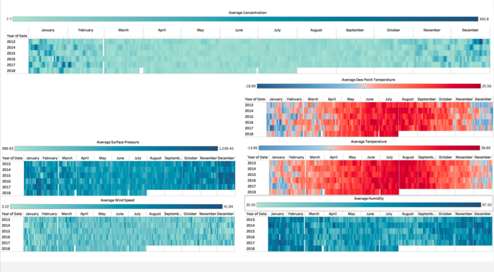
| 1 | At a glance, we are able to infer a correlation between Temperature, Humidity and Concentration of Air Pollutants. | Data Source: EEA,METEO Title: Meteorological Dashboard |
|
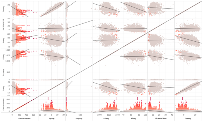
| 2 | Diving deeper, we are able to observe the same result with the correlation plot. | Data Source: EEA,METEO Title: Correlation Plot |
|
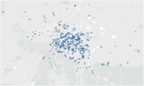
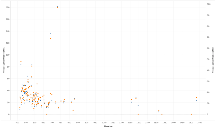
| 3 | Looking at the plot for Elevation, we can conclude that there is little correlation between elevation and the concentration of air pollutants (represented by P1 and P2 plots here). | Data Source: AirTube,METEO,TOPO Title: Elevation |
Reference
Interactive Vizualization
Haversine Formula
Pygeohash
Reverse Geocode

