IS428 2018-19 T1 Assign Cliff Halim Tirtamaya
Contents
Problem & Motivation
On the night of 8th January 2018, the government of Bulgaria issues a health warning to the country. The air quality in Sofia was described to be "catastrophic" that night, indicating an extremely high concentration of particulate matter (PM), the inhalation of which can lead to severe respiratory illnesses and heart disease. At about 6pm, the concentration of PM10 in Sofia’s Ovcha Kupel residential area was 993 µg/m³ (micrograms per cubic metre), and therefore at least 20 times higher than it should be.
Bulgaria has the highest concentrations of the two major varieties of particulate matter, which are tiny airborne droplets or gas particles that come from smokestacks, vehicle tailpipes or a variety of other sources. They can lead to health problems from asthma to cancer. Bulgaria also has the highest concentrations of carbon monoxide and sulfur dioxide, according to the report by the European Environment Agency.
This site serves to provide an analyses to the air pollution problem within the capital city of Sofia, taking into account Official Air Quality from government stations and numerous other airtube sensors from the Citizen Air Quality study. This study hopes to bring up notable interesting points with regards to the air pollution trends in Sofia, and provide readers with a better understanding to the problem. Below are the links to the dashboard developed for the purpose of this study.
Link to Official Air Quality Dashboard
Link to Citizen Air Quality Dashboard
Official Air Quality
Official Air Quality measurements are stored in the EEA dataset. For this particular dataset, the pollutant concentration measurements were collected over a span of 7 years from 2013 to 2018 by 5 to 6 stations. Over the years, some stations have either been decommissioned or installed in various locations. However, at any point in time, there is usually 5-6 stations collecting measurements.
Data Pre-processing of EEA Data
The EEA Dataset comprises of air quality data for Sofia in separate spreadsheets according to years. As such, to be able to analyse the measurements across different years, the spreadsheets that were separated by years had to be combined to a single csv file. This was done by utilizing the copy function within command prompt to iterate and read through all the csvs in a single folder and copy their contents onto a single new csv. For this to work properly, each csv had to be in a similar format with the same headers (which is so in this case). The code and running the process can be found in the screenshot below.
After combining the csvs, the final combined dataset is loaded onto Tableau with the metadata csv, left joined to the combined data, in order to provide the geographic (longitude and latitude) data for each of the stations.
Task 1: Spatio-temporal Analysis of Official Air Quality
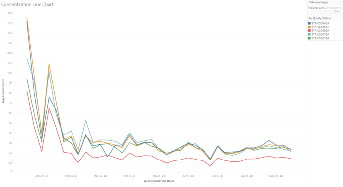
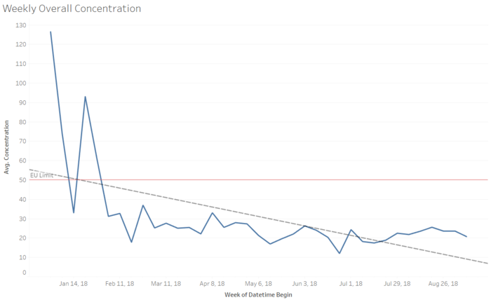
Based on the Official Air Quality data (EEA dataset), the average pollutant concentration levels of 5 out of the 6 stations have been on a decreasing trend since the beginning of 2018 (dated from 6th Jan 2018). With the exception of a spike at the end of January 2018, the trend has been on a general decline as showcased by the trendline in the chart below, implying that air quality has generally improved in Sofia city.
From the start of February 2018, average concentration levels have remained below 50 μg/m3, the limit of EU standard. These levels have been fluctuating within a range of 10-40 μg/m3 till beginning of September 2018. The overall year-on-year analysis shows that air quality has improved significantly from previous years.
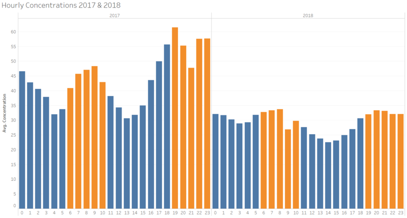
A deep-dive down to a day-to-day detail of concentration levels yielded a notable observation. Comparison of day-to-day concentration levels showed that average concentration in the nighttime is consistently higher than that of daytime. For a clearer view of this observation, the bar chart below shows an average breakdown by the hour throughout the day for the year of 2017 and 2018.
For a typical day in Sofia city, concentration levels dips down during the day starting around 11:00 hours. At approximately 16:00 hours, the concentration levels begin to climb and remain consistently higher for the nighttime before repeating the cycle again. This could be an effect of the temperature changes throughout the day which will be elaborated upon in the later section.
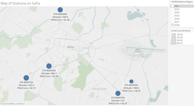
With the longitude and latitude data provided by the metadata, the 5 stations were plotted onto the map Sofia city to showcase the locations of these stations. The distribution of the stations is shown below. This is displayed with a google map view of Sofia city with both natural and man-made features, in order to better provide an understanding with the area in direct proximity with the stations.
The size of the plots for each of the stations was set to correspond with the average concentration levels for each of the station. From the plot chart above, in 2018, it can be observed that the 3 stations located in central-west area of Sofia city have higher average concentration levels as compared the 2 stations in the south east area. A comparison with the view of google map of Sofia city indicates a higher level of human and industrial activity in the central and western area of the city. There is a denser population volume in the stated area and these are all possible contributing factors to a higher average concentration level in the area.
The datasets provided are not fully cleaned with all data integrity. As such, there were several anomalies that can be observed through data visualizations:
| Suspected Anomaly | Visual Evidence |
|---|---|
|
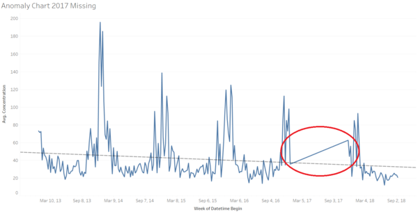
For the year of 2017, data is only collected for the month of December (beginning from 28th November 2018). This can be inferred from the chart below that shows a sudden jump in average concentration levels from 25 December 2016 to 26 November 2017. |
|
|
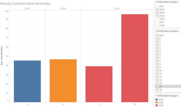
For the year of 2013 and 2014, the data did not show an hourly breakdown and measurements were only taken on 00:00 hour. Similarly so for the year 2015, only an additional measurement was taken on 23:00 hour. No information was provided for this anomaly from the dataset provided. A possibility would be a change in the measurement process of the concentration levels. |
Citizen Science Air Quality Measurements Data
The Citizen Science Air Quality Measurements data comprises of sensors located all across the city, measuring presumably, pollutant concentration levels, under P1 and P2 attributes. The data also includes measurement of humidity, temperature and pressure for the various stations.
Data Pre-processing of Airtube Data
Topography of the data records are included as a geohash code. In order to convert the geohash code into longitude and latitude data, the dataset was loaded into Rstudio. An R package, Ironholds Geohash, was installed for the conversion. After obtaining the longitude and latitude data of the geohash code for the sensors, the sensor locations were mapped out geographically on Tableau.
Task 2: Spatio-temporal Analysis of Citizen Science Air Quality Measurements
(2A) Sensor Coverage, Performance and Operation
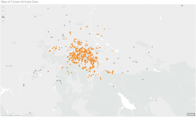
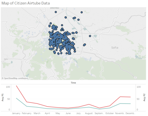
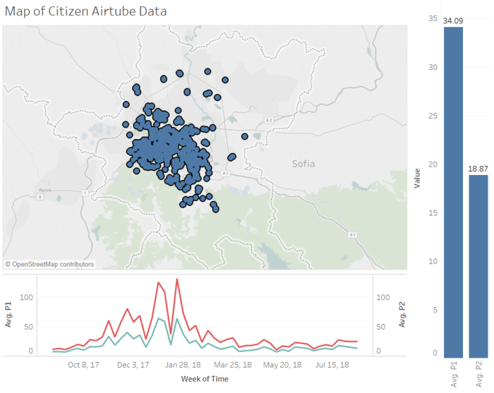
Sensor locations were mapped out geographically on the open source map within Tableau. Several of the sensors were located outside the Sofia city. However, for the purpose of this analyses, only sensors located within the boundaries of Sofia grad were considered. The sensors located within were selected and grouped as a set for filtering purposes.
The coverage of the sensors are heavily condensed within the central area of Sofia city. The edges of the city, particularly so for northern and southern region, have far lesser number of sensors measuring for air quality. From the map shown, the extreme south of the country have close to zero sensors in the area. However, an assessment of geographical features seem to indicate less man-made features, possibly indicating lesser population volume in the area.
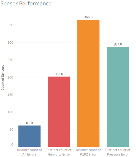
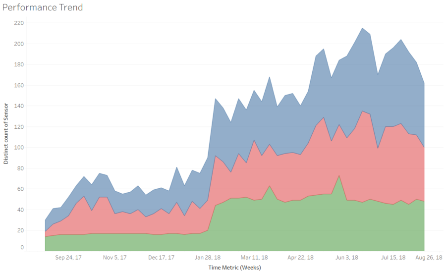
Sensor activity and performance is analysed by the measurements collected at the respective timings. For example, humidity and pressure readings of 0 or negative values are assumed to be error values (as they are not realistically possible). P1 and P2 readings that shows a value of 0 can also possibly indicate the lack of measurement at that point in time as it is unlikely that the surrounding air will have no pollutants at all, also indicating equipment malfunction. Therefore, these 3 factors will be the main factors used to analyse the performance of the sensors around Sofia city.
With reference to the charts above, the bar chart on the left indicates the proportion of sensors with the respective errors. It can be observed that, of all malfunctioning sensors, a majority of them exhibit P1 and P2 errors (either 0 or negative values). The count of "All Errors" refers to the number of sensors that exhibit all malfunctioning properties (0 or negative values for humidity, pressure, P1 and P2 values). Upon plotting these counts of malfunctioning sensors against a weekly metric, it seems to indicate that there is a spike in the number of malfunctioning sensors in the beginning of 2018.
(2B) Air Pollution Measurements
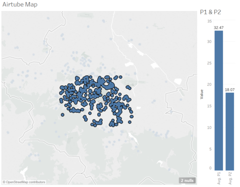
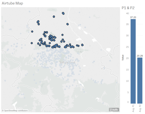
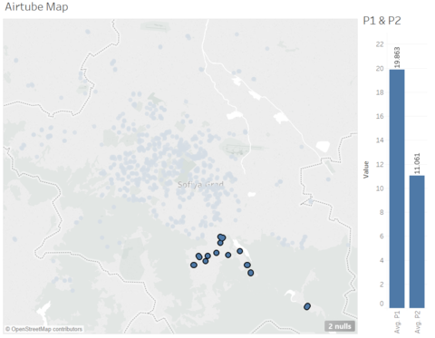
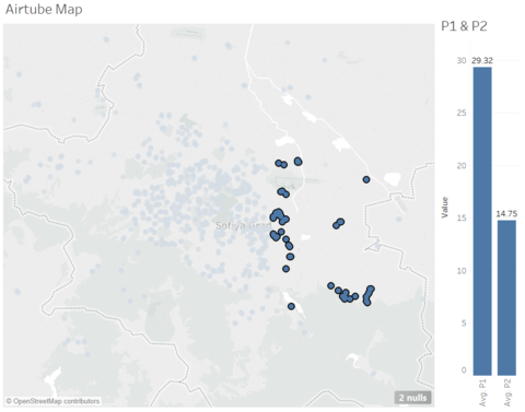
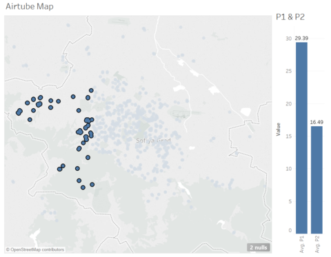
Let us now analyse the air pollution measurements by these sensors. Due to the large number of sensors located all over Sofia city, it will be more comprehensive to analyse groups of sensors based on where they are located in the city, be it North, South, East, West and Central. Sensors have been grouped and filtered accordingly, and average P1 and P2 values (assumed to be pollutant concentrations) were measured by the areas.
| Central | North | South |
|---|---|---|
| East | West |
|---|---|
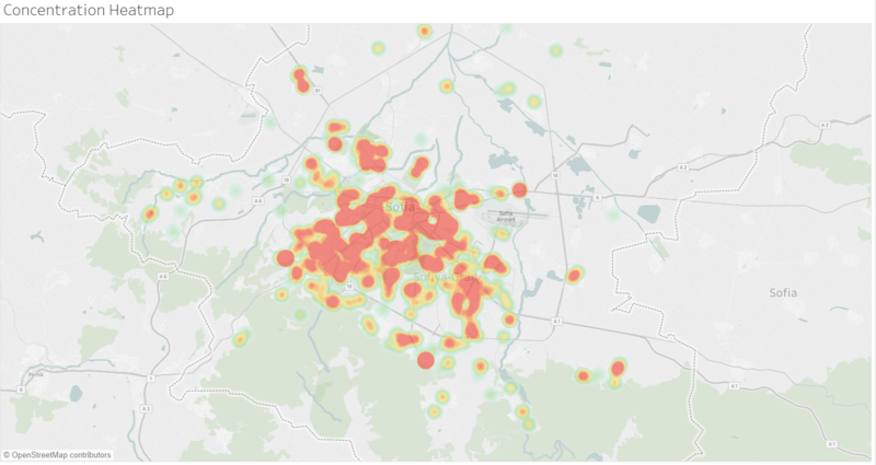
From the charts above, average P1 and P2 values are higher in the north-western areas of Sofia city. These results are consistent with of the findings in task 1, being linked to the observation that much of the population density are clustered around the city center where most of the industrial activity takes place. A heatmap distribution of P1 values is shown below, indicating the centrality of the concentration levels.
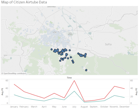
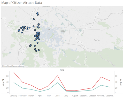
As we consider the monthly breakdown of these average concentration values, it can be noted that for most of the central, northern and eastern part of Sofia, the average concentration values follows a similar pattern across the year. However, for the western area of the city, concentration values were significantly higher in the month of June and the same is so for the southern part of the city in the month of July.
| Central & North-eastern | South | West |
|---|---|---|
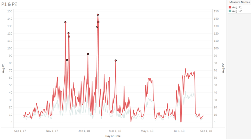
As we break it down further into the day-to-day concentration values, we can observe an notable point of interest. From the chart below, we find the highest concentration points in Sofia city is in the end of 2017 (Nov to Dec) and beginning of 2018 (Jan to Feb). This is aligned to the warning sent out by the Bulgaria government on January 8, 2018 and a second warning on January 20, 2018 to the citizens for high levels pollutant concentration.
Meteorological and Topography Data
Data Pre-processing of METEO and TOPO Data
The METEO dataset provided comprises of various attributes such as temperature, humidity, precipitation and wind speed. The minimum, maximum and averages of all these attributes were also given to us. This dataset was left-joined to the Citizen Air Quality Airtube data on the "time" attribute. As the METEO data only comprises of dates and not time, the DATE() function was utilised to extract the date portion of "time" attribute.
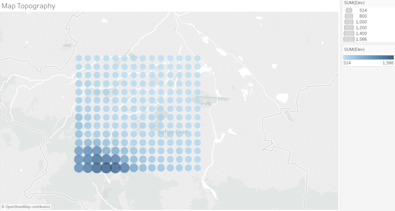
For the topographical data, each longitude and latitude position was given and unique numerical ID and plotted onto the map. The altitude levels were then included in the visualization through the coloring and sizing of the plots, to indicate which areas of the map have a higher or lower altitude.
Task 3: External Factors and Effects on Concentration Levels
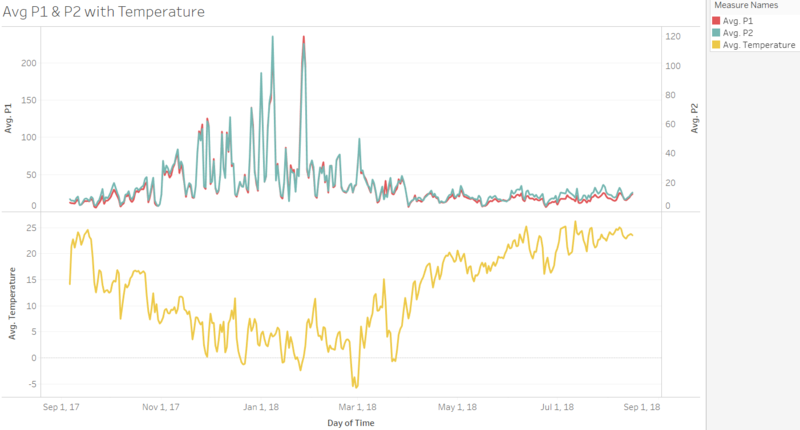
To investigate the relationships between pollutant concentration levels and environmental factors, we will first refer back to the Citizen Air Quality sensor data and supplement the analyses with meteorological and topographical data provided. As we analyse the pattern of concentration levels against temperature fluctuations, we can observe that concentration levels tend to spike in lower temperatures while falling in higher temperatures.
As temperatures fall, the surrounding cold air contracts and becomes denser, thus descending towards ground level, resulting in the pollutants to be concentrated closer to ground level near the sensors. When temperatures rise, the air becomes hotter and expands, becoming less dense. The air rises into the atmosphere and brings the pollutant particles along with it, resulting in lower average concentration levels.
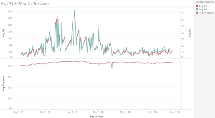
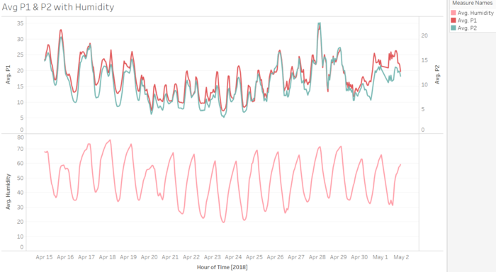
In contrast, with reference to charts below, there seems to be no observable correlation with concentration levels and pressure levels. For humidity effects, the chart on the right below showcases average concentration levels and humidity levels for half a month by the hour every day. It is interesting to point out that both lines tend to exhibit a similar pattern. However, from these alone, we are unable to determine if there is an actual correlation or causation between humidity and concentration levels.
The altitude at which the concentrations were measured also has an impact to the concentration levels. Topography data of sofia city reveals that the south-western part of the city has a higher average altitude as compared to the northern part of the city. From the chart blow., the size and color of the plots indicate the altitude levels of the particular area. The larger and darker the plot, the higher the altitude the plotted area.
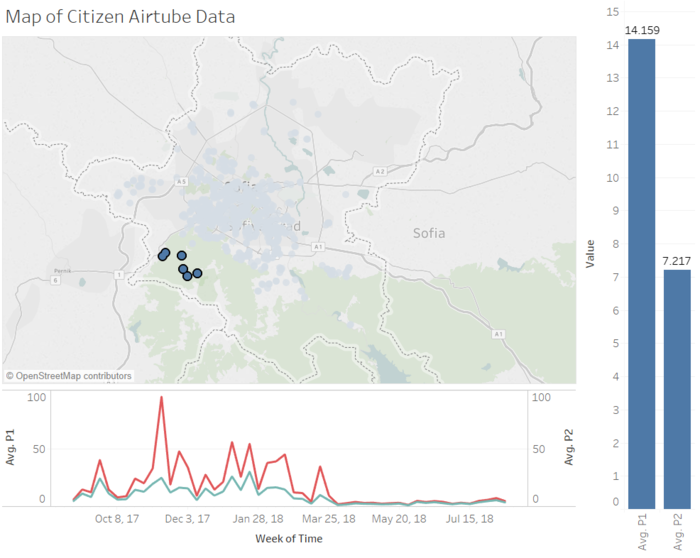
With reference to the airtube data, the sensors located in the area with higher altitudes exhibit lower average concentration levels as compared to the numerous sensors located at the lower altitude areas. From the comparison of the two charts below, sensors located in higher altitude areas have an average of 14.2 and 7.2 for P1 and P2 respectively. In contrast, sensors located in lower altitude areas have an average of 34.1 and 18.9 for P1 and P2 respectively. In a separate study conducted in New Delhi, India, researchers have also found similar results in measuring the relationship between altitude and pollutant concentrations. Air pollutants, the heavier particles in general, are unlikely to be carried off to higher altitudes.
| High Altitude | Low Altitude |
|---|---|
References
In the completion of the analysis, the following references have been useful:

