IS428 AY2018-19T1 Le Van Tuan Long
To be a Visual Detective
Contents
Overview
Air pollution is an important risk factor for health in Europe and worldwide. A recent review of the global burden of disease showed that it is one of the top ten risk factors for health globally. Worldwide an estimated 7 million people died prematurely because of pollution; in the European Union (EU) 400,000 people suffer a premature death. The Organisation for Economic Cooperation and Development (OECD) predicts that in 2050 outdoor air pollution will be the top cause of environmentally related deaths worldwide. In addition, air pollution has also been classified as the leading environmental cause of cancer.
Air quality in Bulgaria is a big concern: measurements show that citizens all over the country breathe in air that is considered harmful to health. For example, concentrations of PM2.5 and PM10 are much higher than what the EU and the World Health Organization (WHO) have set to protect health.
Bulgaria had the highest PM2.5 concentrations of all EU-28 member states in urban areas over a three-year average. For PM10, Bulgaria is also leading on the top polluted countries with 77 μg/m3on the daily mean concentration (EU limit value is 50 μg/m3).
According to the WHO, 60 percent of the urban population in Bulgaria is exposed to dangerous (unhealthy) levels of particulate matter (PM10).
==
Task 1: Spatio-temporal Analysis of Official Air Quality
Questions:
Characterize the past and most recent situation with respect to air quality measures in Sofia City. What does a typical day look like for Sofia city? Do you see any trends of possible interest in this investigation? What anomalies do you find in the official air quality dataset? How do these affect your analysis of potential problems to the environment?
Data Cleaning & Transformation:
To investigate the above problems, we need to clean the data and then visualise the dataset. The cleaning process involves:
- Combining all the datasets across the years into one excel file
- Linking the dataset with the metadata to retrieve the longitude and latitude of the air quality station
Dashboard 1:
Tableau Public Link: [[1]]
This dashboard uses data from 2013 to 2017 which contains the daily readings of the air quality at different stations
This dashboard allows the users to:
- 1. See the fluctuations in the air pollutants daily, and
- 2. Drill-down and filter the data by Year and by Air Quality Station
Visualisation 1:
Image:
Description:
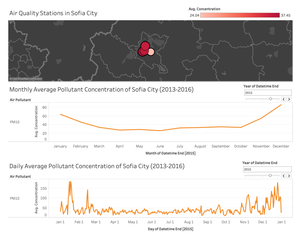
This visualisation shows Sofia city map and the location of the air quality station.
The colour and the size indicate the average pollutants level of that station. The user would be able to select the station to filter visualisation 2 and 3 below.
Insights:
The station with the worst air quality is station 73A as compared to station 52A with the lowest average pollutant readings
Visualisation 2:
Image:
Description:
This visualisation shows the monthly average air quality of Sofia city
The user would be able to filter by year and observe the trends on how air quality changes over the months in the selected year
Insights:
From the visualisation, we can observe the trend that air quality is the worst at the start and at the end of the year from the month of December to January
Visualisation 3:
Image:
Description:
This visualisation shows the daily average air quality of Sofia city
The user would be able to filter by year and observe the trends on how air quality changes over the the days in a selected year
Insights:
From this visualisation we can see that the daily average fluctuates greatly daily. However, the air quality clearly shoots up at the end and the start of the year from December to January
Dashboard 2:
Tableau Public Link: [[2]]
This dashboard uses data in 2018 which contains the hourly readings of air quality
This dashboard allows the users to:
- See the fluctuations in the air pollutants hourly and daily, and
- Compare the air pollutant readings across different air quality stations
Visualisation 1:
Image:
Description:
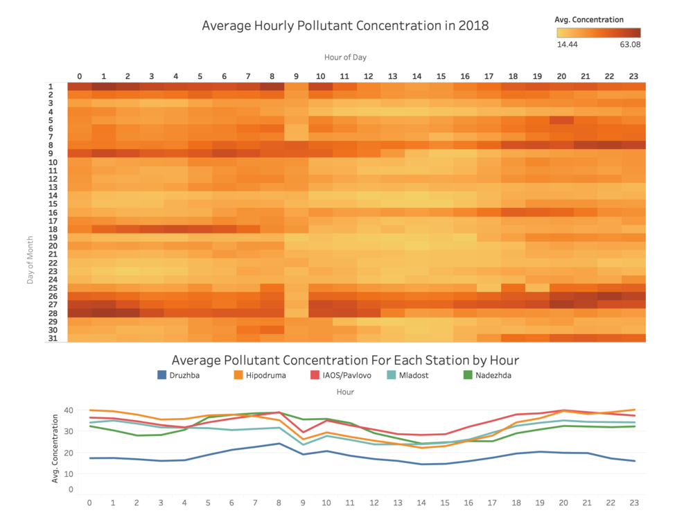
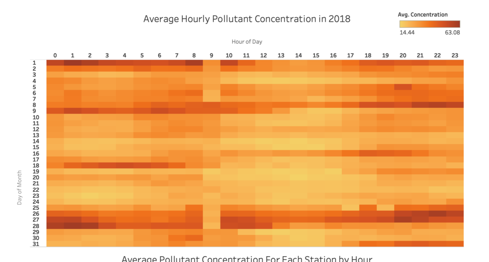
This visualisation shows the heat-map of the average hourly pollutant concentration in 2018 with the x-axis being the hour of the day and the y-axis being the day of the month
The user would be able to:
- Compare the pollutant concentration across the days in a month
- Compare the pollutant concentration across the hours in a day
This would allow us to answer the question of how is the air quality like in a typical day of Sofia city
Insights:
From the visualisation, we have the following conclusions:
- For some days (e.g. day 14), the air quality is consistently low throughout relative to other days
- Some other days (e.g. day 26, 27), the air quality is consistently high throughout
- Some days (e.g. day 16, 18), the air quality fluctuates greatly throughout the days with either morning or evening having worse air quality than the other
Visualisation 2:
Image:
Description:
This visualisation shows the line graph of hourly average pollutant concentration for each of the stations in 2018
The user would be able to:
- Compare the hourly average pollutant concentration across different stations
This would allow us to answer the question of how is the air quality like in a typical day of Sofia city taking into account of the area that the station is situated
Insights:
From the visualisation, we have the following conclusions:
- Looking at all the stations, station Druzhba is observed to have significantly lower PM10 level which indicates that the air quality at the area of Druzhba station is relatively better than other stations
- The other four stations are approximately the same throughout the 24 hours of the day
Task 2: Spatio-temporal Analysis of Citizen Science Air Quality Measurements
Questions:
Using appropriate data visualisation, you are required will be asked to answer the following types of questions:
- Characterize the sensors’ coverage, performance and operation. Are they well distributed over the entire city? Are they all working properly at all times? Can you detect any unexpected behaviors of the sensors through analyzing the readings they capture? Limit your response to no more than 4 images and 600 words.
- Now turn your attention to the air pollution measurements themselves. Which part of the city shows relatively higher readings than others? Are these differences time dependent? Limit your response to no more than 6 images and 800 words.
Data Cleaning & Transformation:
-Enter Q2 Cleaning-
Dashboard 1:
Dashboard 2:
Questions:
Urban air pollution is a complex issue. There are many factors affecting the air quality of a city. Some of the possible causes are:
- Local energy sources. For example, according to Unmask My City, a global initiative by doctors, nurses, public health practitioners, and allied health professionals dedicated to improving air quality and reducing emissions in our cities, Bulgaria’s main sources of PM10, and fine particle pollution PM2.5 (particles 2.5 microns or smaller) are household burning of fossil fuels or biomass, and transport.
- Local meteorology such as temperature, pressure, rainfall, humidity, wind etc
- Local topography
- Complex interactions between local topography and meteorological characteristics.
- Transboundary pollution for example the haze that intruded into Singapore from our neighbours.
In this third task, you are required to reveal the relationships between the factors mentioned above and the air quality measure detected in Task 1 and Task 2. Limit your response to no more than 5 images and 600 words.
Data Cleaning & Transformation:
Refer to the cleaning and preparation of task 2. For task 3 we are using the same dataset.
In order to study the topology of the area, we downloaded and topology map of the country. Credits to the topology map found here: [[3]]
Dashboard 1:
Tableau Public Link: [[4]]
This dashboard aims to show the relationship between the pollutants level and the meteorology factors such as: pressure, humidity and temperature.
The dataset can be filtered for year 2017 and year 2018
- YEAR 2017
- YEAR 2018
Visualisation 2:
Image:
Description:
This visualisation shows the line graph of hourly average pollutant concentration for each of the stations in 2018
The user would be able to:
- Compare the hourly average pollutant concentration across different stations
This would allow us to answer the question of how is the air quality like in a typical day of Sofia city taking into account of the area that the station is situated
Insights:
From the visualisation, we have the following conclusions:
- Looking at all the stations, station Druzhba is observed to have significantly lower PM10 level which indicates that the air quality at the area of Druzhba station is relatively better than other stations
- The other four stations are approximately the same throughout the 24 hours of the day
Dashboard 2:
Tableau Public Link: [[5]]
Conclusion
Reference
Feedbacks
Please feel free to provide your feedback. Thank you.


