IS428 AY2018-19T1 Lee Hyeonjeong
Contents
Problem & Motivation
Air pollution is currently a significant concern among many European countries, known to be one of the top risk factors for health. This is specifically a huge concern in Bulgaria, as the concentrations of PM2.5 and PM10 far exceed the restrictions set by the European Union (EU) and the World Health Organization with the objective to reduce health risks. As of the past three years, Bulgaria has had the highest PM2.5 concentrations among its neighbouring countries, leading it to become one of the most polluted regions in the world.
The health risks among Bulgarians are increasing, as 60 percent of the urban population in this country is being exposed to dangerous particulate matters. As such, there is an urgent need to address such a concern by analysing the current trends and patterns of PM2.5 and PM10 concentrations so that effective measures can be taken.
With the data collected over the 6 years (2013 – 2018), we can create an interactive visual platform using Tableau to help efficiently track and identify major patterns that will be helpful in solving this concern. This platform will meet the following objectives:
1. Identify typical patterns, interesting events and trends in the past and recent by the levels of PM10 concentrations, as reported by official data
2. Identify patterns, events and abnormal patterns in the Citizen Science Air Quality data through pollution concentrations and other various meteorological data
3. Analyse and identify potential associations among variables that may correlate with the air pollution.
Data Exploration & Transformation Process
The dataset zip file given had 4 different folders. Each of the folders provides different records as follows:
- EEA Data (time series PM10 concentrations from 2013 – 2018, recorded as official)
- Air Tube Data (meteorological and concentrations from 2017-2018 in various regions)
- METEO data (basic statistic summary such as wind, etc. from 2012-2018)
- TOPO data (topographical data with elevation)
Official Air Quality Data (EEA)
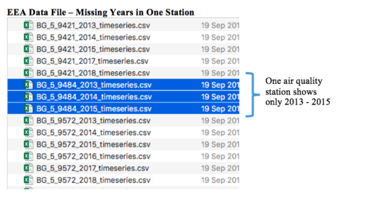
There are a total of 6 stations in the file, with a year range of 2013 to 2018 for each station excluding one station.
Issue: Since this station’s dataset has records only up until 2015, it may not be useful in the analysis.
Solution: As this station’s data will have a huge gap from the current data, it may not show meaningful analysis on the typical patterns and how it has changed over time until recently. Hence, it will be removed from the dataset and thus will not be included in the visualization.
For the remaining 5 stations data, the variable types are the same (level of concentration, station type, date time begin, etc.). This can be easily seen by using text-to-columns in excel. After which, all the 5 stations’ time series data have been merged to one excel file.
Issue: During the process of merging the data, there was a separate meta-data file found in a separate spreadsheet, containing the geographical data (latitude, longitude, altitude, etc.) of the 6 stations. This will be an issue when joining the data in Tableau.
Solution: To make the process more convenient, the ideal solution is to merge the two spreadsheets (meta data & merged EEA data) into one file. This process is possible using Excel’s lookup function. With this, it would be possible to perform a map visualization using the longitude and latitude in Tableau.
Air Tube Data
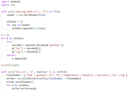
Due to the encoded locations, it was necessary to clean the data using geohash decoding in order to analyze the location through Tableau. The following Python script was used decode:
Meteo Data
For the purpose of task 3, exploratory data analysis of the METEO and TOPO data was done to find significant correlations with data from the previous tasks. Some interesting observations were:
1. Through the map function in tableau, I was able to find that the METEO data describes a location near Sofia Airport which happens to be around Mladost (found in EEA data in Task 1).
2. Mladost currently has data from January 2018 as is split based on “hours,” but the location in METEO data is currently split based on “days.” As such, we can combine the two datasets and see what factors could be affecting the concentrations in Mladost.
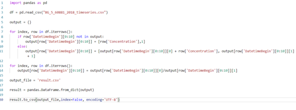
Transforming EEA – Mladost 2018 data: In order to aggregate the hourly data of Mladost to daily data, we can run a script in Python as follows:
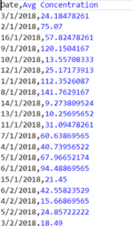
This script made two columns: Date (in day format) and average PM10 concentration per day. We can see the output as follows:
Transforming METEO data: Using Power Query in excel, the METEO csv file was cleaned by combining the year, month, and day into one column using combined columns.
With the two new cleaned files, I was able to join the two data through Tableau’s inner join function. The join was done based on the data columns. With this, it is possible to create the visualization needed for Task 3.
Interactive Visualization
The interactive storyboard can be accessed here (use with Generic Desktop / full screen view):
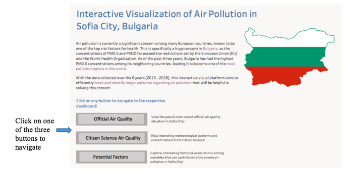
As there are many dimensions and measures to consider in this visualization, various dashboards have been created for a more comprehensive analysis. The home dashboard aims to provide the users with an overall view of the objective of this interactive platform through a short summary. Furthermore, there are three different buttons where each will navigate to a specific dashboard.
Task 1
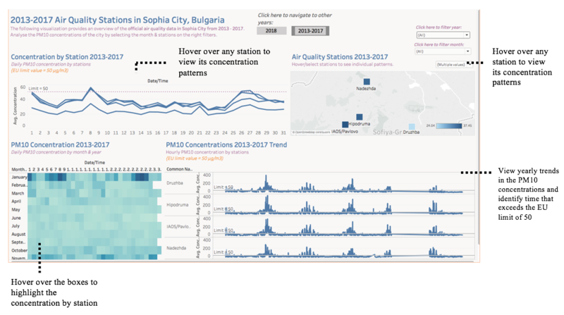
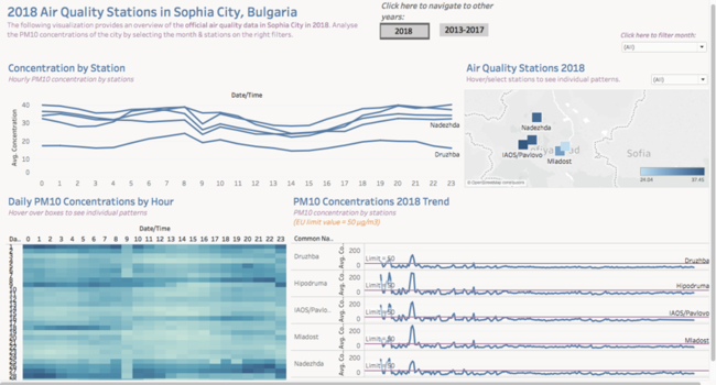
The official air quality visualization is split into two dashboards: 2013-2017 and 2018. There are two main interactive tools on the top side of each dashboard.
Dashboard 1: 2013 - 2017
Dashboard 2: 2018
These two dashboards each provide a total of 4 visuals, with different features enabled:
1. Concentration by Station:
- Line chart that provides the concentration over the 24 hours. The limit line = 50 enables the viewer to see how severe / high the concentration may be.
2. Air Quality Stations:
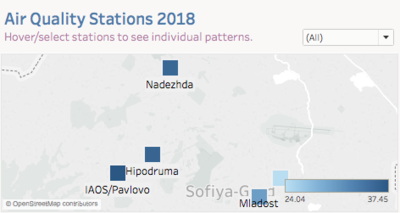
- Map that provides a location of the stations. Marked by color intensity to denote the level of PM10 concentration. Also acts as a filter to filter the other charts based on the selected region.
- Hover over the regions to view a tooltip of the air quality station name and PM10 concentration. Hovering or selecting the region from the dropdown will filter the other charts in the dashboard.
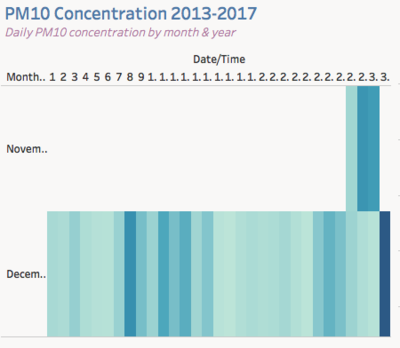
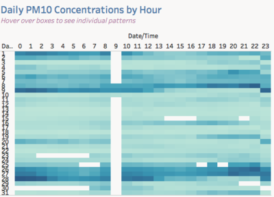
3. PM Concentration:
- Heat map that conveniently shows the level of concentration of PM10 across month & year for the dashboard in 2013-2017, and hour & day for the one in 2018.
- Hover over the boxes to see highlights in other charts to see appropriate associations / relationships over time.
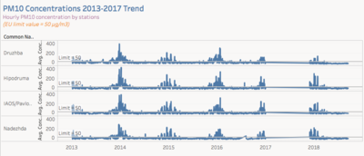
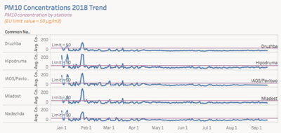
4. PM10 Concentrations Trend:
- Line chart by station to view the trend in concentration over the years (2013 – 2017) or months (2018) and the trend may differ across stations.
Task 1 Questions & Answers
1. What is the typical day like in Sofia City?
| Description | Visual Proof |
|---|---|
| Taking a closer look at the map in default (overall), there seems to a higher concentration in the west side of the region (Pavlovo, Hipodruma, and Nadezhda) than in the east side of the region. The average concentration across all regions in 2018 seem to be ranging from around 24 to 37 ug/m3). This also does not seem to have changed much from the 2013-2017 data, as the three regions were still the most concentrated areas in the past. This could potentially mean that on average, air pollution particles are more concentrated in the west region and less in the East region. However, as mentioned in the previous data preparation step, elevation did not serve a significant reason to the difference in concentration levels; as such, the government should explore other potential factors.Compared to the 2013-2017 PM10 concentrations dashboard, we can notice that the average concentrations has decreased recently, with a level lower than 50 (limit set by the EU). Further actions must be placed on the three significantly polluted areas as their concentration levels have been a serious concern since the past. |
|
| According to the Concentration by Station chart, all the 5 stations seem to have similar patterns in the change in concentration throughout the hours. It is highly noticeable that Druzbha has the lowest average concentration on a daily basis, whereas Pavlovo seem to have the highest on average over the hours. We can also notice from the Concentration by Station chart and the Daily PM10 Concentrations by Hour chart that the average concentration significantly drops around 9am, before it starts to rise again around 10am. From noon – 3pm, we can tell that the concentrations decrease before it starts to peak again after 3pm. It would be meaningful to explore potential factors / causes that make the concentration levels higher in the night time / dawn, and the government should be reminding the citizens to be aware of such patterns as well. |
2. Describe trends of possible interests
| Description | Visual Proof |
|---|---|
| Taking a look at the PM Concentration 2018 Trend, we can notice that all stations had an extremely high concentration level in December, January and early February, and started to drop further over the later months. All stations peaked the highest concentration level around 26-27th in January. In fact, in January 27, 2018, Mladost faced the highest concentration of 258.2, which is surprising as it does not fall under the top three highest average concentrated stations overall. This is applicable to previous years as well - from December 2013 to January 2014, each of the stations peaked the highest concentration levels. The extremely severe concentration levels can be attributed to the Bulgarian traditions during the festive seasons where they often burn wood to build fire, noted to represent the new birth of the sun. As this is a ritual, it is likely that it is one of the causes that spikes the pollution level every year in that season. |
|
| We can tell that from April 2018 onwards, Sofia City’s 5 stations hardly reached the EU’s concentration limit of 50 ug/m3 on average. This is an improvement as compared to the earlier months where the concentration often passed the limit.We can definitely tell that there has been effective measures taken to reduce the daily average concentration levels to be below the EU limit. However, the government would have to take note that it may rise again in December / January next year. |
3. Anomalies in the official air quality dataset? How do these affect your analysis of potential problems to the environment?
| Description | Visual Proof |
|---|---|
| From the PM10 Concentrations 2013-2017 Trend, we can notice that there is an abnormal trend in 2017. After filtering 2017 from the year range filter on the top right, we can notice that there is actually missing data for all stations regarding the concentrations from January to partial November. | |
| From the 2018 Concentrations data, we may think why 9am seems to have a sudden low average concentration level. After filtering the month on the top right (to January), we can see that there is missing data for 9am in January. When filtering certain months, there are some other missing values on other hours as well. In order to effectively measure the concentration level trends, it is necessary to keep proper track every month. |
Task 2
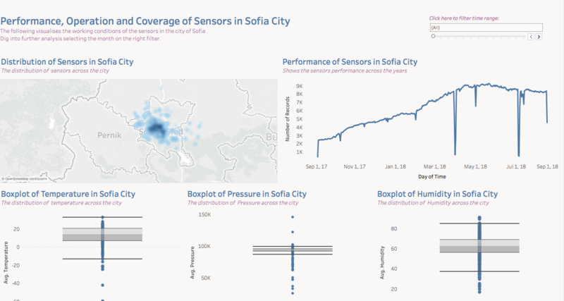
Dashboard 1: Sensor Operations - Coverage and Performance
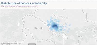
1. Distribution of Sensors Heat map
- Shows the distribution of the sensors' coverage in the city
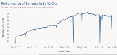
2. Performance of Sensors in Sofia City
- Line chart that shows the sensors' performance over the years through the number of records
3. Distribution of Variables
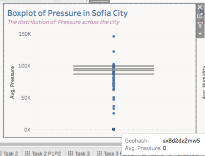
- Box plot that shows the distribution of variables during the time range.
- Can hover over the outliers to see which sensors may not be working
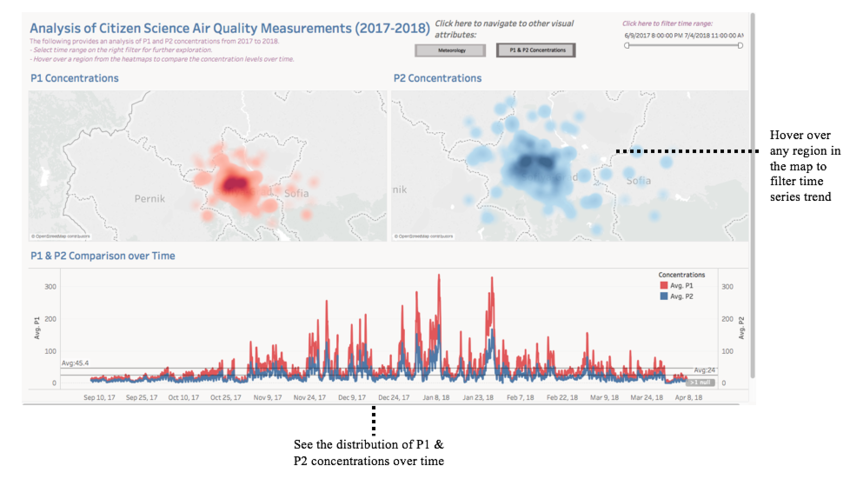
Dashboard 2: P1 & P2 Concentrations
1. Heat Map of P1 & P2
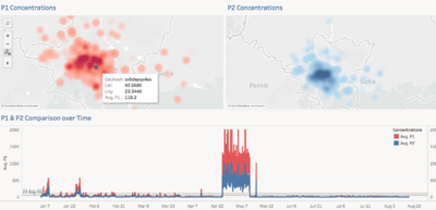
- Shows the concentrations of P1 & P2 particles around the city. Can see how the concentration is distributed / spread out over the regions.
- Hover over a region in any heat map to see the P1 & P2 Comparison over time in just that region.
2. Time Series Chart
- Time series chart to display distribution of P1 & P2 concentrations over time. This can be filtered using the time range on the top.
- The average line of P1 & P2 can be easily seen and is changed whenever the user filters by a specific region.
Task 2 Questions & Answers
1. Characterize the sensors’ coverage, performance and operation. Are they well distributed over the entire city? Are they all working properly at all times? Can you detect any unexpected behaviors of the sensors through analyzing the readings they capture?
| Description | Visual Proof |
|---|---|
| From the first dashboard, we can see from the "Distribution of Sensors in Sofia City" map that the sensors are not covering the entire city as the levels are mostly concentrated towards the middle, and the East and South regions of the city are not properly covered. | |
| From the "Performance of Sensors in Sofia City," we can tell that there are several downward spikes in the number of sensor records, especially in March 31st and July 4th, 2018. The sensors should be inspected further to lessen the defects arising in the future. | |
| From the box plots, we are able to identify the possible defective sensors by looking at the lower end outliers. For example, we can tell that this particular geohash (shown on the picture) has not worked at all during the time range as its pressure and humidity appears to be 0. Comparing the three boxplots, it is possible to tell which sensors may have not been working at least once throughout the year. In addition to adding more sensors in the uncovered regions, there should also be inspections on the existing regions’ sensors so that we can measure the distribution more effectively. |
2. Now turn your attention to the air pollution measurements themselves. Which part of the city shows relatively higher readings than others? Are these differences time dependent?
| Description | Visual Proof |
|---|---|
| From the P1 & P2 Concentrations, we can tell that both P1 and P2 concentrations are similarly distributed, as shown in the heat map. Both pollutants are most intensively concentrated around the middle/ west of the region, whereas both pollutants are less heavily concentrated in the outer regions. We can see that there is a positive correlation between P1 and P2 concentraions. Regions that have a high P1 level are highly likely to also have a high P2 concentration level. Given that most of the central region seem to be most polluted, we can think of various factors that can lead to this problem. As air pollution can be due to both natural and human causes, we can speculate that the central region is most crowded in transportation and human activities. |
|
| As the average P1 concentration is 45.4 in default (whereas P2 average concentration is 24), in normal cases P1 will have a higher concentration level over the years when a region is hovered over from the heat map. From the time-series graph, we can tell that the concentration levels are less in Mar- October and higher in December – January. This observation aligns with our previous findings with the PM10 concentration levels in the first dashboard, where concentration levels peak in those two months. The government can take measures to speculate and identify possible causes of this (e.g. weather, annual year-end human activities, winter break causing severe transport pollution, etc). | |
|
By hovering over a region from any of the heat maps above, we can tell that for that particular sensor, there are anomalies in the data over some time range. This can be used to further inspect when there can be defects in the sensors. |
Task 3
There are two dashboards used to look for associations between various variables and the average concentration.
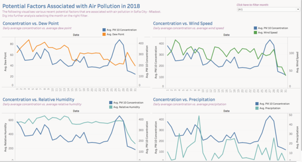
Dashboard 1: Potential Factors Associated with Air Pollution 2018
Concentration vs. Variables - Analysis of Task 1
- Line charts that visualise the relationship between PM10 concentration and the respective variables.
- Filter month on the top right in order to explore patterns per month.
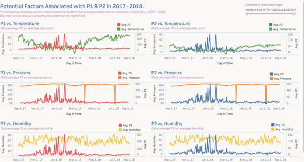
Dashboard 2: Potential Factors Associated with P1 & P2
P1 / P2 vs. Variable - Analysis of Task 2
- Line charts that show a trend in P1 or P2 concentrations vs. the variables by days from part of 2017 - 2018.
- Slide over the time range to explore patterns for a particular time range.
Task 3 Questions & Answers
1. Reveal the relationships between the factors mentioned above and the air quality measure detected in Task 1 and Task 2.
For Task 1:
| Description | Visual Proof |
|---|---|
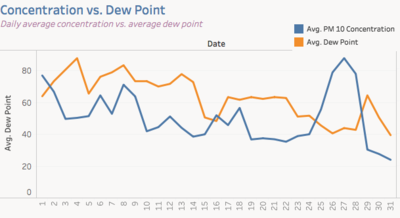
| For "Dew Point vs. PM10 Concentration," we are able to tell that the dew point has a negative relationship with the concentration. When the dew point increases, the concentration of PM10 decreases, and vice-versa. | |
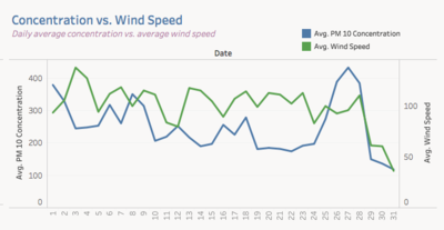
| For "Wind Speed vs. PM10 Concentration," we can tell that wind speed also has a negative relationship with PM10 concentration. | |
| For "Relative Humidity vs PM10 Concentration,"unlike the above 2 points, RH seems to have a slight positive relationship with concentration as when RH increases, concentration decreases. Similarly, for "Precipitation vs PM10 Concentration," precipitation also has a slight positive relationship with the concentration. |
For Task 2:
| Description | Visual Proof |
|---|---|
| For "P1 vs Temperature" or "P2 vs Temperature," the temperature seems to have a negative relationship with the concentrations, as they both decrease as temperature increases. | |
| For "P1/P2 vs Pressure," pressure has a positive relationship with P1 and P2, although the relationship is not as strong and evident, when pressure increases, the concentrations also increase. | |
| For "P1/P2 vs Humidity," it also follows the same trend as Pressure vs P1/P2. Although not as strong, when humidity increases, the concentrations increase. |
Conclusion
With the two comprehensive visualization and dashboard,we were able to make useful insights about what factors would possibly affect the rise and fall of PM10 and PM2.5. The concentration level of PM10 and PM2.5 depends on many different factors and it is definitely hard to pin point a single factor which is more important but the above dashboards could possibly provide the starting step towards determining what factors could be the driving reasons. Using this dashboard and also combining domain knowledge, Bulgaria’s government can come up with a plan to reduce PM10 and PM2.5 in the city of Sofia.
References
http://unmaskmycity.org/project/sofia/
