IS428 2018-19 T1 Assign Koh How Han Vincent
Contents
- 1 Problem & Motivation
- 2 Dataset Analysis & Transformation Process
- 3 Dataset Import Structure & Process
- 4 Interactive Visualization
- 5 Interesting & Anomalous Observations
- 5.1 Task 1: Spatio-temporal Analysis of Official Air Quality
- 5.2 Task 2: Spatio-temporal Analysis of Citizen Science Air Quality Measurements
- 5.2.1 Are they well distributed over the entire city?
- 5.2.2 Are they all working properly at all times?
- 5.2.3 Can you detect any unexpected behaviors of the sensors through analyzing the readings they capture?
- 5.2.4 Which part of the city shows relatively higher readings than others? Are these differences time dependent?
- 5.3 Task 3
- 6 References
- 7 Comments
Problem & Motivation
Air pollution is an important risk factor for health in Europe and worldwide. A recent review of the global burden of disease showed that it is one of the top ten risk factors for health globally. Worldwide an estimated 7 million people died prematurely because of pollution; in the European Union (EU) 400,000 people suffer a premature death. The Organisation for Economic Cooperation and Development (OECD) predicts that in 2050 outdoor air pollution will be the top cause of environmentally related deaths worldwide. In addition, air pollution has also been classified as the leading environmental cause of cancer.
Air quality in Bulgaria is a big concern: measurements show that citizens all over the country breathe in air that is considered harmful to health. For example, concentrations of PM2.5 and PM10 are much higher than what the EU and the World Health Organization (WHO) have set to protect health.
Bulgaria had the highest PM2.5 concentrations of all EU-28 member states in urban areas over a three-year average. For PM10, Bulgaria is also leading on the top polluted countries with 77 μg/m3on the daily mean concentration (EU limit value is 50 μg/m3).
According to the WHO, 60 percent of the urban population in Bulgaria is exposed to dangerous (unhealthy) levels of particulate matter (PM10).
Dataset Analysis & Transformation Process
Official air quality measurements
Citizen science air quality measurements
Dataset Import Structure & Process
Interactive Visualization
Interesting & Anomalous Observations
Task 1: Spatio-temporal Analysis of Official Air Quality
What does a typical day look like for Sofia city?
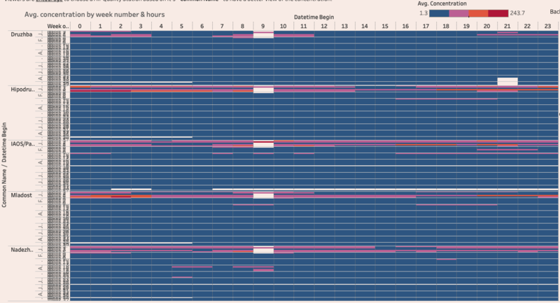
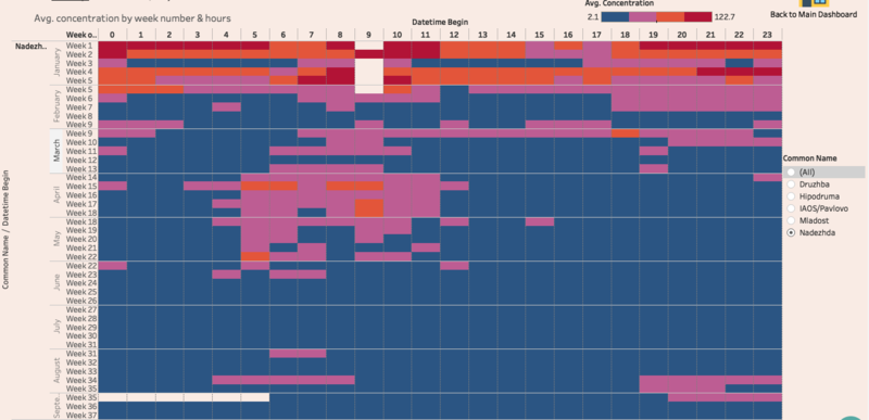
Based on the visualization below, air pollution are still on the higher side for the first 3 months of 2018.
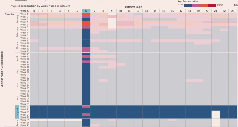
Drilling down to week level and using one of the sensor, Druzhba, we can see that concentration are relatively low throughout the 24 periods. However, there are special cases whereby at certain period of the day, concentration would be higher as compare to others. One such example would be week 31, 0600hrs.
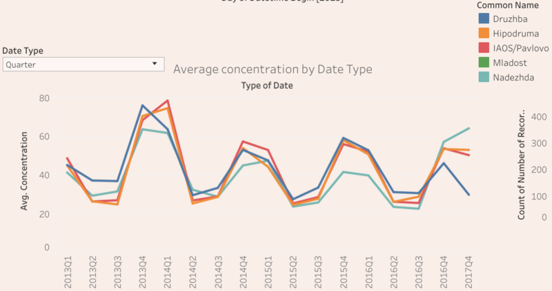
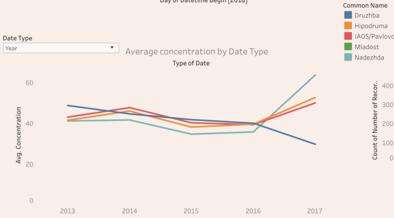
However, these visualization can be misleading as it does not show the trend throughout the year. Therefore, another visualization is introduce to prevent any inaccurate or bias in analysis. Based on the visualization below, observation can be made that the average air pollution by year has decrease (evident from 2013Q3 - 2014Q1 having higher than 2013Q2, 2013Q3 and 2014Q2). However, certain period of the year still have higher average concentration.
Do you see any trends of possible interest in this investigation?
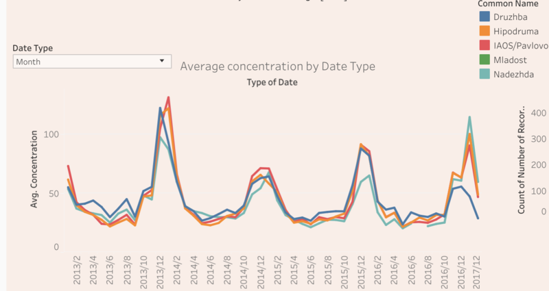
- After generating the average concentration of p1 by month, I have notice that on the month of October, average concentration start to rise and at January, average concentration start to drop till about February to March. One possible reason would be seasonality. Based on the visualization above, there might be a possibility that at lower temperature, concentration will increase.
What anomalies do you find in the official air quality dataset?
- Missing data happens to all sensors in all years with 2017 being one of the year that has missing data from January 2017 to 27 November 2018
- During 2017, air quality station with common name Druzhba, has a high average concentration as compare to other air quality station. In addition, air quality station Nadezhda, has a lower average concentration.
- Nadezhda has unusual high concentration during the period of April to May 2018 between 4am to 11am.
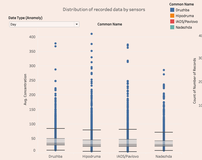
- All 4 sensors contains daily records that are high in concentration.
How do these affect your analysis of potential problems to the environment?
| Anomaly / Unusual Events | Potential Trend / Issue |
|---|---|
| Missing data happens to all sensors in all years with 2017 being one of the year that has missing data from January 2017 to 27 November 2018 | This could potentially cause an inaccurate analysis. As there might be a correlation between season and air pollution, having only December will cause average concentration to be high for the year of 2017, leading to inaccurate analysis. |
| During 2017, air quality station with common name Druzhba, has a high average concentration as compare to other air quality station. In addition, air quality station Nadezhda, has a lower average concentration. |
Initial calculation of the 2 sensors distance is approximately 10km apart. Within 10km, concentration shouldn't be too far apart between this 2 sensors. For Nadezhda, one possible would be the amount of data recorded as compare to other 3 sensors. With only 274 days of data, insight could be inaccurate due to lack of data. For Druzhba, there is a possibilities that the sensor is picking up incorrect readings. |
| Nadezhda has unusual high concentration during the period of April to May 2018 between 4am to 11am. | As the sensor is located within the vicinity of home for locals, it may be difficult to narrow down to the actual cause of this issue because there could be many different factors ranging from incorrect reading to household burning of fossil fuels that affect the reading. |
| All 4 sensors contains daily records that are high in concentration. | Since the amount of outliers are fairly consistent, there might be a pattern in the data. |
Task 2: Spatio-temporal Analysis of Citizen Science Air Quality Measurements
Are they well distributed over the entire city?
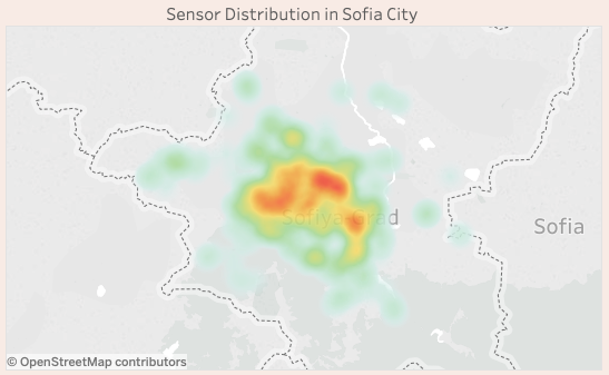
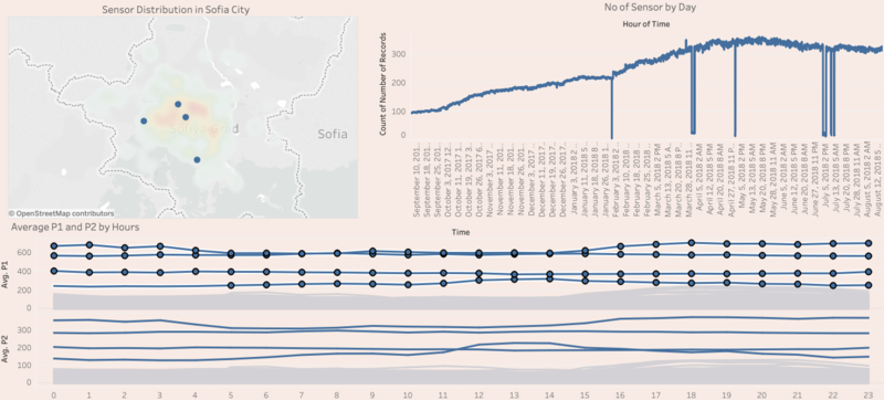
Sensors are relatively distributed around the city, however, using a density map, I observe that north-east side of Sofia city has slightly more sensors as compare to other part of the city.
Are they all working properly at all times?
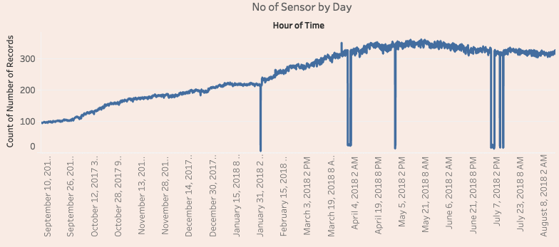
- Most of the time, sensors are working well with a steady increase in the first few months and having a stable number of sensors during the later part of 2018. However, at certain period of the dataset, there are sensors that stop working. This can be seen as there is a sudden dip in the visualization.
- On 26 March 2018 12pm, there is a sudden increase by approximate 40 sensors. This could be new user trying out the sensors during that period of the day.
Can you detect any unexpected behaviors of the sensors through analyzing the readings they capture?
- On certain occasion, average concentration of p1 and p2 seem to be higher as compare to usual. Using the visualization below, we can see that there are several spike in the data.
Which part of the city shows relatively higher readings than others? Are these differences time dependent?
As outlier data has been remove prior to generating this chart and this dashboard only show data point that are above the EC Air Quality Standards for p1 and p2. By highlight all the data point in the above chart (Avg Con. by Hour By Location), the data point that have relatively high reading will be show in the sensor distribution map.
Based on the result and some Google Map search on latitude and longitude, 2 of the location ([42.676, 23.320], [42.696, 23.304]) are denser with locals. Higher reading from this 2 location could be due to household burning of fossil fuels or transportation. The last 2 location ([42.67, 23.232], [42.610, 23.344]) are rather less denser with locals (based on Google Street View), however high readings due to household burning could not be rejected as there are still locals living in this 2 locations.
These higher readings are quite consistent as shown in the chart (Avg Con. by Hour by Location) throughout the 24 hours.
Task 3
Local energy sources
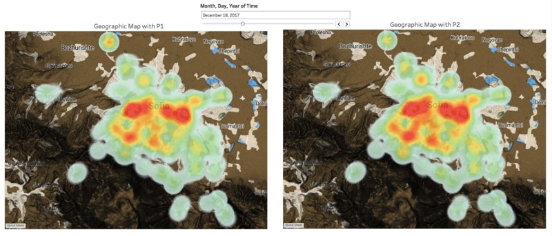
After reviewing data from 2017 to 2018, I realise that as the place get denser with local (ex: central of Sofia City), the concentration seem to be higher. This could be due to household burning of fossil fuels or transportation. However, the result can be inconclusive as there could be other external factors that affect the concentration.
Local meteorology such as temperature, pressure, rainfall, humidity, wind etc
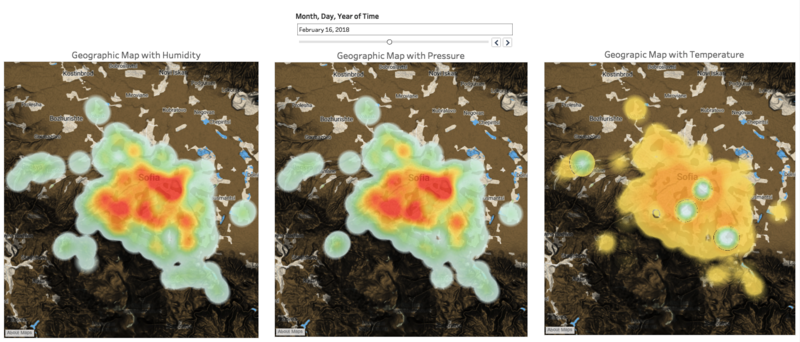
One relationship can be observe between local meteorology and air pollution. When temperature start to decrease, concentration for PM2.5 and PM10 start to increases, precipitation and visibility start to decreases. One possible reasons could be due to temperature inversion. Where higher air sinks due to the air being squeezed or compressed from higher air pressure at lower elevation, sinking air can be warm to the point it is warmer than air below it. Also known as upper air inversion, it create a barrier to prevent thunderstorms from forming. This can cause poor air quality as pollutant can build up.
Complex interactions between local topography and meteorological characteristics.
One relationship can be observe is that when surface temperature increase or decrease, high grounds (darker part of the map in the visualization) does not seem to be affected by the increase in concentration level. One possible reason is that high ground causes difficulties for the pollutant to be disperse which results the concentration of P1 and P2 relatively high in Sofia City.
Transboundary pollution for example the haze that intruded into Singapore from our neighbours.
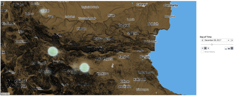
After viewing the data by week. Within the visualization, it was noted that the next high concentration area is at Plovdiv (See below image).
After some research, I found out that there is a heating station at that location. Manage by Toplofikatsiya Plovdiv in the city of Plovdiv in Southern Bulgaria, it is one of the largest heating network in the country. Consisting of 2 power stations, one is steam-gas power station for electricity and thermal power and another, heat-only boiler station.
Publish on 6 April 2018, novinite (Sofia news agency) reported that Plovdiv has the most polluted air in the last heating season. With the news as evident and the distance between 2 state, I am confident to say that the power station located at Plovdiv could be a reason that Sofia city is experiencing high air pollution.
References
- EC Air Quality Standard [[1]]
- How winter affect air pollution [[2]]
- Environment in Sofia [[3]]
- Cause, effect and solution for air pollution [[4]]
- How Meteo affect air pollutant [[5]]
- Bulgaria season [[6]]
- News on Plovdiv (For Transboundary) [[7]]
- Topo Layer on Tableau Map [[8]]
