IS428 2018-19 T1 Assign Koh How Han Vincent
Contents
Problem & Motivation
Air pollution is an important risk factor for health in Europe and worldwide. A recent review of the global burden of disease showed that it is one of the top ten risk factors for health globally. Worldwide an estimated 7 million people died prematurely because of pollution; in the European Union (EU) 400,000 people suffer a premature death. The Organisation for Economic Cooperation and Development (OECD) predicts that in 2050 outdoor air pollution will be the top cause of environmentally related deaths worldwide. In addition, air pollution has also been classified as the leading environmental cause of cancer.
Air quality in Bulgaria is a big concern: measurements show that citizens all over the country breathe in air that is considered harmful to health. For example, concentrations of PM2.5 and PM10 are much higher than what the EU and the World Health Organization (WHO) have set to protect health.
Bulgaria had the highest PM2.5 concentrations of all EU-28 member states in urban areas over a three-year average. For PM10, Bulgaria is also leading on the top polluted countries with 77 μg/m3on the daily mean concentration (EU limit value is 50 μg/m3).
According to the WHO, 60 percent of the urban population in Bulgaria is exposed to dangerous (unhealthy) levels of particulate matter (PM10).
Dataset Analysis & Transformation Process
Official air quality measurements
Citizen science air quality measurements
Dataset Import Structure & Process
Interactive Visualization
Public Tableau Visualization can be access from here: https://public.tableau.com/profile/vincent.koh#!/vizhome/VA-Assignment/MainDashboard?publish=yes For best viewing experience, viewers are recommended to change their browser screen resolution to 1366 x 768 with full screen mode.
To improve user experience, several interactive tool has been setup to ensure flexibility in navigating and generating of visualization.
| Interactive Technique | Rationale | Implementation Steps |
|---|---|---|
| Click to go back one visualization | To allow viewers to return to the previous dashboard. |
|
| Click to proceed to next visualization | To allow viewers to proceed to the next dashboard. | Repeat above steps with a few point to take note.
|
| Click to return to main dashboard | To allow viewers to return back to main dashboard | Repeat above steps with a few point to take note.
|
Notes: Certain dashboard might not have all 3. Depending on the numbering of the dashboard, button for proceed and return will appear accordingly.
Main Dashboard
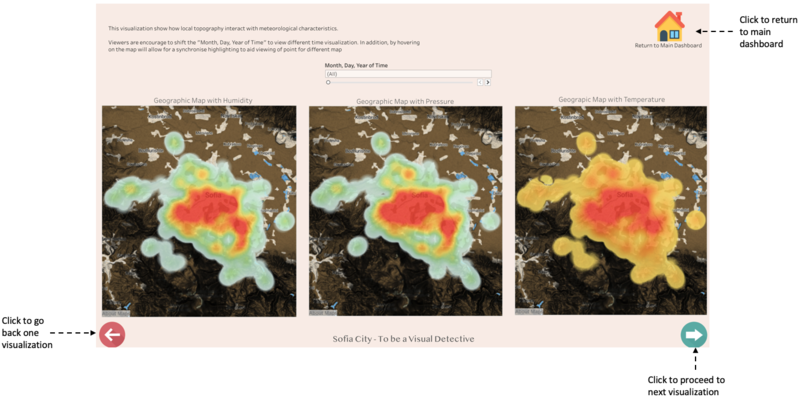
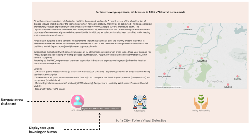
As there is a lot of visualization involved for this assignment, using only 1 dashboard is impossible. In addition, with 4 dataset given for generating of visualization, having all 4 in one dashboard may not be able to use the dataset to its fullest potential. Hence, I have decided to split the dashboard into multiple dashboard. These dashboard will be categorise into 3 different category. Official Data, Citizen Data and relationship between Official Data and/or Citizen Data with Topological and/or Meteorological data.
The following technique has been adopted to help viewers in navigating between dashboards.
| Interactive Technique | Rationale | Implementation Steps |
|---|---|---|
| Navigate across dashboard | To allow viewers to access other dashboard easily with a click of the button |
|
| Display text upon hovering on button | Provide user information on what to expect for the next dashboard. |
|
Typical day of Sofia City
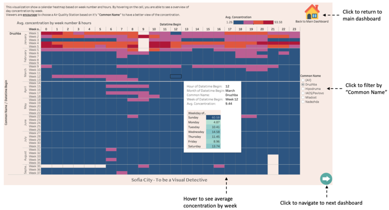
The following image shows the typical day of Sofia City
The following technique has been adopted to help viewers in navigating between dashboards.
| Interactive Technique | Rationale | Implementation Steps |
|---|---|---|
| Hover to see average concentration by week | To allow viewers to see the average concentration by week in terms of day |
(<Sheet name="Avg Con. by Weekday" maxwidth="300" maxheight="300" filter="<Common Name>,<WEEK(Datetime Begin)>">) |
| Click to filter by "Common Name" | To provide viewers in depth view of data collected by individual air quality station |
|
Trends & Anomalies
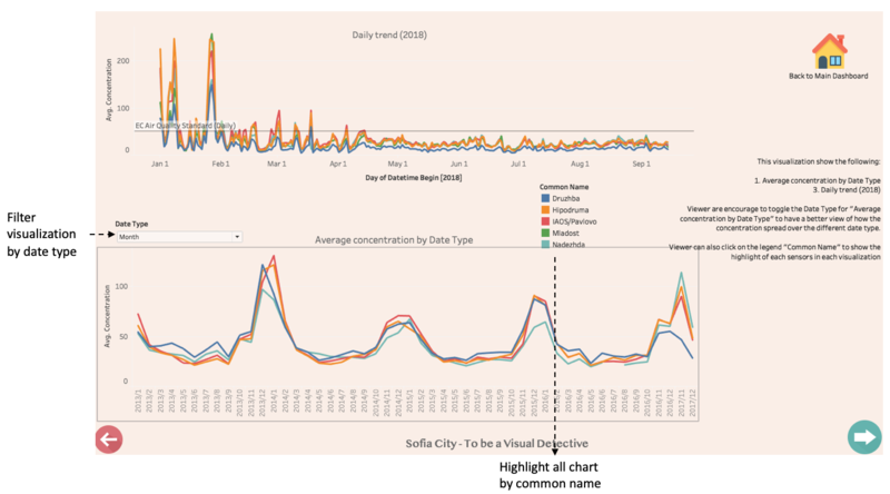
The following image shows the trends & anomalies
| Interactive Technique | Rationale | Implementation Steps |
|---|---|---|
| Filter visualization by date type | To provide viewers the ability to show the trend in different date setting | Ensure visualization is using the custom date selection created during the additional processing stage in Tableau. |
| Highlight all chart by common name | To provide viewers the ability to view the air quality station only in all 3 visualization | Ensure all visualization are using the same "Common Name". Move to the top right hand corner of the legend and click on the funnel (When hover, a tooltip will appear "Highlight Selected Items") |
Distribution & Status of Sensors and Data
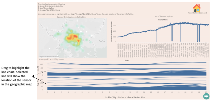
The following image shows the distribution and status of sensors. In addition, data from the sensors is also shown in the line chart.
| Interactive Technique | Rationale | Implementation Steps |
|---|---|---|
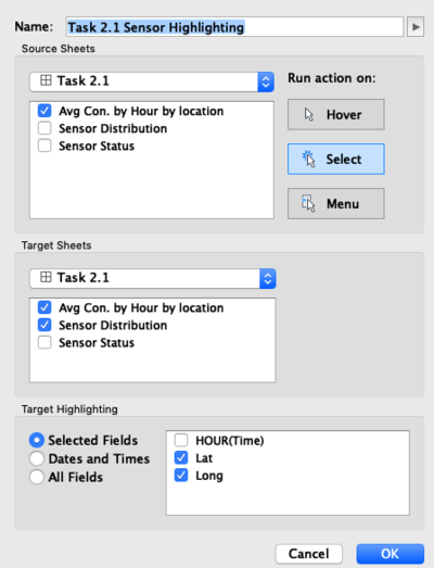
| Drag to highlight the line chart. Selected line will show the location of the sensor in the geographic map | To allow viewers to see multiple sensor location based on the recorded data shown in the line chart |
|
Local Energy Source
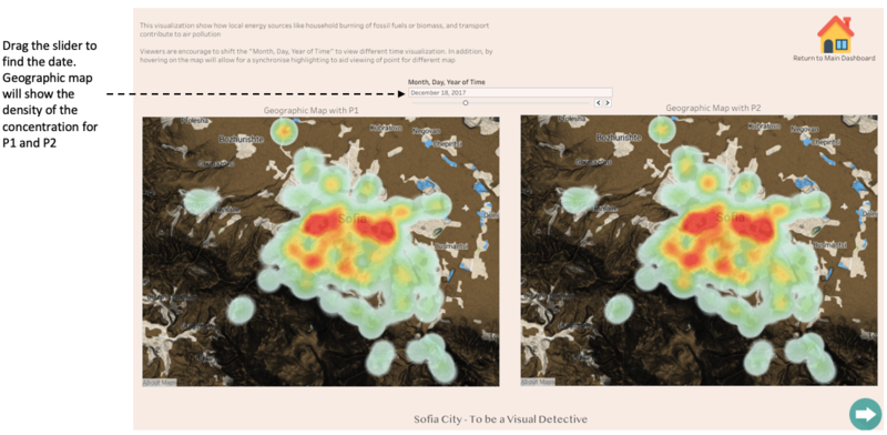
The following image shows the concentration of P1 and P2 in Sofia.
| Interactive Technique | Rationale | Implementation Steps |
|---|---|---|
| Drag the slider to find the date. Geographic map will show the density of the concentration for P1 and P2 | To allow viewers to see selected day concentration. | Ensure visualization is using the custom date selection created during the additional processing |
Local Meteorological Data
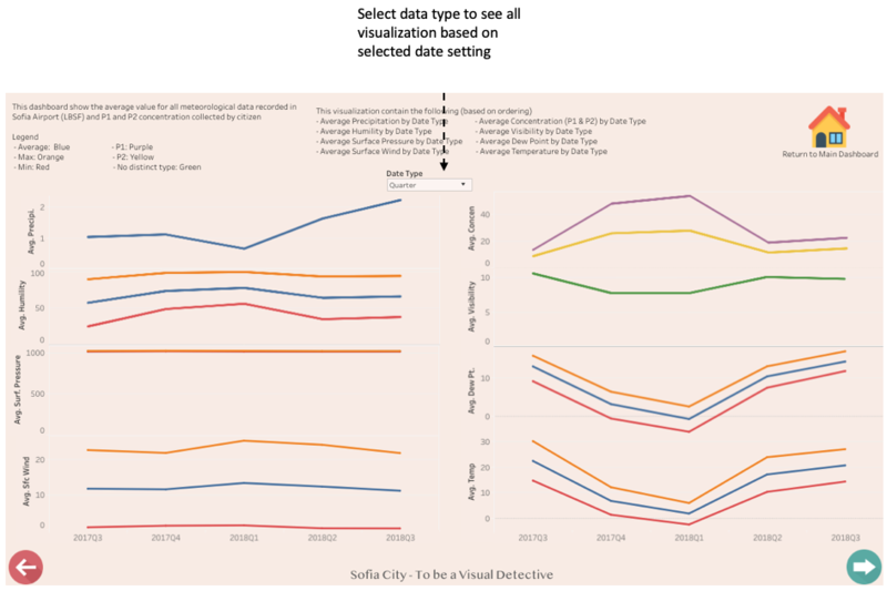
The following image shows the meteorological data with the average P1 and P2.
| Interactive Technique | Rationale | Implementation Steps |
|---|---|---|
| Select data type to see all visualization based on selected date setting | To provide viewers the ability to show the trend in different date setting | Ensure visualization is using the custom date selection created during the additional processing |
