IS428 AY2018-19T1 Lyu Cheng
To be a Visual Detective: Detecting spatio-temporal patterns
Contents
Overview
In Sofia, Bulgaria, air pollution has been a long-standing serious problem. Things got so out of control that even the European Court of Justice ruled against Bulgaria in a case brought by the European Commission against the country over its failure to implement measures to reduce air pollution.
Sofia has 5 metropolitan weather stations that capture weather data on hourly intervals. The analysis and comparison are based on the data collected from the five stations. The main measure of pollution is the concentration of a pollutant, PM10. The assignment will explore the factors, for example, humidity, altitude, position, etc., that affect the pollution level.
An interactive and informative visualisation analysis would be designed and developed to demonstrate the result of the result of the above tasks.
The Task
Task 1: Spatio-temporal Analysis of Official Air Quality
Task 2: Spatio-temporal Analysis of Citizen Science Air Quality Measurements
Task 3: Relationships between the factors mentioned above and the air quality measure detected in Task 1 and Task 2
Background Information
Air pollution is an important risk factor for health in Europe and worldwide. A recent review of the global burden of disease showed that it is one of the top ten risk factors for health globally. Worldwide an estimated 7 million people died prematurely because of pollution; in the European Union (EU) 400,000 people suffer a premature death. The Organisation for Economic Cooperation and Development (OECD) predicts that in 2050 outdoor air pollution will be the top cause of environmentally related deaths worldwide. In addition, air pollution has also been classified as a leading environmental cause of cancer.
Air quality in Bulgaria is a big concern: measurements show that citizens all over the country breathe in air that is considered harmful to health. For example, concentrations of PM2.5 and PM10 are much higher than what the EU and the World Health Organization (WHO) have set to protect health.
Bulgaria had the highest PM2.5 concentrations of all EU-28 member states in urban areas over a three-year average. For PM10, Bulgaria is also leading on the top polluted countries with 77 μg/m3on the daily mean concentration (EU limit value is 50 μg/m3).
According to the WHO, 60 per cent of the urban population in Bulgaria is exposed to dangerous (unhealthy) levels of particulate matter (PM10).
The Data
Official Meteorological Data The official data is used for law suits, policy creation etc. With the far reaching implications, the official data is gathered only from 5 stations, named after neighbourhoods and provides meteorological measurements such as temperature; humidity; pressure etc. This data has longer history, but it’s not spread out across the country. AirBG.info brings to question the quality of this data by suggesting this may have missing data and insufficient measures on the part of the authorities to provide a full representation of Sofia’s air pollution problem.
Citizen Meteorological Data The Citizen data is gathered from the AirBG.info initiative that is not a government funded and is run by volunteers and citizens of Bulgaria. Each citizen that wishes to participate builds a weather monitoring kit from standardized parts. These citizen weather stations upload data every 5 minutes via an onboard WIFI connectivity and is voluminous in nature. This data has shorter history but is spread across a lot more than 5 stations.
In addition it provides data topography data includes Sofia urban area + some areas nominally external to the city (toward the mountains, note large elevation numbers). No particular effort has been made to include entirety of Sofia Capital’s area as per administrative boundaries. This topographical data includes lat/long and elevations for several areas in and around Sofia.
Last but not least, the project allows access to API’s that would allow it to gather, inspect and mine data from Citizen Weather station sensors.
Data Quality
In this section, I examine the quality of the data provided by exploring for bad data, gaps in data and informing next steps.
Data Cleaning Procedure
| Problem #1 | Location is needed for final result to be shown as map and is a learning feature for NN |
|---|---|
| Issue | Bring lat/long/elev data into EEA Data metropolitan data from the metadata.xls file |
| Solution | Left merge EEA_Data with metadata.xls. |
| Problem #2 | Need consistent aggregation across all data for accuracy. |
|---|---|
| Issue | BG_5_60881_2018_timeseries.csv has ‘AveragingTime’ as hour |
| Solution |
| Problem #3 | Goehash cannot be parsed directly by tableau |
|---|---|
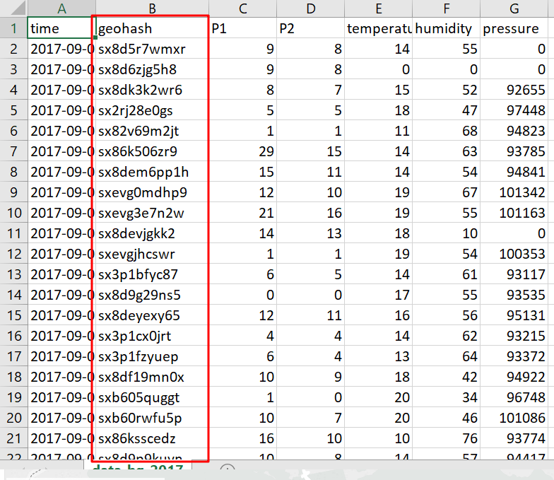
| Issue | Geohash is a convenient way of expressing a location (anywhere in the world) using a short alphanumeric string, with greater precision obtained with longer strings, geohash. One geohash value is corresponding to one set of longitude and latitude values. The tableau software needs to use the longitude and latitude values instead of geohash. The data transformation needs to be done. |
| Solution |
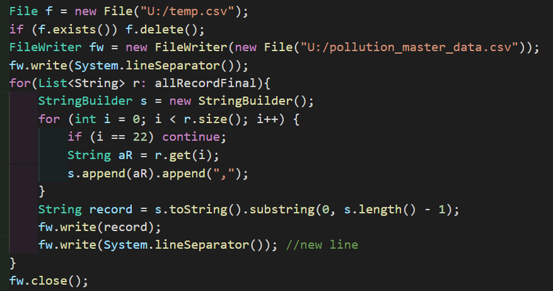
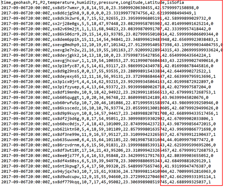
Use coding method to decode all the geohash to long/lat. Notice that the geohash field is still reserved since it is the unique identifier for the different sensors. |
| Problem #4 | Difficulty to identify the data points in the city. |
|---|---|
| Issue |
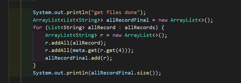
In the citizen dataset, the sensor data is across the whole country, while the assignment is mainly focusing on the Sofia city. Data cleaning is required to remove or mark the unrelated data. |
| Solution |
|
| Problem #4 | pollutant concentration data does not appear in the to meteo data set |
|---|---|
| Issue | Merge the concentration data with the meteo data set |
| Solution | Use coding method to align the time format and inner join the two tables. |
Final Data Files
- pollution_master_data This dataset contains the aggragated data of original EEA dataset.
- timeseries The original EEA dataset
- citizen The aggragated data of original Air Tube dataset
- meteo-concentration The aggragated data from the meteo and timeseries data.
Visualisation
Task 1: Spatio-temporal Analysis of Official Air Quality
- PM10 Concentration over the timeline
- PM10 Concentration over the timeline with shade
Task 2: Spatio-temporal Analysis of Citizen Science Air Quality Measurements
- Citizen geo-distribution
- No. of records by hour across the citizen
Task 3: Relationships between the factors mentioned above and the air quality measure detected in Task 1 and Task 2
| [Task 1] PM10 Concentration over the timeline |
|---|
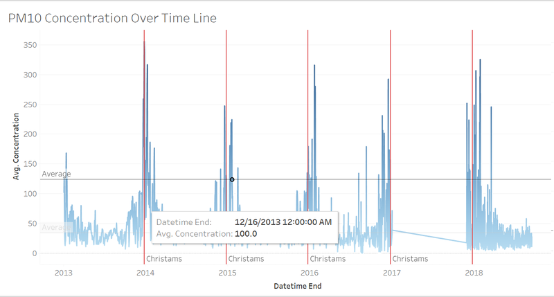
| Purpose / Description This diagram shows the average concentration of the PM10 recorded from the five stations by hours across years.
|
Interactive Technique
|
| Analysis The vertical red drop line indicates the Christmas Days. It is very obvious that the air pollution level grows higher than the other days within one year. This might be mainly because of the fireworks. Also, a deeper inspection of the data shows, regularly missing data hourly from 9-10 AM from Mladost station (BG0079A) for the critical 1st week of January. The readings in the hours following this missing data spike up significantly. What is the cause of these dropped data signals during these hours? Was there an instrument malfunction in the official weather stations. If the instruments are so costly relative to the citizen weather stations, then is it expected to be unreliable under some conditions. The missing data from station Orlov and Mladost may cause the average value of the concentration lower than expectation. The maximum concentration among the five stations may be an alternative option, however, that would fail to show the overall situation of the city as the most polluted area is always at the same station.
|
| [Task 1] PM10 Concentration over the timeline with shade |
|---|
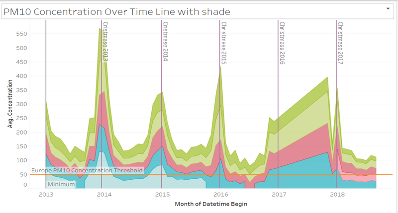
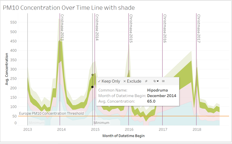
| Purpose / Description This diagram shows the average concentration of the PM10 recorded from the five stations by month across years.
|
Interactive Technique
|
| Analysis A monthly aggregated view shows Druzhba station having highest peaks during holiday/Christmas times. Druzhba is at 548 meters altitude. This elevation is not very high and a relevant official weather station. The missing data from 2017 to 2018 leads to an inaccurate visualisation. According to the previous years, the air pollution level should be lower than what is displayed. The changes of the pollution level from the give stations are relative the same. In other words, the concentrations of PM10 from the five stations increase and decrease simultaneously.
|
| [Task 1] PM10 Concentration over the one day |
|---|
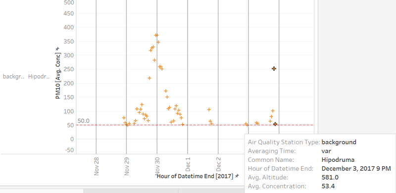
| Purpose / Description This diagram shows the average concentration of the PM10 recorded from station Hipodruma <br |
Interactive Technique
|
| Analysis The diagram shows all the records measured from Hipodruma station within one day. The general trend of pollution level with one day varies as such:
|
| [Task 2] Citizen geo-distribution |
|---|
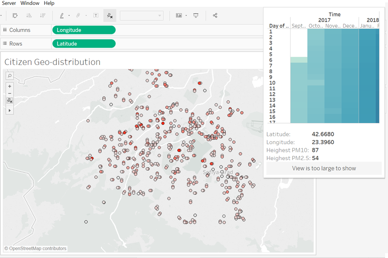
| Purpose / Description This diagram shows a geospatial distribution of all the sensors across the whole city.
<br |
Interactive Technique
|
| Analysis This diagram aims to show the geospatial coverage of sensors across the whole country. This is essential since the spatial coverage of the citizen data reflects the confidence and completeness of the whole dataset. This dataset is obtained from citizen database, it is essential to justify the coverage before looking at the pollution level it reflects, if there is some large area is not tracked, the overall result might not be trustworthy. Only the data points within the city area are displayed, the irrelevant data is hidden. The way to distinguish the data points is described in the previous data cleaning procedures. From the visualization above, the citizen data fairly reflects the overall situation of the country. There is no obvious empty region on the map. However, the North part and the South-East part of the map have a relatively low sensor concentration than the central area. Hence, the pollution records in the central area are more credible. The colour code is responsible for the highest concentration record reported from the sensor at that location. It can be observed that the points with the deepest colour appear at the centre area indicating that the centre area is the most polluted area.
|
| [Task 2] No. of records by hour accross citizen |
|---|
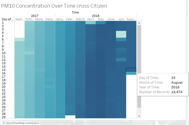
| Purpose / Description This diagram shows the number of records reported from the sensors during the past two years <br |
Interactive Technique
|
| Analysis This visualization aims to investigate the time-coverage of the dataset. Over the past two years, the number of records may not be evenly distributed, if there is some period of time what the total records were collected are significantly lower than the rest periods, the data corresponding to this period is not sufficient to showcase the pollution level of the whole country. It also reflects that there were some major failures on the sensors during that period of time. according to the visual analytics, the records are more concentrated during the second half-year of 2018. This suggests that the sensors' performance was improved at that time. During July 2018, it seems that the sensors report fewer records as compared to other days. Especially in 4th and 5th of July, the data size is approximately ten times lower than other days. The sensors might be under maintenance during that days.
|
Visualisation Software
To perform the visual analysis, this is a list of the software which I used.
- Tableau
- Excel
- VS Code
References
- https://www.datasciencesociety.net/sofia-air-quality-eda-exploratory-data-analysis/
- https://www.datasciencesociety.net/monthly-challenge-sofia-air-solution-kung-fu-panda/
Comments
Do provide me your feedback!:)
