IS428 AY2018-19T1 Sheryl Chong Man Er
Contents
Problem & Motivation
Air pollution is an important risk factor for health in Europe and worldwide. A recent review of the global burden of disease showed that it is one of the top ten risk factors for health globally. Worldwide an estimated 7 million people died prematurely because of pollution; in the European Union (EU) 400,000 people suffer a premature death. The Organisation for Economic Cooperation and Development (OECD) predicts that in 2050 outdoor air pollution will be the top cause of environmentally related deaths worldwide. In addition, air pollution has also been classified as the leading environmental cause of cancer. Air quality in Bulgaria is a big concern. Bulgaria had the highest PM2.5 concentrations of all EU-28 member states in urban areas over a three-year average. For PM10, Bulgaria is also leading on the top polluted countries with 77 μg/m3on the daily mean concentration (EU limit value is 50 μg/m3). According to the WHO, 60 percent of the urban population in Bulgaria is exposed to dangerous (unhealthy) levels of particulate matter (PM10). This is extremely dangerous to people living in Bulgaria as they are constantly exposed to air pollution which placed them in a high risk of cancer and early death.
Through the interactive visualisation, we aim to:
- Discover the patterns of air pollution in Sofia City over a period of time
- Uncover the relationship between air quality, metrological data such as temperature, humidity and topographical data such as elevation
- Suggestion to tackle air pollution
Dataset Analysis & Transformation Process
There were 4 different datasets provided for this assignment which are Official air quality measurements (EEA Data), Citizen science air quality measurements (Air Tube Data), Meteorological measurements and Topography data. This section will elaborate on the dataset analysis and transformation process for each dataset in order to prepare the data for import and analysis on an interactive visualization.
Official Air Quality Data (EEA)
Issue 1:
Some of the stations have missing records. 9484 only have records from 2013 to 2015 while 60881 only have records for 2018
Solution 1:
This records will not be included for merging of data for the visualisation. This ensures that the visualisation is content in terms of values After removing the records, we will start merging the files together for the visualisation.
Issue 2:
For EEA Data, there is an excel file called "metadata" which consists of important information like CommonName, Latitude and Longitude of the station which is critical for the analysis.
Solution 2:
Hence, we need to merge the metadata with the merged EEA file together.
Citizen Science Air Quality Measurements (Air Tube)
Issue 3:
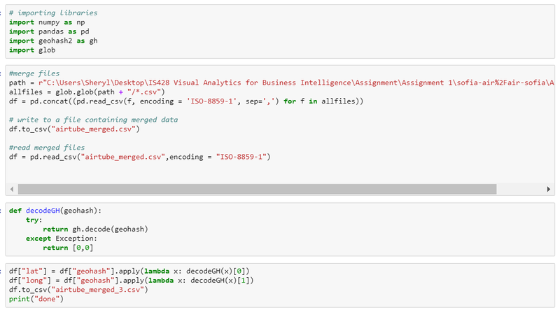
For Air Tube data, the latitude and longitude data are being hashed together which is under geohash column in the data file. Tableau is unable to read that information.
Solution 3:
We will use a python packaged called "geohash" and decode all the geohash into latitude and longitude.
Dataset Import Structure & Process
Interactive Visualisation
Interesting & Anomalous Observations
References
Comments
Please feel free to give some feedback!


