IS428 AY2018-19T1 Kung Jung-wen
Contents
Problem & Motivation
Dataset Transformation Process
Before starting with the analysis in Tableau, each feature within the data set is being analysed to better understand the context of the problem and to ensure that the data transformation process is performed accurately.
Working with EEA Data:
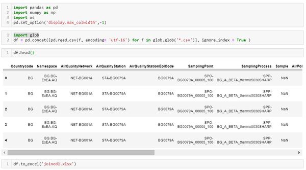
1. Merge all the EEA air quality data: As there are 28 csv files being provided from the data source, we first combining all the data within python.
2. All the CSV files provided contains the air quality station identifiers, air pollution measurement, time period of measurement and other links. To obtain the geographic location of each air station, we then merged the data with metadata using left merge in Python to obtain mainly the longitude and latitude points of each station.
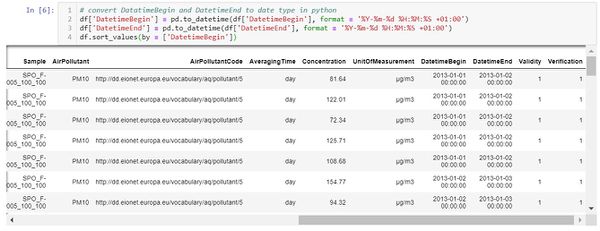
3. The date variables need to be standardised and cleaned up in a format that is readable in Tableau. change date variable to a format that tableau can read. The current DatetimeBegin and DatetimeEnd variables contain time in milliseconds, as the data will only be analysed on either an hourly or daily level, the date of transformed to include the date and hour of the measurement time in Python.
Dataset Import Structure & Process
Interactive Visualization
The interactive visualization can be accessed here: https://public.tableau.com/viws/Assignment3_145/Home?:embed=ey&:display_count=yes
| Interactive Technique | Rationale | Brief Implementation Steps |
|---|---|---|
The use of checkboxes or dropdown list requires the analyst to check/uncheck each date manually which is time-consuming. As such, a time range slider is preferred. |
| |
Use of a drop down list also allow analysts to easily choose the building level that they are interested to analyse. |
| |
When a user filters from one floor to another, the floor plan also changes to provide for quick and easy reference. Due to the space constraint, each floor plan has to be zoomed for users to identify and see the zone areas clearly. |
|
Interesting & Anomalous Observations
Using the dashboard as a platform for investigation and analysis, the following aims to provide answers to the questions posed.
Q1: Spatio-temporal Analysis of Official Air Quality
Interesting & Anomalous Observations
Using the dashboard as a platform for investigation and analysis, the following aims to provide answers to the questions posed.
Characteristic of the past and most recent situation with respect to air quality measures in Sofia City
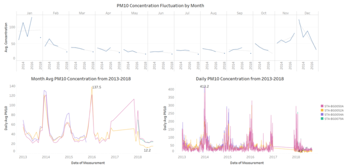
- The overall trend of slight improvement in air quality: Sofia City’s PM10 level is on the fall, air quality is becoming better over the years with lower peaks in 2015 onwards compared to 2014. The PM10 level reached a new minimum level in 2018 with a PM 10 concentration of 12.2.
- Overall improvement in air quality in 2018: from the chart showing the PM10 Concentration Fluctuation by Month, every month in 2018 has the lowest PM10 concentration compared to previous years.
Anomaly pattern in PM10 Concentration
- Extremely poor daily PM10 Concentration in December and January: from Daily PM10 Concentration Chart, most of the peaks are around December and January period and the PM10 level can reach as high as 400+ range.
- Poor monthly average PM10 concentration in 2014 and 2016: The two peaks shown in the Monthly Avg PM10 Concentration Chart, are December 2014 and January 2016 which is consistent with the findings above.
- No improvement in monthly PM10 concentration for January and November: as it was found that the air quality had an overall improvement in 2018, however it seems that the average monthly PM10 level in January and November is on the rise. We cannot make this conclusion about improved air quality in 2018 November and December as the data is not available yet. However, it seems that the main activity that causes of poor air quality is being shifted to November.
What does a typical day look like for Sofia city?
The graph above shows the average hourly PM10 concertation from the air quality stations within the Sofia City for the year 2017 and 2018. Data in 2016 and before are excluded as they are incomplete, where as 2017 data includes the November and December hourly data that complements with 2018’s hourly data from January to September.
- Hours with worst air quality for 2017 and 2018: In a typical day in Sofia City, 12 am -1 am, 7am to 8am and 7pm and 12 pm have the higher concentration of PM 10 level. Generally the PM10 yearly concentration by hour is within the acceptable range.
- Three period of bad quality time: Analysing the hourly concentration for every month, January, November and December have the worst hourly P10 hourly concentration. In January, the PM10 concentration reached very poor category for 2-4 hours consecutively. The hours that have very poor air quality are around midnight, in the morning 8-9 am and at the night time around 8 to 11pm.
- Good air quality most of the time: months other than January, November and December, the air quality is within the good air quality range and in certain months 11 am to 3 pm can achieve very good air quality.
Do you see any trends of possible interest in this investigation?
- From the analysis above, we should investigate the activities that cause January, November and December to hit poor air quality score.
- Understand why from certain months, for instance, April to September is able to achieve very good air quality score during the 11 am to 3 pm hours.
How do these affect your analysis of potential problems to the environment?
From the analysis we identified that the worst PM10 concentration level can reach as high as 413 in a day which is hazardous to any human being and during the January, November and December period, some hours are consistently reaching very poor air quality standard. It is then important to identify the factors behind these patterns and allow the public of Sofia City to be adequately prepared in these periods with masks.


