IS428 AY2018-19T1 Lee Hyeonjeong
Contents
Problem & Motivation
Air pollution is currently a significant concern among many European countries, known to be one of the top risk factors for health. This is specifically a huge concern in Bulgaria, as the concentrations of PM2.5 and PM10 far exceed the restrictions set by the European Union (EU) and the World Health Organization with the objective to reduce health risks. As of the past three years, Bulgaria has had the highest PM2.5 concentrations among its neighbouring countries, leading it to become one of the most polluted regions in the world.
The health risks among Bulgarians are increasing, as 60 percent of the urban population in this country is being exposed to dangerous particulate matters. As such, there is an urgent need to address such a concern by analysing the current trends and patterns of PM2.5 and PM10 concentrations so that effective measures can be taken.
With the data collected over the 6 years (2013 – 2018), we can create an interactive visual platform using Tableau to help efficiently track and identify major patterns that will be helpful in solving this concern. This platform will meet the following objectives:
1. Identify typical patterns, interesting events and trends in the past and recent by the levels of PM10 concentrations, as reported by official data
2. Identify patterns, events and abnormal patterns in the Citizen Science Air Quality data through pollution concentrations and other various meteorological data
3. Analyse and identify potential associations among variables that may correlate with the air pollution.
Data Exploration & Transformation Process
The dataset zip file given had 4 different folders. Each of the folders provides different records as follows:
- EEA Data (time series PM10 concentrations from 2013 – 2018, recorded as official)
- Air Tube Data (meteorological and concentrations from 2017-2018 in various regions)
- METEO data (basic statistic summary such as wind, etc. from 2012-2018)
- TOPO data (topographical data with elevation)
Official Air Quality Data (EEA)
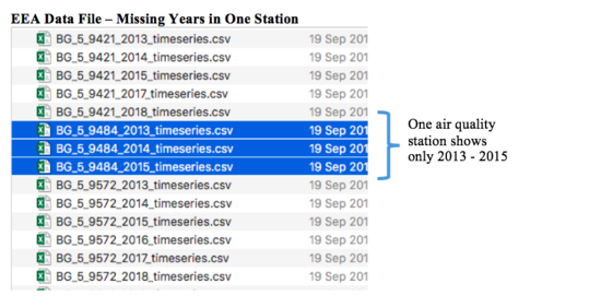
There are a total of 6 stations in the file, with a year range of 2013 to 2018 for each station excluding one station.
Issue: Since this station’s dataset has records only up until 2015, it may not be useful in the analysis.
Solution: As this station’s data will have a huge gap from the current data, it may not show meaningful analysis on the typical patterns and how it has changed over time until recently. Hence, it will be removed from the dataset and thus will not be included in the visualization.
For the remaining 5 stations data, the variable types are the same (level of concentration, station type, date time begin, etc.). This can be easily seen by using text-to-columns in excel. After which, all the 5 stations’ time series data have been merged to one excel file.
Issue: During the process of merging the data, there was a separate meta-data file found in a separate spreadsheet, containing the geographical data (latitude, longitude, altitude, etc.) of the 6 stations. This will be an issue when joining the data in Tableau.
Solution: To make the process more convenient, the ideal solution is to merge the two spreadsheets (meta data & merged EEA data) into one file. This process is possible using Excel’s lookup function. With this, it would be possible to perform a map visualization using the longitude and latitude in Tableau.
Air Tube Data
(geohash)
Meteo Data
For the purpose of task 3, exploratory data analysis of the METEO and TOPO data was done to find significant correlations with data from the previous tasks. Some interesting observations were:
1. Through the map function in tableau, I was able to find that the METEO data describes a location near Sofia Airport which happens to be around Mladost (found in EEA data in Task 1).
2. Mladost currently has data from January 2018 as is split based on “hours,” but the location in METEO data is currently split based on “days.” As such, we can combine the two datasets and see what factors could be affecting the concentrations in Mladost.
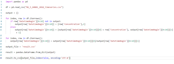
Transforming EEA – Mladost 2018 data: In order to aggregate the hourly data of Mladost to daily data, we can run a script in Python as follows:
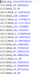
This script made two columns: Date (in day format) and average PM10 concentration per day. We can see the output as follows:
Transforming METEO data: Using Power Query in excel, the METEO csv file was cleaned by combining the year, month, and day into one column using combined columns.
With the two new cleaned files, I was able to join the two data through Tableau’s inner join function. The join was done based on the data columns. With this, it is possible to create the visualization needed for Task 3.
Interactive Visualization
The interactive storyboard can be accessed here (use with Generic Desktop / full screen view):
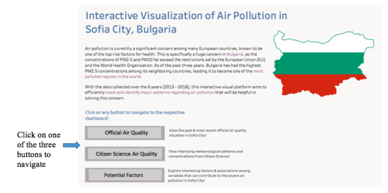
As there are many dimensions and measures to consider in this visualization, various dashboards have been created for a more comprehensive analysis. The home dashboard aims to provide the users with an overall view of the objective of this interactive platform through a short summary. Furthermore, there are three different buttons where each will navigate to a specific dashboard.
Task 1
The official air quality visualization is split into two dashboards: 2013-2017 and 2018. There are two main interactive tools on the top side of each dashboard.


