IS428 AY2018-19T1 Gokarn Malika Nitin
Contents
Problem and Motivation
Dataset Analysis and Transformation Process
Task 1: Spatio-temporal Analysis of Official Air Quality
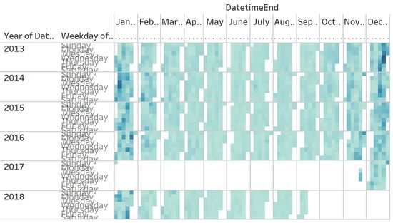
I started by bringing in the EEA Data for the years 2013 to 2018. The aim is to visualize the concentration in terms of the average, across a Calendar Heatmap, to understand the outliers, and any potential anomalies. It can be understood that data across all stations is missing for the time period of 1 January 2017 to 28 November 2017.
This HeatMap visualized above shows the potential for a trend during the winter months from November onwards. However, the trend here is shown by the assigned palette which means that proper definition of boundary conditions is required to see a trend which we can make sense of.
Therefore, making use of the legend available with this map that visualizes the European Air Quality Index for the year 2017. This legend is defined by the European Environment Agency. Therefore, I built binning criteria as shown below:
| Lower Bound (inclusive) | Upper Bound (exclusive) | Label |
|---|---|---|
| - | 20 | Good |
| 20 | 35 | Moderate |
| 35 | 50 | Unhealthy for Sensitive Groups |
| 50 | 100 | Unhealthy |
| 100 | - | Hazardous |
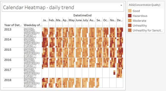
It is important to note that 50μg/m3 measured daily is the limit for Bulgaria with a 35 exceedances each year as defined by the EEA themselves. Thus it is important that the visualization is generated so as to clearly pinpoint the days where the concentration exceeds 50μg/m3. This will clearly differentiate the days that residents of Sofia City are breathing healthy air. Based on the above bins a colour scale can be developed, thereby allowing us to visualize a typical day in Sofia City. The resultant visualization is as below:
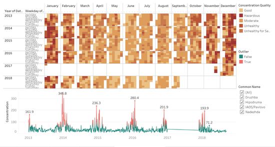
This second categorization allows us to understand that true to the reputation of Bulgaria, Sofia city too has a very high level of concentration of PM10. This is especially so across the year with a dip in the summer months of May, June, and July. More importantly, there are spikes in January and December. The global maxima of all the data is found on 25th December 2013, for which there are cultural reasons explaining the spike in air pollution, as can be found at the following link, wherein it is stated that “Strict tradition demanded that a fire be built in the hearth, with enough wood to burn all night and into Christmas Day, to help with the new birth of the sun.”
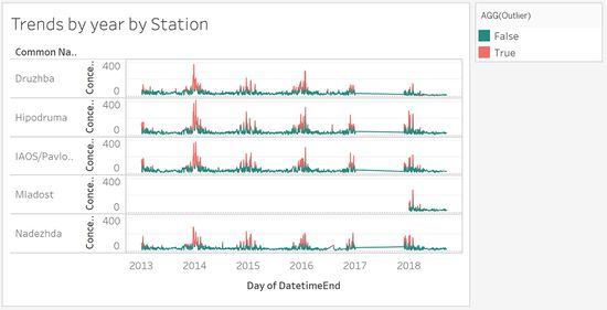
The Calendar Heatmap helps to highlight the overall daily trend of high pollution in terms of PM10. However, in order to better visualize the amount of spike between days, a control plot would be more intuitive in understanding the data. It is noticeable that between 18th and 24th January as well as on Christmas days each year there are spikes. Air pollution is high on Christmas days has already been explained by the cultural significance and traditions above. While there are no significant public holidays during the days of interest in January, I wondered whether there was a chronic trend of January 18th to 24th being the coldest days of the year in Bulgaria. It is interesting to note that while I have not found specific data that points to these dates being the coldest of the year, the average temperature recorded for the month of January is -5 degree to 2 degrees Celsius.
Taking this into account, residents of Bulgaria might be more inclined to lighting fires to get through the cold. Additionally, I found that forest fires are not rare in Bulgaria, and this could have some amount of significant contribution to the deteriorating air quality.
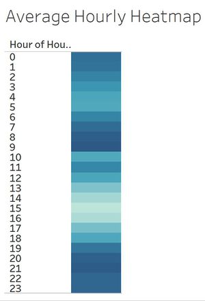
Lastly, the major contributing factors to air pollution across the day is representative of human activity during the day. This would perhaps involve burning motor vehicle fuel during the morning and evening hours involving travelling to and from work. Additionally, it can be speculated that with the night time and early morning hours being the coldest during the winter season, burning of solid fuel would also take place for heating purposes. These two reasons could explain the trend of a specific day, as shown in the below heat map. (Note that data is only for November 2017 until September 2018)
The final dashboard I have designed to represent the spatio-temporal analysis of the official air quality measurements would look like the following:
This dashboard shows the difference between each day's measurements in terms of average, binned by the level of the pollution. Additionally, the difference between each day can be seen through the control plot which highlights all outliers relative to the average measurements of Sofia city. The most important outliers are the maximum values/peaks each year. Interactivity is promoted through the selection of station and the selection of the year.
References
- Air quality index. (2018, May 04). Retrieved from https://www.eea.europa.eu/themes/air/air-quality-index/index#tab-based-on-data
- Air Quality Standards. (n.d.). Retrieved from http://ec.europa.eu/environment/air/quality/standards.htm
- Bulgaria Celebrates with Christmas Eve Traditions. (n.d.). Retrieved from https://www.novinite.com/articles/135151/Bulgaria Celebrates with Christmas Eve Traditions
- Climate - Bulgaria. (n.d.). Retrieved from https://www.climatestotravel.com/climate/Bulgaria
- Public Holidays in Bulgaria in 2018. (n.d.). Retrieved from https://www.officeholidays.com/countries/bulgaria/index.php
- Bulgaria: Kresna Gorge forest fires lead to more evacuations. (2017, August 30). Retrieved from https://sofiaglobe.com/2017/08/28/bulgaria-kresna-gorge-forestfires-lead-to-more-evacuations/
Task 2: Spatio-temporal Analysis of Citizen Science Air Quality Measurements
Sensor's Coverage
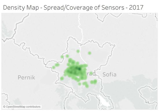
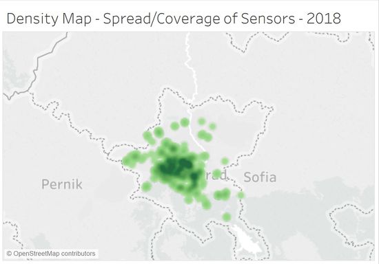
I brought in the sensors for the Sofia region only, and use the Density Marks feature of Tableau 10.3 to plot the coverage of the sensors. I find that the sensors are generally placed in central Sophia, with lack of coverage in South Eastern and North Eastern regions. The number of sensors increases from 2017 to 2018, however, this is mainly concentrated in the central region, with little focus on the areas that lack coverage.
Below is the coverage for the year 2017.
Below is the coverage for the year 2018.
Sensors' Stable Operations
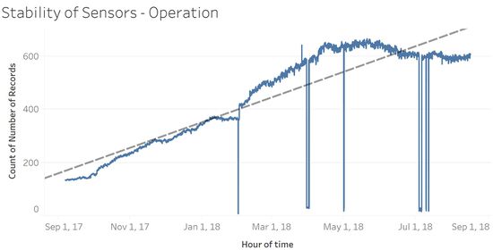
To understand whether the sensors are operating properly at all times, I looked into the time series data of the number of records being captured by the sensors over the hours. This shows that indeed the number of records and thereby sensors has increased over time. However, they are not working properly all the time, as shown by the sudden steep drop in the number of records collected and a sudden spike. Perhaps this is due to sensors suddenly not taking as many or taking too many records as compared to their configuration due to malfunction. A closer look at the time axis shows that these dips started in 2018. This could be due to the new sensors that were added in 2018. Perhaps certain members of the new group of sensors are not working correctly.
Sensors' Performance Accuracy
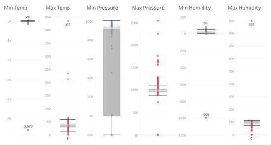
Checking the performance accuracy of the sensors requires some basic knowledge of the measures that are being acquired by the sensors. The three measures I am looking into here are temperature, pressure and humidity.
- Temperature in Bulgaria: The highest ever temperature recorded is 45.2 degrees Celsius, while the lowest ever recorded is -38.3 degrees Celsius. When the sensors recorded temperatures nearing 400 degrees Celsius and -5K Celsius, they are obviously not behaving accuractely.
- Pressure across the world:
- Humidity across the world: Relative humidity is always recorded as a percentage value, therefore values of 898 and -999 are just not possible or anywhere near accurate. Additionally we see some humidity values of around 110 as well.
- Now turn your attention to the air pollution measurements themselves. Which part of the city shows relatively higher readings than others? Are these differences time-dependent? Limit your response to no more than 6 images and 800 words.
References
- Bozhinov, T. (2018, August 15). The weather in Bulgaria: An all-year guide. Retrieved from https://www.kashkaval-tourist.com/weather-in-bulgaria-all-year-guide/
- Humidity. (2018, October 30). Retrieved from https://en.wikipedia.org/wiki/Humidity
Task 3
Urban air pollution is a complex issue. There are many factors affecting the air quality of a city. Some of the possible causes are:
- Local energy sources. For example, according to Unmask My City, a global initiative by doctors, nurses, public health practitioners, and allied health professionals dedicated to improving air quality and reducing emissions in our cities, Bulgaria’s main sources of PM10, and fine particle pollution PM2.5 (particles 2.5 microns or smaller) are household burning of fossil fuels or biomass, and transport.
- Local meteorology such as temperature, pressure, rainfall, humidity, wind etc
- Local topography
- Complex interactions between local topography and meteorological characteristics.
- Transboundary pollution, for example, the haze that intruded into Singapore from our neighbours.
In this third task, you are required to reveal the relationships between the factors mentioned above and the air quality measure detected in Task 1 and Task 2. Limit your response to no more than 5 images and 600 words.
Software
- Tableau - for visualization of the various tasks
- Python - for geocoding
