IS428 AY2018-19T1 Tian Seet Yuen
Contents
- 1 Problem & Motivation
- 2 Data Exploration and Preparation
- 3 Interactive Visualization and Design
- 4 Task 1: Spatio-temporal Analysis of Official Air Quality
- 5 Task 2: Spatio-temporal Analysis of Citizen Science Air Quality Measurements
- 6 Task 3: Relationships and Causal Factors of Air Pollution
- 7 References
- 8 Comments
Problem & Motivation
Air pollution is an important risk factor for health in Europe and worldwide. A recent review of the global burden of disease showed that it is one of the top ten risk factors for health globally. Worldwide an estimated 7 million people died prematurely because of pollution; in the European Union (EU) 400,000 people suffer a premature death. The Organisation for Economic Cooperation and Development (OECD) predicts that in 2050 outdoor air pollution will be the top cause of environmentally related deaths worldwide. In addition, air pollution has also been classified as the leading environmental cause of cancer.
Air quality in Bulgaria is a big concern: measurements show that citizens all over the country breathe in air that is considered harmful to health. For example, concentrations of PM2.5 and PM10 are much higher than what the EU and the World Health Organization (WHO) have set to protect health.
Bulgaria had the highest PM2.5 concentrations of all EU-28 member states in urban areas over a three-year average. For PM10, Bulgaria is also leading on the top polluted countries with 77 μg/m3on the daily mean concentration (EU limit value is 50 μg/m3).
According to the WHO, 60 percent of the urban population in Bulgaria is exposed to dangerous (unhealthy) levels of particulate matter (PM10).
Data Exploration and Preparation
Official Air Quality Dataset
EEA Data
Firstly, let's look at the Official Air Quality data. According to the metadata, there are 6 stations - Nadezhda, Hipodruma, Druzhba, Orlov Most, IAOS/Pavlovo and Mladost. All datasets were merged together into a single csv file.
The important variables are as follow:
- AirQualityStationEoICode
- CommonName
- AirPollutant
- AveragingTime
- Concentration
- DateTime
- Longitude
- Latitude
| Problem #1 | Missing Values |
|---|---|
| Issue | Upon further inspection, data for Year 2016 - 2018 were missing for Orlov Most station, and data for Year 2013 - 2017 were missing for Mladost. Meanwhile, data from Jan 2017 to Oct 2017 were missing for all stations. |
| Solution | Since the main goal is to visualize the overall characteristics of air quality in Sofia City, Orlov Most station was excluded completely since most of its data is missing. However, the remaining stations remained included in the EDA process to discover potential patterns and insights. |
| Problem #2 | Different AveragingTime formats |
|---|---|
| Issue | In this set of timeseries data, there appears to be different AveragingTime formats of PM10 concentration values. In total, there are 3 different formats - 1. Day 2. Var 3. Hour. To illustrate, data for Year 2016 - 2018 are mostly recorded in Hour or Var format. |
| Solution | The datasets will be separated into two formats: Daily and Hourly. Firstly, Var values were converted to Hour values by deducting 1 hour from the Var values. Next, to convert Hour values to Day values, the mean for Hour values in each Day was computed. With that, we have two sets of data - Daily and Hourly. |
Citizen Science Air Quality Dataset
Air Tube
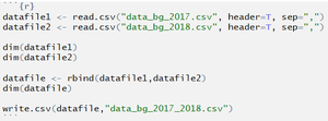
Next, let's explore the Citizen science Air Quality measurements. Firstly, there were 2 datasets - one for 2017 and another for 2018. After which, both datasets were combined together, via a notebook written in R.
| Problem #1 | Tableau unable to read 11-character Geohash values |
|---|---|
| Issue | In the datasets, 11-character geohash was used to provide geographical details. However, Tableau is unable to read these values. |
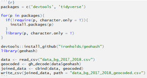
| Solution | R Notebook was utilized to generate the latitude and longitude values according to these geohash values. After which, these values were combined to the current dataset as new columns. |
Interactive Visualization and Design
| Due to the vast amount of visualizations intended to tackle Task 1, squeezing all visualizations within one sheet would result in an overly-cluttered dashboard and thus, not ideal. As such, icons were created to allow users to navigate across sheets to view visualizations for different purposes. | |
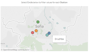
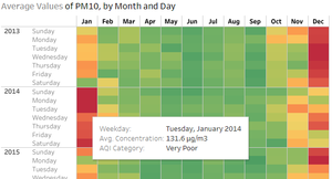
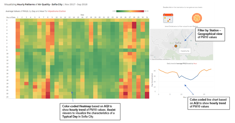
| This geographical map acts as a filter to allow users to attain a good sense of the Station’s geographical location. Upon hovering over the circle, a tooltip appears to represent the station’s name. Sheets within the dashboard are dynamic to this filter, and this allows user to possibly draw insights between geographical differences and PM10 values. | |
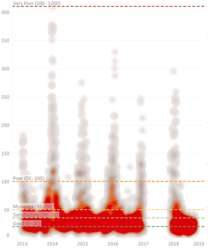
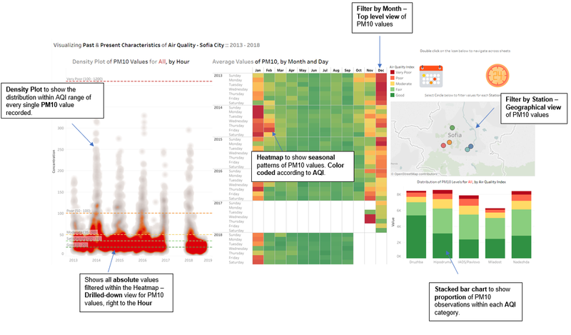
| Reference lines are added to this density plot, to allow users to immediately see where the PM10 measurement lies within. The ranges follow the Air Quality Index given by EEA. Source: http://airindex.eea.europa.eu/. Reference lines are also color coded to represent the danger of PM10 values, whereby “Good” is color coded as dark green and “Very Poor” is color coded as bright red, which signifies danger. | |
| Upon hovering, the tooltip tells you immediately the AQI category and Average concentration value for the PM10 measurement. | |
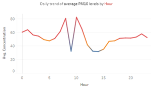
| This line chart is also color coded based on the AQI category. Viewers are able to tell immediately the trend of PM10 values based on hour. |
The following Dashboard is designed to tackle Task 1 specifically:
| Dashboard icons to allow viewers to navigate across sheet. Multiple sheets are used to prevent overly-cluttered graphs within a single sheet. | |
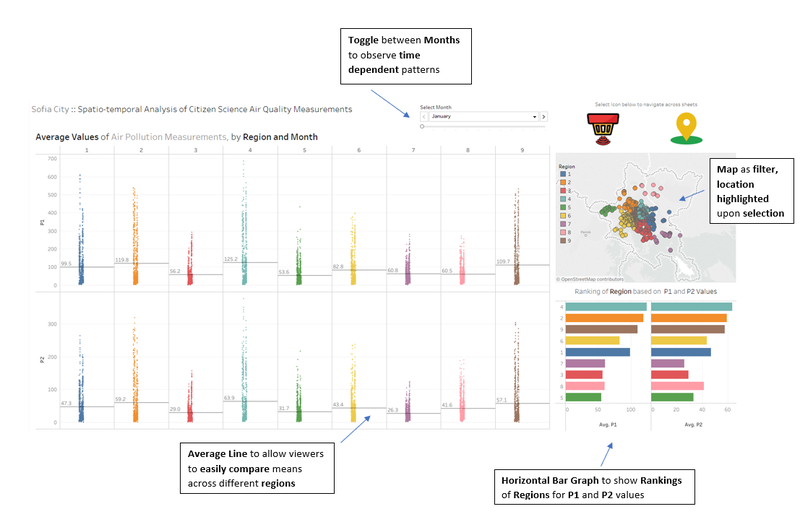
| Slider allows viewer to toggle through each Month and observe and time dependent patterns. | |
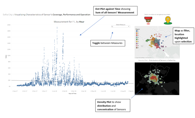
| Toggle for users to select measure and filter the graph based on interest. | |
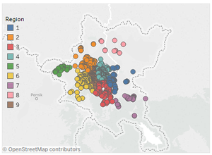
| Color-coded map which shows each Geohash as a coloured circle, according to its clustered region. This map also acts as a filter and highlight, to allow viewers to identify and geographical dependent patterns. Viewers are also able to select the Region based on the Legend shown. |
The following Dashboard is designed to tackle Task 2 specifically:
Task 1: Spatio-temporal Analysis of Official Air Quality
| Characterize the past and most recent situation with respect to air quality measures in Sofia City. Do you see any trends of possible interest in this investigation? |
|---|
|
Past vs Most Recent Characteristics of Air Pollution in Sofia City and Observed Trends 1. This Calendar Heatmap shows the average values of PM10 in Sofia City, by Month and Hour. Via this heatmap, we observe that the color shade trend towards yellow in November, then red in December and January, then fade back to yellow and light green again in February. However, through March to October, most boxes are shaded green. This suggests that Sofia City experiences a seasonal trend of PM10 levels, with peak levels in the months from December to January, ranging from Poor to Very Poor levels, while remaining relatively stable within Good to Moderate AQI (Air Quality Index) ratings in the other 8 months. This observation is interesting as the months from December to January are typically within the Winter season for most countries in Europe. Perhaps there may be a negative correlation between temperature and PM10 values, whereby the lower the temperature, the higher the PM10 value. I will be exploring this further in Task 3 to confirm this hypothesis. 2. As we look across this Heatmap (Top Down), we see that the colors are trending towards yellow and green. The most obvious trend could be observed by comparing the month of December in 2017 to the Decembers in earlier years. In 2018, for the months of May to September, the shade for the green colored boxes are even darker as compared to those between 2013 and 2016. This suggests that PM10 values in Sofia City could be improving slightly towards the healthier range in recent times. 3. At the left of the above image, the density plot shows all absolute values of PM10 recorded by EEA for Sofia City. As we filter the months of May to September, we can observe that values of PM10 in Year 2018 are mostly concentrated within Good to Satisfactory levels. This was not the case in the earlier years, where PM10 values (especially 2013 – 2015) were concentrated within the Moderate level as well. In addition, we can also observe a consistent decrease in density level of PM10 measurements that fall within the Moderate Range (35 – 50) over the years. Hence, this confirms that PM10 values in Sofia City could be improving slightly towards the healthier range in recent times. 4. Via these two stacked bar graphs, we can observe a significant increase in proportion of PM10 measurements which fall within the “Poor” and “Very Poor” AQI levels in January, November and December as compared to the other 8 months. |
Task 2: Spatio-temporal Analysis of Citizen Science Air Quality Measurements
Task 3: Relationships and Causal Factors of Air Pollution
References
