IS428 2018-19 Term1 Assign Yeo Qi Xun
To be a Visual Detective: Revealing spatio-temporal patterns
Contents
Overview
Air pollution is an important risk factor for health in Europe and worldwide. A recent review of the global burden of disease showed that it is one of the top ten risk factors for health globally. Worldwide an estimated 7 million people died prematurely because of pollution; in the European Union (EU) 400,000 people suffer a premature death. The Organisation for Economic Cooperation and Development (OECD) predicts that in 2050 outdoor air pollution will be the top cause of environmentally related deaths worldwide. In addition, air pollution has also been classified as the leading environmental cause of cancer.
Air quality in Bulgaria is a big concern: measurements show that citizens all over the country breathe in air that is considered harmful to health. For example, concentrations of PM2.5 and PM10 are much higher than what the EU and the World Health Organization (WHO) have set to protect health.
Bulgaria had the highest PM2.5 concentrations of all EU-28 member states in urban areas over a three-year average. For PM10, Bulgaria is also leading on the top polluted countries with 77 μg/m3on the daily mean concentration (EU limit value is 50 μg/m3).
According to the WHO, 60 percent of the urban population in Bulgaria is exposed to dangerous (unhealthy) levels of particulate matter (PM10).
The Task
In this assignment, you are required to use visual analytics approach to reveal spatio-temporal patterns of air quality in Sofia City and to identify issues of concern.
Using appropriate data visualisation, you are required will be asked to answer the following types of questions:
Task 1: Spatio-temporal Analysis of Official Air Quality
Characterize the past and most recent situation with respect to air quality measures in Sofia City. What does a typical day look like for Sofia city? Do you see any trends of possible interest in this investigation? What anomalies do you find in the official air quality dataset? How do these affect your analysis of potential problems to the environment?
Your submission for this questions should contain no more than 10 images and 1000 words.
Task 2: Spatio-temporal Analysis of Citizen Science Air Quality Measurements
Using appropriate data visualisation, you are required will be asked to answer the following types of questions:
- Characterize the sensors’ coverage, performance and operation. Are they well distributed over the entire city? Are they all working properly at all times? Can you detect any unexpected behaviors of the sensors through analyzing the readings they capture? Limit your response to no more than 4 images and 600 words.
- Now turn your attention to the air pollution measurements themselves. Which part of the city shows relatively higher readings than others? Are these differences time dependent? Limit your response to no more than 6 images and 800 words.
Task 3: Analyse Unmask My City's Claim
Urban air pollution is a complex issue. There are many factors affecting the air quality of a city. Some of the possible causes are:
- Local energy sources. For example, according to Unmask My City, a global initiative by doctors, nurses, public health practitioners, and allied health professionals dedicated to improving air quality and reducing emissions in our cities, Bulgaria’s main sources of PM10, and fine particle pollution PM2.5 (particles 2.5 microns or smaller) are household burning of fossil fuels or biomass, and transport.
- Local meteorology such as temperature, pressure, rainfall, humidity, wind etc
- Local topography
- Complex interactions between local topography and meteorological characteristics.
- Transboundary pollution for example the haze that intruded into Singapore from our neighbours.
In this third task, you are required to reveal the relationships between the factors mentioned above and the air quality measure detected in Task 1 and Task 2. Limit your response to no more than 5 images and 600 words.
Motivation
These are the main motivations for the development of the visualization tool:
- Understand the difference between official and unofficial data about air quality
- Monitor emissions of each Coal Plant
- Investigate anomalies with weather patterns
- Tracking of air quality in different areas
The tool can be used by citizens and the government alike as it provides useful functions for them to understand more about air quality and how it affects all walks of life in Bulgaria.
Background Information
Key Measurement attributes and their significance
Official air quality measurements (5 stations in the city)
- BuildingDistance Distance to building (m). Value of -999 indicate unknown
- InLetHeight Height of inlet (m). Value of -999 indicate unknown
- KerpDistance Distance to kerp (m). Value of -999 indicate unknown
- AirPollutant Short pollutant name measured at this samplingpoint
- Projection Reference to projection
- Longitude Longitude of samplingpoint
- Latitude Latitude of samplingpoint
- Altitude Altitude of samplingpoint (m)
- Concentration Concentration of pollutant specified in AirPollutant
Citizen Data
- Humidity[%] Hourly relative humidity
- Temperature[degrees C] Hourly temperature
- Pressure[hpa] Hourly surface pressure
- P1[particles per m^2] Hourly PM10 concentration
- P2[particles per m^2] Hourly PM2.5 concentration
Meteorological Data
- TASMAX[degrees C] Daily maximum temperature
- TASAVG[degrees C] Daily average temperature
- TASMIN[degrees C] Daily minimum temperature
- DPMAX[degrees C] Daily maximum dew point temperature
- DPAVG[degrees C] Daily average dew point temperature
- DPMIN[degrees C] Daily minimum dew point temperature
- RHMAX[%] Daily maximum relative humidity
- RHAVG[%] Daily average relative humidity
- RHMIN[%] Daily minimum relative humidity
- sfcWindMAX[km/h] Daily maximum wind speed
- sfcWindAVG[km/h] Daily average wind speed
- sfcWindMIN[km/h] Daily minimum wind speed
- PSLMAX[hpa] Daily maximum surface pressure
- PSLAVG[hpa] Daily average surface pressure
- PSLMIN[hpa] Daily minimum surface pressure
- PRCPMAX[mm] Daily maximum precipitation amount
- PRCPAVG[mm] Daily average precipitation amount
- PRCPMIN[mm] Daily minimum precipitation amount
- VISIB[km] Daily average visibility
Data
You will have the following data and supporting information at your disposal:
- Official air quality measurements (5 stations in the city)
- Citizen science air quality measurements
- Meteorological measurements
- Topography data
The datasets above can be generally grouped into 3 different categories:
- Air Quality Data
- Meteorological Data
- Topography Data
The data will then be visualized using Tableau. However, some data cleaning and preprocessing steps are required before the data is suitable for use in Tableau. I will be using python to execute the following data cleaning tasks
Data Cleaning
| Problem #1 | Citizen Science Air Quality Mapping Data |
|---|---|
| Issue | The original citizen science air quality data provided contains Geohashes. Tableau does not have difficulty reading Geohashes, but to plot the choropleth maps, having the data as Geohashes will pose some issues. Thus, there is a need for non-Tableau solution/alternative. |
| Solution |
| Problem #2 | 2018 Official Air Quality Data is given in hourly format |
|---|---|
| Issue | The original official air quality data for 2018 is given in hourly format while the past years' data is given in daily format. There is a huge gap in data in 2017 that needs to be carefully handled |
| Solution |
Have 2 separate tabs for official air quality data. 1 tab for daily data between 2013 and 2016 and 1 tab for hourly data between 2017 and 2018. |
| Problem #3 | Official Air Quality Data |
|---|---|
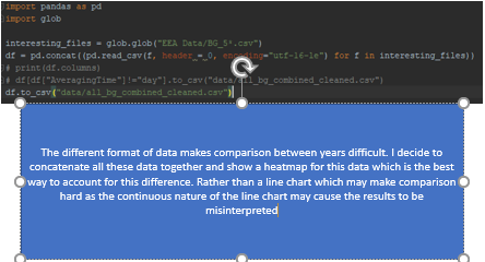
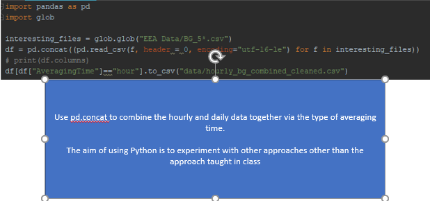
| Issue | The original official air quality data provided does not contain location data. In order to map out the official air quality, there is a need to do an inner join between the metadata data and the original official air quality data. Moreover, we should concatenate all the data obtained from Official Air Quality to enable time series analysis over the years rather than just for 1 particular year. Even though we are able to do this in python using Pandas, I decided to use the out-of-the-box solution of using Tableau to do this inner join. However, for the concatenation, I utilised Python to assist me. |
| Solution |
| Problem #4 | Unsuitable Form of Data for High Dimensional Data |
|---|---|
| Issue | The original official air quality data provided does not allow for easy plotting of charts used to visualise multi-dimensional data. In order to execute the coordinate plot, I had to change the data to get the dimensions all in the same scale. I decided to Tableau instead of Excel as I wanted to try using this tool for normalisation rather than a typical tool that we would use. |
| Solution |
Final Excel Files
- data_bg_combined_cleaned.csv Contains all the citizen obtained data
- all_bg_combined_cleaned.csv Contains all the EEA data
- daily_bg_combined_cleaned.csv Contains all the EEA data aggregated daily
- var_bg_combined_cleaned.csv Contains all the EEA data aggregated hourly
- lbsf_20120101-20180917_IP.csv Contains meteorological data
- metadata.xlsx Contains metadata for EEA data
Data Import/Configuration
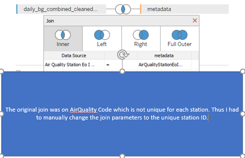
When importing multiple files, we need to tell Tableau how the files are related to one another. In this case, the files have a common attribute of station ids so we are able to join the metadata with the official data.
Brief Implementation Steps
Normally automatic mapping would be sufficient, however in our case, because of the complexity of our data, Tableau was unable to establish a meaningful relationship between the datasets. Thus, we have to do the custom mapping ourselves and choose the station ids from both metadata and EEA data to be joined upon.
Visualisation
The visualization is based on the category of the data. The breakdown of the proposed visualization is as shown below.
- Homepage
| Homepage |
|---|
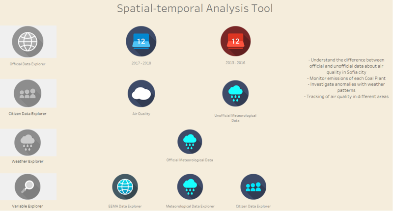
| Purpose / Description The homepage is the landing page you will see when you use this Visualisation tool. The data exploratory tools are all displayed on the homepage. This homepage makes use of the Tableau Dashboard and its new button functions to enable interactivity. It is to serve as a "Home" panel for this visualisation and it would enable the user ease of navigation between the dashboards.
|
Interactive Technique
|
- Official EEA Air Quality Explorer
| Official Air Quality Explorer |
|---|
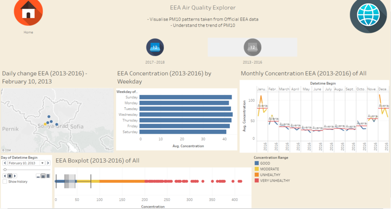
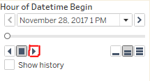
| Purpose / Description This section split is used to show how different attributes may relate with air quality and to show the change in air quality over time on a map. It is split into 2 different tabs. The first tab is to show the changes from 2013 to 2016 which are all aggregated daily data. The second tab is to show the changes from 2017 to 2018 which are hourly data.
|
Interactive Technique
|
| Types of Charts used The data provided are readings taken from the 5 EEA sensors. Thus, all of the readings are taken against time. To do meaningful comparison and analysis with time as one of the dimension, I used mainly,
The image below is a representation of the type of charts used. It does not represent all the charts that are present in the dashboard. |
- Citizen Data Explorer
| Citizen Data Explorer |
|---|
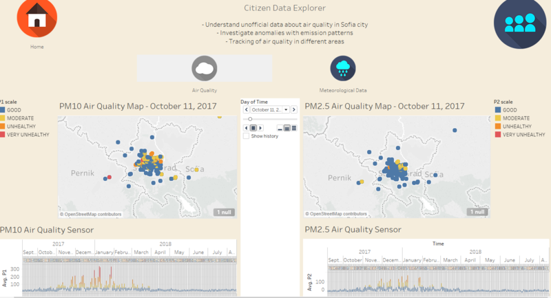
| Purpose / Description This section consists of 2 parts. The first tab is used to show the PM10 and PM2.5 changes across time for the user to understand how the pollution levels of each area of the map. The second tab is used to show the different meteorological data provided by these sensors.
|
Interactive Technique
|
| Types of Charts used The data provided are readings taken from various Citizen Data sensors. Thus, all of the readings are taken against time. To do meaningful comparison and analysis with time as one of the dimension, I used mainly,
The image below is a representation of the type of charts used. It does not represent all the charts that are present in the dashboard. |
- Meteorological Explorer
| Meteorological Explorer |
|---|
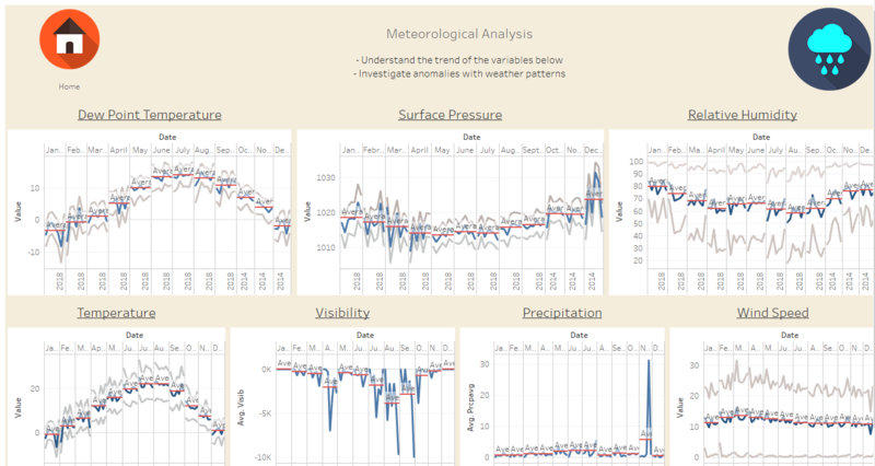
| Purpose / Description The page is used to show the weather conditions of Sofia City over time.
|
Interactive Technique
|
| Types of Charts used All of the readings are taken against time. To do meaningful comparison and analysis with time as one of the dimension, I used mainly,
The image below is a representation of the type of charts used. It does not represent all the charts that are present in the dashboard. |
- Variable Explorer
| Variable Explorer |
|---|
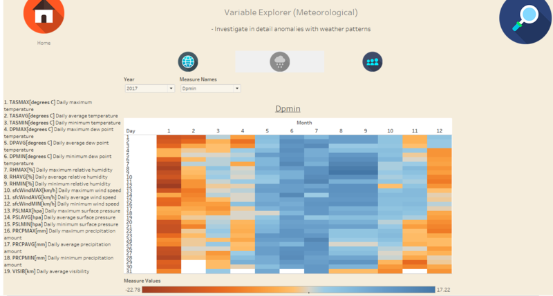
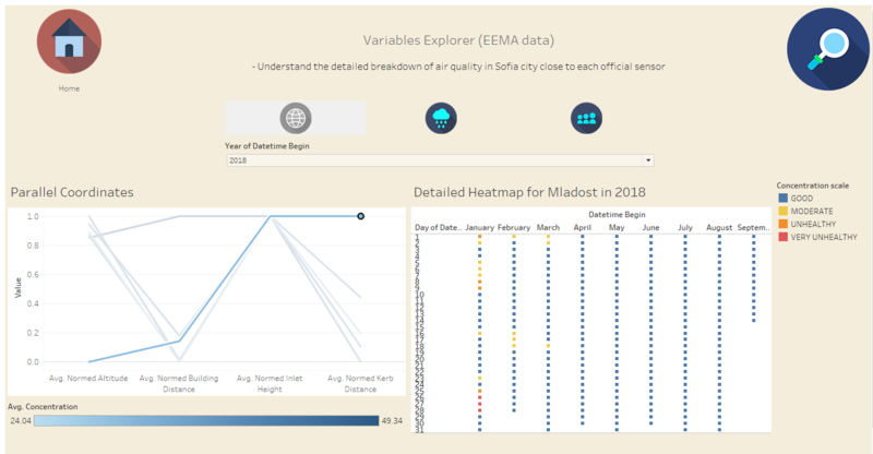
| Purpose / Description The tab is for in-depth analysis of a particular variable across time for each of the 3 datasets (a subtab is created for each dataset): meteological, official air quality and citizen data.
|
Interactive Technique
|
| Types of Charts used The data provided are readings taken from various sources. All of the readings are taken against time. To do meaningful comparison and analysis with time as one of the dimension, I used mainly,
The images below are representations of the type of charts used. It does not represent all the charts that are present in the dashboard. |
Findings - Task #1
| Serial | Observation |
|---|---|
| 1 | A typical day is characterised by good to moderate levels of pollution. |
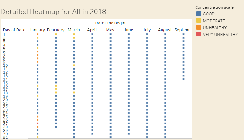
| 2 | Pollution generally seems to peak at the late nights/early mornings (PM10) possibly due to the want for secrecy when emitting as seen from hovering over the Detailed Heatmap in the EEA Data Explorer under Variable Explorer to get the hourly trend |
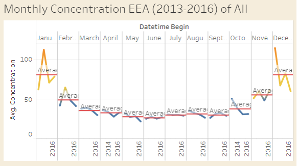
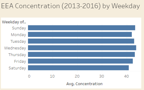
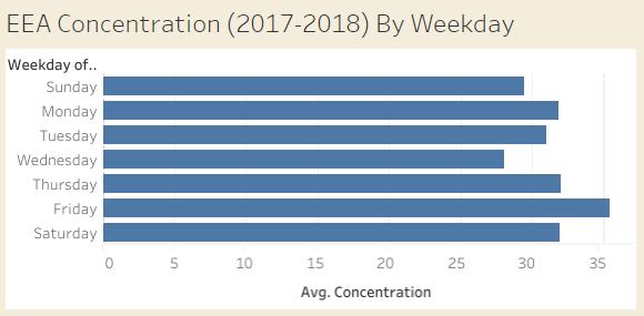
| 3 | Air quality seems to improve from 2013 to 2018 as the average PM10 levels for 2017-2018 are 31.393μg/m^3 while the average PM10 levels for 2013-2016 are 42.638μg/m^3 |
| 4 | Air quality seems to spread from a particular point to another in a slightly delayed manner as seen from the time lapse in 2017-2018 tab in Official Data Explorer |
| 5 | January and December seems to be the months with very heavy emissions and poor air quality |
| 6 | The days with higher emissions seems to change throughout the years possibly signalling a change in operations of emissions emitting
It seems like the highly emitting days are originally Sunday and Wednesday. It seems like the highly emitting days are now Monday and Friday. |
| 7 | Hipodruma seems to have the worst emissions overall out of active sensors as its worst emission peaked at close to 700μg/m^3 as seen in the EEA Data Explorer in Variable Explorer |
| 8 | |
| 9 | |
| 10 |
Findings - Task #2
| Serial | Observation |
|---|---|
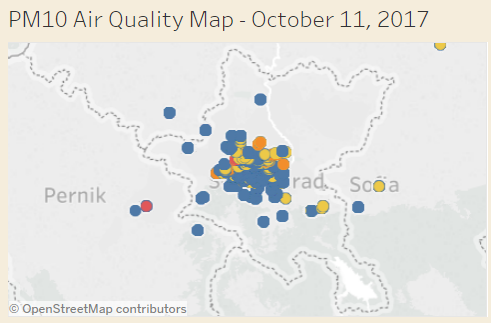
| 1 | They are not very well spread out as many seems to be congregated in the middle of the city. |
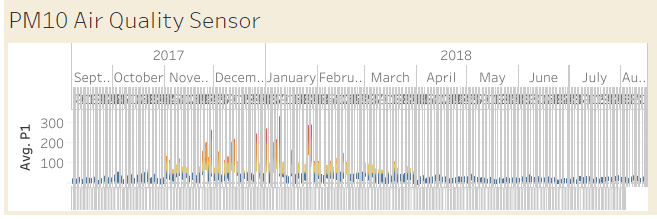
| 2 | They seem to break down occassionally. The pressure sensor in particular seems to be broken and not register the readings in 31 March 2018, 4 July 2018 and 5 July 2018. |
| 3 | Many sensors seems to not be totally working properly as they seem to have a reading of 2000μg/m^3 which is either very high if it is real or an anomalous reading as it differs from the official readings significantly. This is seen by the time lapse and hovering over interesting results. |
| 4 | |
| 5 | |
| 6 | There seems to be an influx of sensors on March 5 2018 |
| 7 | The center of Sofia seems to have higher readings than the rest of Sofia City as seen in the time lapse in Citizen Data Explorer under Air Quality |
| 8 | |
| 9 | |
| 10 |
Findings - Task #3
| Serial | Observation |
|---|---|
| 1 | Local energy sources does not seem to affect the air quality as much since the station which is furthest away from local buildings seems to have the worst air quality consistently |
| 2 | Temperature seems to play a part since the lower the temperature, the higher the values for the PM2.5 and PM10. |
| 3 | Sofia seems to not be as affected by transboundary pollution since the PM2.5 and PM10 levels in Sofia is consistently higher than that of its neighbours. |
| 4 | Amount of PM2.5 particles seems to correlate with the amount of PM10 particle levels |
| 5 | |
| 6 | |
| 7 | |
| 8 | |
| 9 | |
| 10 |
Conclusion
This was a really tough assignment as I had to think out of the box and to really try to create visualisations that needs a lot of transformation. The huge size of the data also caused Tableau to lag tremendously which is a huge obstacle for me to finish the assignment quickly.
Having a dashboard that is effective while choosing my charts is also a challenge as I strictly stuck to the normal definition given by our laptops for a dashboard so as to not let the user scroll and that may have limited the type of content that I put in Tableau.
Moreover, some of the functions I added in my Tableau seems to not be able to be shown on my Tableau public viz so there may be some discrepancy in the images with what is able to be done through Tableau public.
If I had more time to explore, I might have tried getting additional information from google maps to get the count of the sensors in the city. However, I encountered an rate limiting error when trying to call the google maps API to get the additional information. Link
Improvement
To perform the visual analysis, this is a list of the software which I used.
- Tableau
- Excel
- Chrome
- Python
Assignment Q&A
Need more clarification, please feel free to pen down your questions.
- Where exactly is the boundaries of Sofia City?
Assume that it is the Sofia City province boundary in Tableau Maps AKA (Sofiagrad)
- What exactly is the unit of measurements for P1 & P2?
Assume is particles per m^3 which is similar to what is being used in Singapore to calculate the PSI.
- What does var stands for in the official air quality data?
It is same as hourly data after closer inspection
References
Comments
Do provide me your feedback!:)
