IS428 AY2018-19T1 Lau Zi Quan
To be a Visual Detective
Contents
Overview
Air pollution is an important risk factor for health in Europe and worldwide. A recent review of the global burden of disease showed that it is one of the top ten risk factors for health globally. Worldwide an estimated 7 million people died prematurely because of pollution; in the European Union (EU) 400,000 people suffer a premature death. The Organisation for Economic Cooperation and Development (OECD) predicts that in 2050 outdoor air pollution will be the top cause of environmentally related deaths worldwide. In addition, air pollution has also been classified as the leading environmental cause of cancer.
Air quality in Bulgaria is a big concern: measurements show that citizens all over the country breathe in air that is considered harmful to health. For example, concentrations of PM2.5 and PM10 are much higher than what the EU and the World Health Organization (WHO) have set to protect health.
Bulgaria had the highest PM2.5 concentrations of all EU-28 member states in urban areas over a three-year average. For PM10, Bulgaria is also leading on the top polluted countries with 77 μg/m3on the daily mean concentration (EU limit value is 50 μg/m3).
According to the WHO, 60 percent of the urban population in Bulgaria is exposed to dangerous (unhealthy) levels of particulate matter (PM10).
Dataset Analysis & Transformation Process
Four major data sets in zipped file format are provided. They can be download by click on this link.
- Official air quality measurements (5 stations in the city)(EEA Data.zip) – as per EU guidelines on air quality monitoring see the data description HERE…
- Citizen science air quality measurements (Air Tube.zip), incl. temperature, humidity and pressure (many stations) and topography (gridded data).
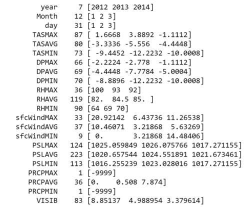
- Meteorological measurements (1 station)(METEO-data.zip): Temperature; Humidity; Wind speed; Pressure; Rainfall; Visibility
- Topography data (TOPO-DATA)
| Dataset | Data Attributes | Rationale Of Usage |
|---|---|---|
| ||
| ||
|
Issue 1 : Merging of Data Set
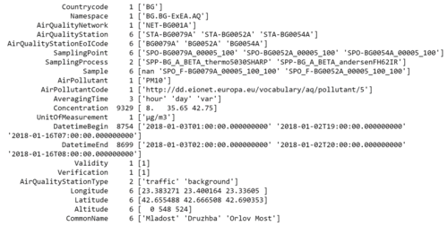
For EEA Data, there is a total of 28 csv file from different stations location in sofia across different years. In addition there a xlsx metadata which consists imporatant information like CommonName (Station Name) and Latitude and Longtitude of the station. In order to proceed with analysis, we need to merge all the data set together.
Solution :
Method 1: Using Python Pandas:
I made use of python pandas read_csv function to load the data into dataframe in order to concatenate the data. After we concat the data, we can merge the data based on the StationEoICode to get more information on the stations.
By using this method, I can export the csv into a single file and load it into different analytics tool for visualization.
Method 2: Using Tableau Union Function:
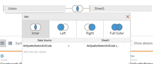
Similarly, Tableau can merge the data together using the union features. Subsequently, we can inner join the data based on the StationEoICode.
Issue 2 : Geohashing for Airtube Data
Solution :
I used python to convert the geohash to coordinates. I reference to python geohash2 library link.
After I decode the geohash, I discover that there are noises in the process. There is a particular geohash "m-2105171" which is unable to be decode. I used this converter to decode the geohash to obtain the latitude and longtitude. There are also a total of null values in the geohash data. In this case, I would probably be remove these 5 records as the geolocation is not located in Sofia or even near Bulgaria.
Issue 3 : Outlier/Noise in Airtube Dataset
During the Exploratory Data Analysis Process, I discovered extreme values in the dataset for certain measures. However, for Task 2, exploring outlier for Airtube Data is required. Thus this clean dataset is used after and before Task 2 to compare the results.
Solution : I removed values for Temperatures that are > 50 degrees Celsius and < -50 degrees Celsius. That is about 25,068 records removed.
Task 1: Spatio-temporal Analysis of Official Air Quality
Firstly, we are looking at only EEA Data from 2013 to 2018. By looking at the data as a whole, we identified that all stations have missing values from the period of 1 Jan 2017 to 28 November 2017.
INSERT THE FIRST GRAPH HERE
From this simple plot, we are able to identify that there is a pattern in the increase of the concentration of PM10. This means that there could be an interesting reason for the cause. Thus I decided to explore what is the current standards for PM10 to be considered unhealthy. Sofia City is located in Bulgaria, which is part of EU, thus I referenced to their standards of air quality from this link. From this link we can further categorize the PM Air quality into different categories. Firstly 50μg/m3 measured daily is the limit for Bulgaria with a 35 exceedences each year. Thus we need to generate a graph that can clearly pinpoint on which day the concentration exceeds and when are the days where people in Sofia city can enjoy breathing healthy air.
INSERT THE CATEGORIES HERE
I used the above categorization as my Color Scaling to visualize how a typical day in Sofia City looks like.
INSERT THE HEATMAP HERE
By categorizing the concentration, we can identify that actually, Sofia City is facing a high level of concentration of PM10. Surprisingly, other than the spikes in January and December, Sofia City is also facing a high concentration of pollutant across the years except for June.
INSERT THE Control Plot HERE
Although Heatmap can highlight the seriousness of pollution Sofia is facing, but using Control Plot, we can use it to identify underlying pattern and interesting
Characterize the past and most recent situation with respect to air quality measures in Sofia City. What does a typical day look like for Sofia city? Do you see any trends of possible interest in this investigation? What anomalies do you find in the official air quality dataset? How do these affect your analysis of potential problems to the environment?
Reference for Task 1:
- url
- url
- url
Your submission for this questions should contain no more than 10 images and 1000 words.


