IS428 2018-19 Term1 Assign Aaron Poh Weixin
Contents
Background & Objectives
Air quality in Bulgaria is a big concern: measurements show that citizens all over the country breathe in air that is considered harmful to health. For example, concentrations of PM2.5 and PM10 are much higher than what the EU and the World Health Organization (WHO) have set to protect health.
Bulgaria had the highest PM2.5 concentrations of all EU-28 member states in urban areas over a three-year average. For PM10, Bulgaria is also leading on the top polluted countries with 77 μg/m3on the daily mean concentration (EU limit value is 50 μg/m3). According to the WHO, 60 percent of the urban population in Bulgaria is exposed to dangerous (unhealthy) levels of particulate matter (PM10).
The objective of this project is to first understand..... (continue)
Task 1: Spatio-temporal Analysis of Official Air Quality
Data Preparation
Before diving into the data cleaning process, it is important to detail some findings/anomalies I got from simply observing and scanning the data:
- The given dataset only focuses on PM10, which will therefore be the main focus of our analysis
- Stations 60881 and 9484 have serious data quality issues
- Station 60881 only has data for 2018
- Station 9484 only has data up to the year 2015
- Station 9484 has missing data for the months of Oct to Dec for the year 2015
- Station 9484 has missing data for the months of Aug to Sep for the year 2013
- Averaging format inconsistent across time periods
- Year 2013-2014 averages data daily
- Year 2015 averages data daily, except for 31 Dec, which they classify as hourly
- Year 2016 mostly averages data daily, with some hourly averages
- Year 2017 averages hourly and only has data for the months of November and December. They also have a 'var' average which does not make sense
- Year 2018 averages mostly hourly, with some daily averages
Considering the task requires analysis of the past and the most recent air quality situation in Sofia City, the large amount of missing data in Station 9484 would be unacceptable, hence I decided to exclude it from the analysis. Furthermore, since Bulgaria is not a big country, 4 stations should be sufficient to explain the air quality situation
Note: (Year 2017 only has severe missing data in the original dataset, but I managed to download the latest version which captures most of the daily data)
With the above information in mind, I decided on the following cleaning procedure (in Python):
|
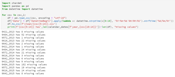
I started off with cleaning the years 2013-2015 and 2017(updated) because they had the cleanest data format. Cleaning was simply converting 'DatetimeBegin' into a suitable DateTime format ("dd/mm/yyyy")
|
||
|
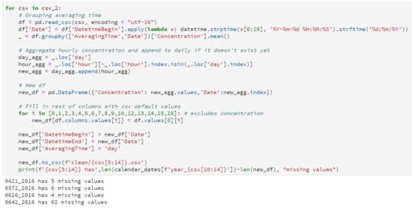
Years 2016 and 2018 were slightly more complicated because they contained both hourly and daily averages.
|
||
|
This step is the simplest as it simply merges all the cleaned datasets into 1 dataset to be parsed into the relevant visualisation tools |
Functions used:
|
Data Visualisation
A typical day in Sofia City really depends on the month you are referring to because concentration levels changes very drastically.
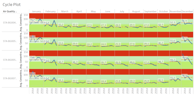
The below cyclical plot shows a summary of a typical day in Sofia City. For the majority of the year from March till October, average concentration levels are below the EU limit of 50μg/m3. Concentration levels usually peak around December or January.
While the visualisation alone is not able to tell us the possible cause of the spike in concentration levels, it is able to highlight trends in concentration levels.
For example, we can see that the station STA-BG00052A has a consistent trend of lower concentration levels over the years. This might indicate a healthier environment for the citizens around the region.
More encouragingly, focusing on the right-most column, we see that average concentration levels in December is dropping significantly over the years. This could have a spillover effect unto January (another unhealthy month) should this trend continue. Looking at the following simple line graph, we can observe that peak average concentration levels seem to be slightly lowering, which brings further good news for the citizens of Sofia City.
Task 2: Spatio-temporal Analysis of Citizen Science Air Quality Measurements
Data Preparation
- 2018: 4 geohash is NA
- 1254 unique geohash in 2018 (1265 overall)
- !!! duplicate geohash - time (NEED to clean!
- 2018 file too big - use jmp to clean
- not every station record every time of the year? (Q: Are they all working properly at all times?)
1) Viz1: station by time graph to see at a snapshot roughly which stations working often (white = not working) 2) Viz2: frequency of operation + % operation
2017:
2018: time: 2958654 (no missing) stations: 2958654


