IS428 2018-19 T1 Assign Cliff Halim Tirtamaya
Contents
Problem & Motivation
WIP
Official Air Quality (EEA Data)
The EEA Dataset comprises of air quality data for Sofia in separate spread sheets according to years.
- Need to combine datasets
- Similar headings
- Use Command Prompt copy function
Link: http://www.tomnash.eu/how-to-combine-multiple-csv-files-into-one-using-cmd/
- Daily Air data and Metadata are left-joined to Daily Air data on Air Quality Station - the unique identifier for each of the 6 stations.
- Changed DateTime Begin and End dimensions to Date & Time type of dimension
Link of Google Map of Sofia: https://www.google.com.sg/maps/place/Sofia+City+Province,+Bulgaria/@42.6860472,23.3214962,10.96z/data=!4m5!3m4!1s0x40aa868332a0a5a3:0x300a01269bf4d70!8m2!3d42.7570109!4d23.4504683
Task 1: Spatio-temporal Analysis of Official Air Quality
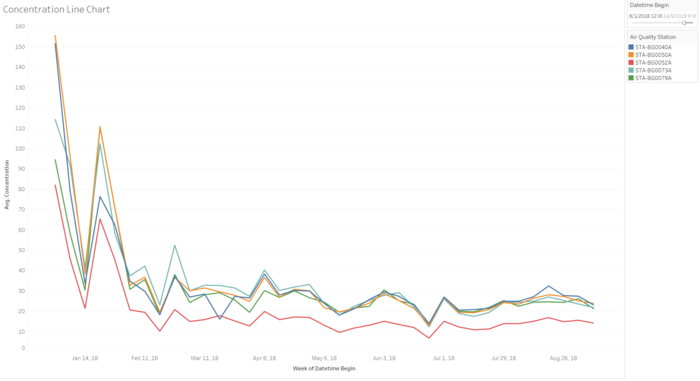
Based on the Official Air Quality data (EEA dataset), the average pollutant concentration levels of 5 out of the 6 stations have been on a decreasing trend since the beginning of 2018. With the exception of a spike at the end of January 2018, the trend has been on a general decline as showcased by the trendline in the chart below. This implies that air quality has generally improved in Sofia city.
From the start of February 2018, average concentration levels have remained below 50 μg/m3, the limit of EU standard. These levels have been fluctuating within a range of 10-40 μg/m3 till beginning of September 2018.
Both concentration line charts here
Anomalies found in dataset are:
- Weekly and hourly data for year of 2017 is missing.
- Spikes are usually at the end and beginning of the year
Anomaly Chart here
Other observations of EEA Data
- When we dive deep to an hourly view of the pollutant concentrations, it can be observed that average pollutant concentration levels are higher in the night time (between 0000 - 0800 hours), at an average range of 30-40 μg/m3. During the day, concentration levels will dip down to a range of 24-30 μg/m3 before rising again after 1800 hours.
- This could be attributed to the environmental phenomena concerning air pollutants. (Research on temperature and time of day affecting concentration levels)
- Station Analyses
- For the recent years of 2016-2018, stations that are located on the western part of Sofia City exhibited higher pollutant concentration levels. (List out the stations). This may be due to the concentration of population and industrial facilities located in the area, contributing to a higher level of pollution.
- Higher altitude --> less pollutant?
Citizen Science Air Quality Measurements Data
The Citizen Science Air Quality Measurements data comprises of sensors located all across the city, measuring pollutant concentration levels, under P1 and P2. The data also includes measurement of humidity, temperature and pressure for the various stations.
Topography data is included as a geohash code. In order to convert the geohash code into longitude and latitude data, the dataset was loaded into Rstudio. A R package, Ironholds Geohash, was installed for the conversion. After obtaining the longitude and latitude data of the geohash code for the sensors, the sensor locations were mapped out geographically on Tableau.
Task 2: Spatio-temporal Analysis of Citizen Science Air Quality Measurements
Sensor locations were mapped out geographically on the open source map within Tableau. Several of the sensors were located outside the Sofia city. The sensors located within were selected and grouped as a set for filtration purposes.
The coverage of the sensors are heavily condensed within the central area of Sofia city. The edges of the city, particularly so for northern and southern region, have far lesser number of sensors measuring for air quality. From the map shown, the extreme south of the country have close to zero sensors in the area. However, an assessment of geographical features seem to indicate less man-made features, possibly indicating lesser population volume in the area.
map of Sofia here
Sensor activity and performance is analysed by the measurements collected at the respective timings. For example, temperature readings of 0°C or negative values are assumed to be malfunctioning. P1 and P2 readings that shows a value of 0 can possibly indicate the lack of measurement at that point in time, also indicating equipment malfunction.
METEO and Topography Data
Task 3: External Factors
WIP
Dataset Import Structure & Process
WIP
Interactive Visualization
WIP
| Table Example | WIP | WIP |
|---|---|---|
|
| ||
|
| ||
|
|
Home Dashboard
WIP
References
In the completion of the analysis, the following references have been extremely useful:
- Tableau Training Video - Polygon Maps (http://www.tableau.com/learn/tutorials/on-demand/polygon-maps-8.2)
- Tableau Training Video - Background Images (http://www.tableau.com/learn/tutorials/on-demand/background-images-8)
- Creating Custom Polygons On A Background Image (https://tableauandbehold.com/2015/04/13/creating-custom-polygons-on-a-background-image/)
- Dynamically Switch Images Using Filters (https://community.tableau.com/message/182926#182926)
- Tableau Tip Week - Dashboard Navigation Buttons (http://www.thedataschool.co.uk/niccolo-cirone/tableau-tip-week-wednesday-creating-dashboard-navigator-buttons/)
