JobSage: Proposal
Contents
Introduction
Being in the penultimate year of our tertiary education, we witness the hectic job rush that impact many of our peers. In reality, most students face a great amount of uncertainty in making major decisions related to their future career prospects. For instance, freshmen are unsure of which majors to enroll in while graduating students are unsure of the ideal company to work for. We aim to provide an insightful data visualization on industries, companies, and jobs, enabling students and working adults alike to find their ideal job.
Problem Statement
1. Graduating students are unsure of which company they'd want to work for, hence, are seeking a tool to visualise and compare important attributes between companies.
2. Freshmen are unsure which majors they would want to enrol in, hence, are seeking a tool to visualize and compare important attributes across industries.
Research Questions
1. Can salary, growth trends, job vacancies and working hours required provide a good representation of the industry characteristics?
- Salary allows one to gauge how much money he or she can potentially make
- Working hours provides insights on work-life balance
- Job vacancies provides an indicator of the demand for personnel in the industry
- Growth trends allows us to understand whether the industry is a sunrise or sunset market, and provides insights on job stability
1. Can sentiment analysis (positive v negative) provide a good representation of the company? More specifically, is a "positive v negative" scale too general to provide viewers with good understanding of company?
- Sentiment analysis provides a good and reliable method to help people quickly understand the general thoughts on the company
2. Can a company's stock price (against time) provide a good representation on its current and future prospects?
- Stock price represents company's valuation. With comparison to time, we can tell the direction of the company's growth
Data Sources
1. Job Listing data from Indeed.com
- Description: Indeed is a worldwide employment-related search engine for job listings. Indeed is used by many large corporations in Singapore, and has a massive database of active and expired job listings.
| Attribute | Description | Example |
|---|---|---|
| Job Title | Title of Job Listing | Communications Intern |
| Category | Industry that job is classified in | Marketing |
| Company Name | Company that job listing belongs to | Ubisoft |
| Job Location | Country or Region of the job | Singapore |
| Job Description | Job description posted on indeed | A background in either Management, Marketing or Communications. The Communications Intern will play a key role in boosting our employer branding efforts, staff... |
| Overall Rating | Cumulative average rating of the company | 3.9 |
| Work-Life Balance Rating | Community rating of the work-life balance in the company | 3.9 |
| Benefits Rating | Community rating of the benefits that the company provides to its employees | 3.2 |
| Job Security Rating | Community rating of job security in the company | 3.4 |
| Management Rating | Community rating of the management team | 3.5 |
| Culture Rating | Community rating of the company culture | 4.1 |
2. Company Reviews Indeed.com
- Description: Indeed is a worldwide employment-related search engine for job listings. Many corporations have a profile page on Indeed, where current and past employees or vendors provide reviews for future potential employees.
| Attribute | Description | Example |
|---|---|---|
| Company | Company Name | |
| Job Title | Title of the Current/Former Employee | Support Engineer |
| Rating | Overall rating that was given by the employee | 5 |
| Title | Title of the review | Amazing company with great people |
| Location | Country or Region that the employee resides in | Seattle, WA |
| Date | Date that review was posted | October 7, 2018 |
| Review Content | Full content of the review | Far and away the best job I have had to date. Worked on leading edge projects with some seriously talented and fun people. The culture is outstanding, but being a contractor often left me on the outside looking in at all the fun and benefits, despite the team's efforts to include me as much as allowable. I would work here again in a heartbeat, but preferably as a direct hire. |
Related Works
| Related Work | Description |
|---|---|
Title: Tax Rates across U.S Companies (2013) |
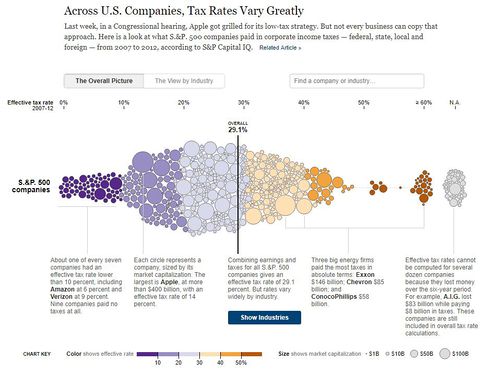
The New York Times published this visualisation showing the tax rates of the S&P 500 companies, and their effective tax rates between 2007 and 2012. The author used circles to represent companies, with the position of the circle representing the amount of effective tax the company is liable to. Size of the circles was used to represent the market capitalization of the company. The author used color to represent intervals of tax rates (eg. dark purple is 0% to 10%). Information of each bracket of tax rates was also provided for the reader to understand the intuition and reasoning behind the spread of the chart. Companies with missing data were also shown, with the author explaining and justifying the reasons for absence of data. The chart can also be filtered by company, industry, or market capitalization. |
Title: Tweet Sentiment Visualization Web App Source:https://www.csc2.ncsu.edu/faculty/healey/tweet_viz/tweet_app/ |
The Tweet Sentiment Visualization Web App is a powerful visual that allows the user to query tweets based on keywords, and understand the sentiment of the twitter community based on various emotions. Some emotions are: Stressed, Nervous, Active, Alert, Elated, Happy, Serene, Relaxed, Subdued, etc. This example provides a good way on how to visualize emotions on a multi-dimensional plot, and gives insights on the possible algorithms that we can use for sentiment analysis of the various companies we are analyzing.
The web app also has a zooming tool, but it has limited flexibility and a relative poor user experience. Interactivity must be improved on to provide more exploratory functions to the user. |
Title: What is the best job for you? Source:https://public.tableau.com/profile/payscale#!/vizhome/2015-04-15BestJobs/Desktop |
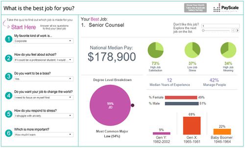
Created using Tableau, this visualization by PayScale, Inc provides an interesting take on filters, as the filters are structured in the form of a quiz. Upon completion of the quiz, a list of jobs that fits all the inputs will be generated. The visualization that is generated provides useful insights that would bring immediate value to an individual who is in the midst of his or her job search. Insights that are generated are as follows:
|
Technical Challenges
Data Sourcing
- Data for job reviews are highly unstructured and non-collated. As such, web crawling must be conducted to compile large sets of data based on the various industries identified.
Difficulty in Sentiment Analysis
- Sentiment is a highly difficult variable to capture and analyse. As such, time must be invested to understand the intricacies and to optimize the algorithmic model that we will develop for this project.
- Our visualization must be able to display a large range of sentiments effectively
Technical Knowledge
- Proficiency in programming in R
- Learning packages such as ggPlot, R Shiny App
- Deploying the R Shiny App live
Storyboard
Project Timeline
References
Visualisations
- https://archive.nytimes.com/www.nytimes.com/interactive/2013/05/25/sunday-review/corporate-taxes.html
- https://www.csc2.ncsu.edu/faculty/healey/tweet_viz/tweet_app/
- ttps://public.tableau.com/profile/payscale#!/vizhome/2015-04-15BestJobs/Desktop
Web Crawling


