IS428 2018 19T1 Group11 Proposal
|
PROPOSAL |
Despite Grab’s strong presence within the South East Asian rideshare market following the acquisition of Uber in March of this year, the growing number of players within the different fields in which Grab operates in incentivises the company to adopt non-traditional methods to improve its business operations.
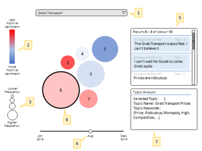
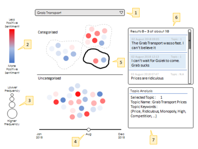
While it is important to fulfil the bottom line, a huge determinant of the company’s success stems from the public’s perception and Grab’s positioning in the markets. As such, this project aims to create a systematic method in which Grab can use to understand the public’s sentiment on their product and the company image.
The NLP algorithm used by Grab to describe the public’s sentiments follows the Latent Dirichlet Allocation (LDA) model, a generative statistical model that allows sets of observations to be explained by unobserved groups, or topics, that explain how some parts of the data are similar. With this model, Grab hopes to identify latent topics of interest and understand the public’s perception of the topic. Grab can therefore make use of this information to address any inadequacies in their business practices, create more effective marketing campaigns and improve their business operations to build a stronger overall brand image.
The objective of the visualization is to bridge the gap between the analytics and business teams. While the findings from the LDA model might be intuitive for those from the analytics team, the business users may find it difficult to internalize these findings. Hence, we aim to create a scalable way to present these findings to the business users in an easy to understand format.
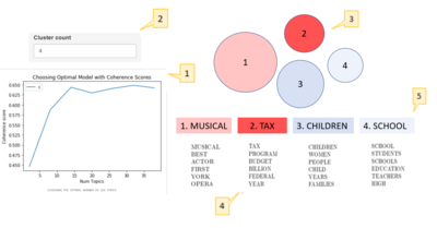
As mentioned before, we hope that by employing the LDA model, the business teams will be able to get a sense of the current perception of Grab’s products by the community. In the model, the user chooses an input of the total number of topics that he or she believes is an ideal balance between granularity and actionability (i.e too many topics may result in low actionability, while too little topics may result in not enough cause for action). As the ideal number of topics are often subjective, our proposed visualization will have the option for users to adjust the number of topics based on what he/she believes is ideal. We will also be including a covariance score plot that can guide users towards the ideal number of topics.
Data Source
Data used is obtained from web scraping of various social media platforms such as Instagram, Twitter, Reddit and Google Play.
The data set consists of 9000 comments that were scraped and collected.
Data Attributes
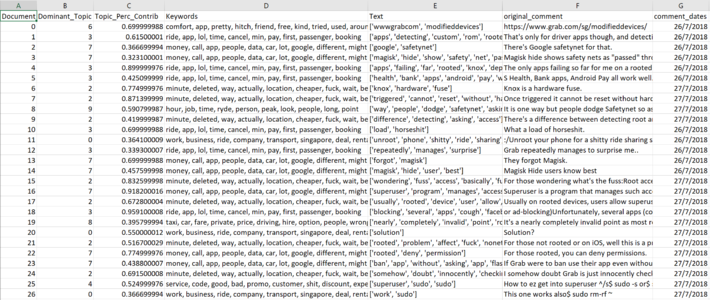
The following is a snapshot of the data collected, and a description of the data attributes:
| Data Attributes | Description of attributes |
|---|---|
| Document | Comments scraped may consist of more than a sentence each. They are separated and identified by documents. Hence, a document represents a sentence of comment. |
| Dominant_Topic | Dominant topic refers to the topic that the document will most likely be sorted into. |
| Topic_Perc_Contrib | The probability that the comment will be found in the topic amongst all other comments with similar keywords. |
| Keywords | Keywords that belong in each of the topics. |
| Text | Words in each comment after the removal of stop words (eg. the, is, to, on etc). |
| Original_Comment | Original comment. |
| Comment_Date | Date that the comment was posted. |
| Related Works | What We Can Learn |
|---|---|
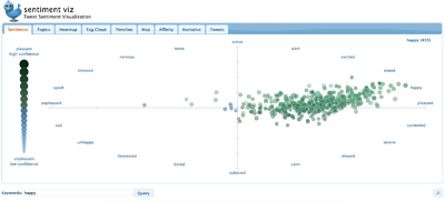
| Tweet Sentiment Visualisation Source: https://www.csc2.ncsu.edu/faculty/healey/tweet_viz/tweet_app/ |
|
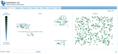
| Tweet topic cluster visualisation
Source: https://www.csc2.ncsu.edu/faculty/healey/tweet_viz/tweet_app/ |
|
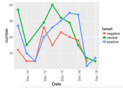
| Tweet sentiment across time
Source: https://www.csc2.ncsu.edu/faculty/healey/tweet_viz/tweet_app/ |
|
| Sketches | Description of Approach |
|---|---|
| Visualisation 1: User modelling interface |
Idea:
|
| Visualisation 2: Topic Cluster Visualisation Option 1
Inspired by: https://www.csc2.ncsu.edu/faculty/healey/tweet_viz/ |
Idea:
*subject to data availability |
| Visualisation 2: Topic Cluster Visualisation Option 2 |
Idea:
|
| Visualisation 2: Topic Cluster Visualisation Option 3 Inspired by: http://lcs.ios.ac.cn/~shil/paper/VISA_VINCI.pdf |
Idea:
*subject to data availability |
| Key challenges | Proposed solution to overcome challenges |
|---|---|
| Data cleaning and ensuring good data quality |
|
| Lack of experience using relevant tools for analysis such as RShiny |
|
| Determining the most effective way to visualise the data |
|
| Technology and Tools | Explanation |
|---|---|
| We will primarily be using Shiny for our visualization. Shiny is an open source R package that provides an elegant and powerful web framework for building web applications using R | |
| We will be building the machine learning model and visualization using R Studio | |
| We will be using Photoshop to design our poster |
https://www.csc2.ncsu.edu/faculty/healey/tweet_viz/
https://rstudio-pubs-static.s3.amazonaws.com/236186_d311ea00291d42509864aa0a77d340e8.html
http://lcs.ios.ac.cn/~shil/paper/VISA_VINCI.pdf
These pages have inspired numerous alternatives to visualising topic sentiments
Feel free to comment and leave suggestions and feedback to help us improve our project!:D

