IS428 AY2018-19T1 Chrysta Yuen Jia Lin
Contents
Problem and Motivation
Air pollution is an important risk factor for health in Europe and worldwide. A recent review of the global burden of disease showed that it is one of the top ten risk factors for health globally. Worldwide, an estimated 7 million people died prematurely because of pollution; in the European Union (EU) 400,000 people suffer a premature death. The Organisation for Economic Cooperation and Development (OECD) predicts that in 2050 outdoor air pollution will be the top cause of environmentally related deaths worldwide. In addition, air pollution has also been classified as the leading environmental cause of cancer.
In particular, air quality in Bulgaria is a big concern: measurements show that citizens all over the country breathe in air that is considered harmful to health. For example, concentrations of PM2.5 and PM10 are much higher than what the EU and the World Health Organization (WHO) have set to protect health. Bulgaria had the highest PM2.5 concentrations of all EU-28 member states in urban areas over a three-year average. For PM10, Bulgaria is also leading on the top polluted countries with 77 μg/m3on the daily mean concentration (EU limit value is 50 μg/m3).
According to the WHO, 60 percent of the urban population in Bulgaria is exposed to dangerous (unhealthy) levels of particulate matter (PM10).
With the huge amount of data collected, there is a need to build an interactive data visualization tool to assist the WHO and the government officials in Bulgaria to identify the areas with highly polluted air that is unfit for breathing.
Dataset Analysis & Transformation Process
Before analyzing the data, there is a need to do data preparation to make sense of the data. Under the Sofia Air data, there are 4 different zip files provided in the assignment with each own unique ways to process and make sense of the data. This particular section will be used to elaborate on the dataset analysis and its transformation process for each dataset, to prepare the data for import and analysis onto tableau.
EEA Data
Problem 1: The raw dataset (EEA Data) has numerous data(bg_x_xxx_year) located in different csv files as seen in Figure 1.
Solution 1: To successfully upload the data set onto Tableau, use the union function(figure 2) to include all the different csv files.
To integrate the metadata, innerjoin metadata and the union-ed bg data based on the variable: AirQualityEoiCode. This step helps to integrate both the bg_data and the metadata.
Problem 2: The raw dataset (EEA Data) has data of stations with limited number of yearly data.
As seen in Figure 3, the problematic data is highlighted with the purple border.
Solution 2: To prevent the data from affecting the rest of the dataset, it will be omitted .
As seen from Figure 3, the data file affected includes: Station 60881 and Station 9484. Both data file will be excluded from the visualization.
Air Tube Data
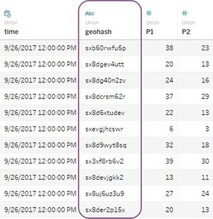
Problem 1: AirTube's data does not brings about the exact location as it is given in geohash format.
Solution 1: Determine the location of the data points by using the geohash package in R environment to convert the geohash format into longitude and latitude. Using the geohash package in R environment, convert the geohash as seen in Figure 5.
Task 1: Spatio-temporal Analysis of Official Air Quality
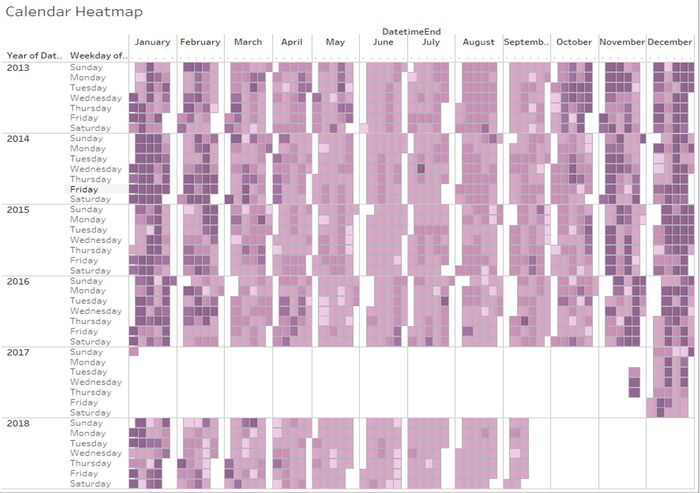
A typical day in Sofia city can be seen from the image in Figure 8, where the days in a week ranges from Sunday to Satursay. The concentration level is divided into 5 different concentration bins(Figure 7):
A typical day in Sofia city is generally rated “Fair”; where a "Fair" grade is determine by a concentration level between 30-45um/g. However, a typical day in Sofia city from November to February is generally rated “Very Poor”; where a "Very Poor" grade is determine by a concentration level that is higher than 60. In particular, the high pollution level during December can be attributed to the Bulgarian's Christmas traditions; fire be built in the hearth, with enough wood to burn all night and into Christmas Day, to help with the new birth of the sun. With this tradition, the amount of pollution during Christmas season will naturally be higher than usual. Having the majority of Bulgarian burn wood throughout the night for the festive season is a huge contribution to the increased pollution concentration level. Despite the continuous burning year on year, it is observed that pollution's concentration level decreased over the years. This can be attributed to modernization, where Bulgarian families' tradition evolve to substitute the lighting of wood with the lighting of candles. As lighted candles produced lesser air pollution as compared to burnt wood, there is a general decrease in Bulgaria's pollution concentration level over the years(Figure 8).
Visualizing the data also reflects the anomalies in the data set, as seen in Figure 9. As seen from Figure 9, the spike in pollution's concentration levels periodically happen during the end of December and the middle of January. This helps to support the previous discussion about Bulgarians' tradition of burning woods during the Christmas.
Task 2: Spatio-temporal Analysis of Citizen Science Air Quality Measurements
As seen from Figure 10 and 11, the sensor's coverage focuses mainly on the central area of Sofia City for both 2017 and 2018. This led to a negligence of the outer rims of Sofia City. Despite so, Figure 11 shows that the number of sensor coverage increased in year 2018.
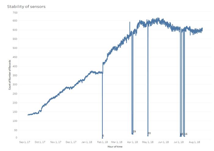
Figure 12 reflects the stability of the sensors by comparing time(hourly) with the total number of records. This helps to determine if the sensors were inaccurate or malfunctioned at any point in time. Taking a closer look at Figure 12, there is an obvious dip in 3 instances; 31st January, 1st April, 1st May, and 4th to 12th July. While the dips did not reflect an empty value, the value is too small to be significantly compared with the remaining data.
Through the readings captured, Figure 13 reflects the unexpected behaviors of pressure, humidity and temperature.
Pressure
Humidity
Temperature Figure 12 shows 2 graphs with the variable temperature. The minimum and maximum temperature of temperature is measured by a dual axis boxplot, on the left of Figure 12. Despite the high outlier value in the temperature min-max boxplot,the average value of the temperature is at a stable number of 12.93. This shows that the value of the outlier affect the average value of the temperature as drastically.
Which part of the city shows relatively higher readings than others? Are these differences time dependent?
Task 3
| Context |
|---|
Urban air pollution is a complex issue. There are many factors affecting the air quality of a city. Some of the possible causes are:
|
| Reveal the relationships between the factors mentioned above and the air quality measure detected in Task 1 and Task 2. |


