IS428 Team wiki: Group12(CJS) Proposal
Problem How happy are you today? How happy were you yesterday? How about last year? Well, this may sound bizarre but did you know happiness can be measured? In fact, since 2012, the United Nations Sustainable Development Solutions Network has been publishing a world happiness report which uses 6 parameters - GDP per capita, social support, healthy life expectancy, freedom to make life choices, generosity, and perception of corruption - to come up with the happiness index for different countries yearly. As a result, we were curious as to whether there is something more the large amount of data being used in this report could tell us.
Motivation The United Nations SDSN publishes reports that present the ranking of the individual countries for the year it is published in but in it, happiness index trends of different countries over the years are not clearly presented. We can realize the importance of such trends when we take the example of Singapore. In 2018, Singapore’s was ranked 34th out of 155 countries in terms of happiness. Though this may seem somewhat high, when we compare it with their 26th ranking in 2017 will we realise that Singapore is becoming a less “happier” country. Therefore, our team would like to observe the data relatively and identify whether such trends are common for other countries as well. Secondly, we are curious to see which of the 6 factors are more closely linked to a happier countries and observe what it would take for countries to be “happier”, by UN’s standards. A country ranked first in the world happiness index might not rank first in one of the 6 factors. Thus, we would like to identify the relationship between the happiness index and the 6 different factors that contribute to it. Also, through this, our team would like to find out whether there has been any inconsistency involved in the ranking over the years and possibly, we could reveal new information in regards to the world happiness index.
1. Identify the overall trends of happiness ranking index of countries over the years between 2008 to 2017
2. Identify the rankings of the each of 6 parameters that make up the happiness index of countries from the years 2008 to 2017
3. Compare the 6 parameters between the selected countries and see how they fare in relation to their final happiness index ranking from the years 2008 to 2017
4. Identify whether there has been a change in the weightage for the individual parameters towards the final happiness index ranking from year to year. (Tentative)
coming soon
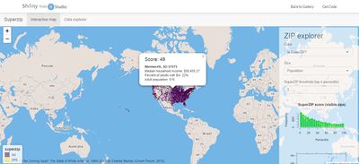
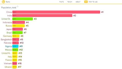
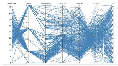
Our visualization are inspired by the following works:
| Reference Visualization Work | Our Team's Take-away |
|---|---|
| |
| |
|
coming soon
coming soon
| Key Technical Challenges | Proposed Solution |
|---|---|
|
No centralized data. Data are all divided year by year. |
|
| Unfamiliar with Visualization Tools |
|
| Unfamiliar with R as a new language |
|
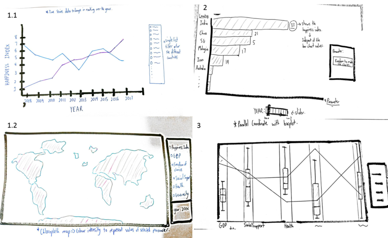
Please check out our visualization sketch to better understand the process.
For section 1(left side of the above image), users would be greeted with a general view of the data from 2008 to 2017. through the time series data and the geographical distribution.This section aim to fulfil objective 1. User can hover the map and see the individual parameter of the happiness index of the country in the specific year. User need to select the year for Chloropleth map.
Visualization presented:
- Line Graph
- Chloropleth map
Section 2(top right of the image) presents a more drilled down view as trends specifically related to the sub factors that make up the final happiness index can be seen here after the user selects the parameter and year. Tentatively, user only need to select parameter and the chart will change dynamically according to the year. This section aim to fulfil objective 2.
Visualizations presented:
- Bar Chart
For the section 3(bottom right of the image), the column or the y-axis are parameters and different lines represent different countries.This section aim to fulfil objective 3.
Visualizations presented:
- Parallel Coordinates
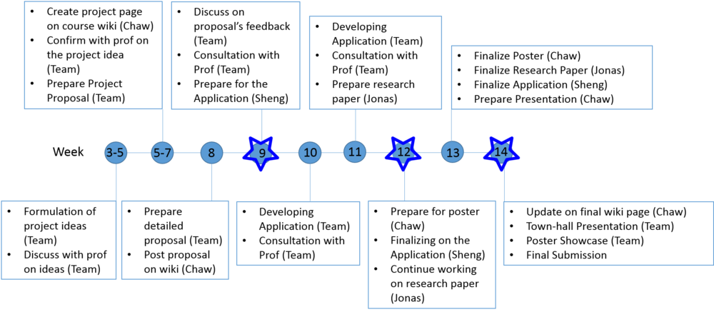
Milestones are indicated with the star.
Please provide us with any comments to improve our visualization better.

