IS428 AY2018-19T1 Huiyeon Kimn
Contents
- 1 Problem & Motivation
- 2 Data Transformation and Analysis Process
- 3 Interactive Visualization
- 4 Task 1: Spatio-temporal Analysis of Official Air Quality
- 5 Task 2: Spatio-temporal Analysis of Citizen Science Air Quality Measurements
- 6 Task 3 - Potential Factor Analysis
- 7 Conclusion
- 8 Tableau Link
- 9 References
- 10 Comments
Problem & Motivation
Bulgaria is suffering from a significant concern which roams around and among many different European Countries. Air pollution, known to be one of the top risk factors for health, threatens the air of Bulgaria. PM2.5 and PM10, widely found air pollutant is found ubiquitously in Bulgaria and know to be far exceeding the restrictions set by the European Union and the WHO (World Health Organization). As of the past 3 years, Bulgaria has had the highest PM2.5 concentrations among its neighboring countries, leading it to become one of the most polluted regions in the world.
With over 60 percent of the urban population in this beautiful country being exposed to dangerous particle matters, the health risk amongst Bulgarians are increasing. As such, there is an urgent need to address such a concern by analyzing the current trends and patterns of PM2.5 and PM10 concentrations so that effective measures can be taken.
We decided to create an interactive visualization, using visual platform such as Tableau to analyze the data collected over the 6 years (2013 - 2018). The platform to be create is made to satisfy these following objectives:
1. Identify patterns, events and abnormal patterns in the Citizen Science Air Quality data through pollution concentrations and other various meteorological data
2. Identify typical patterns, interesting events and trends in the past and recent by the levels of PM10 concentrations, as reported by official data
3. Analyze and identify potential associations among variables that may correlate with the air pollution.
Data Transformation and Analysis Process
We have received 4 sets of data for this analysis assignment. Each of the folders contain different records of data:
• EEA Data (time series PM10 concentrations from 2013 – 2018, recorded as official) • Air Tube Data (meteorological and concentrations from 2017-2018 in various regions) • METEO data (basic statistic summary such as wind, etc. from 2012-2018) • TOPO data (topographical data with elevation)
Official Air Quality Data (EEA)
The given data contains information about 6 stations with time range ranging from 2013 to 2018, depending on the station.
Issue: Different Stations with Different Time Range
Solution:The highlighted station of BG_5_9484 has data only from 2013 to 2015. Since the gap between the other stations and this station is quite big, it will not be meaningful nor correct to show any analysis based on the data of this Air Quality Station. Hence it will be removed from the analysis.
For the remaining dtaa points, we were able to use it with the time series as the data seemed to be correct.
Issue: Geographical Data separated into another Excel Workbook
Solution:The Excel formula shown in the above image was used to match the latitude and Longitude data to our actual data. This formula helped speed up the process by a lot.
Air Tube Data
Issue: Location Data encoded in Geohash
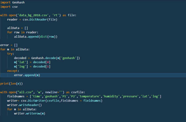
Solution: By writing a script in python, the encoded Geohash was converted back into Latitude and Longitude.
METEO Data
METEO Data had to be transformed in order to answer some answers in Task 3. By doing some exploratory Data Analysis, we were able to find some interesting information, which are:
- Using the map functionality in Tableau, we were able to find that the METEO data describes a location which happens to be the location of Mladost described in Task 1
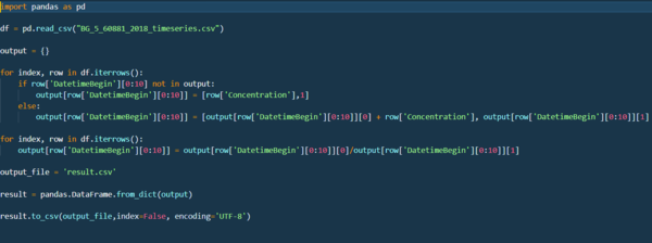
- Mladost has data which is described in an Hourly manner while the METEO data is currently is in Days. As such, the Mladost data had to be aggregated in terms of Days.
First, the EEA data was manipulated using Python Scripting.
Then the METEO data's date was combined into one column by using the "Combine Column" option in Power Query Excel.
The data now are ready to be analyzed!
Interactive Visualization
The following visuals are the output of the analysis.
Task 1: Spatio-temporal Analysis of Official Air Quality
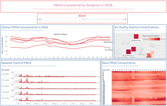
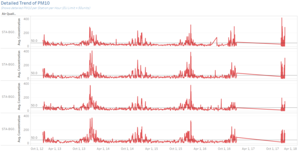
Due to the difference in averaging time in the EEA dataset where 2018, it is Hourly, while the rest in Daily, we decided to split the two data sets in to two different Dashboards.
Dashboard 1 - 2013 - 2017
Dashboard 2 - 2018
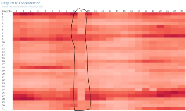
What does a typical day look like for Sofia city? |
|---|
|
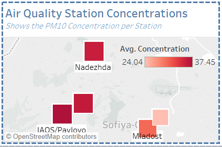
As we can see, the trend of PM10 seems to be similar across the 5 air quality stations. At 0:00AM, the PM10 starts out with a higher value and as the morning comes, the fluctuates up and down. Then we see a sudden dip in the concentration (Possibly an anomaly) around 9AM for the stations. After the dip, the conc. increases at 10AM until starts decreasing again from 11AM to 16PM. Then onwards the concentration level seems to increase again until the next morning. This is the typical conc. level per day in Sofia City. |
Do you see any trends of possible interest in this investigation? |
|---|
|
|
What anomalies do you find in the official air quality dataset? |
|---|
|
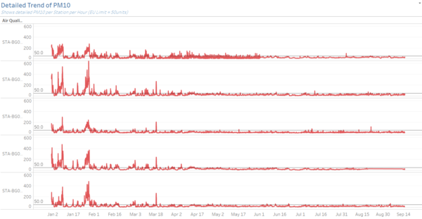
But due to the comprehensive dataset other than the missing data, we are already able to see enough information to conclude many points mentioned above. |
Task 2: Spatio-temporal Analysis of Citizen Science Air Quality Measurements
Dashboard - 1
Dashboard - 2
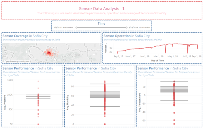
Part 1 - Sensor Operation, Coverage and Performance
Are they well distributed over the entire city? |
|---|
|
|
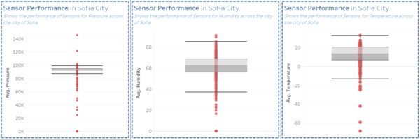
Are they all working properly at all times? |
|---|
|
|
Can you detect any unexpected behaviors of the sensors through analyzing the readings they capture? |
|---|
|
|
Part 2 - Air Pollutant Analysis
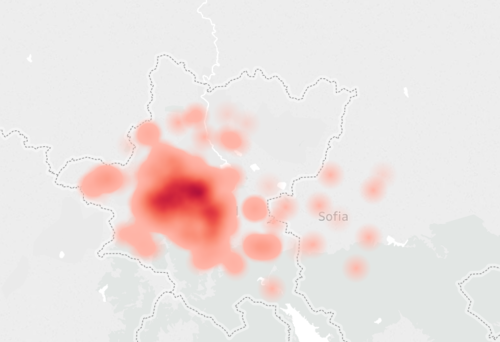
Which part of the city shows relatively higher readings than others? |
|---|
|
|
Are these differences time dependent? |
|---|
|
|
Task 3 - Potential Factor Analysis
Dashboard 1
Dashboard 2
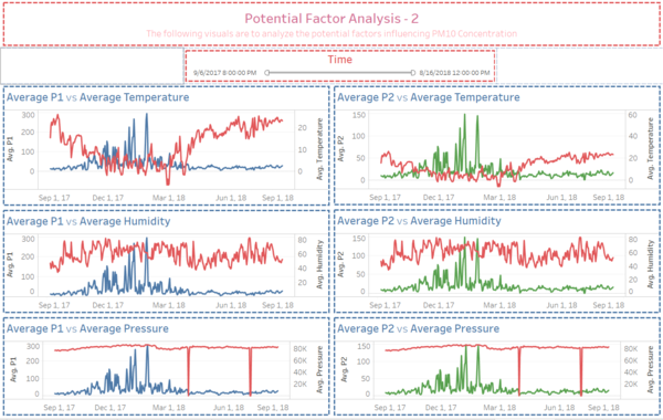
What are the factors influencing Concentration Levels? |
|---|
|
Seeing the visuals which describes Temp, Pressure and Humidity vs P2, we see a similar trend which the P1 follows with temperature negatively related with P2 while pressure and humidity has a slight positive relationship with P2 |
Conclusion
With all these analysis, we can conclude that the concentration level is mainly due to the December tradition and also can be influenced by factors such as temperature and wind speed. This could be the stepping stone for the Bulgarian government to make Sofia city a better place to live for everyone. I wish this project has some influence on the world.
Tableau Link
https://public.tableau.com/profile/huiyeon.kim#!/vizhome/Question1_127/2018?publish=yes
References
- Assignments
- http://unmaskmycity.org/project/sofia/
- https://pypi.org/project/pygeohash
- https://stackoverflow.com
Comments
Feel free to leave us some comments so that we can improve!
| No. | Name | Date | Comments |
|---|---|---|---|
| 1. | Insert your name here | Insert date here | Insert comment here |
| 2. | Insert your name here | Insert date here | Insert comment here |
| 3. | Insert your name here | Insert date here | Insert comment here |
