Difference between revisions of "The Defenders: Proposal Version 1"
| Line 1: | Line 1: | ||
| − | + | <span class="mw-ui-button {{#switch: {{{color|white}}} | red = mw-ui-destructive | green = mw-ui-constructive | white = | blue = mw-ui-progressive}}">[[Project_Groups|{{{Clickable Button|Back to Project Home}}}]]</span><noinclude> | |
{| style="background-color:white; color:white padding: 5px 0 0 0;" width="100%" height=50px cellspacing="0" cellpadding="0" valign="top" border="0" | | {| style="background-color:white; color:white padding: 5px 0 0 0;" width="100%" height=50px cellspacing="0" cellpadding="0" valign="top" border="0" | | ||
| − | | style="background:#ffe4b5;vertical-align:top;width:16%;" | <div style="padding: 3px; font-weight: bold; text-align:center; line-height: wrap_content; font-size:16px; solid #ffe4b5; background #ffe4b5; border-bottom:1px solid #ffe4b5; border-top:1px solid #ffe4b5; font-family:helvetica"> [[The Defenders: Proposal | <b>Proposal</b>]] | + | | style="background:#ffe4b5;vertical-align:top;width:16%;" | <div style="padding: 3px; font-weight: bold; text-align:center; line-height: wrap_content; font-size:16px; solid #ffe4b5; background #ffe4b5; border-bottom:1px solid #ffe4b5; border-top:1px solid #ffe4b5; font-family:helvetica"> [[The Defenders: Proposal Version 1 | <b>Proposal</b>]] |
| style="background:#ffe4b5;vertical-align:top;width:16%;" | <div style="padding: 3px; font-weight: bold; text-align:center; line-height: wrap_content; font-size:16px; solid #ffe4b5; background #ffe4b5; border-bottom:1px solid #ffe4b5; border-top:1px solid #ffe4b5; font-family:helvetica"> [[The Defenders: Poster | <b>Poster</b>]] | | style="background:#ffe4b5;vertical-align:top;width:16%;" | <div style="padding: 3px; font-weight: bold; text-align:center; line-height: wrap_content; font-size:16px; solid #ffe4b5; background #ffe4b5; border-bottom:1px solid #ffe4b5; border-top:1px solid #ffe4b5; font-family:helvetica"> [[The Defenders: Poster | <b>Poster</b>]] | ||
| Line 163: | Line 163: | ||
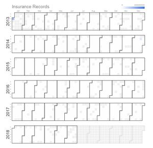
To display time series data of the security breaches over the years, through a calendar heat map, by their respective industries. This way we can observe any spikes or anomalies within the same time period, across the different industries and take possible precautions for the future. Wouldn't it be interesting if we are able to spot correlations between the intended industry and the time of attack? | To display time series data of the security breaches over the years, through a calendar heat map, by their respective industries. This way we can observe any spikes or anomalies within the same time period, across the different industries and take possible precautions for the future. Wouldn't it be interesting if we are able to spot correlations between the intended industry and the time of attack? | ||
| − | '''Technique: | + | '''Technique: Filter''' |
| − | Choose according to the industry to be visualised. Mouse over to observe the details of the day, ie the number of records breached. | + | Choose from dropdown box according to the industry to be visualised. |
| + | |||
| + | '''Technique: Tooltip''' | ||
| + | Mouse over to observe the details of the day, ie the number of records breached. | ||
|- | |- | ||
| Line 173: | Line 176: | ||
| | | | ||
| − | ''' | + | '''Boxplot between type and source of breach''' |
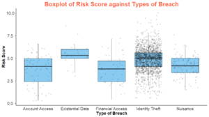
To understand across industries, what are the distribution of the types and sources of breaches, measured by the risk score or the number of records breached. Ever wondered for the healthcare industry, how susceptible are you to breaches used for financial access? The risk score shows you the extent of damage the risk could create, so that you can better prioritize on the attacks you want to defend yourself against. | To understand across industries, what are the distribution of the types and sources of breaches, measured by the risk score or the number of records breached. Ever wondered for the healthcare industry, how susceptible are you to breaches used for financial access? The risk score shows you the extent of damage the risk could create, so that you can better prioritize on the attacks you want to defend yourself against. | ||
| − | '''Technique: | + | '''Technique: Filter''' |
| − | Toggle between source or type of breach to observe the risk scores or number of records breached accordingly | + | Toggle between source or type of breach to observe the risk scores or number of records breached accordingly and choose the appropriate year from the slider or the desired industry |
| + | '''Technique: Tooltip''' | ||
| + | Mouse over to observe the details of individual records on the boxplot. | ||
|- | |- | ||
| Line 186: | Line 191: | ||
| | | | ||
| − | ''' | + | '''Distribution of breaches''' |
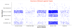
Source of breach over types of breach scatterplot. Distribution of the sources of attacks for each type of attacks and vice versa. Every wondered behind every breach used for financial gains, is it more likely to be done by a malicious insider or outsider? | Source of breach over types of breach scatterplot. Distribution of the sources of attacks for each type of attacks and vice versa. Every wondered behind every breach used for financial gains, is it more likely to be done by a malicious insider or outsider? | ||
| + | |||
| + | '''Technique: Tooltip''' | ||
| + | Mouse over to observe the details of individual records | ||
|- | |- | ||
| Line 201: | Line 209: | ||
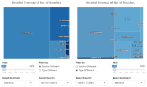
To understand in greater detail the characteristics of breaches affecting each country. Which industry is most threatened by breaches in a country and what are the causes of these breaches? Compare alone or between countries to gain more insights about the above! | To understand in greater detail the characteristics of breaches affecting each country. Which industry is most threatened by breaches in a country and what are the causes of these breaches? Compare alone or between countries to gain more insights about the above! | ||
| − | '''Technique: | + | '''Technique: Filter''' |
| − | a) Radio button to filter by source or type of breach | + | a) Radio button to filter by source or type of breach at the first layer |
b) Toggle which countries and/or continents to select for comparison | b) Toggle which countries and/or continents to select for comparison | ||
c) Slider to select time period to be observed | c) Slider to select time period to be observed | ||
| + | '''Technique: Tooltip''' | ||
Tooltip when hovering the mouse over to show: | Tooltip when hovering the mouse over to show: | ||
<ul> | <ul> | ||
| Line 211: | Line 220: | ||
<li>Type of Industry</li> | <li>Type of Industry</li> | ||
<li>Source of Breach</li> | <li>Source of Breach</li> | ||
| − | <li> | + | <li>Number of Records lost</li> |
| + | <li>Risk Score</li> | ||
</ul> | </ul> | ||
Revision as of 00:45, 25 November 2018
| 1.Breach Level Index |
|---|
| Source : Gemalto, the world leader in digital security. |
| Purpose : Dataset is designed to provide a simple way to input publicly disclosed information on data breaches and calculate a score indicating breach severity. (https://breachlevelindex.com/) |
|
1. Organization Breached 2. Number of Records Breached 3. Date of Breach: 01/01/2013 - 29/06/2018 4. Type of Breach -Nuisance (Email, Addresses, Affiliation) -Account Access (Username, Passwords to websites/ social media) -Financial Access (Bank Account Credentials) -Identity Theft ( Information can be used to masquerade someone) -Existential Data ( Info can be used to threaten business survival) 5. Source of Breach: -Lost Device -Stolen Device -Malicious Insider -Malicious Outsider -State Espionage 6. Location: Country 7. Industry: -Technology, Other, Retail, Government, Healthcare, Education -Financial, Social Media, Hospitality, Entertainment, Insurance -Non-profit, Industrial, Professional Services 8. Risk Score: Log 10 ( Type of Data * Source of Breach * Whether Action was taken) |
| Sketches | How Analyst Can Conduct Analysis |
|---|---|
|
|
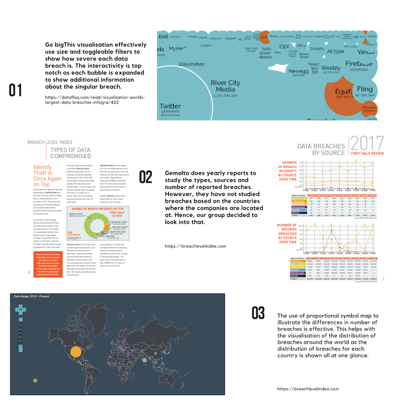
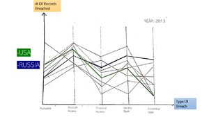
Breach OverviewConsists of an interactive parallel coordinate chart. This visualisation is linked by setting the time period for the data observed through an interactive timeframe. Parallel Coordinates The parallel coordinates show the distribution of each feature amongst the different countries. The use of brushing is to highlight the selected country/countries in relation to the rest of the countries. Dynamic Timeframe Toggle timeframe according to the period to be visualised. |
|
|
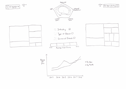
Risk ComparisonConsists of an interactive line chart, 2 treemaps and a radar chart. These visualisations are linked by checkboxes that detail various features such as type of industry, type of breach and source of breach. Both countries can be toggled and changed to other countries via a dropdown list. Line Chart The line chart compares the breaches per pax for 2 countries determined via the dropdown list. The corresponding colors of each country located beside the flag will match the color used for the lines in the line graph Toggle to display trend by year or by month in a cycle plot. Tooltip when hovering the mouse over to show information on:
Treemap The treemap shows a high level view of our breaches and displaying the breach details at the same time. The different rectangles in the treemap will be colored with different intensities based on risk scores. It allows us to see patterns quickly when our eyes visually aggregate rectangles in the same group. Checkbox to check the different features that we would like to drill down to. Toggle year to display different years’ results. Tooltip when hovering the mouse over to show:
Radar Chart The radar chart shows the breakdown of different Human Development Index indicators of various countries shown side by side. This allows us to see the possible different types of countries and see the relation these indicators may have with the breaches the country suffers from Toggle year to display different years’ results. Tooltip when hovering the mouse over to show the exact figure of the particular index. |
| Sketches | Description
(Possible users: Security management personnel from multinational corporations or governmental organization, who wishes to examine if their current effort and resources devoted to preventing cyber attacks are justified and effective as compared to other organizations of similar characteristics.) |
|---|---|
|
|
Breach OverviewCalendar Heatmap To display time series data of the security breaches over the years, through a calendar heat map, by their respective industries. This way we can observe any spikes or anomalies within the same time period, across the different industries and take possible precautions for the future. Wouldn't it be interesting if we are able to spot correlations between the intended industry and the time of attack? Technique: Filter Choose from dropdown box according to the industry to be visualised. Technique: Tooltip Mouse over to observe the details of the day, ie the number of records breached. |
|
|
Boxplot between type and source of breach To understand across industries, what are the distribution of the types and sources of breaches, measured by the risk score or the number of records breached. Ever wondered for the healthcare industry, how susceptible are you to breaches used for financial access? The risk score shows you the extent of damage the risk could create, so that you can better prioritize on the attacks you want to defend yourself against. Technique: Filter Toggle between source or type of breach to observe the risk scores or number of records breached accordingly and choose the appropriate year from the slider or the desired industry Technique: Tooltip Mouse over to observe the details of individual records on the boxplot. |
|
|
Distribution of breaches Source of breach over types of breach scatterplot. Distribution of the sources of attacks for each type of attacks and vice versa. Every wondered behind every breach used for financial gains, is it more likely to be done by a malicious insider or outsider? Technique: Tooltip Mouse over to observe the details of individual records |
|
|
Risk ComparisonTreemap To understand in greater detail the characteristics of breaches affecting each country. Which industry is most threatened by breaches in a country and what are the causes of these breaches? Compare alone or between countries to gain more insights about the above! Technique: Filter a) Radio button to filter by source or type of breach at the first layer b) Toggle which countries and/or continents to select for comparison c) Slider to select time period to be observed Technique: Tooltip Tooltip when hovering the mouse over to show:
|
1. https://www.csa.gov.sg/news/press-releases/cyber-threats-in-singapore-grew-in-2017-mirroring-global-trends
2. https://www.todayonline.com/singapore/cyber-threats-singapore-go-phishing-attacks-see-biggest-jump
3. https://www.mcafee.com/enterprise/en-us/solutions/lp/economics-cybercrime.html
4. http://bl.ocks.org/mthh/7e17b680b35b83b49f1c22a3613bd89f
5. http://www.perceptualedge.com/articles/guests/intro_to_cycle_plots.pdf
Data Sources:
http://hdr.undp.org/en/data#
https://datacatalog.worldbank.org/dataset/harmonized-list-fragility-conflict-and-violence-countries
http://databank.worldbank.org/data/reports.aspx?source=2&series=IT.NET.USER.ZS#
Feel free to comments, suggestions and feedbacks to help us improve our project!:D
