Difference between revisions of "IS428 AY2018-19T1 Sheryl Chong Man Er"
Mechong.2015 (talk | contribs) |
Mechong.2015 (talk | contribs) |
||
| Line 80: | Line 80: | ||
== Conclusion == | == Conclusion == | ||
<br/> | <br/> | ||
| + | |||
| + | Precaution that citizen can take: | ||
| + | # Always wear a mask especially during winter period (November to January) | ||
| + | # Avoid open areas | ||
| + | # Using air purifier to "clean" the air around them | ||
| + | |||
| + | Possible suggestion to improve the air pollution: | ||
| + | # Lower the prices of public transport to entice more people to take the public transport instead of driving | ||
| + | # Increase the prices of cars to deter people from buying cars or to bring in eco-friendly cars | ||
| + | # Provide subsidy for citizen to purchase electronics such as electric warmer to reduce the frequency of burning coals | ||
== References == | == References == | ||
Revision as of 01:08, 12 November 2018
Contents
Problem & Motivation
Air pollution is an important risk factor for health in Europe and worldwide. A recent review of the global burden of disease showed that it is one of the top ten risk factors for health globally. Worldwide an estimated 7 million people died prematurely because of pollution; in the European Union (EU) 400,000 people suffer a premature death. The Organisation for Economic Cooperation and Development (OECD) predicts that in 2050 outdoor air pollution will be the top cause of environmentally related deaths worldwide. In addition, air pollution has also been classified as the leading environmental cause of cancer. Air quality in Bulgaria is a big concern. Bulgaria had the highest PM2.5 concentrations of all EU-28 member states in urban areas over a three-year average. For PM10, Bulgaria is also leading on the top polluted countries with 77 μg/m3on the daily mean concentration (EU limit value is 50 μg/m3). According to the WHO, 60 percent of the urban population in Bulgaria is exposed to dangerous (unhealthy) levels of particulate matter (PM10). This is extremely dangerous to people living in Bulgaria as they are constantly exposed to air pollution which placed them in a high risk of cancer and early death.
Through the interactive visualisation, we aim to:
- Discover the patterns of air pollution in Sofia City over a period of time
- Uncover the relationship between air quality, metrological data such as temperature, humidity and topographical data such as elevation
- Suggestion to tackle air pollution
Dataset Analysis & Transformation Process
There were 4 different datasets provided for this assignment which are Official air quality measurements (EEA Data), Citizen science air quality measurements (Air Tube Data), Meteorological measurements and Topography data. This section will elaborate on the dataset analysis and transformation process for each dataset in order to prepare the data for import and analysis on an interactive visualization.
Official Air Quality Data (EEA)
Issue 1:
Some of the stations have missing records. 9484 only have records from 2013 to 2015 while 60881 only have records for 2018
Solution 1:
This records will not be included for merging of data for the visualisation. This ensures that the visualisation is content in terms of values After removing the records, we will start merging the files together for the visualisation.
Issue 2:
For EEA Data, there is an excel file called "metadata" which consists of important information like CommonName, Latitude and Longitude of the station which is critical for the analysis.
Solution 2:
Hence, we need to merge the metadata with the merged EEA file together.
Citizen Science Air Quality Measurements (Air Tube)
Issue 3:
For Air Tube data, the latitude and longitude data are being hashed together which is under geohash column in the data file. Tableau is unable to read that information.
Solution 3:
We will use a python packaged called "geohash" and decode all the geohash into latitude and longitude.
Issue 4:
The meteorology data is stored in another file. In order to analyse how the meteorology data affects the P1 and P2 concentration rate. We need to merge the files together.
Solution 4:
The common field between the meteorology file and air tube data file is the date. However, in the meteorology file, the date is split into 3 individual columns which are Year, Month and Day. We need to merge the 3 column together to get the full date using excel formula.
Dataset Import Structure & Process
Interactive Visualisation
Interesting & Anomalous Observations
Task 1: Spatio-temporal Analysis of Official Air Quality
Characterize the past and most recent situation with respect to air quality measures in Sofia City
The graph above shows the concentration trends over the years, from this we can observe that:
- There are no data collected from January 2017 to October 2017 hence there's a gap between the graph.
- The sharp peaks are during the winter period (November to January) where concentration level can go as high as 373.3.
- Period between May to September, the concentration level are below the daily limit value set by EU of 50.
- The average concentration level for traffic station type is more than the average concentration level for background station type.
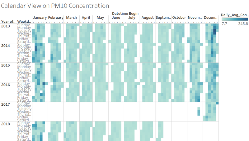
How does a typical day look like for Sofia City
The graph above shows the calendar view of concentration level over the year. This gives an insight into the daily life of a citizen in Sofia City. From this we can observe that:
- There is no noticeable pattern between Monday to Sunday which gives us an insight into how the concentration level differs from weekdays and weekends
- However, this visualisation is aligned with the concentration trend graph which indicates that there is a higher pollution level in December and January.
Anomalies and Trends of possible interest
- Since there are missing data from January 2017 to October 2017, we cannot determine the situation of air pollution during that period of time and discover whether the air pollution improves over that period of time.
- The sharp peaks are during the winter period (November to January). This might due to the citizen burning the coals to keep themselves warm during the winter period hence worsening the pollution level.
- Period between May to September, the concentration level are below the daily limit value set by EU of 50. This might be because it is the summer period when the temperature is generally higher and hotter. The citizen does not need to burn as many coals to keep themselves warm.
- The average concentration level for traffic station type is more than the average concentration level for background station type. This is because the stations are placed near the traffic roads which cars exhaust toxic gases hence the station picked up higher concentration level. Citizens who stay near the traffic will be more exposed to harmful pollution level.
Analysis of potential problems to the environment
- One possible conclusion for having high peaks during November to January is the burning of coal to withstand the cold of the winter season. If the behaviour persists, the concentration level during this peak will be always high. Besides worsening the pollution level, it might danger the health of the citizen which can result in cancer or early death.
Conclusion
Precaution that citizen can take:
- Always wear a mask especially during winter period (November to January)
- Avoid open areas
- Using air purifier to "clean" the air around them
Possible suggestion to improve the air pollution:
- Lower the prices of public transport to entice more people to take the public transport instead of driving
- Increase the prices of cars to deter people from buying cars or to bring in eco-friendly cars
- Provide subsidy for citizen to purchase electronics such as electric warmer to reduce the frequency of burning coals
References
- https://airlief.com/air-pollution-during-winter/
- https://www.tableau.com/about/blog/2018/7/new-features-beta-heatmaps-richer-formatting-options-and-more-discoverable-content
- https://github.com/dbarthe/geohash/
Comments
Please feel free to give some feedback!


