Difference between revisions of "IS428 AY2018-19T1 Lyu Cheng"
| Line 91: | Line 91: | ||
Task 1: Spatio-temporal Analysis of Official Air Quality<br/> | Task 1: Spatio-temporal Analysis of Official Air Quality<br/> | ||
# PM10 Concentration over the timeline | # PM10 Concentration over the timeline | ||
| − | # | + | # PM10 Concentration over the timeline with shade |
# | # | ||
Task 2: Spatio-temporal Analysis of Citizen Science Air Quality Measurements<br/> | Task 2: Spatio-temporal Analysis of Citizen Science Air Quality Measurements<br/> | ||
| − | # | + | # Citizen geo-distribution |
| − | # | + | # No. of records by hour across citizen |
| − | |||
Task 3: Relationships between the factors mentioned above and the air quality measure detected in Task 1 and Task 2<br/> | Task 3: Relationships between the factors mentioned above and the air quality measure detected in Task 1 and Task 2<br/> | ||
| − | + | ||
| − | |||
| − | |||
{| class="wikitable" | {| class="wikitable" | ||
|- | |- | ||
| − | ! style="font-weight: bold;background: #536a87;color:#fbfcfd;width: 20%;" | [ | + | ! style="font-weight: bold;background: #536a87;color:#fbfcfd;width: 20%;" | [Task 1] PM10 Concentration over the timeline |
|- | |- | ||
| <b>Purpose / Description</b><br> | | <b>Purpose / Description</b><br> | ||
| Line 134: | Line 131: | ||
{| class="wikitable" | {| class="wikitable" | ||
|- | |- | ||
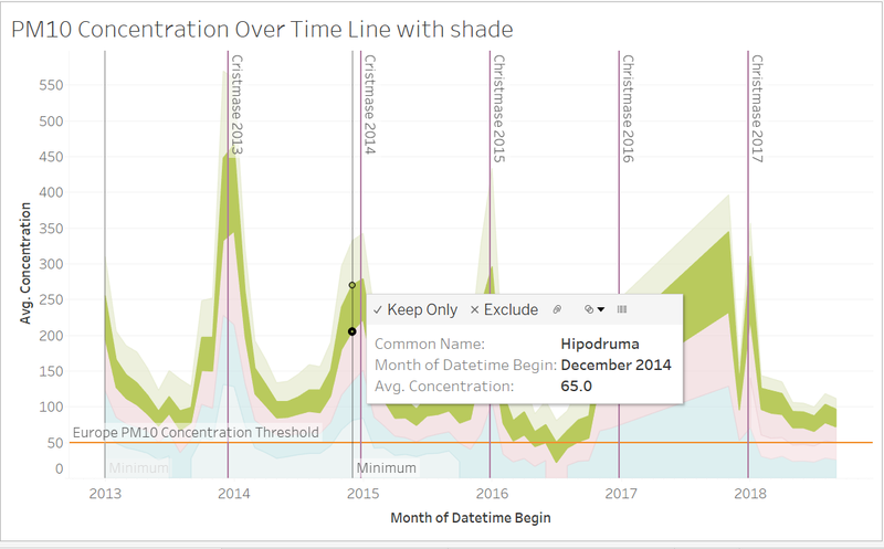
| − | ! style="font-weight: bold;background: #536a87;color:#fbfcfd;width: 20%;" | [ | + | ! style="font-weight: bold;background: #536a87;color:#fbfcfd;width: 20%;" | [Task 1] PM10 Concentration over the timeline with shade |
|- | |- | ||
| <b>Purpose / Description</b><br> | | <b>Purpose / Description</b><br> | ||
| Line 165: | Line 162: | ||
{| class="wikitable" | {| class="wikitable" | ||
|- | |- | ||
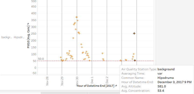
| − | ! style="font-weight: bold;background: #536a87;color:#fbfcfd;width: 20%;" | [ | + | ! style="font-weight: bold;background: #536a87;color:#fbfcfd;width: 20%;" | [Task 1] PM10 Concentration over the one day |
|- | |- | ||
| <b>Purpose / Description</b><br> | | <b>Purpose / Description</b><br> | ||
| Line 183: | Line 180: | ||
| <b>Analysis</b><br> | | <b>Analysis</b><br> | ||
| − | + | The diagram shows all the records meassured from Hipodruma station with in one day. | |
| + | |||
| + | The general trend of pollution level with one day varies as such: | ||
| + | |||
| + | <br/> | ||
| + | |} | ||
| + | |||
| + | |||
| + | {| class="wikitable" | ||
| + | |- | ||
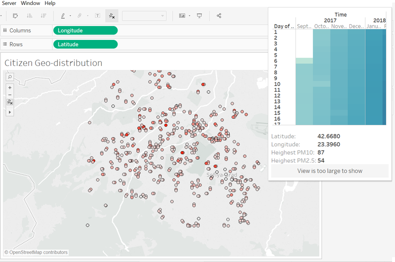
| + | ! style="font-weight: bold;background: #536a87;color:#fbfcfd;width: 20%;" | [Task 2] Citizen geo-distribution | ||
| + | |- | ||
| + | | <b>Purpose / Description</b><br> | ||
| + | This diagram shows a geospatial distribution of all the sensors across the whole city. | ||
| + | <br/> | ||
| + | [[File:Twoone.png|800px|center]] | ||
| + | <br | ||
| + | |- | ||
| + | | <b>Interactive Technique</b><br> | ||
| + | <ol><li>Select : Hover</li> | ||
| + | Tooltips are provided to show sensor's latitude/longitude, highest concentration PM10 and hightest concentration PM2.5. | ||
| + | </ol> | ||
| + | <br/> | ||
| + | |- | ||
| + | | <b>Analysis</b><br> | ||
| + | |||
| + | This diagram aims to show the geospatial coverage of sensors across the whole country. This is essential since the spatial coverage of the citizen data reflects the confidence and completeness of the whole dataset. This dataset is obtained from citizen database, it is essential to justify the coverage before looking at the pollution level it reflects, if there is some large area is not tracked, the overall result might not be trustworthy. | ||
| + | |||
| + | Only the data points within the city area are displayed, the irrelevant data is hidden. The way to distinguish the data points is described in the previous data cleaning procedures. | ||
| + | |||
| + | From the visualization above, the citizen data fairly reflects the overall situation of the country. There is no obvious empty region on the map. However, the North part and the South-East part of the map have a relatively low sensor concentration than the central area. Hence, the pollution records in the central area are more credible. | ||
| + | |||
| + | The color code is responsible for the highest concentration record reported from the sensor at that location. It can be observed that the points with the deepest color appear at the center area indicating that the center area is the most polluted area. | ||
| − | |||
| − | |||
<br/> | <br/> | ||
|} | |} | ||
| + | {| class="wikitable" | ||
| + | |- | ||
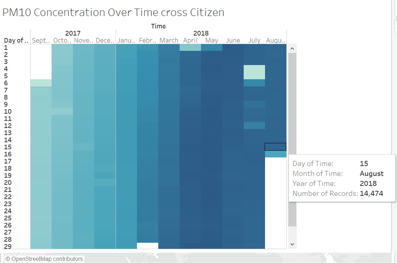
| + | ! style="font-weight: bold;background: #536a87;color:#fbfcfd;width: 20%;" | [Task 2] No. of records by hour accross citizen | ||
| + | |- | ||
| + | | <b>Purpose / Description</b><br> | ||
| + | |||
| + | This diagram shows the number of records reported form the sensors during the past two years <br/> | ||
| + | [[File:Twotwo.JPG|800px|center]] | ||
| + | <br | ||
| + | |- | ||
| + | | <b>Interactive Technique</b><br> | ||
| + | <ol><li>Select : Hover</li> | ||
| + | Tooltips are provided to show station name, concentration of PM10, and the timestamp. | ||
| + | |||
| + | </ol> | ||
| + | <br/> | ||
| + | |- | ||
| + | | <b>Analysis</b><br> | ||
| + | |||
| + | The diagram shows all the records meassured from Hipodruma station with in one day. | ||
| + | |||
| + | The general trend of pollution level with one day varies as such: | ||
| + | |||
| + | <br/> | ||
| + | |} | ||
Revision as of 12:52, 11 November 2018
To be a Visual Detective: Detecting spatio-temporal patterns
Contents
- 1 Overview
- 2 The Task
- 3 Background Information
- 4 The Data
- 5 Data Quality
- 6 Data Cleaning Procedure
- 7 Visualisation
- 8 Use Case
- 9 Findings - Task #1
- 10 Findings - Task #2
- 11 Findings - Task #3
- 12 Findings - Task #4
- 13 Conclusion
- 14 Improvement
- 15 Visualisation Software
- 16 Submission details
- 17 Assignment 3 Q&A
- 18 References
- 19 Comments
Overview
In Sofia, Bulgaria, air pollution has been a long-standing serious problem. Things got so out of control that even the European Court of Justice ruled against Bulgaria in a case brought by the European Commission against the country over its failure to implement measures to reduce air pollution.
Sofia has 5 metropolitan weather stations that capture weather data on hourly intervals. The analysis and comparison are based on the data collected from the five stations. The main measure of pollution is the concentration of a pollutant, PM10. The assignment will explore the factors, for example, humidity, altitude, position, etc., that affect the pollution level.
An interactive and informative visualisation analysis would be designed and developed to demonstrate the result of the result of the above tasks.
The Task
Task 1: Spatio-temporal Analysis of Official Air Quality
Task 2: Spatio-temporal Analysis of Citizen Science Air Quality Measurements
Task 3: Relationships between the factors mentioned above and the air quality measure detected in Task 1 and Task 2
Background Information
Air pollution is an important risk factor for health in Europe and worldwide. A recent review of the global burden of disease showed that it is one of the top ten risk factors for health globally. Worldwide an estimated 7 million people died prematurely because of pollution; in the European Union (EU) 400,000 people suffer a premature death. The Organisation for Economic Cooperation and Development (OECD) predicts that in 2050 outdoor air pollution will be the top cause of environmentally related deaths worldwide. In addition, air pollution has also been classified as a leading environmental cause of cancer.
Air quality in Bulgaria is a big concern: measurements show that citizens all over the country breathe in air that is considered harmful to health. For example, concentrations of PM2.5 and PM10 are much higher than what the EU and the World Health Organization (WHO) have set to protect health.
Bulgaria had the highest PM2.5 concentrations of all EU-28 member states in urban areas over a three-year average. For PM10, Bulgaria is also leading on the top polluted countries with 77 μg/m3on the daily mean concentration (EU limit value is 50 μg/m3).
According to the WHO, 60 per cent of the urban population in Bulgaria is exposed to dangerous (unhealthy) levels of particulate matter (PM10).
The Data
Official Meteorological Data The official data is used for law suits, policy creation etc. With the far reaching implications, the official data is gathered only from 5 stations, named after neighbourhoods and provides meteorological measurements such as temperature; humidity; pressure etc. This data has longer history, but it’s not spread out across the country. AirBG.info brings to question the quality of this data by suggesting this may have missing data and insufficient measures on the part of the authorities to provide a full representation of Sofia’s air pollution problem.
Citizen Meteorological Data The Citizen data is gathered from the AirBG.info initiative that is not a government funded and is run by volunteers and citizens of Bulgaria. Each citizen that wishes to participate builds a weather monitoring kit from standardized parts. These citizen weather stations upload data every 5 minutes via an onboard WIFI connectivity and is voluminous in nature. This data has shorter history but is spread across a lot more than 5 stations.
In addition it provides data topography data includes Sofia urban area + some areas nominally external to the city (toward the mountains, note large elevation numbers). No particular effort has been made to include entirety of Sofia Capital’s area as per administrative boundaries. This topographical data includes lat/long and elevations for several areas in and around Sofia.
Last but not least, the project allows access to API’s that would allow it to gather, inspect and mine data from Citizen Weather station sensors.
Data Quality
In this section, I examine the quality of the data provided by exploring for bad data, gaps in data and informing next steps.
Data Cleaning Procedure
| Problem #1 | Location is needed for final result to be shown as map and is a learning feature for NN |
|---|---|
| Issue | Bring lat/long/elev data into EEA Data metropolitan data from the metadata.xls file |
| Solution |
| Problem #2 | Need consistent aggregation across all data for accuracy. |
|---|---|
| Issue | BG_5_60881_2018_timeseries.csv has ‘AveragingTime’ as hour |
| Solution |
| Problem #3 | Employee Proximity Card Data |
|---|---|
| Issue | The given images are rich in color to denote the various zones. However, to use it effectively as background for a choropleth map, the image should ideally be dull in color. For example, it should be in colors like gray. Furthermore, the zone boundaries are to be demarcated more obviously especially when it is transformed to color such as gray. |
| Solution |
| Problem #4 | pro4 |
|---|---|
| Issue | issue4 |
| Solution | image4 |
Final Data Files
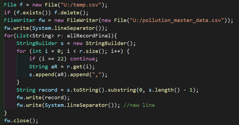
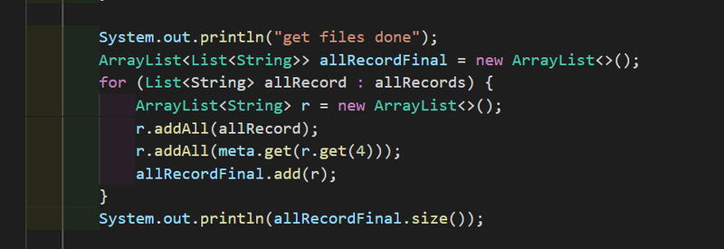
- pollution_master_data This data-set contains the aggragated data of original EEA dataset.
- data_set2 data_set2 info
Visualisation
Task 1: Spatio-temporal Analysis of Official Air Quality
- PM10 Concentration over the timeline
- PM10 Concentration over the timeline with shade
Task 2: Spatio-temporal Analysis of Citizen Science Air Quality Measurements
- Citizen geo-distribution
- No. of records by hour across citizen
Task 3: Relationships between the factors mentioned above and the air quality measure detected in Task 1 and Task 2
| [Task 1] PM10 Concentration over the timeline |
|---|
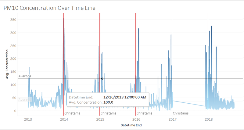
| Purpose / Description This diagram shows the average concentration of the PM10 recorded from the five stations by hours across years.
|
Interactive Technique
|
| Analysis The vertical red drop line indicats the Christmas Days. It is very obviouse that the air pollution level grows higher than the other days within one year. This might be mainly because the fireworks. Also, deeper inspection of the data shows, regularly missing data hourly from 9-10 AM from Mladost station (BG0079A) for the critical 1st week of January. The readings in the hours following this missing data spike up significantly. What is the cause of these dropped data signals during these hours? Was there an instrument malfunction in the official weather stations. If the instruments are so costly relative to the citizen weather stations, then is it expected to be unreliable under some conditions. The missing data from station Orlov and Mladost may cause the average value of the concentration lower than expectation. The maximum concentration among the five stations may be an alternative option, however, that would fail to show the overall situation of the city as the most polluted area is always at the same station.
|
| [Task 1] PM10 Concentration over the timeline with shade |
|---|
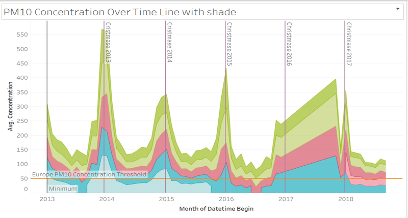
| Purpose / Description This diagram shows the average concentration of the PM10 recorded from the five stations by month across years.
|
Interactive Technique
|
| Analysis A monthly aggregated view shows Druzhba station having highest peaks during holiday/christmas times. Druzhba is at 548 meters altitude. This elevation is not very high and a relevant official weather station. The missing data from 2017 to 2018 leads to an inaccurate visualisation. According to the previous years, the air pollution level should be lower than what is displayed. The changes of the pollution level from the give stations are relative the same. In other words, the concentrations of PM10 from the five stations increase and decrease simultaneously.
|
| [Task 1] PM10 Concentration over the one day |
|---|
| Purpose / Description This diagram shows the average concentration of the PM10 recorded from station Hipodruma <br |
Interactive Technique
|
| Analysis The diagram shows all the records meassured from Hipodruma station with in one day. The general trend of pollution level with one day varies as such:
|
| [Task 2] Citizen geo-distribution |
|---|
| Purpose / Description This diagram shows a geospatial distribution of all the sensors across the whole city.
<br |
Interactive Technique
|
| Analysis This diagram aims to show the geospatial coverage of sensors across the whole country. This is essential since the spatial coverage of the citizen data reflects the confidence and completeness of the whole dataset. This dataset is obtained from citizen database, it is essential to justify the coverage before looking at the pollution level it reflects, if there is some large area is not tracked, the overall result might not be trustworthy. Only the data points within the city area are displayed, the irrelevant data is hidden. The way to distinguish the data points is described in the previous data cleaning procedures. From the visualization above, the citizen data fairly reflects the overall situation of the country. There is no obvious empty region on the map. However, the North part and the South-East part of the map have a relatively low sensor concentration than the central area. Hence, the pollution records in the central area are more credible. The color code is responsible for the highest concentration record reported from the sensor at that location. It can be observed that the points with the deepest color appear at the center area indicating that the center area is the most polluted area.
|
| [Task 2] No. of records by hour accross citizen |
|---|
| Purpose / Description This diagram shows the number of records reported form the sensors during the past two years <br |
Interactive Technique
|
| Analysis The diagram shows all the records meassured from Hipodruma station with in one day. The general trend of pollution level with one day varies as such:
|
| [Step 2] Building Data Explorer : Air Supply Controls / Water Supply Controls / Fan Controls / Coil Controls / Additional System Controls |
|---|
| Purpose / Description The purpose of this dashboard is to give the user and overview of the data of the related controls. Within the HVAC system, there are a lot of intra-working sub-systems which help keep the entire HVAC system working. This dashboard groups all the related controls together and presents an overview of the data. This will allow the user to easier understand the sub-systems of the data. In general, I had grouped the date into 5 sub-systems:
The dashboard is logically designed for to ease usability. The layout as shown below. The dashboard starts with the navigation bar right at the top, followed by the title and description. After which are the filters which are specific for the dashboard. The individual charts then follow. Within the charts itself, it is descriptive by nature. It has its title and this description of what the data is trying to measure. |
Interactive Technique
|
| Types of Charts used The data provided are readings taken from various HVAC/Proximity Sensors. Thus, all of the readings are taken against time. To do meaningful comparison and analysis with time as one of the dimension, I used mainly,
The image below is a representative of the type of charts used. It does not represent all the charts that are present in the dashboard. |
| [Step 2/3] Employee Movement Explorer |
|---|
| Purpose / Description The purpose of this dashboard is visualise the employee proximity card data. The data are given with X,Y coordinates. Thus, we can plot the data on a background image map which is provided in the original dataset. The proximity card data are visualized on the floor map itself. There are modifications to the floor map so that the data can be better visualized. Now that the employee's movements are visualized on an image map, it gives much higher clarity on the employee's movement/activities around the building. |
Interactive Technique
|
| Types of Charts used For this dashboard, much of the data are given based on the location itself. Thus, the data needs to be plotted on an image to effectively show the pattern between the employee's location and the time of the day. This will help to tell us what the employee's movement/activities are like.
The image below is a representative of the type of charts used. It does not represent all the charts that are present in the dashboard. |
| [Step 3] Variable Explorer |
|---|
| Purpose / Description Variable Explorer is to allow the user to further explore the data in more details. In the previous dashboards, especially for the controls, the level of detail is limited so that the analyst can see the bigger picture. In this dashboard, it is designed to empower the analyst to view more about the data and how it changes across floor, zones and time. This is to help the analyst understand how the readings varies across the mentioned building attributes and time. The aim of this dashboard is to focus on just one measurement and understand its pattern/behaviour. |
Interactive Technique
|
| Types of Charts used The data all have one common attribute, which is date/time. Thus, to enable flexibility for the dashboard to handle all of the variable types, the dashboard is fundamentally be required to visualize time-related data. Therefore, the following types of charts are used.
The image below is a representative of the type of charts used. It does not represent all the charts that are present in the dashboard. |
Use Case
| Visualisation Tool Demonstration |
|---|
| Scenario There is a hardworking analyst who wants to explore for patterns with regards to the bathroom use in the building! |
| Steps |
Findings - Task #1
What are the typical patterns in the prox card data? What does a typical day look like for GAStech employees?
| Serial | Observation |
|---|---|
| 1 | The people from the facilities department are always around the building 24/7. They are located mostly in level 1. It appears that they work in shifts and they ensure that there is always someone from the department around ay anytime of the day. |
| 2 | |
| 3 | |
| 4 | |
| 5 | |
| 6 | |
| 7 | |
| 8 | |
| 9 | The offices of the employees are arranged by position. The higher position the employee is, it is likely that his/her office will be at the higher floor. The executive departments are mainly located on the 3rd floor, while people from the facility and security department comes from the 1st and 2nd floor. |
| 10 | Floor 2 is where the bulk of the employees are. Most of the employee's offices are on the 2nd floor. Although their offices are located on the 2nd floor, they still move about the building as frequently. Also, as seen in the floor map and the employee proximity card data, floor 1 is where meetings and front desk offices are located. Thus, the reduced employee presence in floor 1 also suggests that the meeting rooms in floor 1 are likely to be used to host guests/events |
Findings - Task #2
Describe up to ten of the most interesting patterns that appear in the building data. Describe what is notable about the pattern and explain its possible significance.
| Serial | Measurement Category | Description and Significance |
|---|---|---|
| 1 | Thermostat Setting | The general setting for the thermostat heating and cooling setpoints tend to be opposite of each other. When the heating set point is being set to a higher point, the cooling setpoint will be set to a lower point. This is normally because the user is trying to adjust the temperature of the air within the zone. Naturally, when you want the place to be cooler, you will set the heating point at a lower point, and the cooling point to be at a higher point. This is to produce an equilibrium temperature within the zones. You see that the temperature of the air is between the two setpoints. However in the month of June, the period of 7th to 10th. The behavior of the thermostat setting seems to be off the norms. It betrays the general behaviour which is shown in the rest of the month. As the heating setpoint increases, the cooling setpoint increases as well. The general temperature of the air within the zones seems to increase significantly during mid-day. It peaks up as much as to 28.88°C. The average temperature of the air in the zones hovers around 24°C. This is approx. 4°C above the norm. The average temperature in Singapore, especially during the hottest month,February, is around 27°C. The observation here is definitely something worth investigating. The behavior is consistent throughout all the floors and its zone. There are potential reasoning to this cause.
Significance |
| 2 | Mechanical Ventilation Mass Flow Rate | This measurement tells us how much air is flowing through the zone exhaust fan. In the month of June, in particular, there is some inconsistency for the readings on two particular weekends, namely 4th-5th June and 11th-12th June. In general, the readings of this specific measurement has its own cycle within the day. Naturally, it would be lower on the weekends. However, the 2 weekends in June, displays very different reading. The first weekend shows a reading that is below the average while the second weekend shows a reading that is significantly higher than the average. You can also observe that the readings are consistent throughout the weekdays and weekends. During the weekday, the flow rate generally increases during mid-day (Possibly due to the hot weather). On the weekend the pattern is very different. |
| 3 | Bath_Exhaust:Fan Power | This is the measurement of the power used by the bathroom fans. The power indicates usage of the bathroom. There is consistent use of the bathroom throughout the weekday. On the weekend, especially Saturdays (4th and 11th), the usage drops drastically after 1600H. Significance |
| 4 | Dry Bulb Temperature | The dry-bulb temperature (DBT) is the temperature of air measured by a thermometer freely exposed to the air but shielded from radiation and moisture. DBT is the temperature that is usually thought of as air temperature, and it is the true thermodynamic temperature. Thus, this reading tells us the relative weather condition of outside of the building. As shown in the picture, the readings are very consistent throughout the month of June, you can see that the temperature generally goes up during noon. This reading strongly correlates to the time of the day. Generally, you would expect the temperature to go up during mid-day. |
| 5 | Lights/Pump/Equipment Power | The readings from all three power consumers, namely lights, pump and equipment display very health power consumption. Their power consumptions are very consistent throughout the month. Light and Equipment power generally peaks up during the weekday. During the weekend, you can see a significant drop in the power consumption. However, for the pump, the power it consumed is a constant number. Either it could be efficiently used, or potentially there is a faulty sensor which causes this reading. Constant reading of 91W can be suspicious.
|
| 6 | Water Heater Setpoint & Loop Temp Schedule | The loop temperature schedule refers to the temperature set for the hot water loop. This is the temperature at which hot water is delivered to hot water appliances and fixtures. The temperature for both readings were at a constant value throughout all the month. Both are set at the temperature of 60.0 degree celsius. |
| 7 | Supply Side Inlet Temperature | This reading measures the temperature of the water entering the hot water tank. The readings intensified as the temperature increases especially on the weekend. The water going into the hot water tank is generally higher during the weekend then compared to the weekday. This is worth investigating as there are lesser human activities over the weekend. The system could be boiling the water unnecessarily, thus, wasting energy.
|
| 8 | Lights Power | Despite the consistent total Lights power consumption, there is some interesting pattern to it. Lights power in the first floor is generally not turned off. Much of the power consumption comes from the 1st floor. Even past working hours, the 1st floor still consumes significantly high power, while the rest of the floors' consumption dropped to their minimal level. What is more surprising is that the zones, 8A, 8B, and 11B reflect the lights consumed in corridors. It appears that the building is not really energy efficient after all!
|
| 9 | Total Electric Power Demand | The new building claims to be of the highest energy efficiency standards, however, there are questionable data points which do not accurately reflects the energy efficiency capability. The total electric power demand peaks up and intensify on a particular weekend in June (10th - 13th). It begins from Friday morning, and intensify all the way till the following morning. After which, the demand for electric power drops. This is an interesting finding as there should be lower employee activities during the weekends.
|
Findings - Task #3
Describe up to ten notable anomalies or unusual events you see in the data. Prioritize those issues that are most likely to represent a danger or a serious issue for building operations.
| Priority | Measurement Category | Description and Significance |
|---|---|---|
| 1 | Hazium Concentration | Hazium is a recently discovered and possibly dangerous chemical. It poses health hazards to the employees whom inhales it. There are spikes in Hazium concentration especially on 3rd (Friday) and 11th (Saturday) June. What is more surprising is that, one of the areas with high concentration is coming from office 3000(CEO's office). Signifiance As mentioned in the background text, hazium is a dangerous chemical. High concentration of haizum is likely to pose health issues to employees. No one can explain the effects of hazium, but it was concluded to likely be a dangerous chemical to employee. Therefore, it is crucial for the company to look for the root course and address it. |
| 2 | Return Outlet CO2 Concentration | This reading tells us the CO2 concentration within the building. The healthy co2 concentration ranges from 250ppm to 1000pm. However on 2 conservative days (6th and 8th of June), the CO2 concentration spike above 1800 ppm. Signifiance High concentration of CO2 within the building would post health hazard to the employee. PPM reading above 1000, the employees would experience drowsiness. As it reaches above 2000, employees will experience headaches, sleepiness and stagnant, stale, stuffy air. Poor concentration, loss of attention, increased heart rate and slight nausea. It is vital for the company to look investigate the high CO2 concentration. |
| 3 | Thermostat Setting | This finding is as per one which was mentioned in above in Task #2, the malfunction of this Thermostat would be devastating. Signifiance The thermostat is responsible for regulating and maintain the internal temperature of the building. You can effectively say that, the readings from the thermostat would control the temperature of the building. There have been instances of it peaking up. The high temperature may potentially cause health hazard for the employee |
| 4 | VAV_SYS Supply Fan Outlet Mass Flow Rate | This reading tells us the total rate of air delivered by the HVAC system fan to the zone it serves. The data collected in the month of June is not showing consistent results. The readings do tally with the VAV_Sys Supply Fan Outlet:Power. The readings intensify in 2 particular periods, 7th-8th June and 10th-13th June. During 7th-8th June (Tuesday to Wednesday), the reading intensifies in the early hours and late night. This is an abnormal phenomenon. This is telling us that more air is being delivered by the HVAC system fan when there is no supposed employee during this period. The second period, 10th-13th June, shows intensified readings consistently from 10th June evening to 13th June Morning (Friday to Monday).
This reading is important because it will indicate the overall system health of the HVAC fans. It tells us if the HVAC fans are working harder. It also indicates if the HVAC system's ability to maintain the building's internal temperature/ventilation. |
| 5 | Deli-Fan Power | This reading tells us the power used by the deli exhaust fan. There are some suspicious data points with regards to the use of Deli-Fan. The fan usage seems to be consistently high during a Sunday(5th and 12th June). The readings do not seem to tally with the increased human activities during the weekday. The inconsistent readings do not seem to establish any form of correlation with the human activity. But rather, the pattern of seem to be established by other unknown factors. |
| 6 | VAV_SYS Heating Coil Power | There is completely 0 power used for the heating coil. This is entirely not possible as the HVAC system seem to be working properly. Thus, there is very little prove that the Heating Coil is broken/faulty. Signifiance |
| 7 | VAV_SYS Supply Fan:Fan Power | The system supply fan consumes more power on the weekend (both Saturday and Sunday). This is highly unusual as there is lower employee activity within the building. Most of the power comes from the fans in level 3. On Saturday it is a half day, but on Sunday only those who are on shift would be in the building. Therefore, on Sunday, there would be close to zero human activity. Signifiance The supply fan is responsible for circulating the air within the HVAC system. In this case, the unnecessary power consumed by the fan would incur additional cost to the company. Not only that, it is a waste of energy. |
Findings - Task #4
Describe up to five observed relationships between the proximity card data and building data elements. If you find a causal relationship (for example, a building event or condition leading to personnel behavior changes or personnel activity leading to building operations changes), describe your discovered cause and effect, the evidence you found to support it, and your level of confidence in your assessment of the relationship.
| Serial | Discovery |
|---|---|
| 1 |
|
Conclusion
There are many interesting findings which do not reflect the energy efficiency ability which the builders had claimed to be. The new building does not seem to be as energy-efficient as what was previously advertised. As for the occurrence of Hazium, it is postulated to be caused by the employee themselves. The evidence points towards a deliberate attack towards the CEO himself. As Hazium is a newly discovered chemical, its potential impact on the employees is unknown. Many cautious steps should be taken when investigating the Hazium outbreak. Evident suggest that the culprit seem to be an employee from level 3!
Main Link
One tough assignment down, one more project to remaining - https://public.tableau.com/views/MA_3_Final/Home?:embed=y&:display_count=yes
Backup Link
This is one tough assignment,I need more backup link - https://public.tableau.com/views/MA_3_0/Home?:embed=y&:display_count=yes
Improvement
Given more time, i would focus on improving drilling capability of the this visualisation tool. I would also work on improving the interface for the Employee Movement Explorer. But nonetheless, it was a tough fight against time and my analyatical ability. I am still glad manage to generate something like that.
Visualisation Software
To perform the visual analysis, this is a list of the software which I used.
- Tableau
- Excel
- Chrome
- Netbeans
Submission details
This is an individual assignment. You are required to work on the assignment and prepare submission individually. Your completed assignment is due on 24th October 2016, by 12.00 noon.
You need to edit your assignment in the appropriate wiki page of the Assignment Dropbox. The title of the wiki page should be in the form of: IS428_2016-17_T1_Assign3_FullName.
The assignment 3 wiki page should include the URL link to the web-based interactive data visualization system prepared.
Assignment 3 Q&A
Need more clarification, please feel free to pen down your questions.
- What is Hazium? Hazium is a (fictitious) chemical that has become a recent concern on the island of Kronos. Not much is known about its effects, but it is suspected that Hazium is not good for people.
- There are a few extra building file data fields in the .json dataset that do not appear in the .csv data. These extra data fields are actually valid for the building for the dates and times they were recorded, but they will not add significantly to your analysis. So for this assignment, please just use the data fields included in the .csv file.
- Can you provide more info on the data provided in the mobile proximity card data? Are the x,y coordinates bound to a normal (x,y) plane, where in this case the plane is the floor maps? The (x,y) coordinates are bound to a normal plane. The (x,y) plus the floor number would identify a specific location. The lower left of the provided map is (0,0) and the upper right is (189,111).
- In some cases, data is reported for some sensors and not others, or it is documented but not reported. Where can we find this data? Please use the data fields you have available to perform your investigation. In general, the documented set of attributes may not be reported for all zones.
- What does the (x,y) coordinates represent for the mobile robot sensor? The (x,y) coordinates for these reading represent the location of the mobile sensor.
- Sometimes, mobile prox data for a prox card repeats multiple times in a minute. Does this indicate the number of seconds that the prox card was within range of the sensor? No. Multiple readings do not indicate what fraction of the minute that the mobile sensor was in proximity of the prox card.
- In some cases, the value of the VAV Availability Manager Night Cycle On/Off is 2. Is this a valid value? Yes.
- Does F_3_Z_9 VAV Damper Position mean F_3_Z_9 VAV REHEAT Damper Position? Yes.
References
- http://www.picturetopeople.org/image_utilities/image-grayscale-converter/grayscale-image-generator.html
- https://community.tableau.com/message/320738
- http://www.thedataschool.co.uk/niccolo-cirone/tableau-tip-week-wednesday-creating-dashboard-navigator-buttons/
- http://kb.tableau.com/articles/howto/renaming-dimension-column-row-headers
- https://tableauandbehold.com/2015/04/13/creating-custom-polygons-on-a-background-image/
- https://www.kane.co.uk/knowledge-centre/what-are-safe-levels-of-co-and-co2-in-rooms
- https://en.wikipedia.org/wiki/HVAC
Comments
Do provide me your feedback!:)
