Difference between revisions of "Microheart"
Ahmadsm.2015 (talk | contribs) |
|||
| Line 50: | Line 50: | ||
|- | |- | ||
| | | | ||
| − | <center>The dataset "Distribution of Working Population by Planning Area" was selected.</center> | + | <center>[https://www.singstat.gov.sg/find-data/search-by-theme/population/geographic-distribution/latest-data The dataset "Distribution of Working Population by Planning Area" was selected.]</center> |
|| | || | ||
* Planning Area: Character Text, planning areas segmented as per [https://www.ura.gov.sg/Corporate/Planning/Master-Plan/Introduction URA Master Plan 2014] | * Planning Area: Character Text, planning areas segmented as per [https://www.ura.gov.sg/Corporate/Planning/Master-Plan/Introduction URA Master Plan 2014] | ||
Revision as of 19:15, 14 October 2018
Problem Description: By 2030, the elderly and retired population in Singapore is expected to be approximately 90,000 -- almost twice the current figure. Despite the government’s efforts to continuously beef up the availability and accessibility of healthcare for the elderly and retired, there needs to be a means for the government to predict the optimal number of healthcare facilities that best meets the need of our target audience.
Motivation: This project is motivated by the varying ratios of (number of elderly and retired) to number of healthcare facilities in each planning area. This brings a need to detect which planning areas require better access to healthcare facilities.
In this project, we aim to create visualisations that helps users perform and analyse the following:
Descriptive
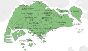
We would like to provide users with up-to-date demographic information, specifically pertaining to the aged population and the distribution across the different areas of Singapore (as per URA 2014). In addition, we would like to include other information, such as the presence of medical facilities and its distribution mapped out on the same planning area chart.
Prescriptive
Based on the suggested design above, we aim to be able to provide users with insights on which certain planning zones or subzones require development and emphasis on medical facilities based on the volume of ageing population staying there.
Predictive
We would like to provide users with a visibility on the trend of ageing population. Based on the dependency ratio formulated from the proportion of ageing population out of the working and economically active population, we aim to be able to predict the timeline on which the ageing situation for the country reaches a critical threshold (where ageing population forms a significant proportion out of the population).
The list of selected dataset that we have sourced for to input into our visualizations can be found below. Necessary data pre-processing steps will be taken to clean and transform the data into a format that is suitable to upload into a visualization.
| Dataset/Source | Data Attributes | Rationale Of Usage |
|---|---|---|
|
The dataset "Singapore Residents by Planning Area/Subzone, Age Group and Sex, June 2000 - 2018" under population trends was selected. |
|
Required dataset to show the volume of population according to the different age groups. Segmented by planning areas, sub-zones, sex and years (across the different sheets) |
|
|
|
This dataset helps ascertain the age-dependency ratio in every planning area. |
|
|
A challenge we faced for this dataset was the lack of csv/excel file on the source website. As such, the records for the locations of the medical facilities had to be manually copied onto an excel spreadsheet. Due to the relatively small number of records of medical facilities, the task is manageable. However, the risk of human error does exist for this particular methodology. |
This dataset provides a distribution of medical facilities across Singapore, based on Master Plan 2014 by URA, and provides an analyses for the gaps between the presence of medical facilities against the volume of ageing population in different planning areas. |
Our project draws inspiration from the following past works and studies:
| Related Works | What We Can Learn |
|---|---|
![thumb]](/18191is428g1/img_auth.php/thumb/e/ed/PastWork1.png/500px-PastWork1.png) Data source: World Bank staff estimates based on age distributions of United Nations Population Division's World Population Prospects. |
This visualisation is supposed to depict the trend of the age dependency ratio in Singapore from 1960 to 2017. The axes are not labelled, making it hard for observers to understand the data that is being captured, at a glance. |
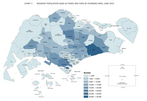 |
This visualisation helps users quickly identify which areas in Singapore are relatively more densely populated with the elder generation and thus are more exposed to the effects of an increased ageing population. |
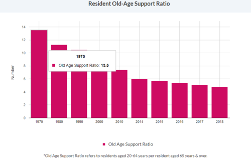 |
Both axes are clearly labelled. The Old Age Support Ratio is defined succinctly below the diagram so users understand. The tooltips also make the values easier to read. |
| Proposed Layout and Methodology | How Analyst Can Conduct Analysis (Rationale) |
|---|---|
|
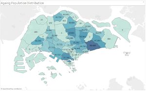
Main population distribution chart based on Master Plan 2014:
Draft Designs: |
|
The following are some of the key technical challenges that we may face throughout the course of the project:
| Key Technical Challenges | How We Propose To Resolve |
|---|---|
|
Explore more on D3.js and understand how it works through available resources such as GitHub etc | |
|
Research on the data required, understand which data set is most important and clean up the data | |
|
Explore the possible ways of visualizing data by researching on the existing charts, graphs etc |
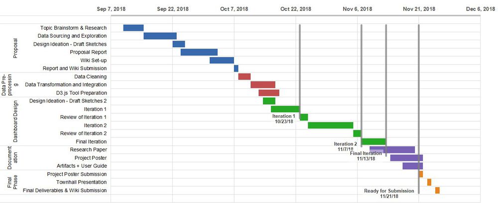
The following shows our project timeline for the completion of this project:
The following are some of the tools/technologies that we will be utilizing during the project:
- Excel: Spreadsheet tool for data pre-processing and transformation
- Tableau: Drafting of visualization designs and preliminary iterations
- R Plotly and Shiny: Main data visualization design tool and publisher onto web-based platform
Feel free to provide us with comments, suggestions and feedback to help us improve our project! (:

