Difference between revisions of "UIUX: Proposal"
Jump to navigation
Jump to search
Feel free to comment on our project! 😁
m |
|||
| Line 67: | Line 67: | ||
To identify trends and understand the distribution of services by category for both imports and exports. | To identify trends and understand the distribution of services by category for both imports and exports. | ||
|- | |- | ||
| + | |} | ||
| + | <center><div style="background:#FF6A00; padding: 15px; line-height: 0.3em; letter-spacing:0.5em;font-size:20px"><font color=#fbfcfd face="Agency FB">BACKGROUND SURVEY OF RELATED WORKS</font></div></center> | ||
| + | {| class="wikitable" width="100%" | ||
| + | |- | ||
| + | ! <div align="center">Visualisation</div> !! <div align="center">Comments</div> | ||
| + | |- | ||
| + | |[[File:UIUXBS1.PNG|500px|frameless|center]] | ||
| + | Reference: https://www.singstat.gov.sg/modules/infographics/singapore-international-trade | ||
| + | |||
| + | || | ||
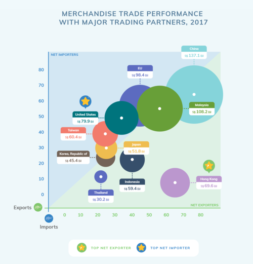
| + | * Use of varying data point sizes(size of circles) to represent the combined import and export value is messy in this diagram because the circles are overlapping each other, making it difficult to visualise.<br> | ||
| + | *Lack of interactivity to study previous years’ data; graph is static and only shows only 2017 data. <br> | ||
| + | *Graph shows the degree of trade between Singapore and its top trading partners in terms of its import and export trade volume as well as visually represent the net trade value by using identical axis for import and export, thereby dividing the graph area in 2 equal zones; Net Importers represented by blue area where imports > exports & Net Exporters represented by green area where imports < exports. | ||
| + | |- | ||
|} | |} | ||
| + | |||
<center><div style="background:#FF6A00; padding: 15px; line-height: 0.3em; letter-spacing:0.5em;font-size:20px"><font color=#fbfcfd face="Agency FB">VISUALISATION PLAN</font></div></center> | <center><div style="background:#FF6A00; padding: 15px; line-height: 0.3em; letter-spacing:0.5em;font-size:20px"><font color=#fbfcfd face="Agency FB">VISUALISATION PLAN</font></div></center> | ||
Revision as of 18:36, 14 October 2018
PROBLEM & MOTIVATION
DATA SOURCES
| Data Set | Data Attributes | Purpose |
|---|---|---|
|
To understand the import figures distributed across all countries as well as grouped by continents. | |
|
To understand the export figures distributed across all countries as well as grouped by continents. | |
|
To identify trends and understand the distribution of services by category for both imports and exports. |
BACKGROUND SURVEY OF RELATED WORKS
Visualisation |
Comments
|
|---|---|
|
Reference: https://www.singstat.gov.sg/modules/infographics/singapore-international-trade |
|
VISUALISATION PLAN
Type of Visualization |
Detailed Description
|
|---|---|
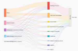
Sample link: http://bl.ocks.org/d3noob/5028304 |
|
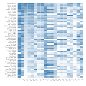
Sample link: http://bl.ocks.org/josiahdavis/7e488547a6381a365ac9 |
|
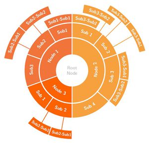
Sample link: https://beta.observablehq.com/@mbostock/d3-sunburst |
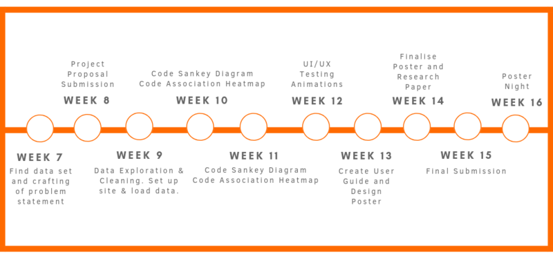
PROJECT TIMELINE
TECHNOLOGIES
TECHNICAL CHALLENGES
| Challenges | Mitigation Plan |
|---|---|
|
|
|
|
|
|
COMMENTS
Feel free to comment on our project! 😁

