Difference between revisions of "GeViz"
Mechong.2015 (talk | contribs) |
Mechong.2015 (talk | contribs) |
||
| Line 147: | Line 147: | ||
==<div style="background:#143c67; padding:15px; font-weight: bold; line-height: 0.3em;letter-spacing:0.5em;font-size:20px"><font color=#fbfcfd face="Lato"><center>PROPOSED STORYBOARD</center></font></div>== | ==<div style="background:#143c67; padding:15px; font-weight: bold; line-height: 0.3em;letter-spacing:0.5em;font-size:20px"><font color=#fbfcfd face="Lato"><center>PROPOSED STORYBOARD</center></font></div>== | ||
| − | < | + | {| class="wikitable" style="background-color:#FFFFFF;" width="100%" |
| − | + | |- | |
| − | < | + | ! style="font-weight: bold;width: 50%;" | Reference of Other Interactive Visualization |
| + | ! style="font-weight: bold;" | What We Can Learn | ||
| + | |- | ||
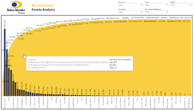
| + | | <p><center>'''Title : Pareto Analysis of Suppliers''' </center></p> | ||
| + | [[File:Pareto Analysis Reference.png|400px|frameless|center]] | ||
| + | <p><center>'''Source''': https://goo.gl/P9RjHk </center></p> | ||
| + | || | ||
| + | * The use of time series chart allows users to view the rise and fall of prices and prevents users from getting overwhelmed by too much cluttered data as compared to using bar charts. | ||
| + | |- | ||
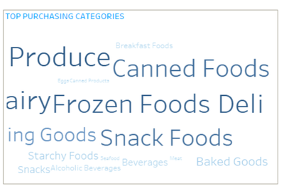
| + | | <p><center>'''Title : Word Cloud on Procurement Details ''' </center></p> | ||
| + | [[File:Word cloud reference.png|400px|frameless|center]] | ||
| + | <p><center>'''Source''': https://linpack-for-tableau.com/data-visualizations/tableau-dashboards/procurement-dashboard/procurement-cockpit/</center></p> | ||
| + | || | ||
| + | * Based on the size of the words, we can identify the keywords quickly. We can learn that by making frequency used keywords stand out can prevent us from overlooking it if it is presented in a tabular format. | ||
| + | |- | ||
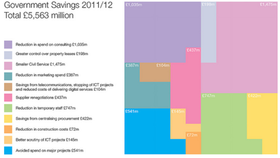
| + | | <p><center>'''Title : Breakdown on Government Cost Savings ''' </center></p> | ||
| + | [[File:Treemap ref.png|400px|frameless|center]] | ||
| + | <p><center>'''Source''': http://www.thevisualeverything.com/tag/budgets/</center></p> | ||
| + | || | ||
| + | * What we can learn on this project is the use of cross filtering to provide an interactive filtering of data. | ||
| + | * The charts on the map will zoom into the details based on the user’s filter preference. | ||
| + | |- | ||
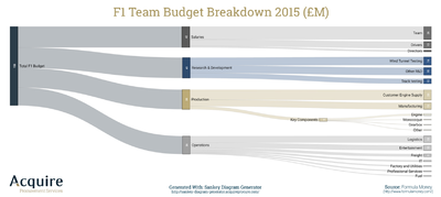
| + | | <p><center>'''Title : Team Budget Breadown ''' </center></p> | ||
| + | [[File:Sankey diagram reference.png|400px|frameless|center]] | ||
| + | <p><center>'''Source''':https://acquireprocure.com/spend-analysis-visualisation/3-reasons-procurement-professionals-use-sankey-diagrams</center></p> | ||
| + | || | ||
| + | * Area shading map allows us to quickly see which area has more HDB flats of which type. | ||
| + | * We can also understand that there are new areas and drawing of boundary changes across the years. | ||
| + | * There is also the information at a glance at the side for the users to view. | ||
| + | |- | ||
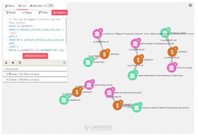
| + | | <p><center>'''Title : Analyzing Involved Authorities, Tenders and Companies ''' </center></p> | ||
| + | [[File:Graph network references.png|400px|frameless|center]] | ||
| + | <p><center>'''Source''': https://linkurio.us/blog/exploring-e1-3-trillion-in-public-contracts-with-graph-visualization/#!prettyPhotooard</center></p> | ||
| + | || | ||
| + | * Data is sorted in descending order, making sure that the viewer will be able to have quick inference. | ||
| + | | | ||
| + | |} | ||
==<div style="background:#143c67; padding:15px; font-weight: bold; line-height: 0.3em;letter-spacing:0.5em;font-size:20px"><font color=#fbfcfd face="Lato"><center>TECHNOLOGIES</center></font></div>== | ==<div style="background:#143c67; padding:15px; font-weight: bold; line-height: 0.3em;letter-spacing:0.5em;font-size:20px"><font color=#fbfcfd face="Lato"><center>TECHNOLOGIES</center></font></div>== | ||
Revision as of 14:17, 25 November 2018
Contents
PROBLEM & MOTIVATION
GeBIZ is a Singapore Government’s one-stop e-procurement portal which facilitates tender activities between Singapore government and local and overseas suppliers. Currently, there is no available tool to aid the public and ministries to understand and gain insights on the procurement made by the government under each ministry. Hence, we are motivated to create an interactive visualisation tool on government's procurement spending to allow the public and ministries to identify spending patterns and gain insights into procurement spending under each ministry.
OBJECTIVES
In this project, we are creating a visualisation that is able to show the following:
- Gain an overview of procurement spending made by each ministry and agency
- Identify the relationships between ministries, agencies and suppliers
- Identify what are the goods and services procured by ministries and agencies under each category
SELECTED DATASETS
The following datasets will be used for analysis , as elaborated below:
| Dataset/Source | Data Attributes | Rationale of Usage |
|---|---|---|
| Government Procurement Data (https://data.gov.sg/dataset/government-procurement) |
|
To gain information on government procurement such as tender description, amount and supplier information |
| Ministry and Agencies List |
|
We will be looking through the Singapore Government Directory (https://www.gov.sg/sgdi/ministries) to categorise the agencies into their respective ministries. This will allow us to visualise the procurement spending on a ministry level. |
APPROACH
Exploratory Data Analytics
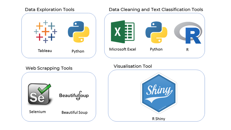
We used Tableau to perform EDA to better understand our dataset and to aid us in the conceptualization of our story board.
Data Cleaning and Feature Creation
We used Excel and Python to create a new column showing the Ministry that each agency belongs to by merging with data obtained from the Singapore Government Directory.
Text Classification using Support Vector Classifier (SVC)
One of the key challenges of working with the provided procurement dataset is the absence of categorization of each procurement transaction. Instead of labelling manually, we applied machine learning to classify the tender descriptions into different categories. We firstly scraped the procurement descriptions and categories from GeBiz website using Selenium and BeautifulSoup libraries in Python to be used as the training and validation dataset in our Support Vector Classifier model. We were able to achieve 90% for training accuracy before performing the categorization prediction.
Government Procurement Dataset after Text Classification
| Dataset/Source | Data Attributes |
|---|---|
| Government Procurement Data |
|
Visualization in R
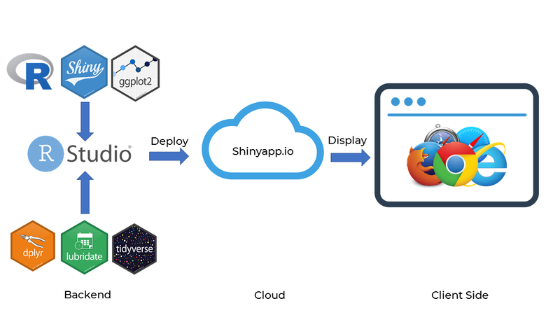
The web application will be built in R and deployed to Shinyapps.io
BACKGROUND SURVEY OF RELATED WORKS
Some of these visualizations that we draw inspiration from, are as follows:
| Reference of Other Interactive Visualization | What We Can Learn | |
|---|---|---|
| ||
| ||
| ||
| ||
|
BRAINSTORMING SESSIONS
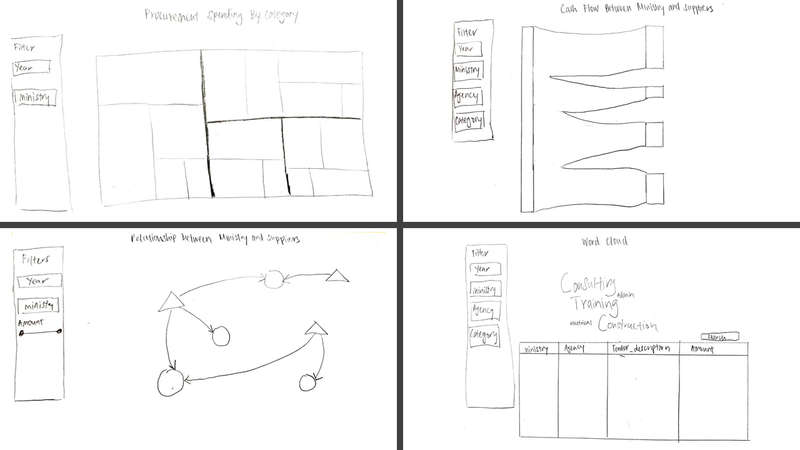
During our brainstorming session, we came out a list of visualization which are able to achieve our objectives and eventually shortlisted 4 visualization - Tree map, Network Graph, Sankey Graph and Word Cloud. After rounds of refinement and consultations with our Professor, the image above is the final draft for our visualization.
PROPOSED STORYBOARD
| Reference of Other Interactive Visualization | What We Can Learn | |
|---|---|---|
| ||
| ||
| ||
| ||
|
TECHNOLOGIES
Tools and technologies
Data Architecture
KEY CHALLENGES
The following are some of the key technical challenges that we may face throughout the course of the project:
| Key Challenges | Mitigation Plan |
|---|---|
| Unfamiliarity with R and Rshiny Libraries |
|
| Unfamiliarity with Libraries for Machine Learning and Web Crawling |
|
| Data Cleaning and Transformation |
|
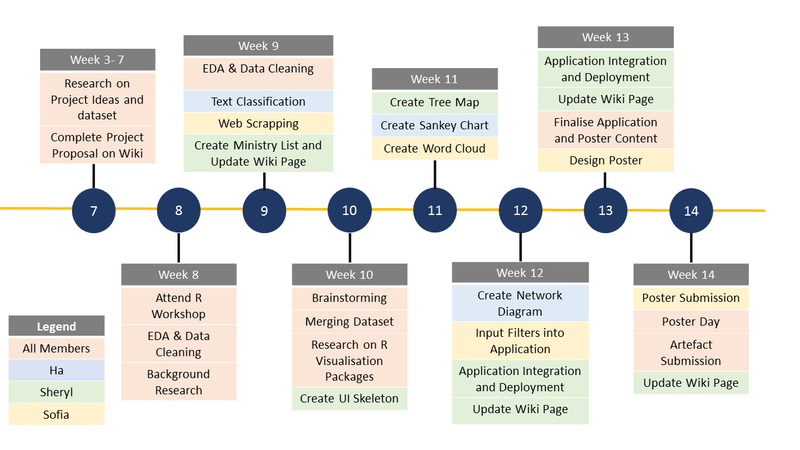
TIMELINE
REFERENCES
COMMENTS
Feel free to leave us some comments so that we can improve! We dont bite :)
| No. | Name | Date | Comments |
|---|---|---|---|
| 1. | Insert your name here | Insert date here | Insert comment here |
| 2. | Insert your name here | Insert date here | Insert comment here |
| 3. | Insert your name here | Insert date here | Insert comment here |


