Difference between revisions of "Sixes: Proposal Version 1"
| Line 56: | Line 56: | ||
{| class="wikitable" style="background-color:#FFFFFF;" width="100%" | {| class="wikitable" style="background-color:#FFFFFF;" width="100%" | ||
|- | |- | ||
| − | ! style="font-weight: bold;background: #FEBF5F;color:#fbfcfd;width: 50%;" | | + | ! style="font-weight: bold;background: #FEBF5F;color:#fbfcfd;width: 50%;" | Key Technical Challenges |
| − | ! style="font-weight: bold;background: #FEBF5F;color:#fbfcfd;" | How | + | ! style="font-weight: bold;background: #FEBF5F;color:#fbfcfd;" | How We Propose To Resolve |
|- | |- | ||
| − | + | | | |
| − | |} | + | [[File:Mainboard.png|600px|center]] |
| + | || | ||
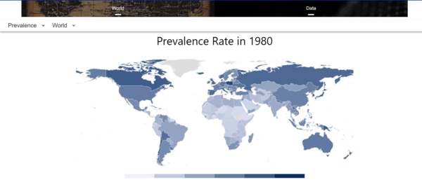
| + | * The navigation bar on top of the screen gives the entrances of the two visualisation sub-parts. | ||
| + | * Analysts will begin the process of investigation once they click map or data | ||
| + | |- | ||
| + | | | ||
| + | [[File:MapControl.png|600px|center]] | ||
| + | || | ||
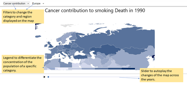
| + | * There are two filters to change the category and region displayed on the map | ||
| + | * The legend on bottom is to differentiate the concentration of the population of a specific category. | ||
| + | * The slider is to autoplay the changes of the map across the years. | ||
| + | |- | ||
| + | | | ||
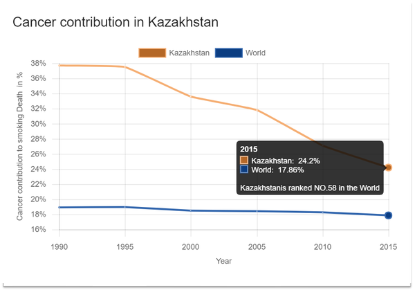
| + | [[File:CountryBreakdown.png|600px|center]] | ||
| + | || | ||
| + | * Upon clicking an individual country on the map, the dialog will be shown. | ||
| + | * The diagram is to show the comparasion between the country and the global situation. | ||
| + | * Upon hovering on one data point on the diagram, the detail comparasion data including the world rank is displayed. | ||
| + | |- | ||
| + | | | ||
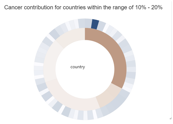
| + | [[File:TimeBreakdown.png|600px|center]] | ||
| + | || | ||
| + | * Upon clicking an individual concentration level on the legend, the dialog will be shown. | ||
| + | * This dialog provides a vertical comparasion among the countries within the same concentration level. | ||
| + | * The inner circle is the corresponding continent, while the outer circle is the countries belonging to the continent. | ||
| + | | | ||
| + | |||
| + | |||
| + | } | ||
| + | |||
</div> | </div> | ||
Revision as of 06:44, 18 November 2018
Every year, more than 480,000 people die due to tobacco-related diseases. That is around 1 in 5 of all deaths annually. It is estimated that 1 in 2 smokers will die from a smoking-related disease. This interactive data visualization tool shows modeled trends in smoking prevalence worldwide. Our aim is to reveal perspectives of smoking and correlates, determinants and consequences about smoking with visual analytics.
In this project, we are interested to create a visualisation that helps users perform the following:
- View the geographical distribution of smokers from recent years
- Share of perniciousness attributed to smoking
- Reveal the trends of smoking and other perniciousness attributed to smoking of specific area or countries, while compared to worldwide value, to bring to attentions for both individuals and countries.
Datasets are retrieved from https://data.unodc.org/#state:1
The data set describes the annual prevalence of use of drug in 2016:
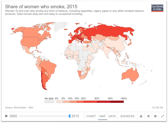
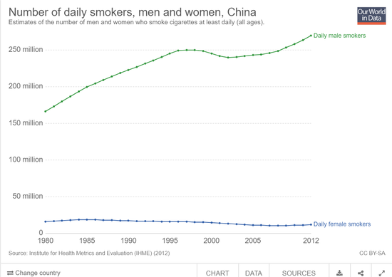
There are many charts and visualisations available which illustrates the various trends of house prices and index. We have selected a few of these to study and learn before we begin developing our own visualizations.
| Related Works | What We Can Learn |
|---|---|
| |
|
| Key Technical Challenges | How We Propose To Resolve | |||||||||
|---|---|---|---|---|---|---|---|---|---|---|
| ||||||||||
| ||||||||||
| ||||||||||
|
KEY TECHNICAL CHALLENGES
The following are some of the key technical challenges that we may face throughout the course of the project:
PROJECT TIMELINE
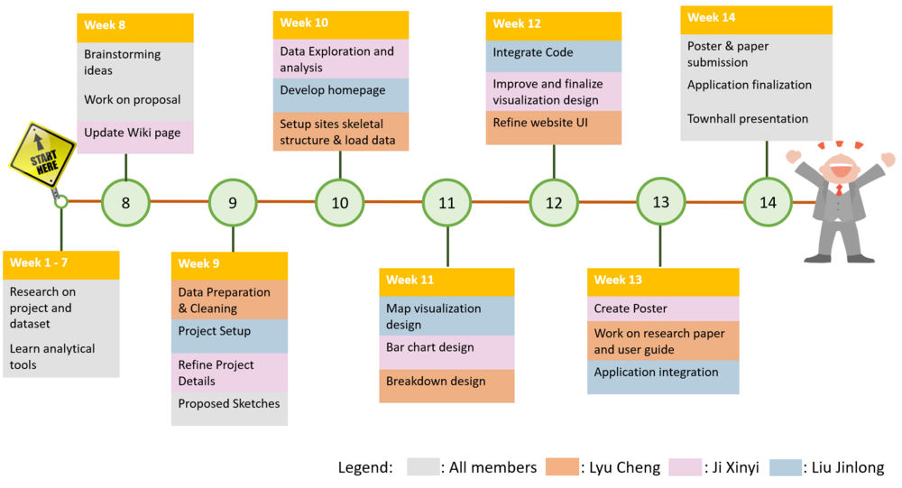
The following shows our project timeline for the completion of this project: TOOLS/TECHNOLOGIES
The following are some of the tools/technologies that we will be utilizing during the project:
WIP REFERENCES
WIP COMMENTS
Feel free to comment here :) |
