Difference between revisions of "IS428 AY2018-19T1 Wang Sheng"
| Line 62: | Line 62: | ||
* Data after filtering | * Data after filtering | ||
[[File:20181111223433.png|thumb|center|500px|Data range after filtering]] | [[File:20181111223433.png|thumb|center|500px|Data range after filtering]] | ||
| + | <br/><hr/> | ||
| + | '''Problem 5. Extreme values in sensor temperature collected''' | ||
| + | * Temperatures collected by the sensors are not always correct | ||
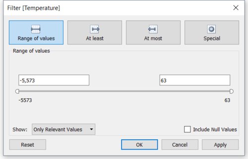
| + | * As shown below, temerature varies from -5000 to 63. Which is impossible. This is due to some faulty sensors. | ||
| + | [[File:20181112014223.png|500px|thumb|center|Range of Temperature captured]] | ||
| + | '''Solution 5. Filter the unnecessary data | ||
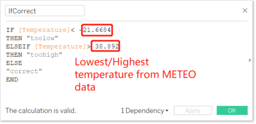
| + | * Within Tableau, create a new calculated field to figure out the impossible values | ||
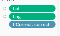
| + | * Filter the faulty values so they won't be counterd in other calculations | ||
| + | [[File:1541958430(1).png|500px|thumb|center|Formula of calculated field]] | ||
| + | [[File:1541958576(1).png|300px|thumb|center|Filter settings]] | ||
<br/><br/> | <br/><br/> | ||
| Line 75: | Line 85: | ||
| | | | ||
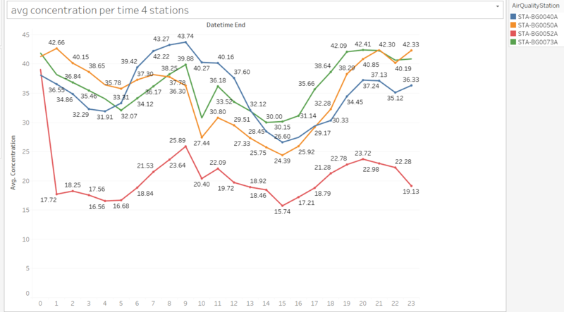
The daily measures from 00:00 - 23:00 are stated as below.<br/> | The daily measures from 00:00 - 23:00 are stated as below.<br/> | ||
| − | |||
[[File:20181111225041.png|800px|center|Pollutant Concentration per hour]] | [[File:20181111225041.png|800px|center|Pollutant Concentration per hour]] | ||
<br/> | <br/> | ||
| Line 81: | Line 90: | ||
| <b>Typical day in Sofia City</b><br> | | <b>Typical day in Sofia City</b><br> | ||
<p> | <p> | ||
| − | 1 | + | 1. The exact concentration value varies with the location of the stations. However, generally the concentration of pollutants reaches it peak value at around 9-10 am and midnight. In the afternoon, around 3pm, the average concentration of air pollutants reaches lowest value. |
| − | |||
| − | |||
| − | |||
</p> | </p> | ||
<br/> | <br/> | ||
| Line 104: | Line 110: | ||
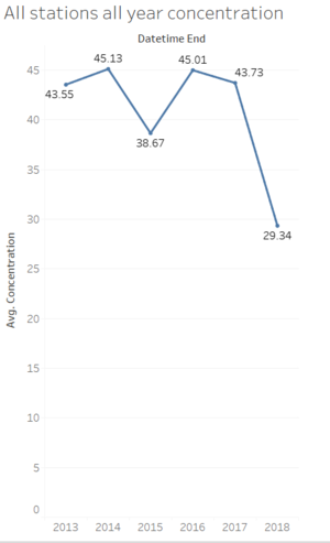
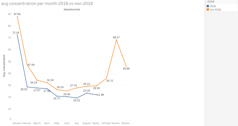
1.As shown in the pollutant concentration by year graph, we can notice that the average pollutant concentration is at the trend of dropping since 2016. Especially from 2017 to 2018, the rate of dropping is very high and the pollutant concentration is the lowerst among observable history. This conclusion is suppported by the following figure:<br/> | 1.As shown in the pollutant concentration by year graph, we can notice that the average pollutant concentration is at the trend of dropping since 2016. Especially from 2017 to 2018, the rate of dropping is very high and the pollutant concentration is the lowerst among observable history. This conclusion is suppported by the following figure:<br/> | ||
[[File:20181111235339.png|800px|thumb|center|Average pollutant concentration]] | [[File:20181111235339.png|800px|thumb|center|Average pollutant concentration]] | ||
| − | <br/> | + | <br/><br/> |
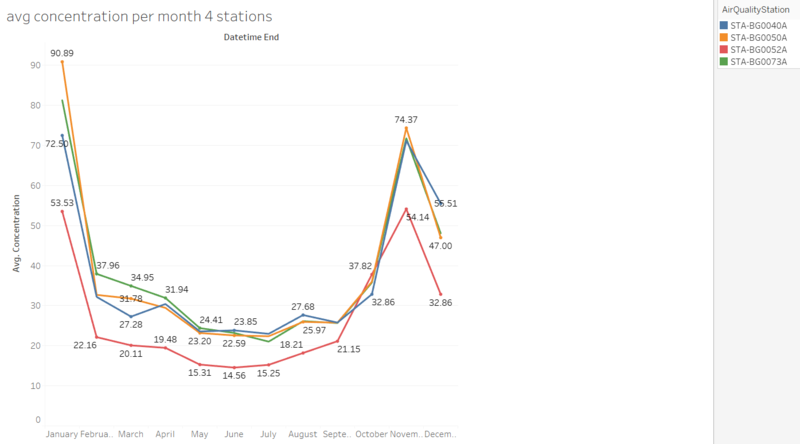
| − | 2. During one year, from January to December, there is an obvious rise in pollutant concentration in winter period especially in January and November. This may due to the coal and wood people burn during winter.January is usually the coldest time of the year thus people will burn more coals which leads to the high concentration of air pollutants in air. <br/> | + | 2. During one year, from January to December, there is an obvious rise in pollutant concentration in winter period especially in January and November. This may due to the coal and wood people burn during winter.January is usually the coldest time of the year thus people will burn more coals which leads to the high concentration of air pollutants in air. <br/><br/> |
3. Among all the 4 stations, one station(STA-BG0052A) has an obvious lowest pollutant concentration among all station at all time.<br/> | 3. Among all the 4 stations, one station(STA-BG0052A) has an obvious lowest pollutant concentration among all station at all time.<br/> | ||
</p> | </p> | ||
| Line 117: | Line 123: | ||
|- | |- | ||
| | | | ||
| − | + | [[File:20181112001056.png|1000px|thumb|center|Concentration of pollutants of all time heatmap]] | |
| − | [[File: | + | [[File:20181112002111.png|1000px|thumb|center|Number of records of all time]] |
| − | [[File: | + | <br/> |
| + | |- | ||
| + | | <b>Anomalies</b><br> | ||
| + | <p> | ||
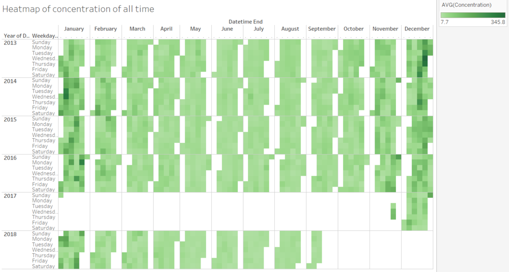
| + | 1. Form heatmap graph we can observe that, we lack of data from 2017 Januray to 2017 November. This will affect the average pollutant concentration of 2017 as its annual average concentration is calculated on with January and December data. Base on observations from other years, these two months have higher average concentration than other months. Thus the average pollutant concentration of 2017 will be much lower than the current value.<br/><br/> | ||
| + | 2. From number of recoreds graph, we can see that the distribution of record is not consistant. Year 2018 has much more records than previous years. Also, in December 3rd of 2017, there are in total of 192 records. This is very different from the rest of the records. Possible reason is that, since 2017 does not have any records for the rest of the month, the record in 2017 December 3rd may be the records of those months.<br/><br/> | ||
| + | 2. As observed in previous section, in December, the concentration value dropped down by a bit but still higher than the rest of the seasons.<br/> | ||
| + | </p> | ||
| + | <br/> | ||
| + | |} | ||
| + | |||
| + | |||
| + | |||
| + | |||
| + | ==Task 2: Spatio-temporal Analysis of Citizen Science Air Quality Measurements == | ||
| + | {| class="wikitable" | ||
| + | |- | ||
| + | ! style="font-weight: bold;background: #536a87;color:#fbfcfd;width: 20%;" | Sensors' coverage, performance and operation | ||
| + | |- | ||
| + | | | ||
| + | [[File:20181112015305.png|500px|thumb|left|Number of records over time]] | ||
| + | [[File:20181112015411.png|500px|thumb|right|Average temperature heatmap]] | ||
| + | [[File:20181112021037.png|500px|thumb|left|Average humidity heatmap]] | ||
| + | [[File:20181112021116.png|500px|thumb|right|Average pressure heatmap]] | ||
| + | |- | ||
| + | | <b>Analysis on the data</b><br> | ||
| + | <p> | ||
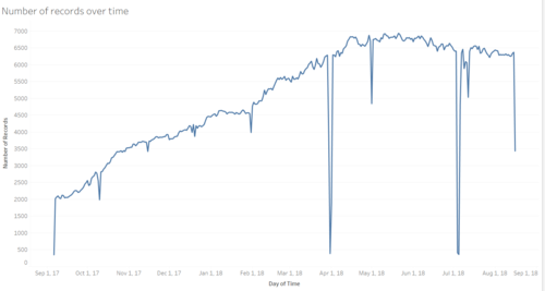
| + | 1. As shown in the number of records over time graph, the number of records given by the sensors are very unstable over time. Some sensors are not working properly all the time.<br/><br/> | ||
| + | 2. As shown in the range of temperature graph stated in data transformation(temperature before clearing) Some sensors give impossible values all the time. This also highly affects the average measures taken.<br/><br/> | ||
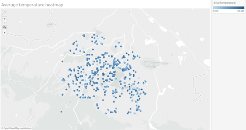
| + | 3.As shown in the average temperature heatmap, the distribution of the sensors are still acceptable as the sensors are spreaded across the whole area besides the density of sensors at bottom right corner is much higher than the density of bottom left corner.<br/><br/> | ||
| + | 4. From the heatmap we can also observe that, although some sensors are very close to each other, they have very different average readings on temperature<br/><br/> | ||
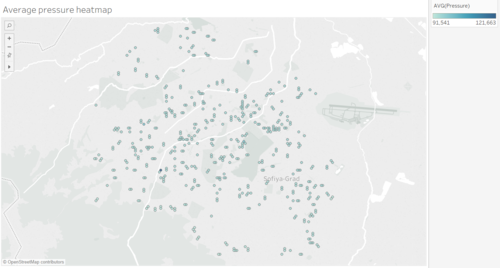
| + | 5. The average humidity heatmap and average pressure heatmap are draw fairly. This means that the sensors are fairly accurate on these measure, only bad on temperature readings. | ||
| + | </p> | ||
| + | <br/> | ||
| + | |} | ||
| + | |||
| + | |||
| + | {| class="wikitable" | ||
| + | |- | ||
| + | ! style="font-weight: bold;background: #536a87;color:#fbfcfd;width: 20%;" | Air pollution measurement | ||
| + | |- | ||
| + | | | ||
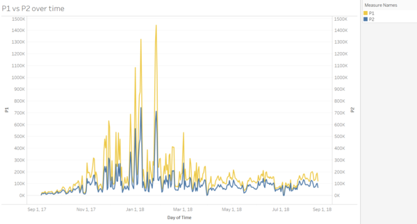
| + | [[File:20181112040142.png|600px|thumb|center|Amount of P1 vs P2 over time]]<br/> | ||
| + | * Diagram shows that over the time, P1 always has a relative higher value than P2 across the city.<br/><br/> | ||
| + | [[File:20181112040318.png|800px|thumb|center|All time pollution heatmap]]<br/> | ||
| + | * From the all time heatmap with total pollution value, we can find that the west and north part has relative higher pollution level.<br/><br/> | ||
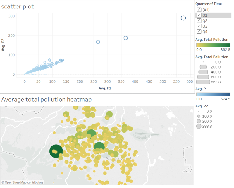
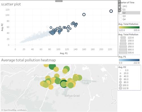
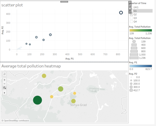
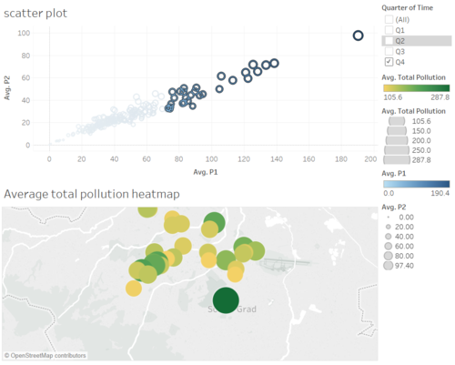
| + | * However is it always the truth? We divide the pollution in to 4 quarters. The interactive dashboard allow user to obeserve the data highlighted in scatter plot so the user can know the geographical location of the points highlighted. We highlight the data with both high P1 and P2 in each scatter plot and observe the geographical distribution of these points and how they changes over time. | ||
| + | |||
| + | [[File:20181112042046.png|500px|thumb|center|Quarter 1]] | ||
| + | [[File:20181112040418.png|500px|thumb|center|Quarter 2 ]] | ||
| + | [[File:20181112040514.png|500px|thumb|center|Quarter 3 ]] | ||
| + | [[File:20181112040550.png|500px|thumb|center|Quarter 4]] | ||
<br/> | <br/> | ||
|- | |- | ||
| − | | <b> | + | | <b>Analysis</b><br> |
<p> | <p> | ||
| − | + | 1. In Q1, and Q4, there is strong dependency between the total pollution level and the location of the point. The north part contains almost all the most polluted places.<br/><br/> | |
| − | + | 2. In Q2, pollution for all the places are not very servere. The most places are mainly at west and middle part.<br/><br/> | |
| + | 3. In Q3, middle part of the city is more polluted. We can conclude that the pollution level of a places changes over time. However, in winter quarter Q1 and Q4, the northern part is the most polluted area.<br/> | ||
</p> | </p> | ||
<br/> | <br/> | ||
|} | |} | ||
| + | |||
| + | |||
| + | |||
| + | |||
| + | ==Task 3 == | ||
| + | {| class="wikitable" | ||
| + | |- | ||
| + | ! style="font-weight: bold;background: #536a87;color:#fbfcfd;width: 20%;" | Further Analysis | ||
| + | |- | ||
| + | | | ||
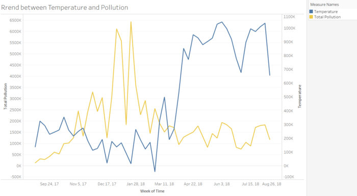
| + | [[File:20181112044446.png|700px|thumb|center|Trend of temperature and pollution]] | ||
| + | <br/> | ||
| + | * From the time series graph of temperature and pollution, we can notice that they are of opposite relationship: When temperature rises, pollution decreases and when temperature decreases, pollution level increases. This may due to the increase in buring fuels during colder temperature.<br/><br/> | ||
| + | [[File:20181112044257.png|700px|thumb|center|Topo-data of sofia city]] | ||
| + | <br/> | ||
| + | * The above graph shows the altitude of all the areas in the city. Comparing to the previous pollution distribution, we can notice that, places with high altitude trends to have very low pollution level. This may because high places block the wind from lower places. Thus, wind cannot blow away the air pollutants of low places and the pollutants kept stucked at places with lower altitude.<br/><br/> | ||
| + | [[File:20181112040514.png|500px|thumb|center|Quarter 3 ]] | ||
| + | [[File:20181112040550.png|500px|thumb|center|Quarter 4]] | ||
| + | [[File:20181112042046.png|500px|thumb|center|Quarter 1]] | ||
| + | [[File:20181112040418.png|500px|thumb|center|Quarter 2 ]] | ||
| + | <br/> | ||
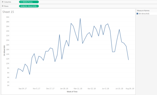
| + | * This pollution level by quarter also shows the movement of pollutants over time. As we can observe, pollutants firstly start at middle are in Q3 2017, then spreaded out to the entire northern area in Q4 2017. In the winter, all pollutants stay there and due to the increase in buring fuels, the level of pollutants increases and the northern area get more polluted. In Q2 2018, with the increase in temperature and wind level, pollutants spreaded out to the west and a bit of middle area of the city. | ||
| + | [[File:20181112045750.png|500px|thumb|center|Wind speed over time]] | ||
| + | <br/> | ||
| + | |} | ||
| + | |||
| + | =Visualisation Software= | ||
| + | To perform the visual analysis, this is a list of the software which I used.<br/> | ||
| + | * Tableau | ||
| + | * Excel | ||
| + | * R-studio | ||
| + | |||
| + | =FeedBack= | ||
| + | <br/> | ||
Revision as of 05:01, 12 November 2018
Contents
Problem & Motivation
Air pollution is an important risk factor for health in Europe and worldwide. A recent review of the global burden of disease showed that it is one of the top ten risk factors for health globally. Worldwide an estimated 7 million people died prematurely because of pollution; in the European Union (EU) 400,000 people suffer a premature death. The Organisation for Economic Cooperation and Development (OECD) predicts that in 2050 outdoor air pollution will be the top cause of environmentally related deaths worldwide. In addition, air pollution has also been classified as the leading environmental cause of cancer.
Air quality in Bulgaria is a big concern: measurements show that citizens all over the country breathe in air that is considered harmful to health. For example, concentrations of PM2.5 and PM10 are much higher than what the EU and the World Health Organization (WHO) have set to protect health.
Bulgaria had the highest PM2.5 concentrations of all EU-28 member states in urban areas over a three-year average. For PM10, Bulgaria is also leading on the top polluted countries with 77 μg/m3on the daily mean concentration (EU limit value is 50 μg/m3).
According to the WHO, 60 percent of the urban population in Bulgaria is exposed to dangerous (unhealthy) levels of particulate matter (PM10).
Dataset Analysis & Transformation Process
Before analyzing the data, there is a need to do data preparation to make sense of the data. Under the Sofia Air data, there are 4 different zip files provided in the assignment with each own unique ways to process and make sense of the data. This particular section will be used to elaborate on the dataset analysis and its transformation process for each dataset, to prepare the data for import and analysis onto tableau.
We are provided with 4 different zip files of data covering all aspects of measures. A good understand on the data content will definitely help us on analyzing the problem. This particular section will be used to elaborate on the dataset analysis and the data transformation needed to be done for all the datasets.
Datasets
- Official air quality measurements (5 stations in the city)(EEA Data.zip) – as per EU guidelines on air quality monitoring see the data description HERE…
- Citizen science air quality measurements (Air Tube.zip) , incl. temperature, humidity and pressure (many stations) and topography (gridded data).
- Meteorological measurements (1 station)(METEO-data.zip): Temperature; Humidity; Wind speed; Pressure; Rainfall; Visibility
- Topography data (TOPO-DATA)
Data transformation
Before start analyzing the data, we notice that the data are not readily prepared to be analyzed by data visualization softwares due to following problems:
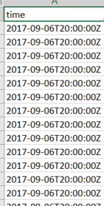
Problem 1. Time columns are stored in different formats in different data files
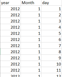
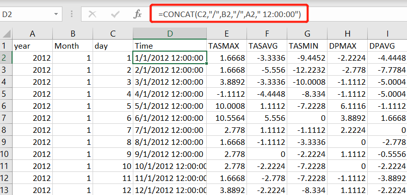
* Time in Air Tube data are stored with format "dd/mm/yyyy hh:mm:ss". However, Time in METO-data are stored in separate columns
Solution 1. Time columns are stored in different formats in different data files
* Re-structure the time format in METEO Data and add additional column in the Excel file
* Join the two data sets according to the same time value
Problem 2. Some years data are missing for EEA data
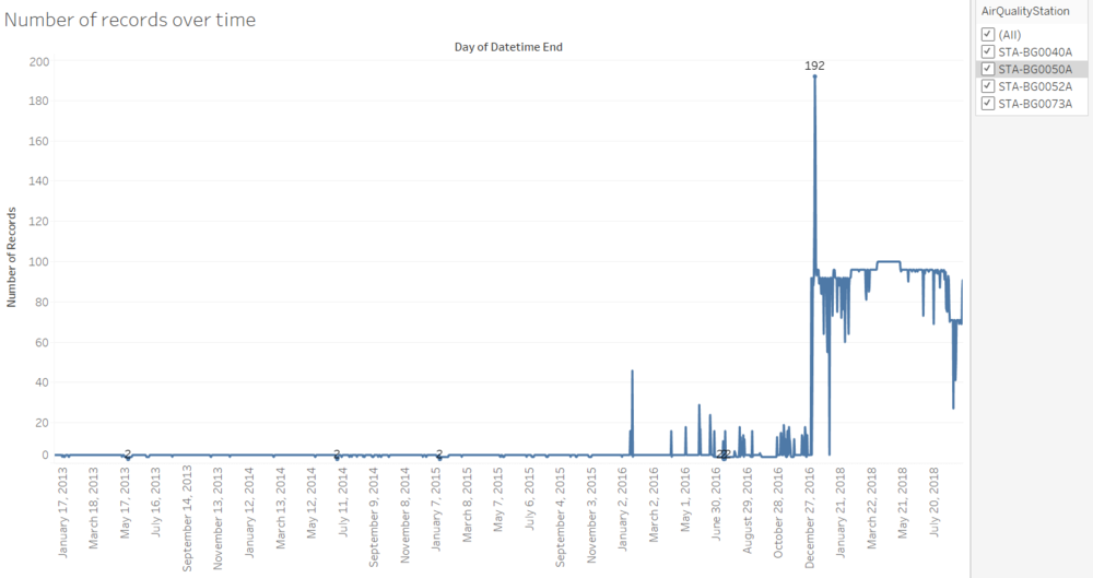
* As show in figure below, this station doesn't have data after year 2015
Solution 2. Use these datasets selecively
  * Can use theses data to state the reliability of the sensors
  * Do not use these data for calculation of average value of measures
Problem 3. Tableau is unable to understand geohash data
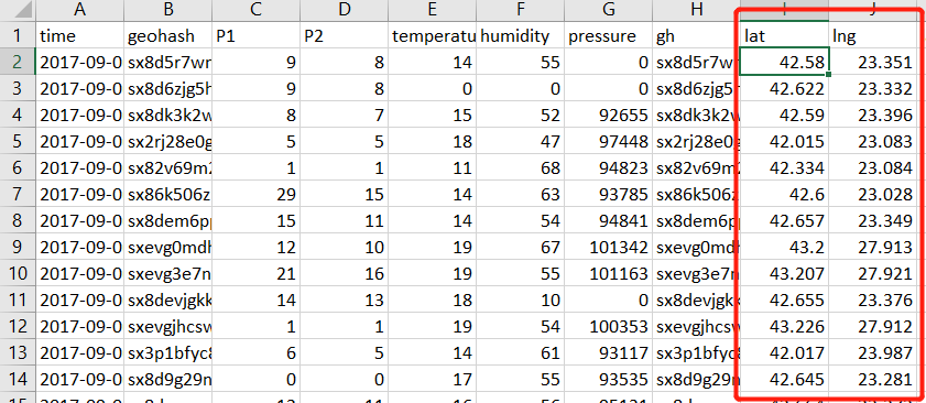
* In Air Tube data, location of sensors are stated in geohash format. However, Tableau can not understand geohash value and thus unable to display the geographical locations on the map.
Solution 3. Data tranformation on geohash data
* Use R package to transform the geohash data to coordinates and store in new columns
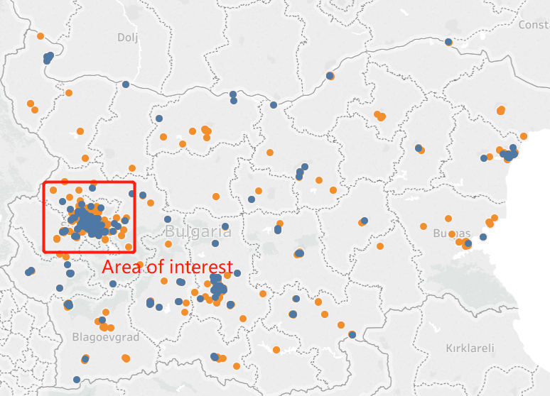
Problem 4. Data provided is beyond our area of interest
  * According to the data and geohash provided, we can get the location of each sensor.
  * However, we only interest those in Sofia's city area. Area is provided in TOPO data
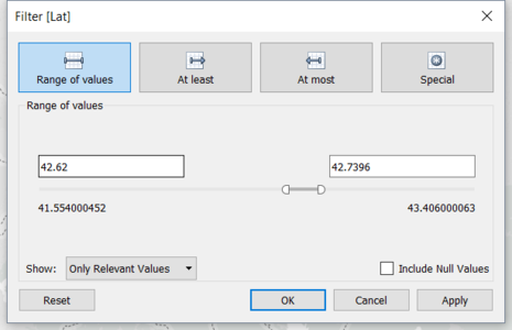
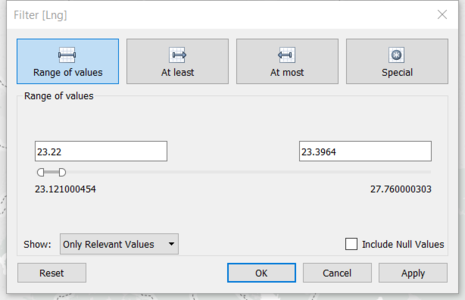
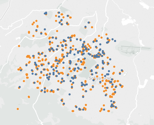
Solution 4. Filter the unnecessary data
* Within Tableau, filter out the uninterested data using filters
* Data after filtering
Problem 5. Extreme values in sensor temperature collected
  * Temperatures collected by the sensors are not always correct
  * As shown below, temerature varies from -5000 to 63. Which is impossible. This is due to some faulty sensors.
Solution 5. Filter the unnecessary data
  * Within Tableau, create a new calculated field to figure out the impossible values
  * Filter the faulty values so they won't be counterd in other calculations
The Task
Use the transformed data, we can concluded following answers supported with appropriate visualizations
Task 1: Spatio-temporal Analysis of Official Air Quality
| Typical day in Sofia city |
|---|
|
The daily measures from 00:00 - 23:00 are stated as below.
|
| Typical day in Sofia City 1. The exact concentration value varies with the location of the stations. However, generally the concentration of pollutants reaches it peak value at around 9-10 am and midnight. In the afternoon, around 3pm, the average concentration of air pollutants reaches lowest value.
|
| Trends of possible interests |
|---|
|
|
| Trends & Interests
1.As shown in the pollutant concentration by year graph, we can notice that the average pollutant concentration is at the trend of dropping since 2016. Especially from 2017 to 2018, the rate of dropping is very high and the pollutant concentration is the lowerst among observable history. This conclusion is suppported by the following figure:
|
| Anomalies and how do them affect analysis of potential problems to the environment |
|---|
|
|
| Anomalies
1. Form heatmap graph we can observe that, we lack of data from 2017 Januray to 2017 November. This will affect the average pollutant concentration of 2017 as its annual average concentration is calculated on with January and December data. Base on observations from other years, these two months have higher average concentration than other months. Thus the average pollutant concentration of 2017 will be much lower than the current value.
|
Task 2: Spatio-temporal Analysis of Citizen Science Air Quality Measurements
| Sensors' coverage, performance and operation |
|---|
| Analysis on the data
1. As shown in the number of records over time graph, the number of records given by the sensors are very unstable over time. Some sensors are not working properly all the time.
|
| Air pollution measurement |
|---|
|
| Analysis
1. In Q1, and Q4, there is strong dependency between the total pollution level and the location of the point. The north part contains almost all the most polluted places.
|
Task 3
| Further Analysis |
|---|
|
|
Visualisation Software
To perform the visual analysis, this is a list of the software which I used.
  * Tableau
  * Excel
  * R-studio
FeedBack
