Difference between revisions of "IS428 2018-19 T1 Assign YeoQinYingSheryl"
| Line 109: | Line 109: | ||
| + | [[File:YQYS Q3.1.png|800px|center]] | ||
| + | There is an inverse relationship with the Concentration Level and the Wind Speed. The higher the wind speed, the lower the concentration level, vice versa. This is illustrated with 2 examples circled in purple. Whereas, there is a direct relationship with the Concentration Level and the Surface Pressure. The higher the surface pressure, the higher the concentration level. This is illustrated with 2 examples circled in orange. High pressure will lead to low winds and little ventilation to transport the pollution away. | ||
| + | [[File:YQYS Q3.2.png|800px|center]] | ||
| + | Temperature in this case, has an inverse relationship with the Concentration Level. The lower the temperature, the higher the concentration. This is illustrated by the similar examples circled in black. This is due the effects of Temperature Inversion especially during the Winter months in Sofia City (December to February), where it traps the pollution at ground level. | ||
| + | [[File:YQYS Q3.3.png|800px|center]] | ||
| + | Precipitation has an inverse relationship with the Concentration level. The higher the precipitation, the lower the concentration. High precipitation means there is higher amount of rainfall/snow, and hence meaning there is lesser pollution as it will be cleared off. If not for that, the pollution will build up slowly. | ||
| + | |||
| + | = Visualisation Link= | ||
| + | https://app.powerbi.com/groups/me/reports/3e6f63c8-856a-4e00-a71e-acd51d608fb1/ReportSectiona1602acfe0685c85114f | ||
= References = | = References = | ||
Revision as of 23:48, 11 November 2018
Contents
Problem & Motivation
Air pollution is an important risk factor for health in Europe and worldwide. A recent review of the global burden of disease showed that it is one of the top ten risk factors for health globally. Worldwide an estimated 7 million people died prematurely because of pollution; in the European Union (EU) 400,000 people suffer a premature death. The Organisation for Economic Cooperation and Development (OECD) predicts that in 2050 outdoor air pollution will be the top cause of environmentally related deaths worldwide. In addition, air pollution has also been classified as the leading environmental cause of cancer.
Air quality in Bulgaria is a big concern: measurements show that citizens all over the country breathe in air that is considered harmful to health. For example, concentrations of PM2.5 and PM10 are much higher than what the EU and the World Health Organization (WHO) have set to protect health.
Bulgaria had the highest PM2.5 concentrations of all EU-28 member states in urban areas over a three-year average. For PM10, Bulgaria is also leading on the top polluted countries with 77 μg/m3on the daily mean concentration (EU limit value is 50 μg/m3).
According to the WHO, 60 percent of the urban population in Bulgaria is exposed to dangerous (unhealthy) levels of particulate matter (PM10).
Given the current poor air quality state in Bulgaria, there is a need build a data visualisation to efficiently identify the spatio-temporal patterns in Sofia City and raise the issues of concern. In view of this, it will assist the Government to come up with measures to help alleviate and mitigate the current problem. Utlimately, being a win-win situation for both the city and its citizens.
Dataset Analysis & Transformation Process
There were four different datasets given for this assignment and this section will illustrate the data analysis and transformation process for each dataset to prepare data for import and visualization.
EEA Data - Official Air Quality Measurements
The data is captured by various Air Quality Stations placed around Sofia City from 2013-2018 to gauge the daily and hourly concentration readings of the Air Quality, measured by µg/m3. The following are some issues faced:
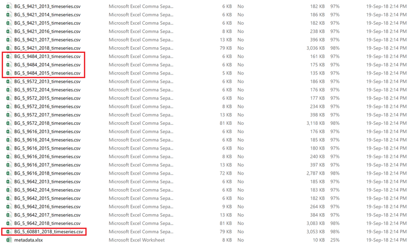
Issue: Incomplete dataset from 2 Air Quality Stations. Unable to analyse the Air Quality Stations with others to draw any insightful trends.
Solution: Exclude incomplete datasets from visualization.
Issue: Data seperated into different sheets in its respective years/air quality stations. This makes analysis difficult, hence the need to join all data together.
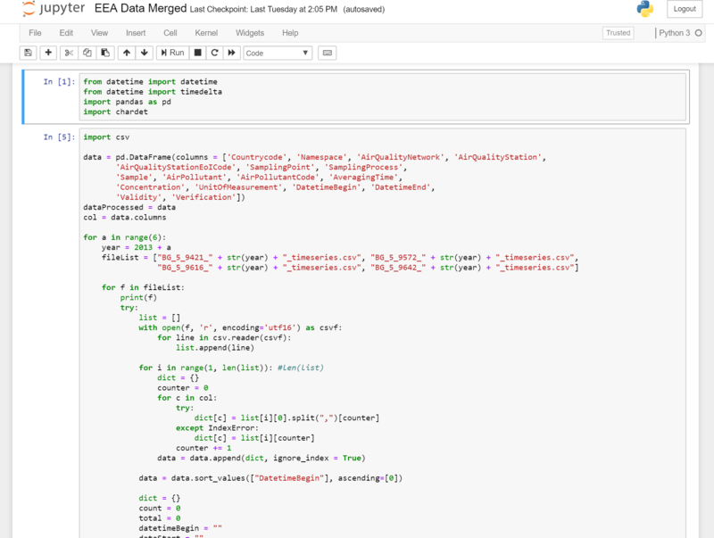
Solution: Use Python (Pandas Library) to combine all data sets into one single file.
Issue: Dataset’s Averaging Time is not constant. Some stated as “Daily”, some stated as “Hourly”, some stated as “var”. Visualization will not be accurate as data will be inconsistent if compared with EU air quality standards, the average is only shown in daily (50 µg/m3) and yearly (40 µg/m3).
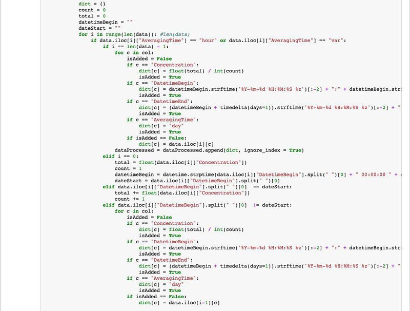
Solution: Filter out the ones in hourly and var. Sum the total and average it.
Air Tube - Citizen Science Air Quality Measurements
Issue: Geographical Location is given in Geohash format. Microsoft Power BI is unable to read.
Solution: Use pygeohash library to retrieve the lat and long of the geographical location.

Issue: Currently data are all separated into different sheets in its respective years, hence the need to join all data together.
Solution: Use Python (Pandas Library) to combine all data sets into one single file.

Dataset Import Structure & Process
After analyzing and transforming the data, the transformed files will be imported to Microsoft Power BI.
Task 1 - Spatio-temporal Analysis of Official Air Quality
According to the European Court of Auditors, Sofia City had no projects thus far to target its high emission rates from domestic heating (solid fuel heating) which is the main contributor to particulate matter emissions. Apart from that, transport is another main source contributing to the massive air pollution in Sofia City. The combination of temperature inversion with all these heating during winter caused air pollution to exacerbate.
It has currently no “industrial” monitoring stations to monitor the power plants and industrial facilities in the area. There used to be one station which is used to record the concentration limits, however due to construction works, it got relocated and concentration limits dropped drastically. Does something smell fishy here?
With little to no measures planned for Sofia City, the air quality levels have been nearing or exceeding the EU standards very frequently, be it daily or yearly. The official air quality data only includes PM10, PM2.5 is missing hence it might not be conclusive of the whole air quality environment. In 2015 and 2016, the data points are below the yearly EU standards. However, its daily air quality measurements still exceeded the daily EU standards and hence explaining why the data points being very close to the yearly EU standards, which is very risky and bad for the environment. Anomalies are found in 2017, where the sudden spike is caused by the insufficient data as only two months (Nov & Dec) are accounted. The data is recorded during the winter period and thus the high average. 2018 data is also not completed unlike the rest in 2013 to 2016 as it has only data from January to September. This may mean that the data is inconclusive to analyze fully.
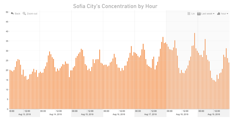
The graph above shows the hourly PM10 concentration level of Sofia City during a 1-week period from August 13, 2018 to August 19, 2018. A typical day in Sofia City has two peaks in its concentration level, following somewhat like a sine graph. It rises gradually during the early morning at about 5AM-8AM (work starts) then goes down during the afternoon period, and then rises gradually during the evening period (6PM-9PM when work ends, everyone starts being at home). Very often, weekend’s concentration level tends to be higher than that of the weekdays. This may be due to higher household domestic heating and transport emissions.
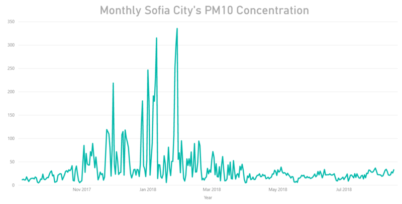
Recently, January 8, 2018 and January 27, 2018 experienced one of the worst air qualities in Sofia City. It was also reported on the news that the air pollution was 5 to 6 times higher than usual. The likely reason for this is that it occurred during the peak of the winter season (December-January-February), where more burning activities and emissions are more evident.
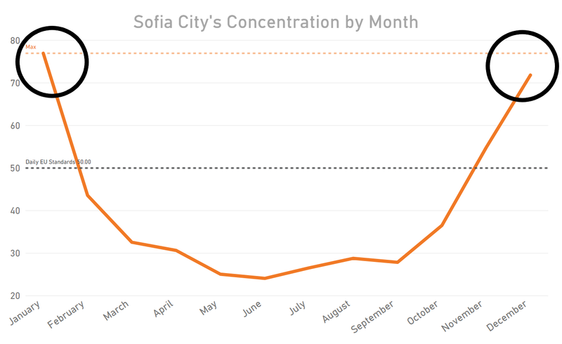
The air quality level significantly increases as the season changes as shown in the peaks. The peaks occur during the December and January period, which is the winter season in Sofia City. The spike is probably due to burning of excessive wood and coal to keep warm during the cold weather and emissions from vehicles. In addition, due to the temperature inversion, warm layers prevent air below it from passing through, so all the pollutants will then be stuck and circulate near the surface.
Overall, Sofia City must take into consideration the peaks and find a solution as a country to counter this problem so that it will keep below the EU daily and yearly standards. Even though there is an improvement (well-kept below the daily 50 µg/m3 EU standards) in its concentration levels in 2018, there needs to be a constant effort to make sure its sustainable even when winter is approaching. Perhaps, renewable energy?
Task 2 - Spatio-temporal Analysis of Citizen Science Air Quality Measurements
The unofficial citizen science air quality data given comes from the Citizens in Sofia City who owns a device that take measurements of the pollutive levels every hour. The data given covers areas not only in Sofia City, but other cities in Bulgaria as well. However, for this task, we will zoom into Sofia City.
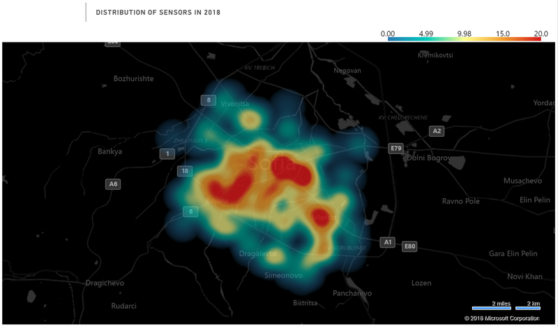
As observed in the heat map above, the coverage of the Citizen Science sensors as at 2018 is mainly concentrated in the center of Sofia City, with a minimal sensors located at the outskirts of Sofia city. There are three areas populated with more sensors compared to the rest as seen shaded in red.
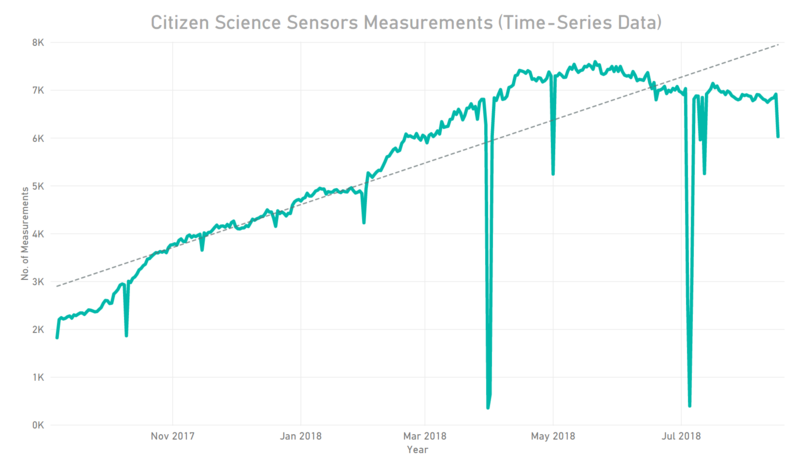
The time-series data above illustrates the number of measurements from September 2017 to August 2018. It shows a gradual increase in the number of Citizen Science Sensors over time, supported by the trend line. The minor dips and major dips reflected in the time-series graph may be due to missing measurements, occurring usually end-month or mid-month.
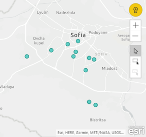 |}
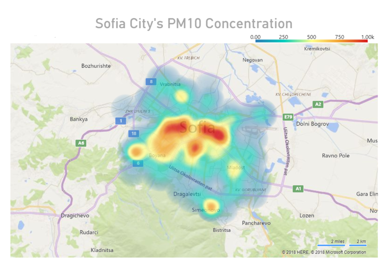
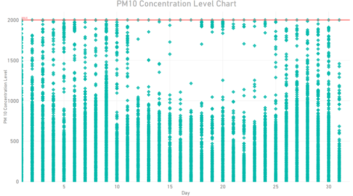
|} The Citizen Science Sensors recorded extreme values of the PM10 concentration level (up to 2000μg/m3) which is too high of an amount. With this, we can safely infer that the sensors that citizens use might not be professional measurement devices unlike the ones used at official air quality stations. Hence, the concentration level measurements taken may not be accurate at all times. Such sensor records as shown on the map above should not be taken into account and should be rectified immediately.
We have excluded the extreme values (>1000μg/m3) as mentioned previously and as per the Heatmap above, it is obvious that the higher concentration levels lies in the northern part of Sofia City as compared to the other parts. We will look into whether the PM10 concentration levels will be affected by months, days, hours.
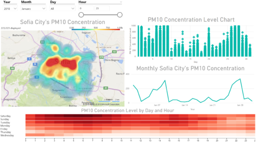
Like before, the readings here show the same characteristics like the Official Air Quality Data where there is a clear difference to the peaks in the various months. The PM10 Concentration Level readings starts to increase from November 2017 to January 2018 till it reaches its peak, and then decrease thereafter. This is a seasonal trend whereby Sofia City faces every year as it is during the winter period.
As seen in the Calendar heatmap, weekends have the most concentrated levels as compared to the weekdays. On average, time ranging from 12AM - 9AM have relatively high concentration level then it drops gradually during the mid-day and then starts to increase gradually as the night approaches.
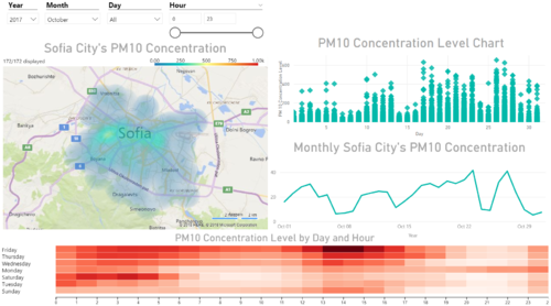 |}
|} The above compares the readings in January 2018 and in October 2017. There is a drastic difference between the concentration levels. The dashboard on the right shows the readings for January 2018 which contains the most extreme air quality levels comparing to the other lull months. Likewise, the northern part of Sofia City clocked more readings than the other parts of the city. The dashboard on the left shows the readings for October 2017 which contain relatively stable readings, having a good mix of high, moderate and low readings by day and hour.
Task 3
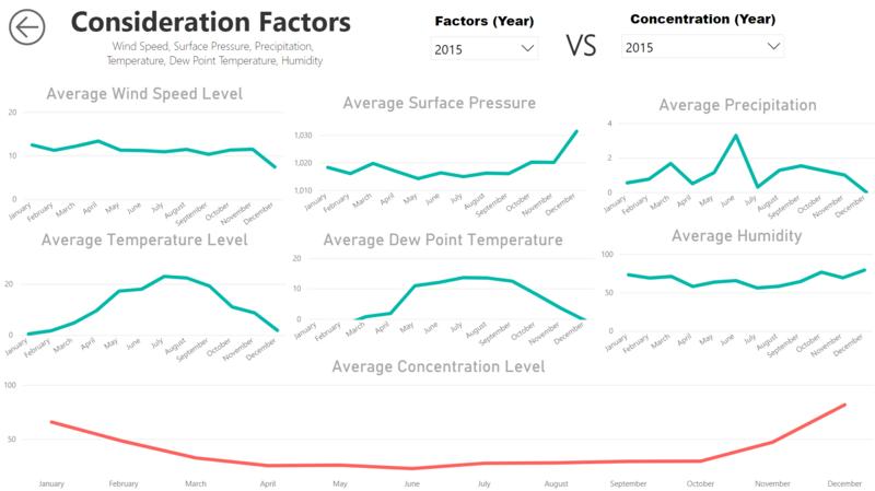
The data used for this dashboard includes the Meteorological Data and the Official Air Quality Data. The above dashboard will be used to find out if there is any correlation between the Concentration Level and the factors put into consideration. The factors include Wind Speed, Surface Pressure, Precipitation, Temperature, Dew Point Temperature and Humidity. Using the year of 2015 as an example, we will be analyzing the relationship between the 2 factors.
There is an inverse relationship with the Concentration Level and the Wind Speed. The higher the wind speed, the lower the concentration level, vice versa. This is illustrated with 2 examples circled in purple. Whereas, there is a direct relationship with the Concentration Level and the Surface Pressure. The higher the surface pressure, the higher the concentration level. This is illustrated with 2 examples circled in orange. High pressure will lead to low winds and little ventilation to transport the pollution away.
Temperature in this case, has an inverse relationship with the Concentration Level. The lower the temperature, the higher the concentration. This is illustrated by the similar examples circled in black. This is due the effects of Temperature Inversion especially during the Winter months in Sofia City (December to February), where it traps the pollution at ground level.
Precipitation has an inverse relationship with the Concentration level. The higher the precipitation, the lower the concentration. High precipitation means there is higher amount of rainfall/snow, and hence meaning there is lesser pollution as it will be cleared off. If not for that, the pollution will build up slowly.
Visualisation Link
References
https://github.com/dbarthe/geohash/
https://www.standartnews.com/english/read/brussels_sofia_has_no_projects_targeting_air_pollution-13174.html
