Difference between revisions of "IS428 AY2018-19T1 Low Yun Vera"
| Line 78: | Line 78: | ||
https://www.kashkaval-tourist.com/weather-in-bulgaria-all-year-guide/ <br> | https://www.kashkaval-tourist.com/weather-in-bulgaria-all-year-guide/ <br> | ||
https://www.quora.com/What-happens-to-us-if-atmospheric-pressure-becomes-zero <br> | https://www.quora.com/What-happens-to-us-if-atmospheric-pressure-becomes-zero <br> | ||
| + | |||
| + | == Tableau Public Link == | ||
| + | https://public.tableau.com/profile/vera2474#!/vizhome/VeraVAAssignment/StoryOfSofiaCity?publish=yes | ||
== Comments == | == Comments == | ||
Revision as of 21:31, 11 November 2018
Contents
Problem & Motivation
Air pollution is an important risk factor for health in Europe and worldwide. A recent review of the global burden of disease showed that it is one of the top ten risk factors for health globally. Worldwide an estimated 7 million people died prematurely because of pollution; in the European Union (EU) 400,000 people suffer a premature death. The Organisation for Economic Cooperation and Development (OECD) predicts that in 2050 outdoor air pollution will be the top cause of environmentally related deaths worldwide. In addition, air pollution has also been classified as the leading environmental cause of cancer.
Air quality in Bulgaria is a big concern: measurements show that citizens all over the country breathe in air that is considered harmful to health. For example, concentrations of PM2.5 and PM10 are much higher than what the EU and the World Health Organization (WHO) have set to protect health.
Bulgaria had the highest PM2.5 concentrations of all EU-28 member states in urban areas over a three-year average. For PM10, Bulgaria is also leading on the top polluted countries with 77 μg/m3on the daily mean concentration (EU limit value is 50 μg/m3).
According to the WHO, 60 percent of the urban population in Bulgaria is exposed to dangerous (unhealthy) levels of particulate matter (PM10).
Dataset Analysis & Transformation Process
There are 4 files provided to us. The AirTube, EEA Data, Meteo data and Topo-Data. This section of the wikipedia page will be explaining the data processing and exploratory data analysis of the files provided.
Air Tube
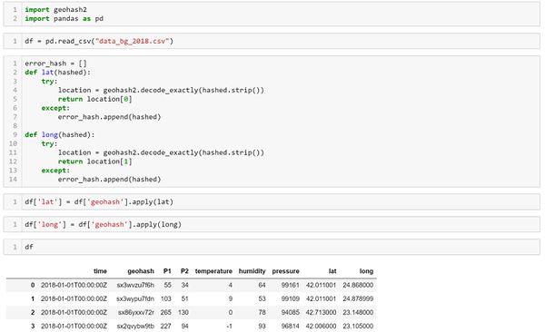
Issue : In this data set the geographical location given is in a geohash format.
Solution : In order to retrieve the latitude and longitude of the location, the use of a python geohash2 library is needed to decode the geohash.
data_bg_2017
There is a geohash "m-2105171”, due to the ‘-‘ in the hash the geohash2 library is unable to decode the geohash hence I have used an online geohash converter to decode the ‘m-2105171’. However, after converting the particular geohash to it's latitude and longtitude and plotting into Tableau it is found out that the particular geohash 'm-210517' is an outlier as shown in the image below highlighted by the red box. Hence, there is a need to remove the particular point.
data_bg_2018
There are 4 missing geohashes found in data_bg_2018.
EEA Data
After Exploring the data with Tableau, it is found out that there are missing values in 2017 from 1st Jan 2017 to 28th November 2017.
For station 9484 there is only data from 2013 - 2015, the year 2016-2018 is missing for that station and hence will be removing it from the analysis. Station 60881 only has data for the year 2018 and also will be omitted.
Issue: In the EEA file, the data for each bg_x_xxxx_year is separated into many different csv files.
Solution: Using the Tableau Union function, I am able to merge the different datasets into one data. There is also a need to innerjoin the metadata on AirQualityEoiCode. This is so that i am able to link the bg_data to the 6 different stations.
Meteo Data
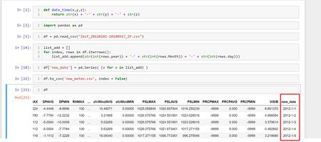
While exploring the meteo data csv file, i have come to realized the date format in the meteo data is separated into year, month, day hence the date will appear as separated values in Tableau. I did some data transformation on the meteo data csv file to combine the year,month and day as one column (2XXX-XX-XX) as seen in the image below.
Task 1: Spatio-temporal Analysis of Official Air Quality
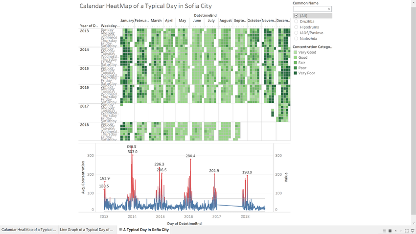
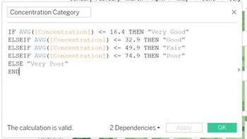
The above dashboard shows the typical day of Sofia city by weekday from Sunday - Saturday. The concentration is separated into 5 different categories using a calculated field in tableau.
It can be seen that a typical day have around good to fair concentration categories. However, in the month of October to January the concentration of air pollution is very poor. Concentration is especially bad from December to January. The highest concentration would be on 25th December 2013. This might be due to a strict Bulgarian tradition that demand a fire to be built on a hearth with enough wood to burn all night into Christmas day resulting in especially high concentration during the festive seasons.
Throughout the years the concentration have also been decreasing as seen by the line chart. This might also be due to the fact that the Christmas tradition now has been replaced with lighted candles which produces less pollutants reference found in reference. From the line chart though there are some peaks of high concentration, overall concentration seems to be good.
A huge anomaly can be found in the dataset and also seen in the dashboard above. In the calendar heatmap in the year 2017 there is a large blank space. Also, in the line chart there is a stagnant line in the year 2017. This indicates that there is a large amount of missing values in the year 2017. This might affect my analysis of potential problems to the environment as 2017's data is missing, I am unable to tell if there were actually large concentration in the year of 2017. I am also unable to tell if this is a recurring problem of pollution in sofia city.
Task 2 Spatio-temporal Analysis of Citizen Science Air Quality Measurements
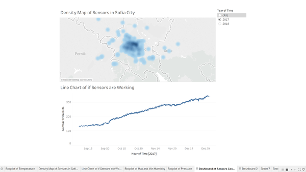
From the dashboard above, the sensor's coverage, performance and operation do not cover the whole of sofia city and not really well distributed. From the density chart, most of the sensors are clustered around the midpoint of sofia city. However, sensors are not distributed around the edges of sofia city. In the year 2017, the sensors are also working properly at all times. There are no dramatic drops in the number of records taken by the sensors.
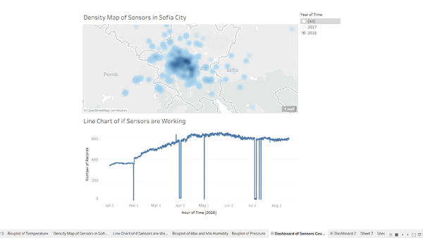
As compared to 2017, 2018 have a higher density, heatmap meaning to say that the year 2018 have more sensors than the year 2017. However looking at the number of records that the sensors have collected there are dramatic drops in the number of records. The dramatic drops in number of records are in February, April, May, July and August. This means that at some point in those months the sensors stopped working properly leading to a decrease in records recorded.
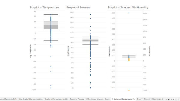
There are unexpected behaviors of the sensors the sensors recorded a temperature of near -100 degree Celsius. Whereas, the lowest ever temperature recorded in Bulgaria is only -38.3 degree Celsius. There is also a recorded pressure of nearing 0 which means absolute vacuum is this definitely an anomaly as absolute vacuum will actually provide lethal damage to the human lungs. The sensors also recorded a humidity of maximum 900% and a humidity of -1000% minimum.
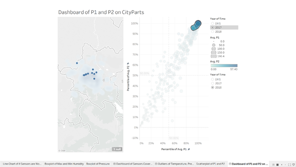
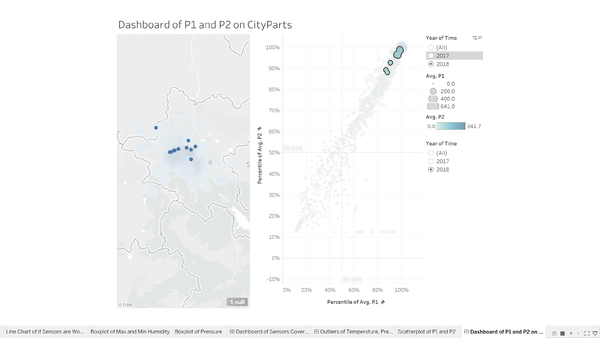
Building a density chart as well as a scatterplot of the percentile of the average air pollution measurement. To identify which part of the city shows relatively
After selecting the year 2017 and the points on the scatterplot with a high percentile of P1 and a high percentile of P2, the density plot is able to show the location of where the points are in Sofia city. There are some points outside of Sofia city and I have excluded the points in the visualizations. These differences are Time dependent as when selected with year 2018 with the same selected points previously, the point's relative percentiles have dropped in the scatterplot. This is because there are more sensors in 2018 with higher P1 and P2 readings as seen in the scatter and density plot.
In the year 2018 it is also noted that there are readings that have low P2 and high P1. Sensors with high readings are more clustered together than sensors with lower readings.
Task 3
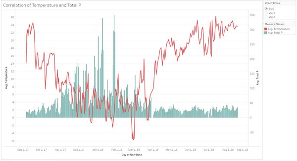
Before starting on Task 3, I had first do an inner join on the METEO Data with the Air Tube Data on the day. This is so that we can perform visual analysis on the relation between AirTube and METEO data.
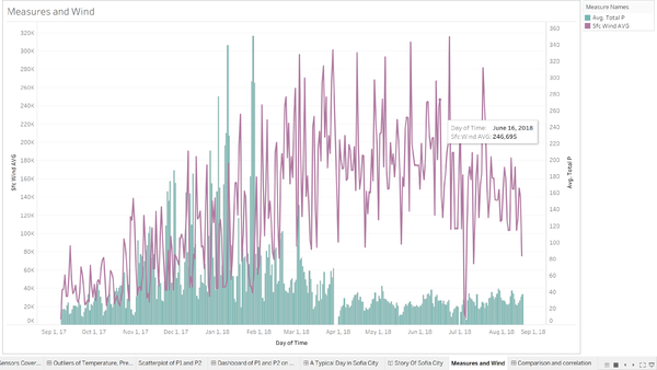
The chart is plotted with the total of P1 + P2 and temperature against Days. It can be seen that when the temperature increases the average total pm2.5 and pm10 decreases. At the same time when temperature decreases, the total average total pm2.5 and pm10 increases. A similar chart is plotted against the Daily average wind speed (sfcWindAVG) to view the relationship between the decrease in airquality and the windspeed.
From the chart, we can see that during the month from 1st March 2018 to 1st September 2018 there is a decrease in the average pm2.5 and pm10 while there is an increase in windspeed. Windspeed affects the air quality measured.
References
https://github.com/DBarthe/geohash
https://www.kashkaval-tourist.com/weather-in-bulgaria-all-year-guide/
https://www.quora.com/What-happens-to-us-if-atmospheric-pressure-becomes-zero
Tableau Public Link
https://public.tableau.com/profile/vera2474#!/vizhome/VeraVAAssignment/StoryOfSofiaCity?publish=yes
